Table of Contents
- Preface
- Introduction
- Notation
- Ordinary least squares
- Regression to the mean
- Statistical linear regression models
- Residuals
- Regression inference
- Multivariable regression analysis
- Multivariable examples and tricks
- Adjustment
- Residuals, variation, diagnostics
-
Multiple variables and model selection
- Multivariable regression
- The Rumsfeldian triplet
- General rules
- R squared goes up as you put regressors in the model
- Simulation demonstrating variance inflation
- Summary of variance inflation
- Swiss data revisited
- Impact of over- and under-fitting on residual variance estimation
- Covariate model selection
- How to do nested model testing in R
- Exercises
- Generalized Linear Models
- Binary GLMs
- Count data
- Bonus material
- Notes
Preface
About this book
This book is written as a companion book to the Regression Models Coursera class as part of the Data Science Specialization. However, if you do not take the class, the book mostly stands on its own. A useful component of the book is a series of YouTube videos that comprise the Coursera class.
The book is intended to be a low cost introduction to the important field of regression models. The intended audience are students who are numerically and computationally literate, who would like to put those skills to use in Data Science or Statistics. The book is offered for free as a series of markdown documents on github and in more convenient forms (epub, mobi) on LeanPub.
This book is licensed under a Creative Commons Attribution-NonCommercial-ShareAlike 4.0 International License, which requires author attribution for derivative works, non-commercial use of derivative works and that changes are shared in the same way as the original work.
About the cover
The picture on the cover is a public domain image taken from Francis Galton’s paper on hereditary stature. It represents an important leap in the development of regression and correlation as well as regression to the mean.
Introduction
Before beginning
This book is designed as a companion to the Regression Models Coursera class as part of the Data Science Specialization, a ten course program offered by three faculty, Jeff Leek, Roger Peng and Brian Caffo, at the Johns Hopkins University Department of Biostatistics.
The videos associated with this book can be watched in full here, though the relevant links to specific videos are placed at the appropriate locations throughout.
Before beginning, we assume that you have a working knowledge of the R programming language. If not, there is a wonderful Coursera class by Roger Peng, that can be found here. In addition, students should know the basics of frequentist statistical inference. There is a Coursera class here and a LeanPub book here.
The entirety of the book is on GitHub here.
Please submit pull requests if you find errata! In addition the course notes can be found
also on GitHub here.
While most code is in the book, all of the code for every figure and analysis in the
book is in the R markdown files (.Rmd) for the respective lectures.
Finally, we should mention swirl (statistics with interactive R programming).
swirl is an intelligent tutoring system developed by Nick Carchedi, with contributions
by Sean Kross and Bill and Gina Croft. It offers a way to learn R in R.
Download swirl here. There’s a swirl
module for this course!.
Try it out, it’s probably the most effective way to learn.
Regression models
Watch this video before beginning
Regression models are the workhorse of data science. They are the most well described, practical and theoretically understood models in statistics. A data scientist well versed in regression models will be able to solve an incredible array of problems.
Perhaps the key insight for regression models is that they produce highly interpretable model fits. This is unlike machine learning algorithms, which often sacrifice interpretability for improved prediction performance or automation. These are, of course, valuable attributes in their own rights. However, the benefit of simplicity, parsimony and interpretability offered by regression models (and their close generalizations) should make them a first tool of choice for any practical problem.
Motivating examples
Francis Galton’s height data
Francis Galton, the 19th century polymath, can be credited with discovering regression. In his landmark paper Regression Toward Mediocrity in Hereditary Stature he compared the heights of parents and their children. He was particularly interested in the idea that the children of tall parents tended to be tall also, but a little shorter than their parents. Children of short parents tended to be short, but not quite as short as their parents. He referred to this as “regression to mediocrity” (or regression to the mean). In quantifying regression to the mean, he invented what we would call regression.
It is perhaps surprising that Galton’s specific work on height is still relevant today. In fact this European Journal of Human Genetics manuscript compares Galton’s prediction models versus those using modern high throughput genomic technology (spoiler alert, Galton wins).
Some questions from Galton’s data come to mind. How would one fit a model that relates parent and child heights? How would one predict a child’s height based on their parents? How would we quantify regression to the mean? In this class, we’ll answer all of these questions plus many more.
Simply Statistics versus Kobe Bryant
Simply Statistics is a blog by Jeff Leek, Roger Peng and Rafael Irizarry. It is one of the most widely read statistics blogs, written by three of the top statisticians in academics. Rafa wrote a (somewhat tongue in cheek) post regarding ball hogging among NBA basketball players. (By the way, your author has played basketball with Rafael, who is quite good, but certainly doesn’t pass up shots; glass houses and whatnot.)
Here’s some key sentences:
- “Data supports the claim that if Kobe stops ball hogging the Lakers will win more”
- “Linear regression suggests that an increase of 1% in % of shots taken by Kobe results in a drop of 1.16 points (+/- 0.22) in score differential.”
In this book we will cover how to create summary statements like this using regression model building. Note the nice interpretability of the linear regression model. With this model Rafa numerically relates the impact of more shots taken on score differential.
Summary notes: questions for this book
Regression models are incredibly handy statistical tools. One can use them to answer all sorts of questions. Consider three of the most common tasks for regression models:
- Prediction e.g.: to use the parent’s heights to predict children’s heights.
- Modeling e.g.: to try to find a parsimonious, easily described mean relationship between parental and child heights.
- Covariation e.g.: to investigate the variation in child heights that appears unrelated to parental heights (residual variation) and to quantify what impact genotype information has beyond parental height in explaining child height.
An important aspect, especially in questions 2 and 3 is assessing modeling assumptions. For example, it is important to figure out how/whether and what assumptions are needed to generalize findings beyond the data in question. Presumably, if we find a relationship between parental and child heights, we’d like to extend that knowledge beyond the data used to build the model. This requires assumptions. In this book, we’ll cover the main assumptions necessary.
Exploratory analysis of Galton’s Data
Watch this video before beginning
Let’s look at the data first. This data was created by Francis Galton in 1885. Galton was a statistician who invented the term and concepts of regression and correlation, founded the journal Biometrika, and was the cousin of Charles Darwin.
You may need to run install.packages("UsingR") if the UsingR library is
not installed. Let’s look at the marginal (parents disregarding children and
children disregarding parents) distributions first.
The parental distribution is all heterosexual couples. The parental average was corrected
for gender via multiplying female heights by 1.08. Remember, Galton didn’t have
regression to help figure out a better way to do this correction!
library(UsingR); data(galton); library(reshape); long <- melt(galton)
g <- ggplot(long, aes(x = value, fill = variable))
g <- g + geom_histogram(colour = "black", binwidth=1)
g <- g + facet_grid(. ~ variable)
g
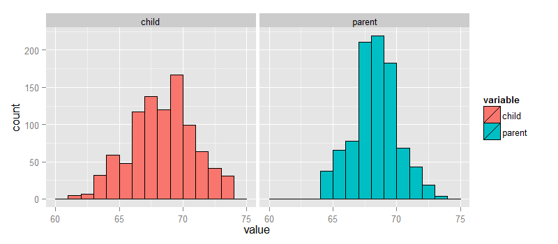
galton datasetFinding the middle via least squares
Consider only the children’s heights. How could one describe the “middle”? Consider one definition. Let \(Y_i\) be the height of child \(i\) for \(i = 1, \ldots, n = 928\), then define the middle as the value of \(\mu\) that minimizes
$$ \sum_{i=1}^n (Y_i - \mu)^2. $$This is physical center of mass of the histogram. You might have guessed that the answer \(\mu = \bar Y\). This is called the least squares estimate for \(\mu\). It is the point that minimizes the sum of the squared distances between the observed data and itself.
Note, if there was no variation in the data, every value of \(Y_i\) was the same, then there would be no error around the mean. Otherwise, our estimate has to balance the fact that our estimate of \(\mu\) isn’t going to predict every observation perfectly. Minimizing the average (or sum of the) squared errors seems like a reasonable strategy, though of course there are others. We could minimize the average absolute deviation between the data \(\mu\) (this leads to the median as the estimate instead of the mean). However, minimizing the squared error has many nice properties, so we’ll stick with that for this class.
Experiment
Let’s use RStudio’s manipulate to see what value of \(\mu\) minimizes the sum of the squared deviations. The code below allows you to create a slider to investigate estimates and their mean squared error.
library(manipulate)
myHist <- function(mu){
mse <- mean((galton$child - mu)^2)
g <- ggplot(galton, aes(x = child)) + geom_histogram(fill = "salmon", colour = "\black", binwidth=1)
g <- g + geom_vline(xintercept = mu, size = 3)
g <- g + ggtitle(paste("mu = ", mu, ", MSE = ", round(mse, 2), sep = ""))
g
}
manipulate(myHist(mu), mu = slider(62, 74, step = 0.5))
The least squares estimate is the empirical mean.
<- ggplot(galton, aes(x = child)) + geom_histogram(fill = "salmon", colour = "blac\k", binwidth=1)
g <- g + geom_vline(xintercept = mean(galton$child), size = 3)
g
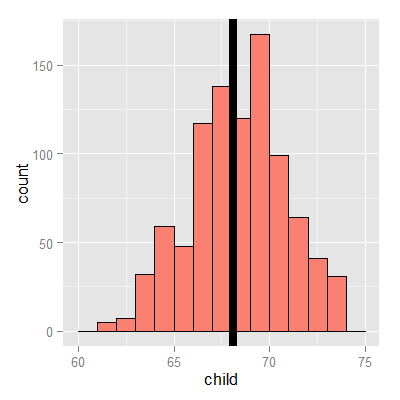
The math (not required)
Watch this video before beginning
Why is the sample average the least squares estimate for \(\mu\)? It’s surprisingly easy to show. Perhaps more surprising is how generally these results can be extended.
$$ \begin{eqnarray*} \sum_{i=1}^n (Y_i - \mu)^2 & = & \sum_{i=1}^n (Y_i - \bar Y + \bar Y - \mu)^2 \\ & = & \sum_{i=1}^n (Y_i - \bar Y)^2 + 2 \sum_{i=1}^n (Y_i - \bar Y) (\bar Y - \mu) + \sum_{i=1}^n (\bar Y - \mu)^2 \\ & = & \sum_{i=1}^n (Y_i - \bar Y)^2 + 2 (\bar Y - \mu) \sum_{i=1}^n (Y_i - \bar Y) + \sum_{i=1}^n (\bar Y - \mu)^2 \\ & = & \sum_{i=1}^n (Y_i - \bar Y)^2 + 2 (\bar Y - \mu) (\sum_{i=1}^n Y_i - n \bar Y) + \sum_{i=1}^n (\bar Y - \mu)^2 \\ & = & \sum_{i=1}^n (Y_i - \bar Y)^2 + \sum_{i=1}^n (\bar Y - \mu)^2\\ & \geq & \sum_{i=1}^n (Y_i - \bar Y)^2 \ \end{eqnarray*} $$Comparing children’s heights and their parent’s heights
Watch this video before beginning
Looking at either the parents or children on their own isn’t interesting. We’re interested in how the relate to each other. Let’s plot the parent and child heights.
(galton, aes(x = parent, y = child)) + geom_point()
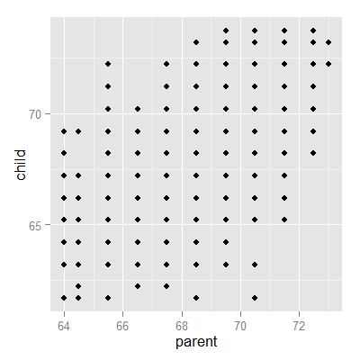
The overplotting is clearly hiding some data. Here you can get the code to make the size and color of the points be the frequency.
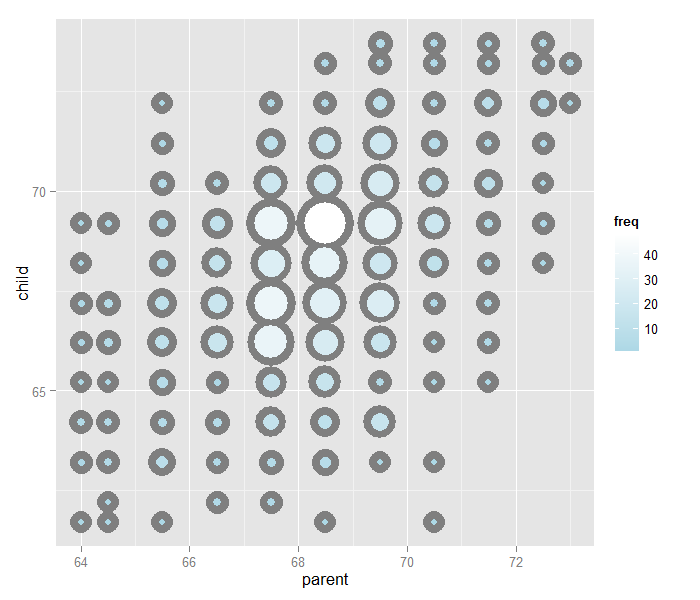
Regression through the origin
A line requires two parameters to be specified, the intercept and the slope. Let’s first focus on the slope. We want to find the slope of the line that best fits the data. However, we have to pick a good intercept. Let’s subtract the mean from both the parent and child heights so that their subsequent means are 0. Now let’s find the line that goes through the origin (has intercept 0) by picking the best slope.
Suppose that \(X_i\) are the parent heights with the mean subtracted. Consider picking the slope \(\beta\) that minimizes
$$ \sum_{i=1}^n (Y_i - X_i \beta)^2. $$Each \(X_i \beta\) is the vertical height of a line through the origin at point \(X_i\). Thus, \(Y_i - X_i \beta\) is the vertical distance between the line at each observed \(X_i\) point (parental height) and the \(Y_i\) (child height).
Our goal is exactly to use the origin as a pivot point and pick the line that minimizes the sum of the squared vertical distances of the points to the line. Use RStudio’s manipulate function to experiment. Subtract the means so that the origin is the mean of the parent and children heights.
library(dplyr)
y <- galton$child - mean(galton$child)
x <- galton$parent - mean(galton$parent)
freqData <- as.data.frame(table(x, y))
names(freqData) <- c("child", "parent", "freq")
freqData$child <- as.numeric(as.character(freqData$child))
freqData$parent <- as.numeric(as.character(freqData$parent))
myPlot <- function(beta){
    g <- ggplot(filter(freqData, freq > 0), aes(x = parent, y = child))
    g <- g  + scale_size(range = c(2, 20), guide = "none" )
    g <- g + geom_point(colour="grey50", aes(size = freq+20), show.legend = FALSE)
    g <- g + geom_point(aes(colour=freq, size = freq))
    g <- g + scale_colour_gradient(low = "lightblue", high="white")
    g <- g + geom_abline(intercept = 0, slope = beta, size = 3)
    mse <- mean( (y - beta * x) ^2 )
    g <- g + ggtitle(paste("beta = ", beta, "mse = ", round(mse, 3)))
    g
}
manipulate(myPlot(beta), beta = slider(0.6, 1.2, step = 0.02))
The solution
In the next few lectures we’ll talk about why this is the solution. But, rather than leave you hanging, here it is:
> lm(I(child - mean(child))~ I(parent - mean(parent)) - 1, data = galton)
Call:
lm(formula = I(child - mean(child)) ~ I(parent - mean(parent)) -
    1, data = galton)

Coefficients:
I(parent - mean(parent))
                   0.646
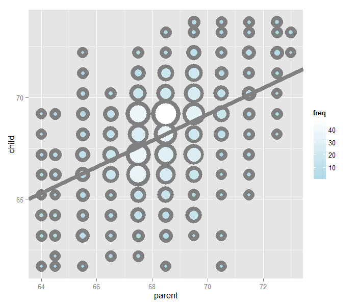
Let’s plot the best fitting line. In the subsequent chapter we will learn all about creating, interpreting and performing inference on such mode fits. (Note that I shifted the origin back to the means of the original data.) The results suggest that for every 1 inch increase in the parents’ height, we estimate a 0.646 inch increase in the child’s height.
Exercises
- Consider the dataset given by
x=c(0.725,0.429,-0.372 ,0.863). What value ofmuminimizessum((x - mu)^2)? Watch a video solution. - Reconsider the previous question. Suppose that weights were given,
w = c(2, 2, 1, 1)so that we wanted to minimizesum(w * (x - mu) ^ 2)formu. What value would we obtain? Watch a video solution. - Take the Galton dataset and obtain the regression through the origin slope estimate where the centered parental height is the outcome and the child’s height is the predictor. Watch a video solution.
Notation
Watch this video before beginning
Some basic definitions
In this chapter, we’ll cover some basic definitions and notation used throughout the book. We will try to minimize the amount of mathematics required so that we can focus on the concepts.
Notation for data
We write \(X_1, X_2, \ldots, X_n\) to describe \(n\) data points. As an example, consider the data set \(\{1, 2, 5\}\) then \(X_1 = 1\), \(X_2 = 2\), \(X_3 = 5\) and \(n = 3\).
Of course, there’s nothing in particular about the variable \(X\). We often use a different letter, such as \(Y_1, \ldots , Y_n\) to describe a data set. We will typically use Greek letters for things we don’t know. Such as, \(\mu\) being a population mean that we’d like to estimate.
The empirical mean
The empirical mean is a measure of center of our data. Under sampling assumptions, it estimates a population mean of interest. Define the empirical mean as
$$ \bar X = \frac{1}{n}\sum_{i=1}^n X_i. $$Notice if we subtract the mean from data points, we get data that has mean 0. That is, if we define
$$ \tilde X_i = X_i - \bar X. $$then the mean of the \(\tilde X_i\) is 0. This process is called centering the random variables. Recall from the previous lecture that the empirical mean is the least squares solution for minimizing
$$ \sum_{i=1}^n (X_i - \mu)^2 $$The empirical standard deviation and variance
The variance and standard deviation are measures of how spread out our data is. Under sampling assumptions, they estimate variability in the population. We define the empirical variance as:
$$ S^2 = \frac{1}{n-1} \sum_{i=1}^n (X_i - \bar X)^2 = \frac{1}{n-1} \left( \sum_{i=1}^n X_i^2 - n \bar X ^ 2 \right) $$The empirical standard deviation is defined as \(S = \sqrt{S^2}.\)
Notice that the standard deviation has the same units as the data. The data defined by \(X_i / s\) have empirical standard deviation 1. This is called scaling the data.
Normalization
We can combine centering and scaling of data as follows to get normalized data. In particular, the data defined by:
$$ Z_i = \frac{X_i - \bar X}{s} $$has empirical mean zero and empirical standard deviation 1. The process of centering then scaling the data is called normalizing the data. Normalized data are centered at 0 and have units equal to standard deviations of the original data. Example, a value of 2 from normalized data means that data point was two standard deviations larger than the mean.
Normalization is very useful for creating data that comparable across experiments by getting rid of any shifting or scaling effects.
The empirical covariance
This class is largely considering how variables covary. This is estimated by the empirical covariance. Consider now when we have pairs of data, \((X_i, Y_i)\). Their empirical covariance is defined as:
$$ Cov(X, Y) = \frac{1}{n-1}\sum_{i=1}^n (X_i - \bar X) (Y_i - \bar Y) = \frac{1}{n-1}\left( \sum_{i=1}^n X_i Y_i - n \bar X \bar Y\right) $$This measure is of limited utility, since its units are the product of the units of the two variables. A more useful definition normalizes the two variables first.
The correlation is defined as:
$$ Cor(X, Y) = \frac{Cov(X, Y)}{S_x S_y} $$where \(S_x\) and \(S_y\) are the estimates of standard deviations for the \(X\) observations and \(Y\) observations, respectively. The correlation is simply the covariance of the separately normalized X and Y data. Because the data have been normalized, the correlation is a unit free quantity and thus has more of a hope of being interpretable across settings.
Some facts about correlation
First, the order of the arguments is irrelevant \(Cor(X, Y) = Cor(Y, X)\) Secondly, it has to be between -1 and 1, \(-1 \leq Cor(X, Y) \leq 1\). Thirdly, the correlation is exactly -1 or 1 only when the observations fall perfectly on a negatively or positively sloped, line, respectively. Fourthly, \(Cor(X, Y)\) measures the strength of the linear relationship between the two variables, with stronger relationships as \(Cor(X,Y)\) heads towards -1 or 1. Finally, \(Cor(X, Y) = 0\) implies no linear relationship.
Exercises
- Take the Galton dataset and find the mean, standard deviation and correlation between the parental and child heights. Watch a video solution.
- Center the parent and child variables and verify that the centered variable means are 0. Watch a video solution.
- Rescale the parent and child variables and verify that the scaled variable standard deviations are 1. Watch a video solution.
- Normalize the parental and child heights. Verify that the normalized variables have mean 0 and standard deviation 1 and take the correlation between them. Watch a video solution.
Ordinary least squares
Watch this video before beginning
Ordinary least squares (OLS) is the workhorse of statistics. It gives a way of taking complicated outcomes and explaining behavior (such as trends) using linearity. The simplest application of OLS is fitting a line.
General least squares for linear equations
Consider again the parent and child height data from Galton.

Let’s try fitting the best line. Let \(Y_i\) be the \(i^{th}\) child’s height and \(X_i\) be the \(i^{th}\) (average over the pair of) parental heights. Consider finding the best line of the form
$$ \mbox{Child Height} = \beta_0 + \mbox{Parent Height} \beta_1, $$Let’s try using least squares by minimizing the following equation over \(\beta_0\) and \(\beta_1\):
$$ \sum_{i=1}^n \{Y_i - (\beta_0 + \beta_1 X_i)\}^2. $$Minimizing this equation will minimize the sum of the squared distances between the fitted line at the parents’ heights (\( \beta_1 X_i\)) and the observed child heights (\(Y_i\)).
The result actually has a closed form. Specifically, the least squares of the line:
$$ Y = \beta_0 + \beta_1 X, $$through the data pairs \((X_i, Y_i)\) with \(Y_i\) as the outcome obtains the line \(Y = \hat \beta_0 + \hat \beta_1 X\) where:
$$ \hat \beta_1 = Cor(Y, X) \frac{Sd(Y)}{Sd(X)} ~~~\mbox{and}~~~ \hat \beta_0 = \bar Y - \hat \beta_1 \bar X. $$At this point, a couple of notes are in order. First, the slope, \(\hat \beta_1\), has the units of \(Y / X\). Secondly, the intercept, \(\hat \beta_0\), has the units of \(Y\).
The line passes through the point \((\bar X, \bar Y)\). If you center your Xs and Ys first, then the line will pass through the origin. Moreover, the slope is the same one you would get if you centered the data, \((X_i - \bar X, Y_i - \bar Y)\), and either fit a linear regression or regression through the origin.
To elaborate, regression through the origin, assuming that \(\beta_0 = 0\), yields the following solution to the least squares criteria:
$$ \hat \beta_1 = \frac{\sum_{i=1}^n X_i Y_i}{\sum_{i=1}^n X_i^2}, $$This is exactly the correlation times the ratio in the standard deviations if the both the Xs and Ys have been centered first. (Try it out using R to verify this!)
It is interesting to think about what happens when you reverse the role of \(X\) and \(Y\). Specifically, the slope of the regression line with \(X\) as the outcome and \(Y\) as the predictor is \(Cor(Y, X) Sd(X)/ Sd(Y)\).
If you normalized the data, \(\{ \frac{X_i - \bar X}{Sd(X)}, \frac{Y_i - \bar Y}{Sd(Y)}\}\), the slope is simply the correlation, \(Cor(Y, X)\), regardless of which variable is treated as the outcome.
Revisiting Galton’s data
Watch this video before beginning
Let’s double check our calculations using R
> y <- galton$child
> x <- galton$parent
> beta1 <- cor(y, x) *  sd(y) / sd(x)
> beta0 <- mean(y) - beta1 * mean(x)
> rbind(c(beta0, beta1), coef(lm(y ~ x)))
     (Intercept)      x
[1,]       23.94 0.6463
[2,]       23.94 0.6463
We can see that the result of lm is identical to hard coding the fit ourselves.
Let’s reverse the outcome/predictor relationship.
> beta1 <- cor(y, x) *  sd(x) / sd(y)
> beta0 <- mean(x) - beta1 * mean(y)
> rbind(c(beta0, beta1), coef(lm(x ~ y)))
     (Intercept)      y
[1,]       46.14 0.3256
[2,]       46.14 0.3256
Now let’s show that regression through the origin yields an equivalent slope if you center the data first
> yc <- y - mean(y)
> xc <- x - mean(x)
> beta1 <- sum(yc * xc) / sum(xc ^ 2)
c(beta1, coef(lm(y ~ x))[2])
            x
0.6463 0.6463
Now let’s show that normalizing variables results in the slope being the correlation.
> yn <- (y - mean(y))/sd(y)
> xn <- (x - mean(x))/sd(x)
> c(cor(y, x), cor(yn, xn), coef(lm(yn ~ xn))[2])
                  xn
0.4588 0.4588 0.4588
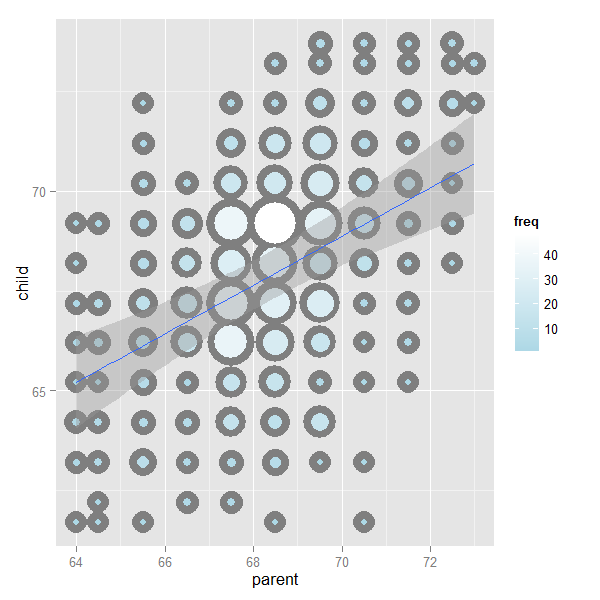
The image below plots the data again, the best fitting line and standard error bars for the fit. We’ll work up to that point later. But, understanding that our fitted line is estimated with error is an important concept. You can find the code for the plot here.
Showing the OLS result
If you would like to see a proof of why the ordinary least squares result works out to be the way that it is: watch this video.
Exercises
- Install and load the package
UsingRand load thefather.sondata withdata(father.son). Get the linear regression fit where the son’s height is the outcome and the father’s height is the predictor. Give the intercept and the slope, plot the data and overlay the fitted regression line. Watch a video solution. - Refer to problem 1. Center the father and son variables and refit the model omitting the intercept. Verify that the slope estimate is the same as the linear regression fit from problem 1. Watch a video solution.
- Refer to problem 1. Normalize the father and son data and see that the fitted slope is the correlation. Watch a video solution.
- Go back to the linear regression line from Problem 1. If a father’s height was 63 inches, what would you predict the son’s height to be? Watch a video solution.
- Consider a data set where the standard deviation of the outcome variable is double that of the predictor. Also, the variables have a correlation of 0.3. If you fit a linear regression model, what would be the estimate of the slope? Watch a video solution.
- Consider the previous problem. The outcome variable has a mean of 1 and the predictor has a mean of 0.5. What would be the intercept? Watch a video solution.
- True or false, if the predictor variable has mean 0, the estimated intercept from linear regression will be the mean of the outcome? Watch a video solution.
- Consider problem 5 again. What would be the estimated slope if the predictor and outcome were reversed? Watch a video solution.
Regression to the mean
Watch this video before beginning
A historically famous idea, regression to the mean
Here is a fundamental question. Why is it that the children of tall parents tend to be tall, but not as tall as their parents? Why do children of short parents tend to be short, but not as short as their parents? Conversely, why do parents of very short children, tend to be short, but not a short as their child? And the same with parents of very tall children?
We can try this with anything that is measured with error. Why do the best performing athletes this year tend to do a little worse the following? Why do the best performers on hard exams always do a little worse on the next hard exam?
These phenomena are all examples of so-called regression to the mean. Regression to the mean, was invented by Francis Galton in the paper “Regression towards mediocrity in hereditary stature” The Journal of the Anthropological Institute of Great Britain and Ireland , Vol. 15, (1886). The idea served as a foundation for the discovery of linear regression.
Think of it this way, imagine if you simulated pairs of random normals. The largest first ones would be the largest by chance, and the probability that there are smaller for the second simulation is high. In other words \(P(Y < x | X = x)\) gets bigger as \(x\) heads to the very large values. Similarly \(P(Y > x | X = x)\) gets bigger as \(x\) heads to very small values. Think of the regression line as the intrinsic part and the regression to the mean as the result of noise. Unless \(Cor(Y, X) = 1\) the intrinsic part isn’t perfect and so we should think about how much regression to the mean should occur. In other words, what should we multiply tall parent’s heights by to predict their children’s height?
Regression to the mean
Let’s investigate this with Galton’s father and son data. Suppose that we normalize \(X\) (child’s height) and \(Y\) (father’s height) so that they both have mean 0 and variance 1. Then, recall, our regression line passes through \((0, 0)\) (the mean of the X and Y). The slope of the regression line is \(Cor(Y,X)\), regardless of which variable is the outcome (recall, both standard deviations are 1). Notice if \(X\) is the outcome and you create a plot where \(X\) is the horizontal axis, the slope of the least squares line that you plot is \(1/Cor(Y, X)\). Let’s plot the normalized father and son heights to investigate.
library(UsingR)
data(father.son)
y <- (father.son$sheight - mean(father.son$sheight)) / sd(father.son$sheight)
x <- (father.son$fheight - mean(father.son$fheight)) / sd(father.son$fheight)
rho <- cor(x, y)
library(ggplot2)
g = ggplot(data.frame(x, y), aes(x = x, y = y))
g = g + geom_point(size = 5, alpha = .2, colour = "black")
g = g + geom_point(size = 4, alpha = .2, colour = "red")
g = g + geom_vline(xintercept = 0)
g = g + geom_hline(yintercept = 0)
g = g + geom_abline(position = "identity")
g = g + geom_abline(intercept = 0, slope = rho, size = 2)
g = g + geom_abline(intercept = 0, slope = 1 / rho, size = 2)
g = g + xlab("Father's height, normalized")
g = g + ylab("Son's height, normalized")
g
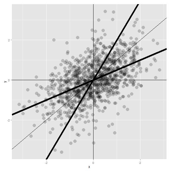
Let’s investigate the plot and the regression fits. If you had to predict a son’s normalized height, it would be \(Cor(Y, X) * X_i\) where \(X_i\) was the normalized father’s height. Conversely, if you had to predict a father’s normalized height, it would be \(Cor(Y, X) * Y_i\).
Multiplication by this correlation shrinks toward 0 (regression toward the mean). It is in this way that Galton used regression to account for regression toward the mean. If the correlation is 1 there is no regression to the mean, (if father’s height perfectly determines child’s height and vice versa).
Note since Galton’s original seminal paper, the idea of regression to the mean has been generalized and expanded upon. However, the core remains. In paired measurements, if there’s randomness then the extreme values of one element of the pair will be likely less extreme in the other element.
The number of applications of this phenomena is staggering. Some financial advisors recommend putting your money in your worst performing fund because of regression to the mean. (If there’s a lot of noise, those are the most likely to gain in value.) An example that I’ve run into is that students performing the best on midterm exams often do much worse on the final. Athletes often follow a phenomenal season with merely a good season. It’s a useful exercise to think whenever paired observations are being evaluated whether real intrinsic properties are being discussed, or just regression to the mean.
Exercises
- You have two noisy scales and a bunch of people that you’d like to weigh. You weigh each person on both scales. The correlation was 0.75. If you normalized each set of weights, what would you have to multiply the weight on one scale to get a good estimate of the weight on the other scale? Watch a video solution.
- Consider the previous problem. Someone’s weight was 2 standard deviations above the mean of the group on the first scale. How many standard deviations above the mean would you estimate them to be on the second? Watch a video solution.
- You ask a collection of husbands and wives to guess how many jellybeans are in a jar. The correlation is 0.2. The standard deviation for the husbands is 10 beans while the standard deviation for wives is 8 beans. Assume that the data were centered so that 0 is the mean for each. The centered guess for a husband was 30 beans (above the mean). What would be your best estimate of the wife’s guess? Watch a video solution.
Statistical linear regression models
Watch this video before beginning
Up to this point, we’ve only considered estimation. Estimation is useful, but we also need to know how to extend our estimates to a population. This is the process of statistical inference. Our approach to statistical inference will be through a statistical model. At the bare minimum, we need a few distributional assumptions on the errors. However, we’ll focus on full model assumptions under Gaussianity.
Basic regression model with additive Gaussian errors.
Consider developing a probabilistic model for linear regression. Our starting point will assume a systematic component via a line and then independent and identically distributed Gaussian errors. We can write the model out as:
$$ Y_i = \beta_0 + \beta_1 X_i + \epsilon_{i} $$Here, the \(\epsilon_{i}\) are assumed to be independent and identically distributed as \(N(0, \sigma^2)\). Under this model,
$$ E[Y_i ~|~ X_i = x_i] = \mu_i = \beta_0 + \beta_1 x_i $$and
$$ Var(Y_i ~|~ X_i = x_i) = \sigma^2. $$This model implies that the \(Y_i\) are independent and normally distributed with means \(\beta_0 + \beta_1 x_i\) and variance \(\sigma^2\). We could write this more compactly as
$$ Y_i ~|~ X_i = x_i \sim N(\beta_0 + \beta_1 x_i, \sigma^2). $$While this specification of the model is a perhaps better for advanced purposes, specifying the model as linear with additive error terms is generally more useful. With that specification, we can hypothesize and discuss the nature of the errors. In fact, we’ll even cover ways to estimate them to investigate our model assumption.
Remember that our least squares estimates of \(\beta_0\) and \(\beta_1\) are:
$$ \hat \beta_1 = Cor(Y, X) \frac{Sd(Y)}{Sd(X)} ~~~\mbox{and}~~~ \hat \beta_0 = \bar Y - \hat \beta_1 \bar X. $$It is convenient that under our Gaussian additive error model that the maximum likelihood estimates of \(\beta_0\) and \(\beta_1\) are the least squares estimates.
Interpreting regression coefficients, the intercept
Watch this video before beginning
Our model allows us to attach statistical interpretations to our parameters. Let’s start with the intercept; \(\beta_0\) represents the expected value of the response when the predictor is 0. We can show this as:
$$ E[Y | X = 0] = \beta_0 + \beta_1 \times 0 = \beta_0. $$Note, the intercept isn’t always of interest. For example, when \(X=0\) is impossible or far outside of the range of data. Take as a specific instance, when X is blood pressure, no one is interested in studying blood pressure’s impact on anything for values near 0.
There is a way to make your intercept more interpretable. Consider that:
$$ Y_i = \beta_0 + \beta_1 X_i + \epsilon_i = \beta_0 + a \beta_1 + \beta_1 (X_i - a) + \epsilon_i = \tilde \beta_0 + \beta_1 (X_i - a) + \epsilon_i. $$Therefore, shifting your \(X\) values by value \(a\) changes the intercept, but not the slope. Often \(a\) is set to \(\bar X\), so that the intercept is interpreted as the expected response at the average \(X\) value.
Interpreting regression coefficients, the slope
Now that we understand how to interpret the intercept, let’s try interpreting the slope. Our slope, \(\beta_1\), is the expected change in response for a 1 unit change in the predictor. We can show that as follows:
$$ E[Y ~|~ X = x+1] - E[Y ~|~ X = x] = \beta_0 + \beta_1 (x + 1) - (\beta_0 + \beta_1 x ) = \beta_1 $$Notice that the interpretation of \(\beta_1\) is tied to the units of the X variable. Let’s consider the impact of changing the units.
$$ Y_i = \beta_0 + \beta_1 X_i + \epsilon_i = \beta_0 + \frac{\beta_1}{a} (X_i a) + \epsilon_i = \beta_0 + \tilde \beta_1 (X_i a) + \epsilon_i $$Therefore, multiplication of \(X\) by a factor \(a\) results in dividing the coefficient by a factor of \(a\).
As an example, suppose that \(X\) is height in meters (m) and \(Y\) is weight in kilograms (kg). Then \(\beta_1\) is kg/m. Converting \(X\) to centimeters implies multiplying \(X\) by 100 cm/m. To get \(\beta_1\) in the right units if we had fit the model in meters, we have to divide by 100 cm/m. Or, we can write out the notation as:
$$ X m \times \frac{100cm}{m} = (100 X) cm ~~\mbox{and}~~ \beta_1 \frac{kg}{m} \times\frac{1 m}{100cm} = \left(\frac{\beta_1}{100}\right)\frac{kg}{cm} $$Using regression for prediction
Watch this video before beginning
Regression is quite useful for prediction. If we would like to guess the outcome at a particular value of the predictor, say \(X\), the regression model guesses:
$$ \hat \beta_0 + \hat \beta_1 X $$In other words, just find the Y value on the line with the corresponding X value. Regression, especially linear regression, often doesn’t produce the best prediction algorithms. However, it produces parsimonious and interpretable models along with the predictions. Also, as we’ll see later we’ll be able to get easily described estimates of uncertainty associated with our predictions.
Example
Let’s analyze the diamond data set from the UsingR package.
The data is diamond prices (in Singapore dollars) and diamond weight
in carats. Carats are a standard measure of diamond mass, 0.2 grams.
To get the data use library(UsingR); data(diamond)
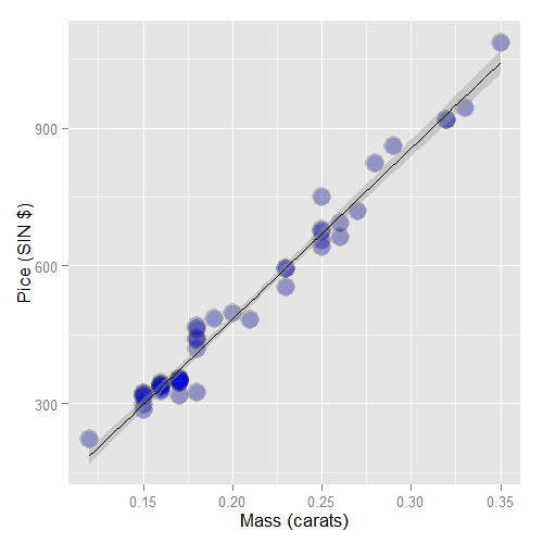
First let’s plot the data. Here’s the code I used
library(UsingR)
data(diamond)
library(ggplot2)
g = ggplot(diamond, aes(x = carat, y = price))
g = g + xlab("Mass (carats)")
g = g + ylab("Price (SIN $)")
g = g + geom_point(size = 7, colour = "black", alpha=0.5)
g = g + geom_point(size = 5, colour = "blue", alpha=0.2)
g = g + geom_smooth(method = "lm", colour = "black")
g
and here’s the plot.
First, let’s fit the linear regression model. This is done
with the lm function in R (lm stands for linear model). The
syntax is lm(Y ~ X) where Y is the response and X is the
predictor.
> fit <- lm(price ~ carat, data = diamond)
> coef(fit)
(Intercept)       carat
     -259.6      3721.0
The function coef grabs the fitted coefficients and conveniently names them
for you. Therefore, we estimate an expected 3721.02 (SIN) dollar increase in price
for every carat increase in mass of diamond.
The intercept -259.63 is the expected price of a 0 carat diamond.
We’re not interested in 0 carat diamonds (it’s hard to get a good price for them ;-). Let’s fit the model with a more interpretable intercept by centering our X variable.
> fit2 <- lm(price ~ I(carat - mean(carat)), data = diamond)
coef(fit2)
           (Intercept) I(carat - mean(carat))
                 500.1                 3721.0
Thus the new intercept, 500.1, is the expected price for the average sized diamond of the data (0.2042 carats). Notice the estimated slope didn’t change at all.
Now let’s try changing the scale. This is useful since a one carat increase in a diamond is pretty big. What about changing units to 1/10th of a carat? We can just do this by just dividing the coefficient by 10, no need to refit the model.
Thus, we expect a 372.102 (SIN) dollar change in price for every 1/10th of a carat increase in mass of diamond.
Let’s show via R that this is the same as rescaling our X variable and refitting. To go from 1 carat to 1/10 of a carat units, we need to multiply our data by 10.
> fit3 <- lm(price ~ I(carat * 10), data = diamond)
> coef(fit3)
  (Intercept) I(carat * 10)
       -259.6         372.1
Now, let’s predict the price of a diamond. This should be as easy as just evaluating the fitted line at the price we want to
> newx <- c(0.16, 0.27, 0.34)
> coef(fit)[1] + coef(fit)[2] * newx
[1]  335.7  745.1 1005.5
Therefore, we predict the price to be 335.7, 745.1 and 1005.5 for
a 0.16, 0.26 and 0.34 carat diamond. Of course, our prediction models
will get more elaborate and R has a generic function, predict,
to put our X values into the model for us. The data has to go into
the model as a data frame with the same named X variables.
> predict(fit, newdata = data.frame(carat = newx))
     1      2      3
 335.7  745.1 1005.5
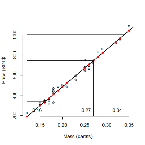
Let’s visualize our prediction. In the following plot, the predicted values at the observed Xs are the red points on the fitted line. The new X values are the at vertical lines, which are connected to the predicted values via the connected horizontal lines.
Exercises
- Fit a linear regression model to the
father.sondataset with the father as the predictor and the son as the outcome. Give a p-value for the slope coefficient and perform the relevant hypothesis test. Watch a video solution. - Refer to question 1. Interpret both parameters. Recenter for the intercept if necessary. Watch a video solution.
- Refer to question 1. Predict the son’s height if the father’s height is 80 inches. Would you recommend this prediction? Why or why not? Watch a video solution.
- Load the
mtcarsdataset. Fit a linear regression with miles per gallon as the outcome and horsepower as the predictor. Interpret your coefficients, recenter for the intercept if necessary. Watch a video solution. - Refer to question 4. Overlay the fit onto a scatterplot. Watch a video solution.
- Refer to question 4. Test the hypothesis of no linear relationship between horsepower and miles per gallon. Watch a video solution.
- Refer to question 4. Predict the miles per gallon for a horsepower of 111. Watch a video solution.
Residuals
Watch this video before beginning
Residual variation
Residuals represent variation left unexplained by our model. We emphasize the difference between residuals and errors. The errors are the unobservable true deviations from the known coefficients, while residuals are the observable deviations from the estimated coefficients. In a sense, the residuals are estimates of the errors.
Consider again the diamond data set from UsingR. Recall that
the data is diamond prices (Singapore dollars) and diamond weight
in carats (standard measure of diamond mass, 0.2g).
To get the data use library(UsingR); data(diamond). Recall that the data
and our linear regression fit looked like the following:

Recall our linear model was
$$ Y_i = \beta_0 + \beta_1 X_i + \epsilon_i $$where we are assuming that \(\epsilon_i \sim N(0, \sigma^2)\). Our observed outcome is \(Y_i\) with associated predictor value, \(X_i\). Let’s label the predicted outcome for index \(i\) as \(\hat Y_i\). Recall that we obtain our predictions by plugging our observed \(X_i\) into the linear regression equation:
$$ \hat Y_i = \hat \beta_0 + \hat \beta_1 X_i $$The residual is defined as the difference the between the observed and predicted outcome
$$ e_i = Y_i - \hat Y_i. $$The residuals are exactly the vertical distance between the observed data point and the associated point on the regression line. Positive residuals have associated Y values above the fitted line and negative residuals have values below.
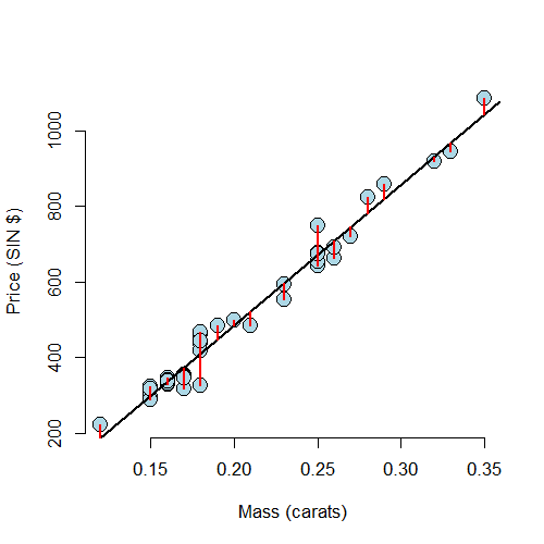
Least squares minimizes the sum of the squared residuals, \(\sum_{i=1}^n e_i^2\). Note that the \(e_i\) are observable, while the errors, \(\epsilon_i\) are not. The residuals can be thought of as estimates of the errors.
Properties of the residuals
Let’s consider some properties of the residuals. First, under our model, their expected value is 0, \(E[e_i] = 0\). If an intercept is included, \(\sum_{i=1}^n e_i = 0\). Note this tells us that the residuals are not independent. If we know \(n-1\) of them, we know the \(n^{th}\). In fact, we will only have \(n-p\) free residuals, where \(p\) is the number of coefficients in our regression model, so \(p=2\) for linear regression with an intercept and slope. If a regressor variable, \(X_i\), is included in the model then \(\sum_{i=1}^n e_i X_i = 0\).
What do we use residuals for? Most importantly, residuals are useful for investigating poor model fit. Residual plots highlight poor model fit.
Another use for residuals is to create covariate adjusted variables. Specifically, residuals can be thought of as the outcome (Y) with the linear association of the predictor (X) removed. So, for example, if you wanted to create a weight variable with the linear effect of height removed, you would fit a linear regression with weight as the outcome and height as the predictor and take the residuals. (Note this only works if the relationship is linear.)
Finally, we should note the different sorts of variation one encounters in regression. There’s the total variability in our response, usually called total variation. One then differentiates residual variation (variation after removing the predictor) from systematic variation (variation explained by the regression model). These two kinds of variation add up to the total variation, which we’ll see later.
Example
Watch this video before beginning
The code below shows how to obtain the residuals.
> data(diamond)
> y <- diamond$price; x <- diamond$carat; n <- length(y)
> fit <- lm(y ~ x)
## The easiest way to get the residuals
> e <- resid(fit)
## Obtain the residuals manually, get the predicted Ys first
> yhat <- predict(fit)
## The residuals are y - yhat. Let's check by comparing this
## with R's build in resid function
> max(abs(e -(y - yhat)))
[1] 9.486e-13
## Let's do it again hard coding the calculation of Yhat
max(abs(e - (y - coef(fit)[1] - coef(fit)[2] * x)))
[1] 9.486e-13
Residuals versus X
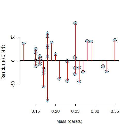
A useful plot is the residuals versus the X values. This allows us to zoom in on instances of poor model fit. Whenever we look at a residual plot, we are searching for systematic patterns of any sort. Here’s the plot for diamond data.
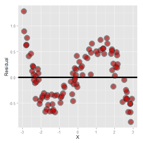
Let’s go through some contrived examples to highlight. Here’s a plot of nonlinear data where we’ve fit a line.
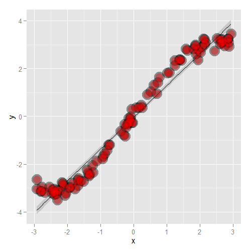
Here’s what happens when you focus in on the residuals.
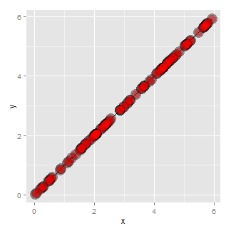
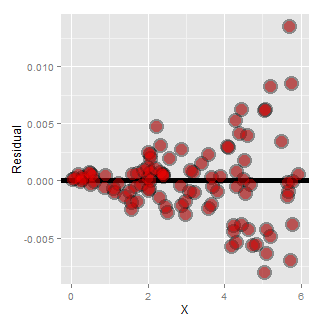
Another common feature where our model fails is when the variance around the regression line is not constant. Remember our errors are assumed to be Gaussian with a constant error. Here’s an example where heteroskedasticity is not at all apparent in the scatterplot.
Now look at the consequences of focusing in on the residuals.
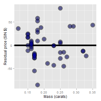
If we look at the residual plot for the diamond data, things don’t look so bad.
Estimating residual variation
We’ve talked at length about how to estimate \(\beta_0\) and \(\beta_1\). However, there’s another parameter in our model, \(\sigma\). Recall that our model is \(Y_i = \beta_0 + \beta_1 X_i + \epsilon_i\), where \(\epsilon_i \sim N(0, \sigma^2)\).
It seems natural to use our residual variation to estimate population error variation. In fact, the maximum likelihood estimate of \(\sigma^2\) is \(\frac{1}{n}\sum_{i=1}^n e_i^2\), the average squared residual. Since the residuals have a zero mean (if an intercept is included), this is close to the the calculating the variance of the residuals. However, to obtain unbiasedness, most people use
$$ \hat \sigma^2 = \frac{1}{n-2}\sum_{i=1}^n e_i^2. $$The \(n-2\) instead of \(n\) is so that \(E[\hat \sigma^2] = \sigma^2\).
This is exactly analogous to dividing by \(n-1\) in the ordinary variance
calculation. In fact, the ordinary variance (using var in R on a vector) is
exactly the same as the residual variance estimate from a model that has an
intercept and no slope. The \(n-2\) instead of \(n-1\) when we
include a slope can be thought of as losing a degree of freedom from having
to estimate an extra parameter (the slope).
Most of this is typically opaque to the user, since we just grab the correct
residual variance output from lm. But, to solidify the concepts, let’s
go through the diamond example to make sure that we can hard code the estimates
on our own. (And from then on we’ll just use lm.)
Diamond example
> y <- diamond$price; x <- diamond$carat; n <- length(y)
> fit <- lm(y ~ x)
## the estimate from lm
> summary(fit)$sigma
[1] 31.84
## directly calculating from the residuals
> sqrt(sum(resid(fit)^2) / (n - 2))
[1] 31.84
Summarizing variation
A way to think about regression is in the decomposition of variability of our response. The total variability in our response is the variability around an intercept. This is also the variance estimate from a model with only an intercept:
$$ \mbox{Total variability}=\sum_{i=1}^n (Y_i - \bar Y)^2 $$The regression variability is the variability that is explained by adding the predictor. Mathematically, this is:
\(\mbox{Regression variability} = \sum_{i=1}^n (\hat Y_i - \bar Y)^2\).
The residual variability is what’s leftover around the regression line
$$ \mbox{Residual variability} = \sum_{i=1}^n (Y_i - \hat Y_i)^2 $$It’s a nice fact that the error and regression variability add up to the total variability:
$$ \sum_{i=1}^n (Y_i - \bar Y)^2 = \sum_{i=1}^n (Y_i - \hat Y_i)^2 + \sum_{i=1}^n (\hat Y_i - \bar Y)^2 $$Thus, we can think of regression as explaining away variability. The fact that all of the quantities are positive and that they add up this way allows us to define the proportion of the total variability explained by the model.
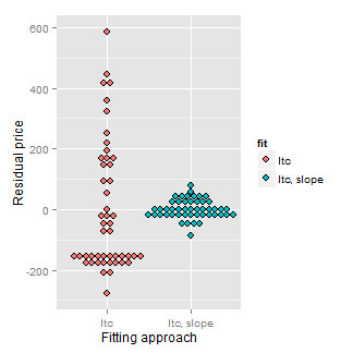
Consider our diamond example again. The plot below shows the variation explained by a model with an intercept only (representing total variation) and then the mass is included as a linear predictor. Notice how much the variation decreases when including the diamond mass.
Here’s the code:
= c(resid(lm(price ~ 1, data = diamond)),
resid(lm(price ~ carat, data = diamond)))
fit = factor(c(rep("Itc", nrow(diamond)),
rep("Itc, slope", nrow(diamond))))
g = ggplot(data.frame(e = e, fit = fit), aes(y = e, x = fit, fill = fit))
g = g + geom_dotplot(binaxis = "y", size = 2, stackdir = "center", binwidth = 20)
g = g + xlab("Fitting approach")
g = g + ylab("Residual price")
g
R squared
R squared is the percentage of the total variability that is explained by the linear relationship with the predictor
$$ R^2 = \frac{\sum_{i=1}^n (\hat Y_i - \bar Y)^2}{\sum_{i=1}^n (Y_i - \bar Y)^2} $$Here are some summary notes about R squared.
- \(R^2\) is the percentage of variation explained by the regression model.
- $$ 0 \leq R^2 \leq 1 $$
- \(R^2\) is the sample correlation squared
- \(R^2\) can be a misleading summary of model fit.
- Deleting data can inflate it.
- (For later.) Adding terms to a regression model always increases \(R^2\).
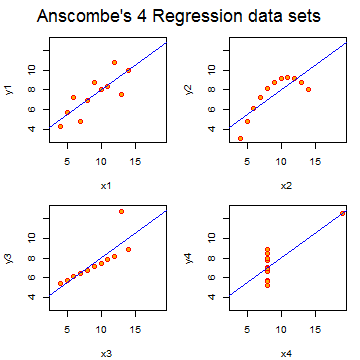
Anscombe’s residuals (named after their inventor)
are a famous example of how R squared doesn’t tell the whole story
about model fit. In this example, four data sets have equivalent R squared
values and beta values, but dramatically different model fits. The result is to suggest
that reducing data to a single number, be it R squared, a test statistic
or a P-value, often masks important aspects of the data.
The code is quite simple: data(anscombe);example(anscombe).
Exercises
- Fit a linear regression model to the
father.sondataset with the father as the predictor and the son as the outcome. Plot the father’s height (horizontal axis) versus the residuals (vertical axis). Watch a video solution. - Refer to question 1. Directly estimate the residual variance and
compare this estimate to the output of
lm. Watch a video solution. - Refer to question 1. Give the R squared for this model. Watch a video solution.
- Load the
mtcarsdataset. Fit a linear regression with miles per gallon as the outcome and horsepower as the predictor. Plot horsepower versus the residuals. Watch a video solution. - Refer to question 4. Directly estimate the residual variance and
compare this estimate to the output of
lm. Watch a video solution. - Refer to question 4. Give the R squared for this model. Watch a video solution.
Regression inference
In this chapter, we’ll consider statistical inference for regression models.
Reminder of the model
Consider our regression model:
$$ Y_i = \beta_0 + \beta_1 X_i + \epsilon_i $$where \(\epsilon \sim N(0, \sigma^2)\). Let’s consider some ways for doing inference for our regression parameters. For this development, we assume that the true model is known. We also assume that you’ve seen confidence intervals and hypothesis tests before. If not, consider taking the Statistical Inference course and reading the accompanying book before approaching this material.
Remember our estimates:
$$ \hat \beta_0 = \bar Y - \hat \beta_1 \bar X $$and
$$ \hat \beta_1 = Cor(Y, X) \frac{Sd(Y)}{Sd(X)}. $$Review
Let’s review some important components of statistical inference. Consider statistics like the following:
$$ \frac{\hat \theta - \theta}{\hat \sigma_{\hat \theta}} $$where \(\hat \theta \) is an estimate of interest, \(\theta\) is the estimand of interest and \( \hat \sigma_{\hat \theta} \) is the standard error of \(\hat \theta\). We see that in many cases such statistics often have the following properties:
- They are normally distributed and have a finite sample Student’s T distribution under normality assumptions.
- They can be used to test \(H_0 : \theta = \theta_0\) versus \(H_a : \theta >,
- They can be used to create a confidence interval for \(\theta\) via \(\hat \theta \pm Q_{1-\alpha/2} \hat \sigma_{\hat \theta}\) where \(Q_{1-\alpha/2}\) is the relevant quantile from either a normal or T distribution.
In the case of regression with iid Gaussian sampling assumptions on the errors, our inferences will follow very similarly to what you saw in your inference class.
We won’t cover asymptotics for regression analysis, but suffice it to say that under assumptions on the ways in which the \(X\) values are collected, the iid sampling model and mean model, the normal results hold to create intervals and confidence intervals
Results for the regression parameters
First, we need standard errors for our regression parameters. These are given by:
$$ \sigma_{\hat \beta_1}^2 = Var(\hat \beta_1) = \sigma^2 / \sum_{i=1}^n (X_i - \bar X)^2 $$and
$$ \sigma_{\hat \beta_0}^2 = Var(\hat \beta_0) = \left(\frac{1}{n} + \frac{\bar X^2}{\sum_{i=1}^n (X_i - \bar X)^2 }\right)\sigma^2 $$In practice, \(\sigma^2\) is replaced by its residual variance estimate covered in the last chapter.
Given how often this came up in inference, it’s probably not surprising that under iid Gaussian errors
$$ \frac{\hat \beta_j - \beta_j}{\hat \sigma_{\hat \beta_j}} $$follows a t distribution with n-2 degrees of freedom and a normal distribution for large n. This can be used to create confidence intervals and perform hypothesis tests.
Example diamond data set
Let’s go through a didactic example using our diamond pricing data.
First, let’s define our outcome, predictor and estimate all of the parameters.
(Note, again we’re hard coding these results, but lm will give it to us automatically).
library(UsingR); data(diamond)
y <- diamond$price; x <- diamond$carat; n <- length(y)
beta1 <- cor(y, x) * sd(y) / sd(x)
beta0 <- mean(y) - beta1 * mean(x)
e <- y - beta0 - beta1 * x
sigma <- sqrt(sum(e^2) / (n-2))
ssx <- sum((x - mean(x))^2)
Now let’s calculate the standard errors for our regression coefficients and the t statistic. The natural null hypotheses are \(H_0: \beta_j = 0\). So our t statistics are just the estimates divided by their standard errors.
<- (1 / n + mean(x) ^ 2 / ssx) ^ .5 * sigma
seBeta1 <- sigma / sqrt(ssx)
tBeta0 <- beta0 / seBeta0
tBeta1 <- beta1 / seBeta1
Now let’s consider getting P-values. Recall that P-values are the probability
of getting a statistic as or larger than was actually obtained, where the
probability is calculated under the null hypothesis. Below I also do some
formatting to get it to look like the output from lm.
> pBeta0 <- 2 * pt(abs(tBeta0), df = n - 2, lower.tail = FALSE)
> pBeta1 <- 2 * pt(abs(tBeta1), df = n - 2, lower.tail = FALSE)
> coefTable <- rbind(c(beta0, seBeta0, tBeta0, pBeta0), c(beta1, seBeta1, tBeta1, pB\
eta1))
> colnames(coefTable) <- c("Estimate", "Std. Error", "t value", "P(>|t|)")
> rownames(coefTable) <- c("(Intercept)", "x")
> coefTable
            Estimate Std. Error t value   P(>|t|)
(Intercept)   -259.6      17.32  -14.99 2.523e-19
x             3721.0      81.79   45.50 6.751e-40
The first column is the actual estimates. The second is the standard
errors, the third is the t value (the first divided by the second) and the
final is the t probability of getting an unsigned statistic that large under
the null hypothesis (the P-value for the two sided test).
Of course, we don’t actually go through this exercise every time; lm does
it for us.
> fit <- lm(y ~ x);
> summary(fit)$coefficients
            Estimate Std. Error t value  Pr(>|t|)
(Intercept)   -259.6      17.32  -14.99 2.523e-19
x             3721.0      81.79   45.50 6.751e-40
Remember, we reject if our P-value is less than our desired type I error rate. In both cases the test is for whether or not the parameter is zero. This is almost always of interest for the slope, but frequently a zero intercept isn’t of interest so that P-value is often disregarded.
For the slope, a value of zero represents no linear relationship between the predictor and response. So, the P-value is for performing a test of whether any (linear) relationship exist or not.
Getting a confidence interval
Recall from your inference class, a fair number of confidence intervals take the form of an estimate plus or minus a t quantile times a standard error. Let’s use that formula to create confidence intervals for our regression parameters. Let’s first do the intercept.
> sumCoef <- summary(fit)$coefficients
> sumCoef[1,1] + c(-1, 1) * qt(.975, df = fit$df) * sumCoef[1, 2]
[1] -294.5 -224.8
Now let’s do the slope:
> (sumCoef[2,1] + c(-1, 1) * qt(.975, df = fit$df) * sumCoef[2, 2]) / 10
[1] 355.6 388.6
So, we would interpret this as: “with 95% confidence, we estimate that a 0.1 carat increase in diamond size results in a 355.6 to 388.6 increase in price in (Singapore) dollars”.
Prediction of outcomes
Finally, let’s consider prediction again. Consider the problem of predicting Y at a value of X. In our example, this is predicting the price of a diamond given the carat.
We’ve already covered that the estimate for prediction at point \(x_0\) is:
$$ \hat \beta_0 + \hat \beta_1 x_0 $$A standard error is needed to create a prediction interval. This is important, since predictions by themselves don’t convey anything about how accurate we would expect the prediction to be. Take our diamond example. Because the model fits so well, we would be surprised if we tried to sell a diamond and the offers were well off our model prediction (since it seems to fit quite well).
There’s a subtle, but important, distinction between intervals for the regression line at point \(x_0\) and the prediction of what a \(y\) would be at point \(x_0\). What differs is the standard error:
For the line at \(x_0\) the standard error is,
$$ \hat \sigma\sqrt{\frac{1}{n} + \frac{(x_0 - \bar X)^2}{\sum_{i=1}^n (X_i - \bar X)^2}} $$For the prediction interval at \(x_0\) the standard error is
$$ \hat \sigma\sqrt{1 + \frac{1}{n} + \frac{(x_0 - \bar X)^2}{\sum_{i=1}^n (X_i - \bar X)^2}} $$Notice that the prediction interval standard error is a little larger than the error for a line. Think of it this way. If we want to predict a Y value at a particular X value, and we knew the actual true slope and intercept, there would still be error. However, if we only wanted to predict the value at the line at that X value, there would be no variance, since we already know the line.
Thus, the variation for the line only considers how hard it is to estimate the regression line at that X value. The prediction interval includes that variation, as well as the extra variation unexplained by the relationship between Y and X. So, it has to be a little wider.
For the diamond example, here’s both the mean value and prediction interval.
(code and plot). Notice that to get the various intervals, one has to
use one of the options interval="confidence" or interval="prediction" in the
prediction function.
library(ggplot2)
newx = data.frame(x = seq(min(x), max(x), length = 100))
p1 = data.frame(predict(fit, newdata= newx,interval = ("confidence")))
p2 = data.frame(predict(fit, newdata = newx,interval = ("prediction")))
p1$interval = "confidence"
p2$interval = "prediction"
p1$x = newx$x
p2$x = newx$x
dat = rbind(p1, p2)
names(dat)[1] = "y"
g = ggplot(dat, aes(x = x, y = y))
g = g + geom_ribbon(aes(ymin = lwr, ymax = upr, fill = interval), alpha = 0.2)
g = g + geom_line()
g = g + geom_point(data = data.frame(x = x, y=y), aes(x = x, y = y), size = 4)
g
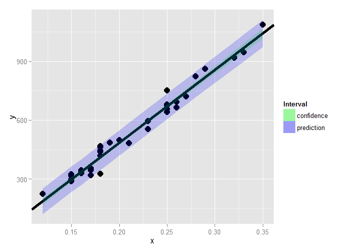
Summary notes
- Both intervals have varying widths.
- Least width at the mean of the Xs.
- We are quite confident in the regression line, so that
interval is very narrow.
- If we knew \(\beta_0\) and \(\beta_1\) this interval would have zero width.
- The prediction interval must incorporate the variability
in the data around the line.
- Even if we knew \(\beta_0\) and \(\beta_1\) this interval would still have width. *
Exercises
- Test whether the slope coefficient for the
father.sondata is different from zero (father as predictor, son as outcome). Watch a video solution. - Refer to question 1. Form a confidence interval for the slope coefficient. Watch a video solution
- Refer to question 1. Form a confidence interval for the intercept (center the fathers’ heights first to get an intercept that is easier to interpret). Watch a video solution.
- Refer to question 1. Form a mean value interval for the expected son’s height at the average father’s height. Watch a video solution.
- Refer to question 1. Form a prediction interval for the son’s height at the average father’s height. Watch a video solution.
- Load the mtcars dataset. Fit a linear regression with miles per gallon as the outcome and horsepower as the predictor. Test whether or not the horsepower power coefficient is statistically different from zero. Interpret your test.
- Refer to question 6. Form a confidence interval for the slope coefficient.
- Refer to question 6. Form a confidence interval for the intercept (center the HP variable first).
- Refer to question 6. Form a mean value interval for the expected MPG for the average HP.
- Refer to question 6. Form a prediction interval for the expected MPG for the average HP.
- Refer to question 6. Create a plot that has the fitted regression line plus curves at the expected value and prediction intervals.
Multivariable regression analysis
In this chapter we extend linear regression so that our models can contain more variables. A natural first approach is to assume additive effects, basically extending our linear model to a plane or hyperplane. This technique represents one of the most widely used and successful methods in statistics.
Multivariable regression analyses: adjustment
If I were to present evidence of a relationship between breath mint usage (mints per day, X) and pulmonary function (measured in FEV), you would be skeptical. Likely, you would say, ‘smokers tend to use more breath mints than non smokers, smoking is related to a loss in pulmonary function. That’s probably the culprit.’ If asked what would convince you, you would likely say, ‘If non-smoking breath mint users had lower lung function than non-smoking non-breath mint users and, similarly, if smoking breath mint users had lower lung function than smoking non-breath mint users, I’d be more inclined to believe you’. In other words, to even consider my results, I would have to demonstrate that they hold while holding smoking status fixed.
This is one of the main uses of multivariate regression, to consider a relationship between a predictor and response, while accounting for other variables.
Multivariable regression analyses: prediction
An insurance company is interested in how last year’s claims can predict a person’s time in the hospital this year. They want to use an enormous amount of data contained in claims to predict a single number. Simple linear regression is not equipped to handle more than one predictor. How can one generalize SLR to incorporate lots of regressors for the purpose of prediction? What are the consequences of adding lots of regressors? Surely there must be consequences to throwing variables in that aren’t related to Y? Surely there must also be consequences to omitting variables that are?
The linear model
The general linear model extends simple linear regression (SLR) by adding terms linearly into the model.
$$ Y_i = \beta_1 X_{1i} + \beta_2 X_{2i} + \ldots + \beta_{p} X_{pi} + \epsilon_{i} = \sum_{k=1}^p X_{ki} \beta_k + \epsilon_{i} $$Here \(X_{1i}=1\) typically, so that an intercept is included. Least squares (and hence maximum likelihood estimates under iid Gaussianity of the errors) minimizes:
$$ \sum_{i=1}^n \left(Y_i - \sum_{k=1}^p X_{ki} \beta_k\right)^2 $$Note, the linearity referred to in these models is linearity in the coefficients. Thus
$$ Y_i = \beta_1 X_{1i}^2 + \beta_2 X_{2i}^2 + \ldots + \beta_{p} X_{pi}^2 + \epsilon_{i} $$is still a linear model. We’ve just squared the elements of the predictor variables.
Estimation
Recall, the LS estimate for regression through the origin is,
\(E[Y_i]=X_{1i}\beta_1\), was \(\sum X_i Y_i / \sum X_i^2.\)
Let’s consider two regressors, \(E[Y_i] = X_{1i}\beta_1 + X_{2i}\beta_2 = \mu_i\). Least squares tries to minimize:
$$ \sum_{i=1}^n (Y_i - X_{1i} \beta_1 - X_{2i} \beta_2)^2 $$We describe fitting with two regressors using residuals, since it will help us to understand how multivariable regression adjusts an effect for another variable. The result is that the estimate for \(\beta_1\) is:
$$ \hat \beta_1 = \frac{\sum_{i=1}^n e_{i, Y | X_2} e_{i, X_1 | X_2}}{\sum_{i=1}^n e_{i, X_1 | X_2}^2}, $$where, \(e_{i, Y|X_2}\) is the residual having fit \(Y\) on \(X_2\) and \(e_{i, X_1|X_2}\) is the residual having fit \(X_1\) on \(X_2\). That is, the regression estimate for \(\beta_1\) is the regression through the origin estimate having regressed \(X_2\) out of both the response and the predictor. Similarly, the regression estimate for \(\beta_2\) is the regression through the origin estimate having regressed \(X_1\) out of both the response and the predictor.
More generally, multivariate regression estimates are exactly those having removed the linear relationship of the other variables from both the regressor and response. This demonstrates the sense in which multivariate regression variables adjust for the effect of the other variables.
Example with two variables, simple linear regression
We already have one of the most important examples of two variables down, linear regression. The linear regression model is:
$$ Y_{i} = \beta_1 X_{1i} + \beta_2 X_{2i} $$where \(X_{2i} = 1\) is an intercept term. Let’s double check our rule, since we already know what the least squares estimates are in this case.
Notice the fitted coefficient of \(X_{2i}\) on \(Y_{i}\) is \(\bar Y\), the mean of the Ys. Then the residuals are \(e_{i, Y | X_2} = Y_i - \bar Y\).
Similarly, the fitted coefficient of \(X_{2i}\) on \(X_{1i}\) is \(\bar X_1\). Then, the residuals are \(e_{i, X_1 | X_2}= X_{1i} - \bar X_1\).
Thus let’s work out the estimate for \(\beta_1\):
$$ \hat \beta_1 = \frac{\sum_{i=1}^n e_{i, Y | X_2} e_{i, X_1 | X_2}}{\sum_{i=1}^n e_{i, X_1 | X_2}^2} = \frac{\sum_{i=1}^n (X_i - \bar X)(Y_i - \bar Y)}{\sum_{i=1}^n (X_i - \bar X)^2} = Cor(X, Y) \frac{Sd(Y)}{Sd(X)} $$This agrees with the estimate that we came up with before.
The general case
In the general case with \(p\) regressors, least squares solutions have to minimize:
$$ \sum_{i=1}^n (Y_i - X_{1i}\beta_1 - \ldots - X_{pi}\beta_p)^2 $$The least squares estimate for the coefficient of a multivariate regression model is exactly regression through the origin with the linear relationships with the other regressors removed from both the regressor and outcome by taking residuals. In this sense, multivariate regression “adjusts” a coefficient for the linear impact of the other variables.
Of course, we don’t fit multivariate regression models in this way
ever in practice, we rely on software like lm. In fact, the
programs that fit multivariate regression don’t do it this way either. However,
thinking in the terms of residuals is the most conceptually useful way to think about what multivariate regression is accomplishing.
Simulation demonstrations
Watch this video demonstration.
Let’s do some simulation exercises to convince ourselves how multivariable regression works.
Linear model with three variables
> n = 100; x = rnorm(n); x2 = rnorm(n); x3 = rnorm(n)
## Generate the data
> y = 1 + x + x2 + x3 + rnorm(n, sd = .1)
## Get the residuals having removed X2 and X3 from X1 and Y
> ey = resid(lm(y ~ x2 + x3))
> ex = resid(lm(x ~ x2 + x3))
## Fit regression through the origin with the residuals
> sum(ey * ex) / sum(ex ^ 2)
[1] 1.009
## Double check with lm
> coef(lm(ey ~ ex - 1))
    ex
1.009
## Fit the full linear model to show that it agrees
coef(lm(y ~ x + x2 + x3))
(Intercept)           x          x2          x3
     1.0202      1.0090      0.9787      1.0064
You can see that the estimate, 1.009, is obtained by the recipe we outlined;
and it agrees with the function lm produces for us.
Interpretation of the coefficients
Let’s go through the interpretation of the coefficients. Consider the predicted mean for a given set of values of the regressors:
$$ E[Y | X_1 = x_1, \ldots, X_p = x_p] = \sum_{k=1}^p x_{k} \beta_k. $$Now consider incrementing \(X_1\) (and only \(X_1\)) by 1.
$$ E[Y | X_1 = x_1 + 1, \ldots, X_p = x_p] = (x_1 + 1) \beta_1 + \sum_{k=2}^p x_{k} \beta_k $$Now let’s subtract these two equations:
$$ E[Y | X_1 = x_1 + 1, \ldots, X_p = x_p] - E[Y | X_1 = x_1, \ldots, X_p = x_p] = (x_1 + 1) \beta_1 + \sum_{k=2}^p x_{k} \beta_k - \sum_{k=1}^p x_{k} \beta_k = \beta_1 $$Thus, the interpretation of a multivariate regression coefficient is the expected change in the response per unit change in the regressor, holding all of the other regressors fixed. The latter part of the phrase is important, by holding the other regressors constant, we are investigating an adjusted effect, just like we described in the smoking and breath mint usage example at the beginning of the chapter.
In the next chapter, we’ll do examples and go over context-specific interpretations.
Fitted values, residuals and residual variation
All of our simple linear regression quantities can be extended to linear models. Here we list them out in one place. Our statistical model is:
$$ Y_i = \sum_{k=1}^p X_{ki} \beta_{k} + \epsilon_{i} $$where \(\epsilon_i \sim N(0, \sigma^2)\). Our fitted responses are:
$$ \hat Y_i = \sum_{k=1}^p X_{ki} \hat \beta_{k}. $$We can define our residuals exactly as in linear regression:
$$ e_i = Y_i - \hat Y_i $$Our variance estimate is.
$$ \hat \sigma^2 = \frac{1}{n-p} \sum_{i=1}^n e_i ^2 $$To get predicted responses at new values, \(x_1, \ldots, x_p\), simply plug them into the linear model \(\sum_{k=1}^p x_{k} \hat \beta_{k}\).
Coefficients have standard errors, we can label them as \(\hat \sigma_{\hat \beta_k}\), and
$$ \frac{\hat \beta_k - \beta_k}{\hat \sigma_{\hat \beta_k}} $$follows a t distribution with \(n-p\) degrees of freedom. Predicted responses have standard errors and we can calculate predicted and expected response intervals.
Summary notes on linear models
- Linear models are the single most important applied statistical and machine learning technique, by far.
- Some amazing things that you can accomplish with linear models
- Decompose a signal into its harmonics.
- Flexibly fit complicated functions.
- Fit factor variables as predictors.
- Uncover complex multivariate relationships with the response.
- Build accurate prediction models.
Exercises
- Load the dataset
Seatbeltsas part of thedatasetspackage viadata(Seatbelts). Useas.data.frameto convert the object to a dataframe. Fit a linear model of driver deaths withkmsandPetrolPriceas predictors. Interpret your results. Watch a video Solution - Predict the number of driver deaths at the average
kmsandpetrollevels. Watch a video solution. - Take the residual for
DriversKilledhaving regressed outkmsand an intercept Watch a video solution. and the residual forPetrolPricehaving regressed outkmsand an intercept. Fit a regression through the origin of the two residuals and show that it is the same as your coefficient obtained in question 1. - Take the residual for
DriversKilledhaving regressed outPetrolPriceand an intercept. Take the residual forkmshaving regressed outPetrolPriceand an intercept. Fit a regression through the origin of the two residuals and show that it is the same as your coefficient obtained in question 1.
Multivariable examples and tricks
Watch this video before beginning.
In this chapter we cover a few examples of multivariate regression in order to get a hands on sense of the basics.
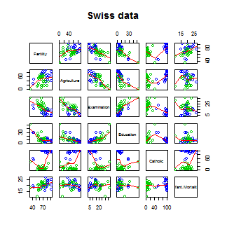
Data set for discussion
We’ll start with the Swiss dataset that is part of the
datasets package. This can be loaded in R with:
> require(datasets); data(swiss); ?swiss
Standardized fertility measure and socio-economic indicators for each of 47 French-speaking provinces of Switzerland at about 1888.
A data frame with 47 observations on 6 variables, each of which is in percent, i.e., in [0, 100].
[,1]   Fertility          a common standardized fertility measure
[,2]   Agriculture        percent of males involved in agriculture as occupation
[,3]	 Examination        percent draftees receiving highest on army examination
[,4]	 Education          percent education beyond primary school for draftees
[,5]	 Catholic           percent catholic (as opposed to protestant)
[,6]	 Infant.Mortality   live births who live less than 1 year
All variables but Fertility give percentages of the population.
Let’s see the result of calling lm on this data set.
> summary(lm(Fertility ~ . , data = swiss))
                 Estimate Std. Error t value  Pr(>|t|)
(Intercept)       66.9152   10.70604   6.250 1.906e-07
Agriculture       -0.1721    0.07030  -2.448 1.873e-02
Examination       -0.2580    0.25388  -1.016 3.155e-01
Education         -0.8709    0.18303  -4.758 2.431e-05
Catholic           0.1041    0.03526   2.953 5.190e-03
Infant.Mortality   1.0770    0.38172   2.822 7.336e-03
Agriculture is expressed in percentages (0 - 100), representing the percentage
of the male population involved in agriculture.
The regression slope estimate for this variable is -0.1721. We interpret
this coefficient as follows:
Our model estimates an expected 0.17 decrease in standardized fertility for every 1% increase in percentage of males involved in agriculture, holding the remaining variables constant.
Note that the the t-test for \(H_0: \beta_{Agri} = 0\) versus
\(H_a: \beta_{Agri} \neq 0\) is significant since 0.0187 is less
that typical benchmarks (0.05, for example). Note that, by default, R is
reporting the P-value for the two sided test. If you want the one sided test,
calculate it directly using the T-statistic and the degrees of freedom.
(You can figure it out from the two sided P-value, but it’s easy to get tripped
up with signs.)
Interestingly, the unadjusted estimate is
summary(lm(Fertility ~ Agriculture, data = swiss))$coefficients
            Estimate Std. Error t value  Pr(>|t|)
(Intercept)  60.3044    4.25126  14.185 3.216e-18
Agriculture   0.1942    0.07671   2.532 1.492e-02
Notice that the sign of the slope estimate reversed! This is an example of so-called “Simpson’s Paradox”. This purported paradox (which is actually not a paradox at all) simply points out that unadjusted and adjusted effects can be the reverse of each other. Or in other words, the apparent relationship between X and Y may change if we account for Z. Let’s explore multivariate adjustment and sign reversals with simulation.
Simulation study
Below we simulate 100 random variables with a linear relationship between X1, X2 and Y. Notably, we generate X1 as a linear function of X2. In this simulation, X1 has a negative adjusted effect on Y while X2 has a positive adjusted effect (adjusted referring to the effect including both variables). However, X1 is related to X2. Notice our unadjusted effect of X1 is of the opposite sign (and way off), while the adjusted one is about right. What’s happening? Our unadjusted model is picking up the effect X2 as it’s represented in X1. Play around with the generating coefficients to see how you can make the estimated relationships very different than the generating ones. More than anything, this illustrates that multivariate modeling is hard stuff.
> n = 100; x2 <- 1 : n; x1 = .01 * x2 + runif(n, -.1, .1); y = -x1 + x2 + rnorm(n, s\
d = .01)
> summary(lm(y ~ x1))$coef

            Estimate Std. Error t value  Pr(>|t|)
(Intercept)    1.454      1.079   1.348 1.807e-01
x1            96.793      1.862  51.985 3.707e-73
>summary(lm(y ~ x1 + x2))$coef
             Estimate Std. Error  t value   Pr(>|t|)
(Intercept)  0.001933  0.0017709    1.092  2.777e-01
x1          -1.020506  0.0163560  -62.393  4.211e-80
x2           1.000133  0.0001643 6085.554 1.544e-272
To confirm what’s going on, let’s look at some plots. In the left panel, we plot Y versus X1. Notice the positive relationship. However, if we look at X2 (the color) notice that it clearly goes up with Y as well. If we adjust both the X1 and Y variable by taking the residual after having regressed X2, we get the actual correct relationship between X1 and Y.
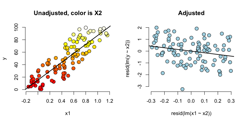
Back to this data set
In our data set, the sign reverses itself with the inclusion of Examination and Education. However, the percent of males in the province working in agriculture is negatively related to educational attainment (correlation of -0.6395) and Education and Examination (correlation of 0.6984) are obviously measuring similar things.
So, given now that we know including correlated variables with our variable of interest into our regression relationship can drastically change things we have to ask: “Is the positive marginal an artifact for not having accounted for, say, Education level? (Education does have a stronger effect, by the way.)” At the minimum, anyone claiming that provinces that are more agricultural have higher fertility rates would immediately be open to criticism that the real effect is due to Education levels.
You might think then, why don’t I just always include all variables that I have into my regression model to avoid incorrectly adjusted effects? Of course, it’s not this easy and there’s negative consequences to including variables unnecessarily. We’ll talk more about model building and the process of choosing which variables to include or not in the next chapter.
What if we include a completely unnecessary variable?
Next chapter we’ll discuss working with a collection of correlated predictors. But you might wonder, what happens if you include a predictor that’s completely unnecessary. Let’s try some computer experiments with our fertility data. In the code below, z adds no new linear information, since it’s a linear combination of variables already included. R just drops terms that are linear combination of other terms.
> z <- swiss$Agriculture + swiss$Education
lm(Fertility ~ . + z, data = swiss)\
> Call:
lm(formula = Fertility ~ . + z, data = swiss)

Coefficients:
     (Intercept)       Agriculture       Examination         Education          Cath\
olic
          66.915            -0.172            -0.258            -0.871             0\
.104
Infant.Mortality                 z
           1.077                NA
This is a fundamental point of multivariate regression: regression models fit the linear space of the regressors. Therefore, any linear reorganization of the regressors will result in an equivalent fit, with different covariates of course. However, the percentage of the variance explained in the response will be constant. It is only through adding variables that are not perfectly explained by the existing ones that one can explain more variation in the response. So, for example, models with covariates i) X and Z, ii) X+Z and X-Z and iii) 2X and 4Z will all explain the same amount of variation in Y. A third variable, W say, will only explain more variation in Y if it’s not perfectly explained by X and Z. R lets you know when you’ve done this by putting redundant variables as having NA coefficients.
Dummy variables are smart
It is interesting to note that models with factor variables as predictors are simply special cases of regression models. As an example, consider the linear model:
$$ Y_i = \beta_0 + X_{i1} \beta_1 + \epsilon_{i} $$where each \(X_{i1}\) is binary so that it is a 1 if measurement \(i\) is in a group and 0 otherwise. As an example, consider a variable as treated versus not in a clinical trial. Or, in a more data science context, consider an A/B test comparing two ad campaigns where Y is the click through rate.
Refer back to our model. For people in the group, \(E[Y_i] = \beta_0 + \beta_1\), and for people not in the group, \(E[Y_i] = \beta_0\). The least squares fits work out to be \(\hat \beta_0 + \hat \beta_1\) as the mean for those in the group and \(\hat \beta_0\) as the mean for those not in the group. The variable \(\beta_1\) is interpreted as the increase or decrease in the mean comparing those in the group to those not. The T-test for that coefficient is exactly the two group T test with a common variance.
Finally, note including a binary variable that is 1 for those not in the group would be redundant, it would create three parameters to describe two means. Moreover, we know from the last section that including redundant variables will result in R just setting one of them to NA. We know that the intercept column is a column of ones, the group variable is one for those in the group while a variable for those not in the group would just be the subtraction of these two. Thus, it’s linearly redundant and unnecessary.
More than two levels
Consider a multilevel factor level. For didactic reasons, let’s say a three level factor. As an example consider a variable for US political party affiliation: Republican, Democrat, Independent/other. Let’s use the model:
$$ Y_i = \beta_0 + X_{i1} \beta_1 + X_{i2} \beta_2 + \epsilon_i. $$Here the variable \(X_{i1}\) is 1 for Republicans and 0 otherwise, the variable \(X_{i2}\) is 1 for Democrats and 0 otherwise. As before, we don’t need an \(X_{i3}\) for Independent/Other, since it would be redundant.
So now consider the implications of more model. If person \(i\) is Republican then \(E[Y_i] = \beta_0 +\beta_1\). On the other hand, If person \(i\) is Democrat then \(E[Y_i] = \beta_0 + \beta_2\). Finally, if \(i\) is Independent/Other \(E[Y_i] = \beta_0\).
So, we can interpret our coefficients as follows. \(\beta_1\) compares the mean for Republicans to that of Independents/Others. \(\beta_2\) compares the mean for Democrats to that of Independents/Others. \(\beta_1 - \beta_2\) compares the mean for Republicans to that of Democrats. Notice the coefficients are all comparisons to the category that we left out, Independents/Others. If one category is an obvious reference category, chose that one to leave out. In R, if our variable is a factor variable, it will create the dummy variables for us and pick one of the levels to be the reference level. Let’s go through an example to see.
Insect Sprays
Let’s consider a model with factors. Consider the InsectSprays dataset in R. The data
models the number of dead insects from different pesticides. Since it’s not clear from the documentation,
let’s assume (probably accurately)
that these were annoying bad insects, like fleas, mosquitoes or cockroaches, and not good ones like butterflies
or ladybugs. After getting over that mental hurdle, let’s plot the data.
require(datasets);data(InsectSprays); require(stats); require(ggplot2)
g = ggplot(data = InsectSprays, aes(y = count, x = spray, fill  = spray))
g = g + geom_violin(colour = "black", size = 2)
g = g + xlab("Type of spray") + ylab("Insect count")
g
Here’s the plot. There are probably better ways to model this data, but let’s use a linear model just to illustrate factor variables.
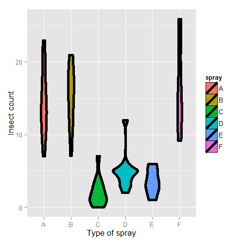
First, let’s set Spray A as the reference (the default, since it has the lowest alphanumeric factor level).
> summary(lm(count ~ spray, data = InsectSprays))$coef
            Estimate Std. Error t value  Pr(>|t|)
(Intercept)  14.5000      1.132 12.8074 1.471e-19
sprayB        0.8333      1.601  0.5205 6.045e-01
sprayC      -12.4167      1.601 -7.7550 7.267e-11
sprayD       -9.5833      1.601 -5.9854 9.817e-08
sprayE      -11.0000      1.601 -6.8702 2.754e-09
sprayF        2.1667      1.601  1.3532 1.806e-01
Therefore, 0.8333 is the estimated mean comparing Spray B to Spray A (as B - A), -12.4167 compares Spray C to Spray A (as C - A) and so on. The inferential statistics: standard errors, t value and P-value all correspond to those comparisons. The intercept, 14.5, is the mean for Spray A. So, its inferential statistics are testing whether or not the mean for Spray A is zero. As is often the case, this test isn’t terribly informative and often yields extremely small statistics (since we know the spray kills some bugs). The estimated mean for Spray B is its effect plus the intercept (14.5 + 0.8333); the estimated mean for Spray C is 14.5 - 12.4167 (its effect plus the intercept) and so on for the rest of the factor levels.
Let’s hard code the factor levels so we can directly see what’s going on. Remember, we simply leave out the dummy variable for the reference level.
> summary(lm(count ~
             I(1 * (spray == 'B')) + I(1 * (spray == 'C')) +
             I(1 * (spray == 'D')) + I(1 * (spray == 'E')) +
             I(1 * (spray == 'F'))
           , data = InsectSprays))$coef
                      Estimate Std. Error t value  Pr(>|t|)
(Intercept)            14.5000      1.132 12.8074 1.471e-19
I(1 * (spray == "B"))   0.8333      1.601  0.5205 6.045e-01
I(1 * (spray == "C")) -12.4167      1.601 -7.7550 7.267e-11
I(1 * (spray == "D"))  -9.5833      1.601 -5.9854 9.817e-08
I(1 * (spray == "E")) -11.0000      1.601 -6.8702 2.754e-09
I(1 * (spray == "F"))   2.1667      1.601  1.3532 1.806e-01
Of course, it’s identical. You might further ask yourself, what would happen if I included a dummy variable for Spray A? Would the world implode? No, it just realizes that one of the dummy variables is redundant and drops it.
> summary(lm(count ~
   I(1 * (spray == 'B')) + I(1 * (spray == 'C')) +
   I(1 * (spray == 'D')) + I(1 * (spray == 'E')) +
   I(1 * (spray == 'F')) + I(1 * (spray == 'A')), data = InsectSprays))$coef

                      Estimate Std. Error t value  Pr(>|t|)
(Intercept)            14.5000      1.132 12.8074 1.471e-19
I(1 * (spray == "B"))   0.8333      1.601  0.5205 6.045e-01
I(1 * (spray == "C")) -12.4167      1.601 -7.7550 7.267e-11
I(1 * (spray == "D"))  -9.5833      1.601 -5.9854 9.817e-08
I(1 * (spray == "E")) -11.0000      1.601 -6.8702 2.754e-09
I(1 * (spray == "F"))   2.1667      1.601  1.3532 1.806e-01
However, if we drop the intercept, then the Spray A term is no longer redundant. Then each coefficient is the mean for that Spray.
> summary(lm(count ~ spray - 1, data = InsectSprays))$coef
       Estimate Std. Error t value  Pr(>|t|)

sprayA   14.500      1.132  12.807 1.471e-19
sprayB   15.333      1.132  13.543 1.002e-20
sprayC    2.083      1.132   1.840 7.024e-02
sprayD    4.917      1.132   4.343 4.953e-05
sprayE    3.500      1.132   3.091 2.917e-03
sprayF   16.667      1.132  14.721 1.573e-22
So, for example, 14.5 is the mean for Spray A (as we already knew), 15.33 is the mean for Spray B (14.5 + 0.8333 from our previous model formulation), 2.083 is the mean for Spray C (14.5 - 12.4167 from our previous model formulation) and so on. This is a nice trick if you want your model formulated in the terms of the group means, rather than the group comparisons relative to the reference group.
Also, if there are no other covariates, the estimated coefficients for this model are exactly the empirical means of the groups. We can use dplyr to check this really easily and grab the mean for each group.
> library(dplyr)
> summarise(group_by(InsectSprays, spray), mn = mean(count))
Source: local data frame [6 x 2]

  spray     mn
1     A 14.500
2     B 15.333
3     C  2.083
4     D  4.917
5     E  3.500
6     F 16.667
Often your lowest alphanumeric level isn’t the level that you’re most
interested in as a reference group. There’s an easy fix for that with
factor variables; use the relevel function. Here we give a simple
example. We created a variable spray2 that has Spray C as the reference
level.
> spray2 <- relevel(InsectSprays$spray, "C")
> summary(lm(count ~ spray2, data = InsectSprays))$coef
            Estimate Std. Error t value  Pr(>|t|)
(Intercept)    2.083      1.132  1.8401 7.024e-02
spray2A       12.417      1.601  7.7550 7.267e-11
spray2B       13.250      1.601  8.2755 8.510e-12
spray2D        2.833      1.601  1.7696 8.141e-02
spray2E        1.417      1.601  0.8848 3.795e-01
spray2F       14.583      1.601  9.1083 2.794e-13
Now the intercept is the mean for Spray C and all of the coefficients are interpreted with respect to Spray C. So, 12.417 is the comparison between Spray A and Spray C (as A - C) and so on.
Summary of dummy variables
If you haven’t seen this before, it might seem rather strange. However, it’s essential to understand how dummy variables are treated, as otherwise huge interpretation errors can be made. Here we give a brief bullet summary of dummy variables to help solidify this information.
- If we treat a variable as a factor, R includes an intercept and omits the alphabetically first level of the factor.
- The intercept is the estimated mean for the reference level.
- The intercept t-test tests for whether or not the mean for the reference level is 0.
- All other t-tests are for comparisons of the other levels versus the reference level.
- Other group means are obtained the intercept plus their coefficient.
- If we omit an intercept, then it includes terms for all levels of the factor.
- Group means are now the coefficients.
- Tests are tests of whether the groups are different than zero.
- If we want comparisons between two levels, neither of which is the reference level, we could refit the model with one of them as the reference level.
Other thoughts on this data
We don’t suggest that this is in anyway a thorough analysis of this data. For example, the data are counts which are bounded from below by 0. This clearly violates the assumption of normality of the errors. Also there are counts near zero, so both the actual assumption and the intent of this assumption are violated. Furthermore, the variance does not appear to be constant (look back at the violin plots). Perhaps taking logs of the counts would help. But, since there are 0 counts, maybe log(Count + 1). Also, we’ll cover Poisson GLMs for fitting count data.
Further analysis of the swiss dataset
Watch this video before beginning.
Let’s create some dummy variables in the swiss dataset to illustrate them in a more
multivariable context. Just to remind ourselves of the dataset, here’s the first few
rows.
> library(datasets); data(swiss)
> head(swiss)

          Fertility Agriculture Examination Education Catholic Infant.Mortality
Courtelary     80.2        17.0          15        12     9.96             22.2
Delemont       83.1        45.1           6         9    84.84             22.2
Franches-Mnt   92.5        39.7           5         5    93.40             20.2
Moutier        85.8        36.5          12         7    33.77             20.3
Neuveville     76.9        43.5          17        15     5.16             20.6
Porrentruy     76.1        35.3           9         7    90.57             26.6
Let’s create a binary variable out of the variable Catholic to illustrate dummy variables in multivariable models. However, it should be noted that this isn’t patently absurd, since the variable is highly bimodal anyway. Let’s just split at majority Catholic or not:
> library(dplyr)
> swiss = mutate(swiss, CatholicBin = 1 * (Catholic > 50))
Since we’re interested in Agriculture as a variable and Fertility as an outcome, let’s plot those two color coded by the binary Catholic variable:
= ggplot(swiss, aes(x = Agriculture, y = Fertility, colour = factor(CatholicBin)))
g = g + geom_point(size = 6, colour = "black") + geom_point(size = 4)
g = g + xlab("% in Agriculture") + ylab("Fertility")
g
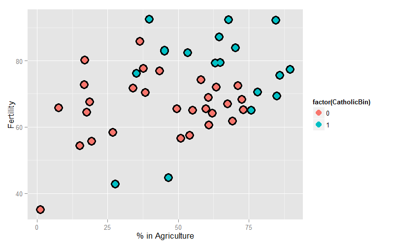
Our model is:
$$ Y_i = \beta_0 + X_{i1} \beta_1 + X_{i2} \beta_2 + \epsilon_i $$where \(Y_i\) is Fertility, \(X_{i1}\) is ‘Agriculture and
\(X_{i2}\) is CatholicBin. Let’s first fit the model with \(X_{i2}\)
removed.
> summary(lm(Fertility ~ Agriculture, data = swiss))$coef

            Estimate Std. Error t value  Pr(>|t|)
(Intercept)  60.3044    4.25126  14.185 3.216e-18
Agriculture   0.1942    0.07671   2.532 1.492e-02
This model just assumes one line through the data (linear regression). Now let’s add our second variable. Notice that the model is
$$ Y_i = \beta_0 + X_{i1} \beta_1 + \epsilon_{i} $$when \(X_{i2} = 0\) and
$$ Y_i = (\beta_0 +\beta_2) + X_{i1} \beta_1 + \epsilon_{i} $$when \(X_{i2} = 1\). Thus, the coefficient in front of the binary variable is the change in the intercept between non-Catholic and Catholic majority provinces. In other words, this model fits parallel lines for the two levels of the factor variable. If the factor variable had 4 levels, it would fit 4 parallel lines, where the coefficients for the factors are the change in the intercepts to the reference level.
## Parallel lines
summary(lm(Fertility ~ Agriculture + factor(CatholicBin), data = swiss))$coef

                     Estimate Std. Error t value  Pr(>|t|)
(Intercept)           60.8322     4.1059  14.816 1.032e-18
Agriculture            0.1242     0.0811   1.531 1.329e-01
factor(CatholicBin)1   7.8843     3.7484   2.103 4.118e-02
Thus, 7.8843 is the estimated change in the intercept in the expected relationship between Agriculture and Fertility going from a non-Catholic majority province to a Catholic majority.
Often, however, we want both a different intercept and slope. This is easily obtained with an interaction term
$$ Y_i = \beta_0 + X_{i1} \beta_1 + X_{i2} \beta_2 + X_{i1}X_{i2} \beta_3 + \epsilon_i . $$Now consider with \(X_{i2} = 0\), the model reduces to:
$$ Y_i = \beta_0 + X_{i1} \beta_1 + \epsilon_{i}. $$When \(X_{i2} = 1\) the model is
$$ Y_i = (\beta_0 + \beta_2) + X_{i1} (\beta_1 + \beta_3) + \epsilon_{i}. $$Thus, the coefficient in front of the main effect \(X_{i2}\), labeled \(\beta_2\) in our model, is the change in the intercept, while the coefficient in front of interaction term \(X_{i2}X_{i1}\), labeled \(\beta_3\) in our model, is the change in the slope. Let’s try it:
> summary(lm(Fertility ~ Agriculture * factor(CatholicBin), data = swiss))$coef

                                 Estimate Std. Error t value  Pr(>|t|)
(Intercept)                      62.04993    4.78916 12.9563 1.919e-16
Agriculture                       0.09612    0.09881  0.9727 3.361e-01
factor(CatholicBin)1              2.85770   10.62644  0.2689 7.893e-01
Agriculture:factor(CatholicBin)1  0.08914    0.17611  0.5061 6.153e-01
Thus, 2.8577 is the estimated change in the intercept of the linear relationship between Agriculture and Fertility going from non-Catholic majority to Catholic majority to Catholic majority provinces. The interaction term, 0.08914, is the estimate change in the slope. The estimated intercept in non-Catholic provinces is 62.04993 while the estimated intercept in Catholic provinces is 62.04993 + 2.85770. The estimated slope in non-Catholic majority provinces is 0.09612 while it is 0.09612 + 0.08914 for Catholic majority provinces. If the factor has more than two levels, all of the main effects are change in the intercepts from the reference level while all of the interaction terms are changes in slope (again compared to the reference level).
Homework exercise, plot both lines on the data to see the fit!
Exercises
- Do exercise 1 of the previous chapter if you have not already.
Load the dataset
Seatbeltsas part of thedatasetspackage viadata(Seatbelts). Useas.data.frameto convert the object to a dataframe. Fit a linear model of driver deaths withkmsandPetrolPriceas predictors. Interpret your results. - Repeat question 1 for the outcome being the log of the count of driver deaths. Interpret your coefficients. Watch a video solution.
- Refer to question 1. Add the dummy variable
lawand interpret the results. Repeat this question with a factor variable that you create calledlawFactorthat takes the levelsNoandYes. Change the reference level fromNotoYes. Watch a video solution. - Discretize the
PetrolPricevariable into four factor levels. Fit the linear model with this factor to see how R treats multiple level factor variables. Watch a video solution. - Perform the plot requested at the end of the last chapter.
Adjustment
Watch this video before beginning.
Adjustment, is the idea of putting regressors into a linear model to investigate the role of a third variable on the relationship between another two. Since it is often the case that a third variable can distort, or confound, the relationship between two others.
As an example, consider looking at lung cancer rates and breath mint usage. For the sake of completeness, imagine if you were looking at forced expiratory volume (a measure of lung function) and breath mint usage. If you found a statistically significant regression relationship, it wouldn’t be wise to rush off to the newspapers with the headline “Breath mint usage causes shortness of breath!”, for a variety of reasons. First off, even if the association is sound, you don’t know that it’s causal. But, more importantly in this case, the likely culprit is smoking habits. Smoking rates are likely related to both breath mint usage rates and lung function. How would you defend your finding against the accusation that it’s just variability in smoking habits?
If your finding held up among non-smokers and smokers analyzed separately, then you might have something. In other words, people wouldn’t even begin to believe this finding unless it held up while holding smoking status constant. That is the idea of adding a regression variable into a model as adjustment. The coefficient of interest is interpreted as the effect of the predictor on the response, holding the adjustment variable constant.
In this chapter, we’ll use simulation to investigate how adding a regressor into a model addresses the idea of adjustment.
Experiment 1
Let’s first generate some data. Consider the model
$$ Y_i = \beta_0 + \beta_1 X + \tau T + \epsilon_i $$We’re interested in the relationship between our binary treatment, \(T\), and \(Y\). However, we’re concerned that the relationship may depend on the continuous variable, \(X\).
Let’s simulate some data.
<- 100; t <- rep(c(0, 1), c(n/2, n/2)); x <- c(runif(n/2), runif(n/2));
beta0 <- 0; beta1 <- 2; tau <- 1; sigma <- .2
y <- beta0 + x * beta1 + t * tau + rnorm(n, sd = sigma)
Let’s plot the data. Below I give the code for the first plot; the rest of the code for plots throughout this chapter is omitted. (However, you can see the course git repository for the rest of the code.)
(x, y, type = "n", frame = FALSE)
abline(lm(y ~ x), lwd = 2)
abline(h = mean(y[1 : (n/2)]), lwd = 3)
abline(h = mean(y[(n/2 + 1) : n]), lwd = 3)
fit <- lm(y ~ x + t)
abline(coef(fit)[1], coef(fit)[2], lwd = 3)
abline(coef(fit)[1] + coef(fit)[3], coef(fit)[2], lwd = 3)
points(x[1 : (n/2)], y[1 : (n/2)], pch = 21, col = "black", bg = "lightblue", cex = \
2)
points(x[(n/2 + 1) : n], y[(n/2 + 1) : n], pch = 21, col = "black", bg = "salmon", c\
ex = 2)
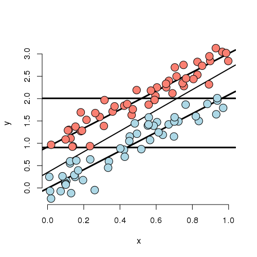
Looking at this plot, notice that the X variable is unrelated to treatment/group status (color). In addition, the X variable is clearly linearly related to Y, but the intercept of this relationship depends on group status. The treatment variable is also related to Y; especially look at the horizontal lines which connect the group means to the Y axis. The third line is the what you would get if you just fit X and ignored group. Furthermore, notice that the relationship between group status and Y is constant depending on X. In other words, both the apparent relationship and our estimated model have parallel lines. (Remember, our model, by not including an interaction term, did not allow for estimated non-parallel lines.)
Finally, notice that the estimated relationship between the group variable and the outcome doesn’t change much, regardless of whether X is accounted for or not. You can see this by comparing the distance between the horizontal lines and the distance between the intercepts of the fitted lines. The horizontal lines are the group averages (disregarding X). That the relationship doesn’t change much is ultimately a statement about balance. The nuisance variable (X) is well balanced between levels of the group variable. So, whether you account for X or not, you get about the same answer. Moreover, we have lots of data at every level of X to make a direct comparison of the group on Y. One way to try to achieve such balance with high probability is to randomize the group variable. This is especially useful, of course, when one doesn’t get to observe the nuisance covariate. Though be careful that as the number of unobserved covariates
Now let’s consider less ideal settings.
Experiment 2
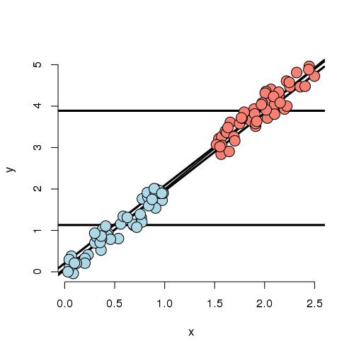
In this experiment, the X variable is highly related to group status. That is, if you know the X variable, you could very easily predict which group they belonged to. If we disregard X, there’s an apparent strong relationship between the group variable and Y. However, if we account for X, there’s basically none. In this case, the apparent effect of group on Y is entirely explained by X. Our regression model would likely have a strong significant effect if group was included by itself and this effect would vanish if X was included.
Further notice, there are no data to directly compare the groups at any particular value of X. (There’s no vertical overlap between the blue and red points.) Thus the adjusted effect is entirely based on the model, specifically the assumption of linearity. Try to draw curves on this plot assuming non-linear relationships outside of their cloud of points for the blue and red groups. You quickly will conclude that many relationships are possible that would differ from this model’s conclusions. Worse still, you have no data to check the assumptions. Of course, R will churn forward without any complaints fitting this model and reporting no significant difference between the groups.
It’s worth noting at this point, that our experiments just show how the data can arrive at different effects when X is included or not. In a real application, it may be the case that X should be included and maybe that it shouldn’t be.
For example, consider an example that I was working on a few years ago. Imagine if group was whether or not the subject was taking blood pressure medication and X was systolic blood pressure (ostensibly, the two variable giving the same information). It may not make sense to adjust for blood pressure when looking at blood pressure medication on the outcome.
On the other hand consider another setting I ran into. A colleague was studying chemical brain measurements of patients with a severe mental disorder versus controls post mortem. However, the time since death was highly related to the time the brain was stored since death, perhaps due to the differential patient sources of the two groups. The time since death was strongly related to the outcome we were studying. In this case, it is very hard to study the groups as they were so contaminated by this nuisance covariate.
Thus we arrive at the conclusion that whether or not to include a covariate is a complex process relying on both the statistics and a careful investigation into the subject matter being studied.
Experiment 3
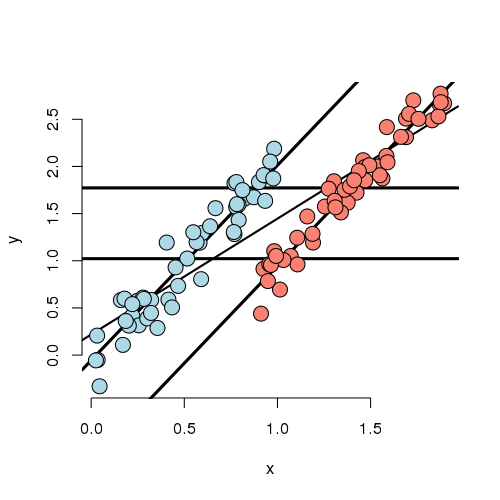
In this experiment, we simulated data where the marginal (ignoring X)
and conditional (using X) associations differ. First note that
if X is ignored, one would estimate a higher marginal mean for Y
of the red group over the blue group. However, if we look at the
intercept in the fitted model, the blue group has a higher
intercept. In other words, if you were to fit this linear
model as lm(Y ~ Group) you would get one answer and
lm(Y ~ Group + X) would give you the exact opposite answer,
and in both cases the group effect would be highly statistically
significant!
Also in this settings, there isn’t a lot of overlap between the groups for any given X. That means there isn’t a lot of direct evidence to compare the groups without relying heavily on the model. In other words, group status is related to X quite strongly (though not as strongly as in the previous example). The adjusted relationship suggest that the blue group is larger than the red group. However, the reversal of the effect comes as bigger X means more likely red and bigger X means higher Y.
Let’s concoct an example around a way this data could have occurred. Suppose that you’re comparing two ad campaigns (labeled blue and red). Y is the sales from the ad (suppose you can measure this) and X is time of day that the ad is shown. Ads shown later on in the day do better than ads shown earlier. However, the blue ad campaign tended to get run in the morning while the red one tended to get run in the evening. So, ignoring time of day leads to the erroneous conclusion that the the red ad did better. Again randomization of the ads to time slots would likely have eliminated this problem.
Experiment 4
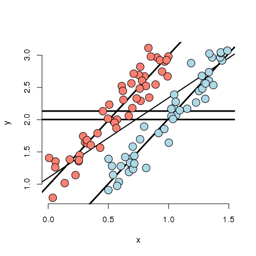
Now that you’ve gotten the hang of it. You can see how marginal and conditional associations can differ. Experiment 4 is a case where the marginal association is minimal yet the conditional association is large. In this case, by adding X to the model, the group effect became more statistically significant.
Experiment 5
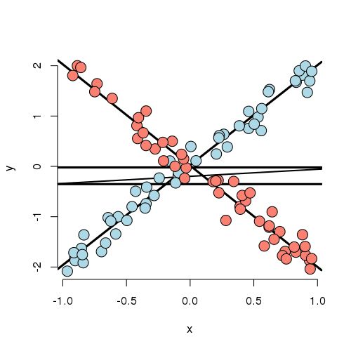
Let’s look at a weird one. In this case, the best fitting model has both a group main effect and interaction with X. The main point here is that there is no meaningful group effect, the effect of group depends on what level of X you’re at. At a small value of X, the red group is here and at a large value of X, the blue group is higher; at intermediate values, they’re the same. Thus, it makes no sense to talk about a group effect in this example; group and X are intrinsically linked in their impact on Y.
As an example, imagine if Y is health outcome, X is time and group is two medications. One makes you much better right away then much worse as time goes on and the other doesn’t do much at the start but steadily improves symptoms over time. Of course, most examples seen in practice aren’t that extreme. Still even with a slight departure in constant slopes, the meaning of a main group effect goes away.
Some final thoughts
Nothing we’ve discussed is intrinsic to having a discrete group and continuous X. One, the other, both or neither could be discrete. What this reinforces is that modeling multivariable relationships is hard. You should continue to play around with simulations to see how the inclusion or exclusion of another variable can change apparent relationships.
We should also caution that our discussion only dealt with associations. Establishing causal or truly mechanistic relationships requires quite a bit more thinking.
Exercises
- Load the dataset
Seatbeltsas part of thedatasetspackage viadata(Seatbelts). Useas.data.frameto convert the object to a dataframe. Fit a linear model of driver deaths withkmsandPetrolPriceas predictors. Interpret your results. - Compare the
kmscoefficient with and without the inclusion of thePetrolPricevariable in the model. Watch a video solution. - Compare the
PetrolPricecoefficient with and without the inclusion of thekmsvariable in the model.
Residuals, variation, diagnostics
Watch this video before beginning
Residuals
Recall from Chapter 6 that the vertical distances between the observed data points and the fitted regression line are called residuals. We can generalize this idea to the vertical distances between the observed data and the fitted surface in multivariable settings.
To be specific, recall our linear model, which was specified as \(Y_i = \sum_{k=1}^p X_{ki} \beta_j + \epsilon_{i}\). Throughout this lecture, we’ll also assume that \(\epsilon_i \stackrel{iid}{\sim} N(0, \sigma^2)\), even though this assumption isn’t necessary for the definition of the residuals.
We define the residuals as:
$$ e_i = Y_i - \hat Y_i = Y_i - \sum_{k=1}^p X_{ki} \hat \beta_j. $$This definition is identical (\(Y_i - \hat Y_i\)) to our definition in the linear regression case. The residuals are the vertical distances between the observed data points and the fitted regression surface. Just like in linear regression, our estimate of residual variation is basically the average of the squared residuals. Specifically, \(\hat \sigma^2 = \frac{\sum_{i=1}^n e_i^2}{n-p}\). Just like the before, we divide by \(n-p\) rather than \(n\) so that the estimate is unbiased, \(E[\hat \sigma^2] = \sigma^2\).
Obtaining and plotting residuals in R is particularly easy. The function resid will return the residuals of a model
fit with lm. Some useful plots, including a residual plot, can be performed with the plot function on the output
of a lm fit. Consider the swiss dataset from previous chapters.
(swiss); par(mfrow = c(2, 2))
fit <- lm(Fertility ~ . , data = swiss); plot(fit)
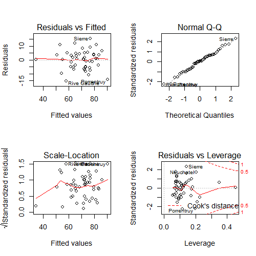
plot on the swiss dataset.Consider the upper left hand plot of the residuals (\(e_i\)) versus the fitted values (\(\hat Y_i\)). Often, a horizontal reference line at 0 is drawn since (whenever an intercept is included) the residuals must sum to 0 and so will lie above and below the zero. Just like in our previous residual plots, one should look for any systematic patterns or large outlying observations.
Note that this is one of many residual plots that one may be interested in
performing. For example, one might want to look at plots of residuals by
individual predictors or, as is done by plot, versus leverage (defined
later in this chapter).
Influential, high leverage and outlying points
As previously mentioned, it is a good idea to check our data for outliers. We may want to refer back to these points to see if we can ascertain how they became outliers, such as a misrecording. In addition, we may want to fit the models with and without those points included in order to ascertain their influence on the model fit and inferential goals.
Outliers can results for a variety of reasons. They can be real, but inconvenient, data. They could arise from spurious processes like processing or recording errors. They can have varying degrees of influence on our model. Thus, calling a point an outlier is vague and we need a more precise language to discuss points that fall outside of our cloud of data. The plot below is useful for understanding different sorts of outliers.
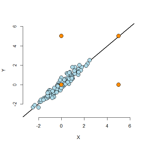
The lower left hand point is not an outlier having neither leverage nor influence on our fitted model. The upper left hand point is an outlier in the Y direction, but not in the X. It will have little impact on our fitted model, since there’s lots of X points nearby to counteract its effect. This point is said to have low leverage and influence. The upper right hand point is outside of the range of X values and Y values, but conforms nicely to the regression relationship. This point has little effect on the fitted model. It has high leverage, but chooses not to exert it, and thus has low influence. The lower right hand point is outside of the range of X values, but not the Y values. However, it does not conform to the relationship of the remainder of the points at all. This outlier has high leverage and influence.
From this discussion you can maybe guess at the formal definition of two important terms: leverage and influence. Leverage discusses how outside of the norm a point’s X values are from the cloud of other X values. A point with high leverage has the opportunity to dramatically impact the regression model. Whether or not it does so depends on how closely it conforms to the fit.
The other concept, influence, is a measure of how much impact a point has on the regression fit. The most direct way to measure influence is fit the model with the point included and excluded.
Residuals, Leverage and Influence measures
Watch this video before beginning.
Now that we understand the three concepts of residuals, leverage and influence, we present a laundry list
of probes. Do ?influence.measures to see the full suite of influence measures in stats.
First consider residuals. We already know if fit is the output of
lm (as in fit = lm(y ~ x1 + x2)), then resid(fit) returns the
ordinary residuals. A problem, though, is that these are defined as
\(Y_i - \hat Y_i \) and thus have the units of the outcome. This
isn’t great for comparing residual values across different analyses
with different experiments. So, some efforts to standardize residuals
have been made. Two of the most common are:
-
rstandard- residuals divided by their standard deviations -
rstudent- residuals divided by their standard deviations, where the ith data point was deleted in the calculation of the standard deviation for the residual to follow a t distribution
Both of these endeavor to create T-like (as in Student’s T distribution)
statistics so that one can threshold residuals using T cutoffs. This is
why these sorts of residuals are called studentized. The rstudent
residuals are exactly T distributed while the rstandard is not. The
rstandard residuals are sometimes called internally standardized while the
rstudent are called externally. The distinction between the residuals
is mostly for establishing probability based cutoffs. Instead, we recommend
looking at the residuals as a collective and using the cutoffs loosely.
Under this way of thinking,
the distinctions over which of these two kinds of standardization are used
is more academic than practical.
A common use for residuals is to diagnose normality of the errors. This is often done by plotting the residual quantiles versus normal quantiles. This is called a residual QQ plot. Your residuals should fall roughly on a line if plotted in a normal QQ plot. There is of course noise and a perfect fit would not be expected even if the model held.
Leverage is largely measured by one quantity, so called hat diagonals, which can be obtained in R by the function hatvalues. The
hat values are necessarily between 0 and 1 with larger values indicating
greater (potential for) leverage.
After leverage, there are quite a few ways to probe for influence. These are:
-
dffits- change in the predicted response when the \(i^{th}\) point is deleted in fitting the model. -
dfbetas- change in individual coefficients when the \(i^{th}\) point is deleted in fitting the model. -
cooks.distance- overall change in the coefficients when the \(i^{th}\) point is deleted.
In other words, the dffits check for influence in the fitted values,
dfbetas check for influence in the coefficients individually and cooks.distance checks for influence in the coefficients as a collective.
Finally, there’s a residual measure that’s also an influence measure.
Particularly, consider resid(fit) / (1 - hatvalues(fit)) where fit is the linear model fit. This is the so-called PRESS residuals. These
are the residual error from leave one out cross validation. That is, the difference in the response and the predicted response at data point \(i\), where it was not included in the model fitting.
How do I use all of these things?
First of all, be wary of simplistic rules for diagnostic plots and measures. The use of these tools is context specific. It’s better to understand what they are trying to accomplish and use them judiciously. Not all diagnostics measures have meaningful absolute scales. You can look at them relative to the values across the data. Even for the ones with known exact distributions to establish cutoffs, those distributions (like the externally studentized residual) have degrees of freedom that depend on the sample size, so a single threshold can’t be used across all settings.
A better way to think about these tool is as diagnostics, like a physician diagnosing a health issue. These tools probe your data in different ways to diagnose different problems. Some examples include:
- Patterns in your residual plots generally indicate some poor aspect of model fit.
- Heteroskedasticity (non constant variance).
- Missing model terms.
- Temporal patterns (plot residuals versus collection order).
- Residual QQ plots investigate normality of the errors.
- Leverage measures (hat values) can be useful for diagnosing data entry errors and points that have a high potential for influence.
- Influence measures get to the bottom line, ‘how does deleting or including this point impact a particular aspect of the model’.
Let’s do some experiments to see how these measure hold up.
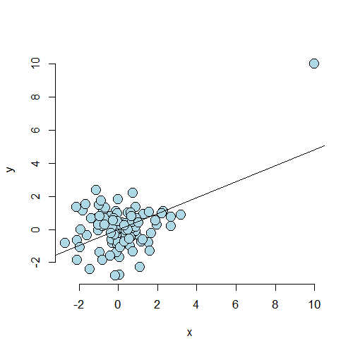
Simulation examples
Case 1
In what follows, we’re going to try several simulation settings and see the values of some
on the residuals, influence measures and leverage. In our first
case, we simulate 100 points. The 101st point, c(10, 10),
has created a strong regression relationship where there shouldn’t be one.
Note we prepend this point at the beginning of the Y and X vectors.
<- 100; x <- c(10, rnorm(n)); y <- c(10, c(rnorm(n)))
plot(x, y, frame = FALSE, cex = 2, pch = 21, bg = "lightblue", col = "black")
abline(lm(y ~ x))
<div class=”rimage center”><img src=”fig/unnamed-chunk-3.png” title=”plot of chunk unnamed-chunk-3” alt=”plot of chunk unnamed-chunk-3” class=”plot” /></div>
First, let’s look at the dfbetas. Note the dfbetas are 101 by 2 dimensional, since there’s a dfbeta
for both the intercept and the slope. Let’s just output the first 10 for the slope.
> fit <- lm(y ~ x)
> round(dfbetas(fit)[1 : 10, 2], 3)
     1      2      3      4      5      6      7      8      9     10
 6.007 -0.019 -0.007  0.014 -0.002 -0.083 -0.034 -0.045 -0.112 -0.008
Clearly the first point has a much, much larger dfbeta for the slope than
the other points. That is, the slope changes dramatically from when we include
this point to not including it. Try it out with Cook’s distance and the
dffits. Let’s look at leverage.
round(hatvalues(fit)[1 : 10], 3)
    1     2     3     4     5     6     7     8     9    10
0.445 0.010 0.011 0.011 0.030 0.017 0.012 0.033 0.021 0.010
Again, this point has a much higher leverage value than that of
the other points. By having a large leverage value and
dfbeta, we’re seeing that this point has a high potential for influence, and
decided to exert it.
Case 2
Consider a second case where the point lies on a natural line defined by the data, but is well outside of the cloud of X values. Since the code is so similar, I don’t show it. But, as always, it can be found in the github repo for the courses.
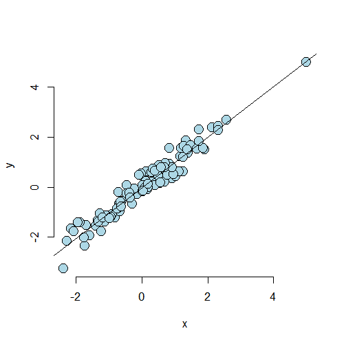
Now let’s consider the dfbetas and the leverage for the
first 10 observations.
> round(dfbetas(fit2)[1 : 10, 2], 3)
     1      2      3      4      5      6      7      8      9     10
-0.072 -0.041 -0.007  0.012  0.008 -0.187  0.017  0.100 -0.059  0.035
> round(hatvalues(fit2)[1 : 10], 3)
    1     2     3     4     5     6     7     8     9    10
0.164 0.011 0.014 0.012 0.010 0.030 0.017 0.017 0.013 0.021
As we would expect, the dfbeta value for the first point is well with
the range of the other points. The leverage is much larger than the others.
In this case, the point has high leverage, but chooses not to exert it as influence.
Play around with more simulation examples to get a feeling for what these measures do. This will help more than anything in understanding their value.
Example described by Stefanski
Watch this video before beginning.
We end with a really fun example from Stefanski in TAS 2007 volume 61. This paper illustrates how a residual plot can unveil hidden treasures that would be nearly impossible to detect with other kinds of plots. He has several examples on his website and we go through one. First, let’s read in the data and do a scatterplot matrix.
<- read.table('http://www4.stat.ncsu.edu/~stefanski/NSF_Supported/Hidden_Images/\orly_owl_files/orly_owl_Lin_4p_5_flat.txt', header = FALSE)
pairs(dat)
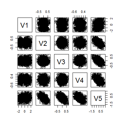
It looks like a big mess of nothing. We can fit a model and get that all of the variables are highly significant
> summary(lm(V1 ~ . -1, data = dat))$coef
   Estimate Std. Error t value  Pr(>|t|)
V2   0.9856    0.12798   7.701 1.989e-14
V3   0.9715    0.12664   7.671 2.500e-14
V4   0.8606    0.11958   7.197 8.301e-13
V5   0.9267    0.08328  11.127 4.778e-28
Can we call it a day? Let’s check a residual plot.
<- lm(V1 ~ . - 1, data = dat); plot(predict(fit), resid(fit), pch = '.')
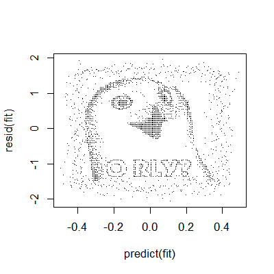
There appears to be a pattern. The moral of the story here is that residual plots can really hone in on systematic patterns in the data that are completely non-apparent from other plots.
Back to the Swiss data

swiss datasetExercises
- Load the dataset
Seatbeltsas part of thedatasetspackage viadata(Seatbelts). Useas.data.frameto convert the object to a dataframe. Fit a linear model of driver deaths withkms,PetrolPriceandlawas predictors. - Refer to question 1. Directly estimate the residual variation via the function
resid. Compare with R’s residual variance estimate. Watch a video solution. - Refer to question 1. Perform an analysis of diagnostic measures including, dffits, dfbetas, influence and hat diagonals. Watch a video solution.
LocalWords: shouldn prepend lang rnorm cex pch bg Stefanski TAS scatterplot LocalWords: dat lm V1 coef V2 989e V3 500e V4 301e V5 778e resid swiss
Multiple variables and model selection
Watch this video before beginning.
This chapter represents a challenging question: “How do we choose what to variables to include in a regression model?”. Sadly, no single easy answer exists and the most reasonable answer would be “It depends.”. These concepts bleed into ideas of machine learning, which is largely focused on high dimensional variable selection and weighting. In this chapter we cover some of the basics and, most importantly, the consequences of over- and under-fitting a model.
Multivariable regression
In our Coursera Data Science Specialization, we have an entire class on prediction and machine learning. So, in this class, our focus will be on modeling. That is, our primary concern is winding up with an interpretable model, with interpretable coefficients. This is a very different process than if we only care about prediction or machine learning. Prediction has a different set of criteria, needs for interpretability and standards for generalizability. In modeling, our interest lies in parsimonious, interpretable representations of the data that enhance our understanding of the phenomena under study.
Like nearly all aspects of statistics, good modeling decisions are context dependent. Consider a good model for prediction, versus one for studying mechanisms, versus one for trying to establish causal effects. There are, however, some principles to help you guide your way.
Parsimony is a core concept in model selection. The idea of parsimony is to keep your models as simple as possible (but no simpler). This builds on the idea of Occam’s razor, in that all else being equal simpler explanations are better than complex ones. Simpler models are easier to interpret and are less finicky. Complex models often have issues with fitting and, especially, overfitting. (To see a counterargument, consider Andrew Gelman’s blog..)
Another principle that I find useful for looking at statistical models
is to consider them as lenses through which to look at your data. (I
attribute this quote to the great statistician Scott Zeger.) Under
this philosophy, what’s the right model - whatever one connects the
data to a true, parsimonious statement about what you’re
studying. Unwin and authors have formalized these ideas more into
something they call exploratory model
analysis
I like this, as it turns our focus away from trying to get a single,
best, true model and instead focuses on utilizing models as ways to
probe data. This is useful, since all models are wrong in some fashion.
Keep this in mind as we focus on variable inclusion and exclusion in this chapter.
The Rumsfeldian triplet
Before we begin, I’d like to give a quote from Donald Rumsfeld, the controversial Secretary of Defense of the US during the start of the Afghanistan and second Iraq wars. He gave this quote regarding weapons of mass destruction (read more about it here):
“There are known knowns. These are things we know that we know. There are known unknowns. That is to say, there are things that we know we don’t know. But there are also unknown unknowns. There are things we don’t know we don’t know.” - Donald Rumsfeld
This quote, widely derided for its intended purpose, is quite insightful in the unintended context of regression model selection. Specifically, in our context “Known Knowns” are regressors that we know we should check for inclusion in the model. The “Known Unknowns” are regressors that we would like to include in the model, but don’t have. The “Unknown Unknowns” are regressors that we don’t even know about that we should have included in the model.
In this chapter, we’ll talk about Known Knowns; variables that are potentially of interest in our model that we have. Known Unknowns and Unknown Unknowns (especially) are more challenging to deal with. A central method for dealing with Unknown Unknowns is randomization. If you’d like to compare a treatment to a control, or perform an A/B test of two advertising strategies, randomization will help insure that your treatment is balanced across levels of the Unknown Unknowns with high probability. (Of course, being unobserved, you can never know whether or not the randomization was effective.)
For Known Unknowns, those variables we wish we had collected but did not, there are several strategies. For example, a proxy variable might be of use. As an example, we had some brain volumetric measurements via MRIs and really wished we had done the processing to get intra-cranial volume (head size). The need for this variable was because we didn’t want to compare brain volumetric measurements and conclude that bigger people with bigger heads have more brain mass. This would be a useless conclusion. For example, killer whales have bigger brains than dolphins, but that doesn’t tell you much about killer whales or dolphins. More interesting would be if killer whales who were exposed to toxic chemicals had lower brain volume relative to their intra-cranial volume than whales who weren’t. In our case, (we were studying humans), we used height, gender and other anthropomorphic measurements to get a good guess of intra-cranial volume.
For the rest of the lecture, let’s discuss the known knowns and what their unnecessary inclusion and exclusion implies in our analysis.
General rules
Here we state a couple of general rules regarding model selection for our known knowns.
- Omitting variables results in bias in the coefficients of interest - unless the regressors are uncorrelated with the omitted ones.
I want to reiterate this point: if the omitted variable is uncorrelated with the included variables, its omission has no impact on estimation. It might explain some residual variation, thus it could have an impact on inference. As previously mentioned, this lack of impact of uncorrelated variables is why we randomize treatments; randomization attempts to disassociate our treatment indicator with variables that we don’t have to put in the model. Formal theories of inference can be designed around the use of randomization. However, in a practical sense, if there’s too many unobserved confounding variables, even randomization won’t help you, since with high probability one will stay correlated with the treatment.
In most cases we won’t have randomization. So, to avoid bias, why don’t we throw everything into the regression model? The following rule prevents us from doing that:
- Including variables that we shouldn’t have increases standard errors of the regression variables.
Actually, including any new variables increases the actual (not estimated) standard errors of other regressors. So we don’t want to idly throw variables into the model. In addition the model must tend toward perfect fit as the number of non-redundant regressors approaches the sample size. Our \(R^2\) increases monotonically as more regressors are included, even unrelated white noise.
R squared goes up as you put regressors in the model
Let’s try a simulation. In this simulation, no regression relationship exists. We simulate data and \(p\) regressors as random normals. The plot is of the \(R^2\).
<- 100
plot(c(1, n), 0 : 1, type = "n", frame = FALSE, xlab = "p", ylab = "R^2")
y <- rnorm(n); x <- NULL; r <- NULL
for (i in 1 : n){
x <- cbind(x, rnorm(n))
r <- c(r, summary(lm(y ~ x))$r.squared)
}
lines(1 : n, r, lwd = 3)
abline(h = 1)
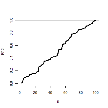
Notice that the \(R^2\) goes up, monotonically, as the number of regressors
is increased. This reminds us of a couple of things. First, irrelevant variables
explain residual variation by chance. And, when evaluating fit, we have to take
into account the number of regressors included. The adjusted \(R^2\) is better
for these purposes than \(R^2\) since it accounts for the number of variables
included in the model. In R, you can get the adjusted \(R^2\) very easily
by grabbing summary(fitted_model)$adj.r.squared instead of summary(fitted_model)$r.squared.
Simulation demonstrating variance inflation
Watch this video before beginning.
Now let’s use simulation to demonstrate variation inflation. In this case,
we’re going to simulate three regressors, x1, x2 and x3. We then repeatedly
generate data from a model, where y only depends on x1. We fit three models,
y ~ x1, y ~ x1 + x2, and y ~ x1 + x2 + x3. We do this over and over
again and look at the standard deviation of the x1 coefficient.
> n <- 100; nosim <- 1000
> x1 <- rnorm(n); x2 <- rnorm(n); x3 <- rnorm(n);
> betas <- sapply(1 : nosim, function(i){
  y <- x1 + rnorm(n, sd = .3)
  c(coef(lm(y ~ x1))[2],
    coef(lm(y ~ x1 + x2))[2],
    coef(lm(y ~ x1 + x2 + x3))[2])
  })
> round(apply(betas, 1, sd), 5)

     x1      x1      x1
0.02839 0.02872 0.02884
Notice that the standard error for the x1 coefficient goes up as more regressors are included (left to right in our vector output). It’s important to note that these are the actual standard errors (obtained by repeatedly simulating the data). These aren’t obtainable in a single dataset since we only get one realization. The estimated standard errors, the ones we have access to in a data analysis, may not go up as you include more regressors.
Now let’s see if we can make the variance inflation worse. In this case, I’ve made x2 and x3 correlated with x1.
> n <- 100; nosim <- 1000
> x1 <- rnorm(n); x2 <- x1/sqrt(2) + rnorm(n) /sqrt(2)
> x3 <- x1 * 0.95 + rnorm(n) * sqrt(1 - 0.95^2);
> betas <- sapply(1 : nosim, function(i){
  y <- x1 + rnorm(n, sd = .3)
  c(coef(lm(y ~ x1))[2],
    coef(lm(y ~ x1 + x2))[2],
    coef(lm(y ~ x1 + x2 + x3))[2])
})
> round(apply(betas, 1, sd), 5)
     x1      x1      x1
0.03131 0.04270 0.09653
Notice that the variance inflation goes up quite a bit more. This is an issue with including variables that are highly correlated with the ones that we are interested in. In the first simulation, the regressors were simulated independently, and the variance inflation wasn’t bad. In the second, they were correlated and it was much worse.
Summary of variance inflation
- Notice variance inflation was much worse when we included a variable that
was highly related to
x1. - We don’t know \(\sigma\), the residual variance, so we can’t know the actual variance inflation amount.
- However, \(\sigma\) drops out of the ratio of the standard errors. Thus, if one sequentially adds variables, one can check the variance (or sd) inflation for including each one.
- When the other regressors are actually orthogonal (correlation 0) to the regressor of interest, then there is no variance inflation.
- The variance inflation factor (VIF) is the increase in the variance for the ith regressor compared to the ideal setting where it is orthogonal to the other regressors.
- The square root of the VIF is the increase in the sd instead of variance.
- Remember, variance inflation is only part of the picture. We want to include certain variables, even if they dramatically inflate our variance.
Let’s revisit our previous simulation to show how one can estimate the relative
increase in variance. Let’s simulate a single dataset, and I’ll show how to get
the relative increase in variance for including x2 and x3. All you need to do is
take the ratio of the variances for that coefficient. If you don’t exactly
understand the code, don’t worry. The idea is that we can obtain these from an observed
data set.
> y <- x1 + rnorm(n, sd = .3)
> a <- summary(lm(y ~ x1))$cov.unscaled[2,2]
> c(summary(lm(y ~ x1 + x2))$cov.unscaled[2,2],
  summary(lm(y~ x1 + x2 + x3))$cov.unscaled[2,2]) / a
[1] 1.895 9.948
Now let’s check it by referring to our previous simulation and see what
the relative variance for x1 is when including the x2 and x2 plus x3 models.
> temp <- apply(betas, 1, var); temp[2 : 3] / temp[1]
   x1    x1
1.860 9.506
Notice that it’s the same (about). In other words, from a single observed dataset we can perfectly estimate the relative variance inflation caused by adding a regressor.
Swiss data revisited
> data(swiss);
> fit1 <- lm(Fertility ~ Agriculture, data = swiss)
> a <- summary(fit1)$cov.unscaled[2,2]
>fit2 <- update(fit1, Fertility ~ Agriculture + Examination)
> fit3 <- update(fit1, Fertility ~ Agriculture + Examination + Education)
> c(summary(fit2)$cov.unscaled[2,2],
    summary(fit3)$cov.unscaled[2,2]) / a
[1] 1.892 2.089
Thus inclusion of Examination increases the variance of the Agriculture effect by 89.2% while further adding Examination and Education causes a 108.9% increase. Again, the observed standard errors won’t follow these percentages. These are the increases if we actually knew \(\sigma^2\).
Let’s look at the variance inflation factors. These measure how much variance inflation the variable causes relative to the setting where it was orthogonal to the other regressors. This is nice because it has a well contained interpretation within a single model fit. Also, one doesn’t have to do all of the model refitting we did above to explore variance inflation. So, in general, the VIFs are the most convenient entity to work with.
> library(car)
> fit <- lm(Fertility ~ . , data = swiss)
> vif(fit)
     Agriculture      Examination        Education         Catholic Infant.Mortality
           2.284            3.675            2.775            1.937            1.108
> sqrt(vif(fit)) #If you prefer sd inflation
     Agriculture      Examination        Education         Catholic Infant.Mortality
           1.511            1.917            1.666            1.392            1.052
Impact of over- and under-fitting on residual variance estimation
Watch this video before beginning.
Assuming that the model is linear with additive iid errors, we can mathematically describe the impact of omitting necessary variables or including unnecessary ones. These two rules follow:
- If we underfit the model, that is omit necessary covariates, the variance estimate is biased.
- If we correctly, or overfit, the model, including all necessary covariates and possibly some unnecessary ones, the variance estimate is unbiased. However, the variance of the variance is larger if we include unnecessary variables.
These make sense. If we’ve omitted important variables, we’re attributing residual variation that is really systematic variation explainable by those omitted covariates. Therefore, we would expect a variance estimate that is systematically off (biased). We would also expect absence of bias when we throw the kitchen sink at the model and include everything (necessary and unnecessary). However, then our variance estimate is unstable (the variance of the variance estimate is larger).
Covariate model selection
Ideally, you include only the necessary variables in a regression model. However, it’s impossible to know in practice which ones are necessary and which ones are not. Thus we have to discuss variable selection a little bit. Automated covariate selection is a difficult topic. It depends heavily on how rich of a covariate space one wants to explore. The space of models explodes quickly as you add interactions and polynomial terms.
In the Data Science Specialization prediction class, we’ll cover many modern methods for traversing large model spaces for the purposes of prediction. In addition, principal components or factor analytic models on covariates are often useful for reducing complex covariate spaces.
It should also be noted that careful design can often eliminate the need for complex model searches at the analyses stage. For example, randomized designs, randomized block designs, crossover designs, clinical trials, A/B testing are all examples of designs where randomization, balance and stratification are used to create data sets that have more direct analyses. However, control over the design is often limited in data science.
I’ll give my favorite approach for model selection when I’m trying to get a parsimonious explanatory model. (I would use a different strategy for prediction.) Given a coefficient that I’m interested in, I like to use covariate adjustment and multiple models to probe that effect to evaluate it for robustness and to see what other covariates knock it out or amplify it. In other words, if I have an effect, or absence of an effect, that I’d like to report, I try to first come up with criticisms of that effect and then use models to try to answer those criticisms.
As an example, if I had a significant effect of lead exposure on brain size I would think about the following criticism. Were the high exposure people smaller than the low exposure people. To address this, I would consider adding head size (intra-cranial volume). If the lead exposed were more obese than the non-exposed, I would put a model with body mass index (BMI) included. This isn’t a terribly systematic approach, but it tends to teach you a lot about the the data as you get your hands dirty. Most importantly, it makes you think hard about the questions your asking and what are the potential criticisms to your results. Heading those criticisms off at the pass early on is a good idea.
How to do nested model testing in R
One particular model selection technique is so useful I’ll cover it since it likely wouldn’t be covered in a machine learning or prediction class. If the models of interest are nested and without lots of parameters differentiating them, it’s fairly uncontroversial to use nested likelihood ratio tests for model selection. Consider the following example:
> fit1 <- lm(Fertility ~ Agriculture, data = swiss)
> fit3 <- update(fit1, Fertility ~ Agriculture + Examination + Education)
> fit5 <- update(fit1, Fertility ~ Agriculture + Examination + Education + Catholic \
+ Infant.Mortality)
> anova(fit1, fit3, fit5)

Analysis of Variance Table

Model 1: Fertility ~ Agriculture
Model 2: Fertility ~ Agriculture + Examination + Education
Model 3: Fertility ~ Agriculture + Examination + Education + Catholic +
    Infant.Mortality
  Res.Df  RSS Df Sum of Sq    F  Pr(>F)
1     45 6283
2     43 3181  2      3102 30.2 8.6e-09 ***
3     41 2105  2      1076 10.5 0.00021 ***
---
Signif. codes:  0 '***' 0.001 '**' 0.01 '*' 0.05 '.' 0.1 ' ' 1
Notice how the three models I’m interested in are nested. That is, Model 3 contains all of the Model 2 variables which contains all of the Model 1 variables. The P-values are for a test of whether all of the new variables are all zero or not (i.e. whether or not they’re necessary). So this model would conclude that all of the added Model 3 terms are necessary over Model 2 and all of the Model 2 terms are necessary over Model 1. So, unless there were some other compelling reasons, we’d pick Model 3. Again, you don’t want to blindly follow a model selection procedure, but when the models are naturally nested, this is a reasonable approach.
Exercises
- Load the dataset
Seatbeltsas part of thedatasetspackage viadata(Seatbelts). Useas.data.frameto convert the object to a dataframe. Fit a linear model of driver deaths withkms,PetrolPriceandlawas predictors. - Perform a model selection exercise to arrive at a final model. Watch a video solution.
LocalWords: knowns regressors volumetric MRIs intra
Generalized Linear Models
Watch this video before beginning.
Generalized linear models (GLMs) were a great advance in statistical modeling. The original manuscript with the GLM framework was from Nelder and Wedderburn in 1972. in the Journal of the Royal Statistical Society. The McCullagh and Nelder book1 is the famous standard treatise on the subject.
Recall linear models. Linear models are the most useful applied statistical technique. However, they are not without their limitations. Additive response models don’t make much sense if the response is discrete, or strictly positive. Additive error models often don’t make sense, for example, if the outcome has to be positive. Transformations, such as taking a cube root of a count outcome, are often hard to interpret.
In addition, there’s value in modeling the data on the scale that it was collected. Particularly interpretable transformations, natural logarithms in specific, aren’t applicable for negative or zero values.
The generalized linear model is a family of models that includes linear models. By extending the family, it handles many of the issues with linear models, but at the expense of some complexity and loss of some of the mathematical tidiness. A GLM involves three components:
- An exponential family model for the response.
- A systematic component via a linear predictor.
- A link function that connects the means of the response to the linear predictor.
The three most famous cases of GLMs are: linear models, binomial and binary regression and Poisson regression. We’ll go through the GLM model specification and likelihood for all three. For linear models, we’ve developed them throughout the book. The next two chapters will be devoted to binomial and Poisson regression. We’ll only focus on the most popular and useful link functions.
Example, linear models
Let’s go through an example. Assume that our response is {$$}Y_i \sim N(\mu_i, \sigma^2){/$$}. The Gaussian distribution is an exponential family distribution. Define the linear predictor to be
\(\eta_i = \sum_{k=1}^p X_{ki} \beta_k\).
The link function as \(g\) so that \(g(\mu) = \eta\). For linear models \(g(\mu) = \mu\) so that \(\mu_i = \eta_i\). This yields the same likelihood model as our additive error Gaussian linear model
$$ Y_i = \sum_{k=1}^p X_{ki} \beta_k + \epsilon_{i} $$where \(\epsilon_i \stackrel{iid}{\sim} N(0, \sigma^2)\). So, we’ve specified our model as a GLM above and with a more traditional linear model specification below. Let’s try an example where the GLM is more necessary.
Example, logistic regression
Assume that our outcome is a 0, 1 variable. Let’s model \(Y_i \sim Bernoulli(\mu_i)\) so that \(E[Y_i] = \mu_i\) where \(0\leq \mu_i \leq 1\).
- Linear predictor: \(\eta_i = \sum_{k=1}^p X_{ki} \beta_k\)
- Link function \(g(\mu) = \eta = \log\left( \frac{\mu}{1 - \mu}\right)\)
In this case, \(g\) is the (natural) log odds, referred to as the logit. Note then we can invert the logit function as:
$$ \mu_i = \frac{\exp(\eta_i)}{1 + \exp(\eta_i)} ~~~\mbox{and}~~~ 1 - \mu_i = \frac{1}{1 + \exp(\eta_i)} $$Some people like to call this the expit function. The logit is useful as it converts probabilities which lie in [0,1] into the whole real line, a more natural space for the linear part of the model to live. Notice further, we’re not transforming the outcome (Y). Instead, we’re modeling our Y as if it were a collection of coin flips and applying the transformation to the probability of a head.
To get the estimates we maximize the likelihood. We can write out the likelihood as:
$$ \prod_{i=1}^n \mu_i^{y_i} (1 - \mu_i)^{1-y_i} = \exp\left(\sum_{i=1}^n y_i \eta_i \right) \prod_{i=1}^n (1 + \eta_i)^{-1} $$Example, Poisson regression
Let’s consider a problem with count data. Assume that :
- \(Y_i \sim Poisson(\mu_i)\) so that \(E[Y_i] = \mu_i\) where \(0\leq \mu_i\).
- Linear predictor \(\eta_i = \sum_{k=1}^p X_{ki} \beta_k\).
- Link function \(g(\mu) = \eta = \log(\mu)\)
Recall that \(e^x\) is the inverse of \(\log(x)\) so that we have:
$$ \mu_i = e^{\eta_i} $$Thus, the likelihood is:
$$ \prod_{i=1}^n (y_i !)^{-1} \mu_i^{y_i}e^{-\mu_i} \propto \exp\left(\sum_{i=1}^n y_i \eta_i - \sum_{i=1}^n \mu_i\right) $$How estimates are obtained
For GLMs, estimates have to be obtained numerically through an iterative algorithm. The algorithms are very well behaved, so convergence is usually not a problem unless you have a lot of data on a boundary, such as a lot of 0 counts in binomial or Poisson data. The standard errors are obtained also numerically, and are usually based on large sample theory. The exact equation that gets solved is the so-called normal equations
$$ 0=\sum_{i=1}^n \frac{(Y_i - \mu_i)}{Var(Y_i)}W_i $$The variance differs by the model. The \(W_i\) are derivative terms that we won’t deal with.
- For the linear model \(Var(Y_i) = \sigma^2\) (is constant).
- For Bernoulli case \(Var(Y_i) = \mu_i (1 - \mu_i)\)
- For the Poisson case \(Var(Y_i) = \mu_i\).
In the latter two cases, it is often relevant to have a more flexible variance model, even if it doesn’t correspond to an actual likelihood. We might make the following changes:
$$ 0=\sum_{i=1}^n \frac{(Y_i - \mu_i)}{\phi \mu_i (1 - \mu_i ) } W_i ~~~\mbox{and}~~~ 0=\sum_{i=1}^n \frac{(Y_i - \mu_i)}{\phi \mu_i} W_i $$These are called ‘quasi-likelihood’ normal equations. R offers these as an option in the glm function
as the quasipoisson and quasibinomial options. These offer more flexible variance options than straight
Poisson and binomial models.
Odds and ends
At this point, let’s do some bookkeeping before we work through examples.
- The normal equations have to be solved iteratively, resulting in \(\hat \beta_k\) and, if included, \(\hat \phi\).
- Predicted linear predictor responses can be obtained as \(\hat \eta = \sum_{k=1}^p X_k \hat \beta_k\)
- Predicted mean responses as \(\hat \mu = g^{-1}(\hat \eta)\)
- Coefficients are interpreted as
or the change in the link function of the expected response per unit change in \(X_k\) holding other regressors constant.
- Variations on Newon/Raphson’s algorithm are used to do it.
- Asymptotics are used for inference usually (but not always).
- Many of the ideas from linear models can be brought over to GLMs.
Exercises
- True or false, generalized linear models transform the observed outcome. (Discuss.) Watch a video solution.
- True or false, the interpretation of the coefficients in a GLM are on the scale of the link function. (Discuss.) Watch a video solution.
- True or false, the generalized linear model assumes an exponential family for the outcome. (Discuss.) Watch a video solution.
- True or false, GLM estimates are obtained by maximizing the likelihood. (Discuss.) Watch a video solution.
- True or false, some GLM distributions impose restrictions on the relationship between the mean and the variance. (Discuss.) Watch a video solution.
Binary GLMs
Watch this video before beginning.
Binary GLMs come from trying to model outcomes that can take only two values. Some examples include: survival or not at the end of a study, winning versus losing of a team and success versus failure of a treatment or product. Often these outcomes are called Bernoulli outcomes, from the Bernoulli distribution named after the famous probabilist and mathematician.
If we happen to have several exchangeable binary outcomes for the same level of covariate values, then that is binomial data and we can aggregate the 0’s and 1’s into the count of 1’s. As an example, imagine if we sprayed insect pests with 4 different pesticides and counted whether they died or not. Then for each spray, we could summarize the data with the count of dead and total number that were sprayed and treat the data as binomial rather than Bernoulli.
Example Baltimore Ravens win/loss
The Baltimore Ravens are an American Football team in the US’s National Football League.2 The data contains the wins and losses of the Ravens by the number of points that they scored. (In American football, the goal is to score more points than your opponent.) It should be clear that there would be a positive relationship between the number of points scored and the probability of winning that particular game.
Let’s load the data and use head to look at the first few rows.
> download.file("https://dl.dropboxusercontent.com/u/7710864/data/ravensData.rda"
              , destfile="./data/ravensData.rda",method="curl")
> load("./data/ravensData.rda")
> head(ravensData)
  ravenWinNum ravenWin ravenScore opponentScore
1           1        W         24             9
2           1        W         38            35
3           1        W         28            13
4           1        W         34            31
5           1        W         44            13
6           0        L         23            24
A linear regression model would look something like this:
$$ Y_i = \beta_0 + \beta_1 X_i + e_i $$Where \(Y_i\) is a binary indicator of whether or not the Ravens won game \(i\)(1 for a win, 0 for a loss). \(X_i\) is the number of points that they scored for that game. and \(\epsilon_i\) is the residual error term.
Under this model then \(\beta_0\) is the expected value of \(Y_i\) given a 0 point game. For a 0/1 variable, the expected value is the probability, so the intercept is the probability that the Ravens win with 0 points scored. Then \(\beta_1\) is the increase in probability of a win for each additional point.
At this point in the book, I hope that fitting and interpreting this model would be second nature.
> lmRavens <- lm(ravensData$ravenWinNum ~ ravensData$ravenScore)
> summary(lmRavens)$coef
                      Estimate Std. Error t value Pr(>|t|)
(Intercept)             0.2850   0.256643   1.111  0.28135
ravensData$ravenScore   0.0159   0.009059   1.755  0.09625
There are numerous problems with this model. First, if the Ravens score more than 63 points in a game, we estimate a 0.0159 * 63, which is greater than 1, increase in the probability of them winning. This is an impossibility, since a probability can’t be greater than 1. Sixty three is an unusual, but not impossible, score in American football, but the principle applies broadly: modeling binary data with linear models results in models that fail the basic assumption of the data.
Perhaps less galling, but still an annoying aspect of the model, is that if the error is assumed to be Gaussian, then our model allows \(Y_i\) to be anything from minus infinity to plus infinity, when we know our data can be only be 0 or 1. If we assume that our errors are discrete to force this, we assume a very strange distribution on the errors.
There also aren’t any transformations to make things better. Any one to one transformation of our outcome is still just going to have two values, thus the same set of problems.
The key insight was to transform the probability of a 1 (win in our example) rather than the data itself. Which transformation is most useful? It turns out that it involves the log of the odds, called the logit.
Odds
You’ve heard of odds before, most likely from discussions of gambling. First note, odds are a fraction greater than 0 but unbounded. The odds are not a percentage or proportion. So, when someone says “The odds are fifty percent”, they are mistaking probability and odds. They likely mean “The probability is fifty percent.”, or equivalently “The odds are one.”, or “The odds are one to one”, or “The odds are fifty [divided by] fifty.” The latter three odds statements are all the same since: 1, 1 / 1 and 50 / 50 are all the same number.
If \(p\) is a probability, the odds are defined as \(o = p/(1-p)\). Note that we can go backwards as \(p = o / (1 + o)\). Thus, if someone says the odds are 1 to 1, they’re saying that the odds are 1 and thus \(p = 1 / (1 + 1) = 0.5\). Conversely, if someone says that the probability that something occurs is 50%, then they mean that \(p=0.5\) so that the odds are \(o = p / (1 - p) = 0.5 / (1 - 0.5) = 1\).
The odds are famously derived using a standard fair game setting. Imagine that you are playing a game where you flip a coin with success probability \(p\) with the following rules:
- If it comes up heads, you win \(X\) dollars.
- If it comes up tails, you lose \(Y\).
What should we set \(X\) and \(Y\) for the game to be fair? Fair means the expected earnings for either player is 0. That is:
$$ E[earnings]= X p - Y (1 - p) = 0 $$This implies \(\frac{Y}{X} = \frac{p}{1 - p} = o\). Consider setting \(X=1\), then \( Y = o\). Thus, the odds can be interpreted as “How much should you be willing to pay for a \(p\) probability of winning a dollar?” If \(p > 0.5\) you have to pay more if you lose than you get if you win. If \(p < 0.5\) you have to pay less if you lose than you get if you win.
So, imagine that I go to a horse race and the odds that a horse loses are 50 to 1. They usually specify in terms of losing at horse tracks, so this would be said to be 50 to 1 “against” where the against is implied and not stated on the boards. The odds of the horse winning are then 1/50. Thus, for a fair bet if I were to bet on the horse winning, they should pay me 50 dollars if he wins and should pay 1 dollar if he loses. (Or any agreed upon multiple, such as 100 dollars if he wins and 2 dollars if he loses.) The implied probability that the horse loses is \(50 / (1 + 50)\).
It’s an interesting side note that the house sets the odds (hence the implied probability) only by the bets coming in. They take a small fee for every bet win or lose (the rake). So, by setting the odds dynamically as the bets roll in, they can guarantee that they make money (risk free) via the rake. Thus the phrase “the house always wins” applies literally. Even more interesting is that by the wisdom of the crowd, the final probabilities tend to match the percentage of times that event happens. That is, house declared 50 to 1 horses tend to win about 1 out of 51 times and lose 50 out of 51 times, even though that 50 to 1 was set by a random collection of mostly uninformed bettors. This is why even your sports junkie friend with seemingly endless up to date sports knowledge can’t make a killing betting on sports; the crowd is just too smart as a group even though most of the individuals know much less.
Finally, and then I’ll get back on track, many of the machine learning algorithms work on this principle of the wisdom of crowds: many small dumb models can make really good models. This is often called ensemble learning, where a lot of independent weak classifiers are combined to make a strong one. Random forests and boosting come to mind as examples. In the Coursera Practical Machine Learning class, we cover ensemble learning algorithms.
Getting back to the issues at hand, recall that probabilities are between 0 and 1. Odds are between 0 and infinity. So, it makes sense to model the log of the odds (the logit), since it goes from minus infinity to plus infinity. The log of the odds is called the logit:
$$ g = \mathrm{logit}(p) = \log(p / (1 - p)) $$We can go backwards from the logit to the probability with the so-called expit (inverse logit):
$$ \mathrm{expit}(g) = e^g / (1 + e^g) = 1 / (1 + e^{-g}) = p. $$Modeling the odds
Let’s come up with notation for modeling the odds. Recall that \(Y_i\) was our outcome, a 0 or 1 indicator of whether or not the Raven’s won game \(i\).
Let
$$ p_i = \mathrm{P}(Y_i = 1 ~|~ X_i = x_i, \beta_0, \beta_1) $$be the probability of a win for number of points \(x_i\). Then the odds that they win is \(p_i / (1 - p_i)\) and the log odds is \(\log{p_i / (1 - p_i)} = \mathrm{logit}(p_i)\).
Logistic regression puts the model on the log of the odds (logit) scale. In other words,
$$ \mathrm{logit}(p_i) = \beta_0 + \beta_1 x_i $$Or, equivalently, we could just say
$$ P(Y_i = 1 ~|~ X_i = x_i, \beta_0, \beta_1) = p_i = \frac{ \exp(\beta_0 + \beta_1 x_i)}{1 + \exp(\beta_0 + \beta_1 x_i)} $$Interpreting Logistic Regression
Recall our model is:
$$ \mathrm{logit}\{P(Y_i = 1 ~|~ X_i = x_i)\} = \beta_0 + \beta_1 x_i $$Let’s write this as:
$$ \mathrm{log}\{O(Y_i = 1 ~|~ X_i = x_i)\} = \beta_0 + \beta_1 x_i $$where \(O(Y_i = 1 ~|~ X_i = x_i)\) refers to the odds. Interpreting \(\beta_0\) is straightforward, it’s the log of the odds of the Ravens winning for a 0 point game. Just like in regular regression, for this to have meaning, a 0 X value has to have meaning. In this case, there’s a structural consideration that’s being ignored in that the Ravens can’t win if they score 0 points (they can only tie or lose). This is an unfortunate assumption of our model.
For interpreting the \(\beta_1\) coefficient, consider the following:
$$ \mathrm{log}\{O(Y_i = 1 ~|~ X_i = x_i + 1)\} - \mathrm{log}\{O(Y_i = 1 ~|~ X_i = x_i)\} = \mathrm{log}\left\{ \frac{O(Y_i = 1 ~|~ X_i = x_i + 1)} {O(Y_i = 1 ~|~ X_i = x_i)} \right\} = \beta_1 $$So that \(\beta_1\) is the log of the relative increase in the odds of the Ravens winning for a one point increase in score. The ratio of two odds is called, not surprisingly, the odds ratio. So \(\beta_1\) is the log odds ratio of the Ravens winning associated with a one point increase in score.
We can get rid of the log by exponentiating and then get that \(\exp(\beta_1)\) is the odds ratio associated with a one point increase in score. It’s a nifty fact that you can often perform this exponentiation in your head, since for numbers close to zero, exponentiation is about 1 + that number. So, if you have a logistic regression slope coefficient of 0.01, you know that e to that coefficient is about 1.01. So you know that the coefficient estimates a 1% increase in the odds of a success for every 1 unit increase in the regressor.
Visualizing fitting logistic regression curves
Watch this video before beginning.
Let’s visualize what the logistic regression model is
fitting. Consider setting \(\beta_0\) to 0 and
varying \(\beta_1\) for X being a regressor
equally spaced between -10 and 10. Notice that
the logistic curves vary in their curvature.
= seq(-10, 10, length = 1000)
beta0 = 0; beta1s = seq(.25, 1.5, by = .1)
plot(c(-10, 10), c(0, 1), type = "n", xlab = "X", ylab = "Probability", frame = FALS\
E)
sapply(beta1s, function(beta1) {
y = 1 / (1 + exp( -1 * ( beta0 + beta1 * x ) ))
lines(x, y, type = "l", lwd = 3)
}
)
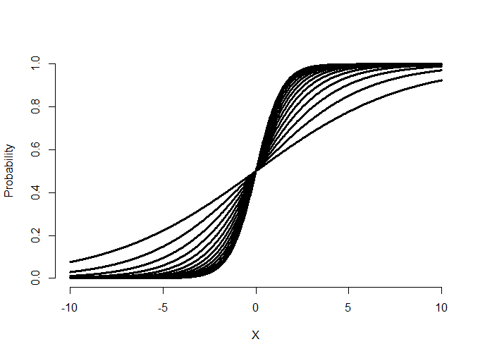
Try making the slope negative and see what happens. (It flips the curve from increasing to decreasing.) Now let’s hold \(\beta_1\) fixed and vary \(\beta_0\).
= seq(-10, 10, length = 1000)
beta0s = seq(-2, 2, by = .5); beta1 = 1
plot(c(-10, 10), c(0, 1), type = "n", xlab = "X", ylab = "Probability", frame = FALS\
E)
sapply(beta0s, function(beta0) {
y = 1 / (1 + exp( -1 * ( beta0 + beta1 * x ) ))
lines(x, y, type = "l", lwd = 3)
}
)
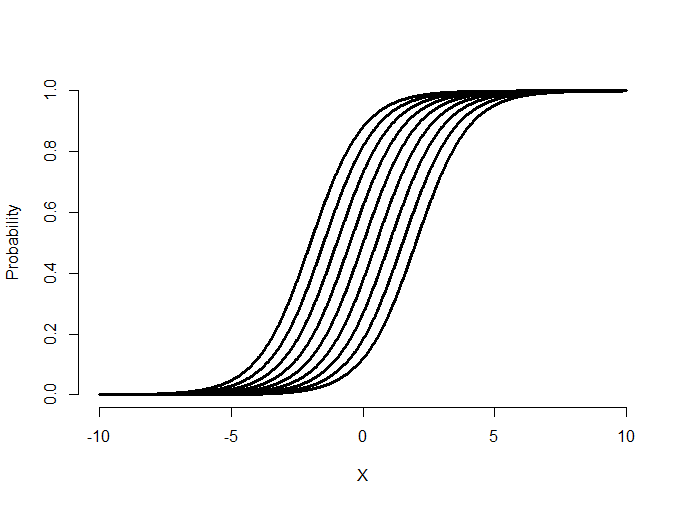
Notice that varying the intercept shifts the curve back and forth. Let’s superimpose some data with the fitted curve.
= seq(-10, 10, length = 1000)
beta0 = 0; beta1 = 1
p = 1 / (1 + exp(-1 * (beta0 + beta1 * x)))
y = rbinom(prob = p, size = 1, n = length(p))
plot(x, y, frame = FALSE, xlab = "x", ylab = "y")
lines(lowess(x, y), type = "l", col = "blue", lwd = 3)
fit = glm(y ~ x, family = binomial)
lines(x, predict(fit, type = "response"), lwd = 3, col = "red")
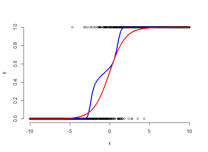
The plot above shows the simulated binary data (black points), the fitted logistic curve (red) and a lowess smoother through the data (blue). The lowess smoother shows a non-parametric estimate of the probability of a success at each x value. Think of it as a moving proportion. Logistic regression gets to move around the intercept and slope of the logistic curve to fit the data well. Here the fit says that the probability of a 1 for low values of x is very small, the probability of a 1 for high values of x is high and it is intermediate at the points in the middle.
Ravens logistic regression
Watch this video before beginning.
Now let’s run our binary regression model on the Ravens data.
> logRegRavens = glm(ravensData$ravenWinNum ~ ravensData$ravenScore,family="binomial\")
> summary(logRegRavens)
Call:
glm(formula = ravensData$ravenWinNum ~ ravensData$ravenScore,
family = "binomial")
Deviance Residuals:
Min 1Q Median 3Q Max
-1.758 -1.100 0.530 0.806 1.495
Coefficients:
Estimate Std. Error z value Pr(>|z|)
(Intercept) -1.6800 1.5541 -1.08 0.28
ravensData$ravenScore 0.1066 0.0667 1.60 0.11
(Dispersion parameter for binomial family taken to be 1)
Null deviance: 24.435 on 19 degrees of freedom
Residual deviance: 20.895 on 18 degrees of freedom
AIC: 24.89
Number of Fisher Scoring iterations: 5
## plotting the fit
> plot(ravensData$ravenScore,logRegRavens$fitted,pch=19,col="blue",xlab="Score",ylab\
="Prob Ravens Win")
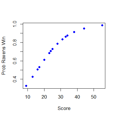
In this case, the data only covers some of the logistic curve, so that the full “S” of the curve isn’t visible. To interpret our coefficients, let’s exponentiate them.
> exp(logRegRavens$coeff)
          (Intercept) ravensData$ravenScore
               0.1864                1.1125
> exp(confint(logRegRavens))
                         2.5 % 97.5 %
(Intercept)           0.005675  3.106
ravensData$ravenScore 0.996230  1.303
The first line of code shows that the exponentiated slope coefficient is 1.11. Thus, we estimate a 11% increase in the odds of winning per 1 point increase in score. However, the data are variable and the confident interval goes from 0.99 to 1.303. Since this interval contains 1 (or contains 0 on the log scale), it’s not statistically significant. (It’s pretty close, though.)
If we had included another variable in our model, say home versus away game indicator, then our slope is interpreted holding the value of the covariate held fixed. Just like in multivariable regression.
We can also compare nested models using ANOVA and, by and large, our general model discussion carries over to this setting as well.
Some summarizing comments
Odds aren’t probabilities. In binary GLMs, we model the log of the odds (logit) and our slope parameters are interpreted as log odds ratios. Odds ratios of 1 or log odds ratios of 0 are interpreted as no effect of the regressor on the outcome.
Exercises
- Load the dataset
Seatbeltsas part of thedatasetspackage viadata(Seatbelts). Useas.data.frameto convert the object to a dataframe. Create a new outcome variable for whether or not greater than 119 drivers were killed that month. Fit a logistic regression GLM with this variable as the outcome andkms,PetrolPriceandlawas predictors. Interpret your parameters. Watch a video solution. - Fit a binomial model with
DriversKilledas the outcome anddriversas the total count withkms,PetrolPriceandlawas predictors, interpret your results. Watch a video solution. - Refer to Question 1. Use the
anovafunction to compare models with justlaw,lawandPetrolPriceand all three predictors. Watch a video solution.
Count data
Watch this video before beginning.
Acknowledgment to Jeff Leek for much of the code and organization of this chapter.
Many data take the form of unbounded count data. For example, consider the number of calls to a call center or the number of flu cases in an area or the number of hits to a web site.
In some of these cases the counts are clearly bounded. However, modeling the counts as unbounded is often done when the upper limit is not known or is very large relative to the number of events.
If the upper bound is known, the techniques we’re discussing can be used to model the proportion or rate. The starting point for most count analysis is the the Poisson distribution.
Poisson distribution
The Poisson distribution is the goto distribution for modeling counts and rates. We’ll define a rate as a count per unit of time. For example your heart rate is often expressed in beats per minute. So, we might look at web hits per day, or disease cases per exposure time (incidence rates). Also, though not exactly a rate, we can treat proportions as if rates when \(n\) is large and the success probability is small.
We would write that a random variable is Poisson, \(X \sim \mathrm{Poisson}(t\lambda)\), if its density function is:
$$ P(X = x) = \frac{(t\lambda)^x e^{-t\lambda}}{x!} $$where \(x = 0, 1, \ldots\). The mean of the Poisson is \(E[X] = t\lambda\), thus \(E[X / t] = \lambda\). The variance of the Poisson is \(Var(X) = t\lambda\). The Poisson tends to a normal as \(t\lambda\) gets large and approximates a binomial with large \(n\) and small \(p\) where we would think of \(t\lambda\) as \(n p \).
Here are some plots of the Poisson density to illustrate how it closely approximates a normal.
(mfrow = c(1, 3))
plot(0 : 10, dpois(0 : 10, lambda = 2), type = "h", frame = FALSE)
plot(0 : 20, dpois(0 : 20, lambda = 10), type = "h", frame = FALSE)
plot(0 : 200, dpois(0 : 200, lambda = 100), type = "h", frame = FALSE)
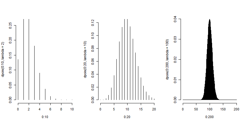
Poisson distribution
Let’s analyze some data using the Poisson distribution. Consider the daily counts to Jeff Leek’s web site: http://biostat.jhsph.edu/~jleek/
We’re interested in the number of hits per day. Since the unit of time is always one day, set \(t = 1\) and then the Poisson mean is interpreted as web hits per day. If we set \(t = 24\) then our Poisson rate would be interpreted as web hits per hour.
Let’s load the data:
> download.file("https://dl.dropboxusercontent.com/u/7710864/data/gaData.rda",destfi\
le="./data/gaData.rda",method="curl")
> load("./data/gaData.rda")
> gaData$julian = julian(gaData$date)
> head(gaData)
        date visits simplystats julian
1 2011-01-01      0           0  14975
2 2011-01-02      0           0  14976
3 2011-01-03      0           0  14977
4 2011-01-04      0           0  14978
5 2011-01-05      0           0  14979
6 2011-01-06      0           0  14980

> plot(gaData$julian,gaData$visits,pch=19,col="darkgrey",xlab="Julian",ylab="Visits")
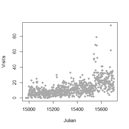
Linear regression
We could try to fit the data with linear regression. This is an often reasonable thing to do. Specifically, we would start with the model
$$ Y_i = \beta_0 + beta_1 x_i + \epsilon_i $$where \(Y_i\) is the number of web hits on day i and \(x_i\) is the day (expressed as a Julian date, the number of days since January 1st, 1970).
This model isn’t anywhere near as objectionable as when applied in the binary case. Two sticking points remain. First, the response is a count and thus is non-negative, while our model doesn’t acknowledge that. Secondly, the errors are typically assumed Gaussian, which is not an accurate approximation for small counts. As the counts get larger, straight application of linear or multivariable regression models becomes more compelling.
1 > plot(gaData$julian,gaData$visits,pch=19,col="darkgrey",xlab="Julian",ylab="Visits")
2 > lm1 = lm(gaData$visits ~ gaData$julian)
3 > abline(lm1,col="red",lwd=3)
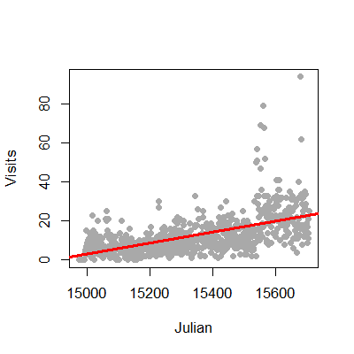
The non-negativity could be handled by a (natural) log transformation of the outcome. The log has a special interpretation with respect to regression, so we cover it here. First, there is the issue of zero counts (which can’t be logged). Often a +1 is added to all data before taking the log, a reasonable solution but one that harms the nice interpretation properties of the log. Secondly, a square root or cube root transformation is often applied (which works just fine on zeros). While correcting nicely for skewness, this approach creates the issue of losing the nice interpretation of logs. Thus for the time being, let’s assume no zero counts in the discussion.
Consider now the model:
$$ \log(Y_i) = \beta_0 + \beta_1 x_i + \epsilon_i $$The quantity \(e^{E[\log(Y)]}\) estimates the geometric mean of \(Y\). When you take the natural log of outcomes and fit a regression model, your exponentiated coefficients estimate things about geometric means. Thus \(e^{\beta_0}\) is the geometric mean of hits on day 0, while \(e^{\beta_1}\) is the relative increase or decrease in hits going from one day to the next.
Let’s try this briefly with Jeff’s data.
> round(exp(coef(lm(I(log(gaData$visits + 1)) ~ gaData$julian))), 5)
  (Intercept) gaData$julian
        0.000         1.002
Thus our model estimates a 0.2% increase in geometric mean daily web hits each day. What’s nice about the geometric mean is it’s a multiplicative quantity. In this case it make sense to think multiplicatively, as we would very naturally think in the terms of percent increases or decreases in the daily rate of web traffic.
Poisson regression
Watch this video before beginning.
Poisson regression is similar to logging the outcome. However, instead we log the model mean exactly as in the binary chapter where we logged the modeled odds. This takes care of the problem of zero counts elegantly.
Consider a model where we assume that \(Y_i \sim \mathrm{Poisson}(\mu_i)\). and
$$ \log(E[Y_i ~|~ X_i = x_i]) = \log(\mu_i) = \beta_0 + \beta_1 x_i $$Note that we’re not logging the outcome, we’re logging the assumed mean in the model.
We interpret our coefficients as follows. \(e^\beta_0\) is the expected mean of the outcome when \(x_i = 0\). Using the relationship:
$$ \frac{E[Y_i ~|~ X_i = x_i+1]}{E[Y_i ~|~ X_i = x_i]} = e^{\beta_1}, $$\(e^{\beta_1}\) is the expected relative increase in the outcome for a unit change in the regressor. If there’s more than one regressor in the model, then the coefficients are interpreted in the terms of the other regressors being held fixed.
Let’s try it in R for Jeff’s data:
> plot(gaData$julian,gaData$visits,pch=19,col="darkgrey",xlab="Julian",ylab="Visits")
> glm1 = glm(gaData$visits ~ gaData$julian,family="poisson")
> abline(lm1,col="red",lwd=3); lines(gaData$julian,glm1$fitted,col="blue",lwd=3)
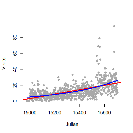
Mean-variance relationship
The Poisson model suggest a specific relationship between the mean and the variance. Specifically, if \(Y_i \sim \mathrm{Poisson}(\mu_i)\), then \(E[Y_i] = \mathrm{Var}(Y_i)\). We can often check whether or not this relationship apparently holds. For example, we can plot the fitted values (estimates \(E[Y_i]\)) by generalized version of residuals for Poisson models.
> plot(glm1$fitted,glm1$residuals,pch=19,col="grey",ylab="Residuals",xlab="Fitted")

There are several methods for dealing with data that, while being counts, do not follow the mean variance relationship assumed by the Poisson model. Perhaps the easiest is to assume a so-called quasi-Poisson model. This is from the idea of quasi-likelihood. Here, the model is extended to have the variance be a constant (non-fixed) multiple of the mean. A very related approach are so-called negative binomial models. These models typically assume a more general mean/variance relationship.
Other approaches directly model the mean/variance relationship or rely on asymptotics to be robust to the assumption. We omit a full discussion of general of methods for addressing complex mean variance relationships and simply show a quasi-Poisson fit for the data of this chapter.
> glm2 = glm(visits ~ julian,family="quasipoisson", data = gaData)
#
# Confidence interval expressed as a percentage
> 100 * (exp(confint(glm2)) - 1)[2,]
Waiting for profiling to be done...
                   2.5 %       97.5 %
julian         0.2072924    0.2520376
#
# As compared to the standard Poisson interval
> 100 * (exp(confint(glm1)) - 1)[2,]
Waiting for profiling to be done...
                   2.5 %       97.5 %
julian         0.2192443    0.2399335
In this case the distinction between the intervals is minimal. Again, we reiterate that this only pursues one direction of model departure.
Rates
We fit rates or proportions in Poisson models by including the temporal or sample size component as a (natural) log offset in the model specification. Recall that \(Y_i\) was the number of web hits. Let \(W_i\) be the number of hits directed to the site from the Simply Statistics BLOG site.
Consider the model where
$$ W_i \sim \mathrm{Poisson}(\mu_i) $$so that
$$ \log(\mu_i) = \beta_0 + \beta_1 x_i + \log(Y_i) $$This is a model for the proportion in the sense that \(\mu_i\) is the expected count and our model is:
$$ \log(\mu_i / Y_i) = \beta_0 + \beta_1 x_i $$In this case we were interested in a proportion. If our interest was in rates, counts over a time period, such as incident rate (cases per time at risk), the time variable would be included as the offset.
1 glm3 = glm(simplystats ~ julian(gaData$date),offset=log(visits+1),
2 family="poisson",data=gaData)
3 plot(julian(gaData$date),glm3$fitted,col="blue",pch=19,xlab="Date",ylab="Fitted Coun\4 ts")
5 points(julian(gaData$date),glm1$fitted,col="red",pch=19)
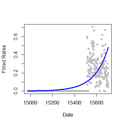
Exercises
- Load the dataset
Seatbeltsas part of thedatasetspackage viadata(Seatbelts). Useas.data.frameto convert the object to a dataframe. Fit a Poisson regression GLM withUKDriversKilledas the outcome andkms,PetrolPriceandlawas predictors. Interpret your results. Watch a video solution. - Refer to question 1. Fit a linear model with the log of drivers killed as the outcome. Interpret your results. Watch a video solution.
- Refer to question 1. Fit your Poisson log-linear model with
driversas a log offset (to consider the proportion of drivers killed of those killed or seriously injured.) Watch a video solution. - Refer to Question 1. Use the
anovafunction to compare models with justlaw,lawandPetrolPriceand all three predictors. Watch a video solution.
Bonus material
Watch this video before beginning..
This chapter is a bit of an mishmash of interesting things that one can accomplish with linear models.
How to fit functions using linear models
Up to this point, we’ve only considered fitting lines, planes and polynomials for linear models. Consider a model \(Y_i = f(X_i) + \epsilon\). How can we fit such a model using linear models (often called scatterplot smoothing)?
We’re going to cover a basic technique called regression splines. Consider the model
$$ Y_i = \beta_0 + \beta_1 X_i + \sum_{k=1}^d (x_i - \xi_k)_+ \gamma_k + \epsilon_{i} $$where \((a)_+ = a\) if \(a > 0\) and 0 otherwise and \(\xi_1 \leq ... \leq \xi_d\) are known knot points. Prove to yourself that the mean function:
\beta_0 + \beta_1 X_i + \sum{k=1}^d (x_i - \xi_k)+ \gamma_k {/$$} is continuous at the knot points. That is, we could draw this function without lifting up the pen.
Let’s try a simulated example. The function is a sine curve with noise. We have twenty knot points.
## simulate the data
n <- 500; x <- seq(0, 4 * pi, length = n); y <- sin(x) + rnorm(n, sd = .3)
## the break points of the spline fit
knots <- seq(0, 8 * pi, length = 20);
## building the regression spline terms
splineTerms <- sapply(knots, function(knot) (x > knot) * (x - knot))
## adding an intercept and the linear term
xMat <- cbind(1, x, splineTerms)
## fit the model, notice the intercept is in xMat so we have -1
yhat <- predict(lm(y ~ xMat - 1))
## perform the plot
plot(x, y, frame = FALSE, pch = 21, bg = "lightblue", cex = 2)
lines(x, yhat, col = "red", lwd = 2)
The plot discovers the sine curve fairly well. However, it has abrupt break points. This is because our fitted function is continuous at the knot points, but is not differentiable. We can get it to have one continuous derivative at those points, by adding squared terms. Adding cubic terms would make it twice continuously differentiable (so even a little smoother looking). Here’s our squared regression spline model:
$$ Y_i = \beta_0 + \beta_1 X_i + \beta_2 X_i^2 + \sum_{k=1}^d (x_i - \xi_k)_+^2 \gamma_k + \epsilon_{i} $$<- sapply(knots, function(knot) (x > knot) * (x - knot)^2)
xMat <- cbind(1, x, x^2, splineTerms)
yhat <- predict(lm(y ~ xMat - 1))
plot(x, y, frame = FALSE, pch = 21, bg = "lightblue", cex = 2)
lines(x, yhat, col = "red", lwd = 2)
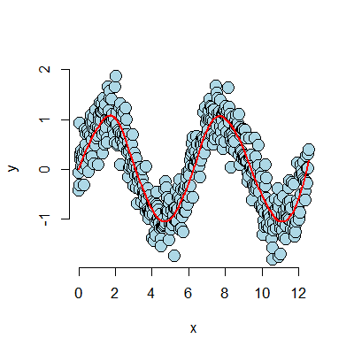
Notice how much smoother the fitted (red) curve is now.
Notes
The collection of regressors is called a basis. People have spent a lot of time thinking about bases for this kind of problem. So, consider this treatment is just a teaser. Further note that a single knot point term can fit hockey stick like processes, as long as you know exactly where the knot point is.
These bases can be used in GLMs as well. Thus, this gives us an easy method for fitting non-linear functions in the linear predictor. An issue with these approaches in either linear or generarlized linear models is the large number of parameters introduced. Most solutions require some method of “regularization”. In this process the effective dimension is reduced by adding a term that penalizes large coefficients.
Harmonics using linear models
Finally, we’d like to end with another basis, perhaps the most famous one.
Consider give a musical chord played continuously, could we use linear models
to discover the notes? In the following simulation I consider the piano keys
from middle C for a full octave.
We’re going to generate our chords as sine curves of the specified frequencies.
Then we’ll fit a linear model with all of the sine curves and look at which
coefficients seem large. Those would make up our chord. I got the note frequencies
here.
 1 ## Chord finder, playing the white keys on a piano from octave c4 - c5
 2 ## Note frequencies in the order of C4, D4, E4, F4, G4, A4, B4, C5
 3 notes4 <- c(261.63, 293.66, 329.63, 349.23, 392.00, 440.00, 493.88, 523.25)
 4 ## The time variable (how long the chord is played and how frequently it is digitall\
 5 y sampled)
 6 t <- seq(0, 2, by = .001); n <- length(t)
 7 ## The notes for a C Major Chord
 8 c4 <- sin(2 * pi * notes4[1] * t); e4 <- sin(2 * pi * notes4[3] * t);
 9 g4 <- sin(2 * pi * notes4[5] * t)
10 ## Create the chord by adding the three together
11 chord <- c4 + e4 + g4 + rnorm(n, 0, 0.3)
12 ## Create a basis that has all of the notes
13 x <- sapply(notes4, function(freq) sin(2 * pi * freq * t))
14 ## Fit the model
15 fit <- lm(chord ~ x - 1)
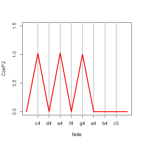
It is interesting to note that what we’re accomplishing is highly related to the famous Discrete Fourier Transform. This is an automatic what to fit all sine and cosine terms available to a set of data. And, the Fast (Discrete) Fourier Transform (FFT) does it about as fast as possible (faster than fitting the linear model). Here, I give some code to show taking the FFT and plotting the coefficients. Notice it lodes on the three notes comprising the chords.
##(How you would really do it)
a <- fft(chord); plot(Re(a)^2, type = "l")
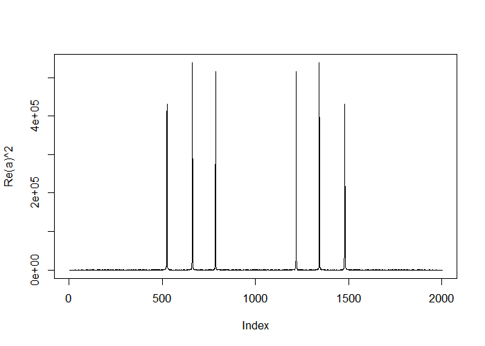
Thanks!
Thanks for your time and attention in reading this book. I hope that you’ve learned some of the basics of linear models and have internalized that these are some incredibly powerful tools. As a next direction, you might consider more coverage of generalized linear models, or looking at the specific cases for correlated data. Thanks again!
Brian
