Table of Contents
- Acknowledgements
- What is d3.js?
- Introduction
- What do we need to get started?
- Starting with a simple graph
-
Things we can do with the simple graph
- Setting up and configuring the Axes
- Adding Axis Labels
- How to add a title to your graph
- Change a line chart into a scatter plot
- Smoothing out graph lines
- Make a dashed line
- Filling an area under the graph
- Adding a drop shadow to allow text to stand out on graphics.
- Adding grid lines to a graph
- Adding more than one line to a graph
- Labelling multiple lines on a graph
- Multiple axes for a graph
-
Elements, Attributes and Styles
- The Framework
-
Elements
- Circle
- Ellipse
- Rectangle
- Line
- Polyline
- Polygon
- Path
- Clipped Path (AKA clipPath)
-
Text
- Anchor at the bottom, middle of the text:
- Anchor at the bottom, right of the text:
- Anchor at the middle, left of the text:
- Anchor in the middle, centre of the text:
- Anchor in the middle, right of the text:
- Anchor at the top, left of the text:
- Anchor at the top, middle of the text:
- Anchor at the top, right of the text:
- Attributes
- Styles
- Manipulating data
- Bar Charts and Histograms
- Tree Diagrams
- Sankey Diagrams
-
Assorted Tips and Tricks
- Change a line chart into a scatter plot
- Adding tooltips.
- What are the predefined, named colours?
- Selecting / filtering a subset of objects
- Select items with an IF statement.
- Applying a colour gradient to a line based on value.
- Applying a colour gradient to an area fill.
- Transitions
- Show / hide an element by clicking on another element
- Using HTML inputs with d3.js
- Add an HTML table to your graph
- More table madness: sorting, prettifying and adding columns
- Adding web links to d3.js objects
- Using the Yahoo Query Language (YQL) to get data.
- Export an image from a d3.js page as a SVG or bitmap
- Understanding JavaScript Object Notation (JSON)
- D3.js Examples Explained
Acknowledgements
Mike
First and foremost I would like to express my thanks to Mike Bostock, the driving force behind d3.js. His efforts are tireless and his altruism in making his work open and available to the masses is inspiring.
The decision for him to leave what must have been an incredible job with the New York Times to return to improving visualisation software (d3.js in particular) has marked him as a very special person indeed. If any reader of this book has the opportunity to support his continuing efforts, please do.
Partners, Supporters and Contributors.
Mike has worked with a crew of like-minded individuals in bringing D3 to the World. Vadim Ogievetsky and Jeffrey Heer share honours for the work on D3: Data-Driven Documents and while there has been a cast of over 40 people contributing to the D3 code base, Jason Davies stands out as the man who has provided a generous portion especially in the area of mapping.
Nick Zhu has created a fantastic resource in dc.js (which is built on top of d3.js and crossfilter) and has been kind enough to provide good advice and permission to include some of his work.
Advice given by Christophe Viau has been a great help in getting me settled into the on-line world and his energy in managing and directing the D3 community is amazing.
Mike Dewar (Getting Started with D3), Scott Murray (Interactive Data Visualization for the Web) and Sebastian Gutierrez (dashingd3js.com) lead the pack for providing high quality reference material for learning D3. Many thanks gentlemen.
Proof Reading
I am particularly grateful for the assistance given by Filiep Spyckerelle and Robin Bennett who selflessly donated their time and expertise in proofreading the earlier edition of D3 Tips and Tricks (d3.js v3) (where this document contains any errors, they are most certainly mine).
In fact Robin has been very quick off the mark and is feeding back areas for improvement in the new book already!
The d3.js Community
Big thanks go out to the D3 community. Whether providing advice on Google Groups or Stack Overflow, contributing examples on bl.ocks.org or just giving back in the form of time and effort to similar work. Well done all.
Cover art
Out of the blue and in yet another example of the friendly and giving nature of people involved in this community I was contacted by Jose (‘Tactician Jenro’) who offered to use his skills to design a cover for the original book. He has subsequently designed the cover for this version and I think he did an awesome job and was super helpful. If you think that he could help you out with a project, you can get in touch with him at @tacticianjenro or via his web site at http://mindthetimes.xyz/.

Leanpub
Lastly, I want to pay homage to Leanpub who have made the publishing of this document possible. They offer an outstanding service for self-publishing and have made the task of providing and distributing content achievable.
Make sure you get the most up to date copy of D3 Tips and Tricks
If you’ve received a copy of this book from any location other than Leanpub then it’s possible that you haven’t got the latest version. Go to https://leanpub.com/d3-t-and-t-v4 and download the most recent version. After all, it won’t cost you anything :-). If you find some value in the work, please consider contributing when you download it so that Leanpub get something for hosting the book (and I’ll think of you fondly while I continue adding content :-D).
What is d3.js?
d3.js (hereafter abridged as D3) is “a JavaScript library for manipulating documents based on data”.
But that description doesn’t do it justice.
D3 is all about helping you to take information and make it more accessible to others via a web browser.
It’s a JavaScript library. That means that it’s a software tool that can be used in conjunction with other software tools to achieve a task. Those other tools are based on web standards such as HTML, SVG and CSS but you don’t need to know too much about them to start using D3 (although it will help :-)).
It’s an open framework, which means that there are no hidden mysteries about how it does its magic and it allows others to contribute to a constant cycle of improvement.
Being built to leverage web standards means that modern browsers don’t have to do anything special to use D3, they just have to support the framework that the Internet has adopted for ease of use.
The beauty of D3 is that it allows you to associate data and what appears on the screen in a way that directly links the two. Change the data and you change the object on the screen. D3’s trick is to let you set what appears on the screen. A circle, a line, a point on a map, a graph, a bouncing ball, a gradient (and way, way more). Once the data and the object are linked the possibilities are endless.
D3 bridges the gap between the static display of data and the desire of people to represent it dynamically. That applies equally to the developer who wants to show something cool and to the end user who wants to be able to explore information interactively.
It was (and still is being) developed by Mike Bostock who has not just spent time writing the code, but writing the documentation for D3 as well. There is an extensive community of supporters who also contribute to the code, provide technical support online and generally have fun creating amazing visualizations. Their contributions are extraordinary (you only have to look at the work of Jason Davies to be amazed).
This book has been written to incorporate the changes in version 4 of d3.js to the original edition of D3 Tips and Tricks. If you’re looking for the equivalent for version 3 you can find it here.
Introduction
I never set out to write treatise on D3… But here I am three years after publishing the first version of this book and I’m in the process of updating it for version 4 of d3.js, while also looking back at a range of other books that have been written as a result of this first foray into publishing.
I am a simple user of this extraordinary framework and when I say simple, I really mean I had no idea how to get it to do anything when I started; I needed to do a lot of searching and learned by trial-and-error (emphasis on the errors which were entirely mine). The one thing that I did know was that the example graphics shown by Mike Bostock and others were the sort of graphical goodness that I wanted to play with.
So to get from the point of having no skills whatsoever to the point where I could begin to code up something to display data in a way I wanted, I had to capture the information as I went. The really cool thing about this sort of process is that it doesn’t need to occur all at once. You can start with no knowledge whatsoever (or pretty close) and by standing on the shoulders of other’s work, you can add building blocks to improve what you’re seeing and then change the blocks to adapt and improve.
For example (and this is pretty much how it started). I wanted to draw a line graph, so I imported an example and then got it running locally on my computer. Then I worked out how to change the example data for my data. Then I worked out how to move the Y axis from the right to the left. Then how to make the axis labels larger, change the tick size, make the lines fatter, change the colour, add a label, fill the area under the graph, put the graph in the centre of the page, add a glow to the text to help it stand out, put it in a framework (bootstrap), add buttons to change data sets, animate the transitions between data sets, update the data automatically when it changed, add a pan and zoom feature, turn parts of the graph into hyperlinks to move to other graphs… And then I started on bar graphs :-).
The point to take away from all of this is that any one graph is just a collection of lots of blocks of code, each block designed to carry out a specific function. Pick the blocks you want and implement them.
I found it was much simpler to work on one thing (block) at a time, and this helped greatly to reduce the uncertainty factor when things didn’t work as anticipated. I’m not going to pretend that everything I’ve done while trying to build graphs employs the most elegant or efficient mechanism, but in the end, if it all works on the screen, I walk away happy :-). That’s not to say I have deliberately ignored any best practices – I just never knew what they were. Likewise, wherever possible, I have tried to make things as extensible as possible.
D3 has also steered down the road of providing standalone micro-libraries available as components and this flexibility continues to redefine the maxim of change being the only constant in the software world.
You will find that I have typically eschewed a simple “Do this approach” for more of a story telling exercise. This means that some explanations are longer and more flowery than might be to everyone’s liking, but there you go, try to be brave :-)
I’m sure most authors try to be as accessible as possible. I’d like to do the same, but be warned… There’s a good chance that if you ask me a technical question I may not know the answer. So please be gentle with your emails :-).
Email: ‘d3noobmail+contact@gmail.com’
What do we need to get started?
Let’s be honest with each other. D3 is not the simplest way to draw a graph.
However, that doesn’t mean that it’s beyond those with a little computer savy and a willingness to experiment. Remember failure is your friend (I am fairly sure that I am also related by blood). Just learn from your mistakes and it’ll all work out.
So, here in no particular order is a list of good things to know. None of which are essential, but any one (or more) of which will make your life slightly easier.
- HyperText Markup Language (HTML)
- JavaScript
- Cascading Style Sheets (CSS)
- Web Servers
- PHP
HTML
This stands for HyperText Markup Language and is the stuff that web pages are made of. Check out the definition and other information on Wikipedia for a great overview. Just remember that all you’re going to use HTML for is to hold the code that you will use to present your information. This will be as a .html (or .htm) file and they can be pretty simple (we’ll look at some in a moment).
JavaScript
JavaScript is what’s called a ‘scripting language’. It is the code that will be contained inside the HTML file that will make D3 do all its fanciness. In fact, D3 is a JavaScript Library, it’s the native language for using D3.
Knowing a little bit about this would be really good, but to be perfectly honest, I didn’t know anything about it before I started. I read a book along the way (JavaScript: The Missing Manual from O’Reilly) and that helped with context, but the examples that are available for D3 graphics are understandable, and with a bit of trial and error, you can figure out what’s going on.
In fact, most of what this collection of information’s about is providing examples and explanations for the JavaScript components of D3.
Cascading Style Sheets (CSS)
Cascading Style Sheets (everyone tends to call them ‘Style Sheets’ or ‘CSS’) is a language used to describe the formatting (or “look and feel”) of a document written in a markup language. The job of CSS is to make the presentation of the components you will draw with D3 simpler by assigning specific styles to specific objects. One of the cool things about CSS is that it is an enormously flexible and efficient method for making everything on the screen look more consistent and when you want to change the format of something you can just change the CSS component and the whole look and feel of your graphics will change.
Web Servers
Web servers can go one of two ways. If you have access to a web server and know where to put the files so that you can access them with your browser, you’re in a good place. If you’re not quite sure, read on…
A web server will allow you to access your HTML files and will provide the structure that allows it to be displayed on a web browser. There are some simple instructions on the main D3 wiki page for setting up a local server. Or you might have access to a remote one and be able to upload your files. However, for a little more functionality and a whole lot of ease of use, I can thoroughly recommend WampServer (WAMP) as a free and simple way to set up a local web server that includes PHP and a MySQL database (more on those later). Go to the WampServer web page (http://www.wampserver.com/en/) and see if it suits you.
Throughout this document I will be describing the files and how they’re laid out in a way that has suited my efforts while using WAMP, but they will work equally well on a remote server. I will explain a little more about how I arrange the files later in the ‘Getting D3’ section.

There are other options of course. You could host code on GitHub and present the resulting graphics on bl.ocks.org. This is a great way to make sure that your code is available for peer review and sharing with the wider community.
One such alternative option that I have recently started playing with is Plunker (http://plnkr.co/) This is a lightweight collaborative online editing tool. It’s so cool I wrote a special section for it which you can find later in this document. This is definitely worth trying if you want to use something simple without a great deal of overhead. If you like what you see, perhaps consider an alternative that provides a greater degree of capability if you go on to greater d3.js things.
PHP
PHP is a scripting language for the web. That is to say that it is a programming language which is executed when you load web pages and it helps web pages do dynamic things.
You might think that this sounds familiar and that JavaScript does the same thing. But not quite.
JavaScript is designed so that it travels with the web page when it is downloaded by a browser (the client). However, PHP is executed remotely on the server that supplies the web page. This might sound a bit redundant, but it’s a big deal. This means that the PHP which is executed doesn’t form part of the web page, but it can form the web page. The implication here is that the web page you are viewing can be altered by the PHP code that runs on a remote server. This is the dynamic aspect of it.
In practice, PHP could be analogous to the glue that binds web pages together. Allowing different portions of the web page to respond to directions from the end user.
It is widely recognised not only as a relatively simple language to learn, but also as a fairly powerful one. At the same time it comes into criticism for being somewhat fragmented and sometimes contradictory or confusing. But in spite of any perceived shortcomings, it is a very widely used and implemented language and one for which there is no obvious better option.
Other Useful Stuff
Text Editor
A good text editor for writing up your code will be a real boost. Don’t make the fatal mistake of using an office word processor or similar. THEY WILL DOOM YOU TO A LIFE OF MISERY. They add in crazy stuff that you can’t even see and never save the files in a way that can be used properly.
Preferably, you should get an editor that will provide some assistance in the form of syntax highlighting which is where the editor knows what language you are writing in (JavaScript for example) and highlights the text in a way that helps you read it. For example, it will change text that might appear as this;
Into something like this;
// Get the data
d3.tsv("data/data.tsv", function(error, data) {
data.forEach(function(d) {
    d.date = parseDate(d.date);
    d.close = +d.close;
});
Infinitely easier to use. Trust me.
There are plenty of editors that will do the trick. I have a preference for Geany, mainly because it’s what I started with and it grew on me :-).
Getting D3
Luckily this is pretty easy and could go one of two ways.
Host d3.js locally
Go to the D3 repository on github and download the entire repository by clicking on the ‘ZIP’ button.

What you do with it from here depends on how you’re hosting your graphs. If you’re working on them on your local PC, then you will want to have the d3.js file in the path that can be seen by the browser. Again, I would recommend WAMP (a local web server) to access your files locally. If you’re using WAMP, then you just have to make sure that it knows to use a directory that will contain the d3 directory and you will be away.
Use a remote CDN to always use the latest version of d3.js
The alternative to downloading d3.js and using it locally is to always retrieve it from an online source. For d3.js this could be done via having the following line in our JavaScript; <script src="https://d3js.org/d3.v4.min.js"></script>. This method has the advantage of always using the latest version of D3 and is especially useful if your visualisations are hosted somewhere like bl.ocks.org.
Potential directory structure
The following image is intended to provide a very crude overview of how we can set up the directories for our web server.
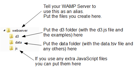
- webserver: Use this as our ‘base’ directory where you put our files that we create. That way when we open our browser we point to this directory and it allows us to access the files like a normal web site.
- d3: This would be our unzipped d3 directory. It contains all the examples and more importantly the d3.v4.js file that we need to get things going. To do this we would include a line like the following;
<script type="text/javascript" src="d3/d3.v4.js"></script>
This tells our browser that from the file it is running (one of the html graph files) if it goes into the ‘d3’ folder it will find the d3.v4.js file that it can load.
- data: I use this directory to hold any data files that I would use for processing. For example, you will see the following line in the code examples that follow
d3.csv("data/data.csv", function(error, data) {. Again, that’s telling the browser to go into the ‘data’ directory and to load the ‘data.csv’ file. - js: Often we will find that we will want to include other JavaScript libraries to load. This is a good place to put them.
Where to get information on d3.js
D3 has made huge advances in providing an extensible and practical framework for manipulating data as web objects. At the same time there has been significant increase in information available for people to use it. The following is a far from exhaustive list of sources, but from my own experience it represents a useful subset of knowledge.
d3js.org
d3js.org would be the first port of call for people wanting to know something about d3.js.
From the overview on the main page you can access a dizzying array of examples that have been provided by the founder of d3 (Mike Bostock) and a host of additional developers, artists, coders and anyone who has something to add to the sum knowledge of cool things that can be done with D3.
There is a link to a documentation page that serves as a portal to the ever important API reference, contributed tutorials and other valuable links (some of which I will mention in paragraphs ahead).
The last major link is to the Github repository where you can download d3.js itself.
It is difficult to overstate the volume of available information that can be accessed from d3js.org. It stands alone as the one location that anyone interested in D3 should visit.
Google Groups
There is a Google Group dedicated to discussions on d3.js.
In theory this forum is for discussions on topics including visualization design, API design, requesting new features, etc. With a specific direction made in the main header that “If you want help using D3, please use the d3.js tag on Stack Overflow!”.
In practice however, it would appear that a sizeable proportion of the posts there are technical assistance requests of one type or another. Having said that this means that if you’re having a problem, there could already be a solution posted there. However, if at all possible the intention is certainly that people use Stack Overflow, so this should be the first port of call for those types of inquiry.
So, by all means add this group as a favourite and this will provide you with the opportunity to receive emailed summaries of postings or just an opportunity to easily browse recent goings-on.
Stack Overflow
Stack Overflow is a question and answer site whose stated desire is “to build a library of detailed answers to every question about programming”. Ambitious. So how are they doing? Actually really well. Stack overflow is a fantastic place to get help and information. It’s also a great place to help people out if you have some knowledge on a topic.
They have a funny scheme for rewarding users that encourages providing good answers based on readers voting. It’s a great example of gamification working well. If you want to know a little more about how it works, check out this page; http://stackoverflow.com/about.
They have a d3.js tag (http://stackoverflow.com/questions/tagged/d3.js) and like Google Groups there is a running list of different topics that are an excellent source of information.
Github
Github is predominantly a code repository and version control site. It is highly regarded for its technical acumen and provides a fantastic service that is broadly used for many purposes. Not the least of which is hosting the code (and the wiki) for d3.js.
Whilst not strictly a site that specialises in providing a Q & A function, there is a significant number of repositories which mention d3.js. With the help from an astute search phrase, there is potentially a solution to be found there.
The other associated feature of Github is Gist. Gist is a pastebin service (a place where you can copy and past code) that can provide a ‘wiki like’ feature for individual repositories and web pages that can be edited through a Git repository. Gist plays a role in providing the hub for the bl.ocks.org example hosting service set up by Mike Bostock.
For a new user, Github / Gist can be slightly daunting. It’s an area where you will get most value by understanding something about the services before you start using them. This is certainly true if you want to make use of its incredible features that are available for hosting code. However, if you want to browse other peoples code it’s an easier introduction. Have a look through what’s available and if you feel so inclined, I recommend that you learn enough to use their service. It’s time well spent.
bl.ocks.org
bl.ocks.org is a viewer for code examples which are hosted on Gist. You are able to load your code into Gist, and then from bl.ocks.org you can view them.
This is a really great way for people to provide examples of their work and there are many who do. However, it’s slightly tricky to know what is there. There is a project that will help with searching the bl.ocks for key words. This is an immensely valuable service that should be a highlight for someone wanting inspiration or assistance.
I would describe the process of getting your own code hosted and displaying as something that will be slightly challenging for people who are not familiar with Github / Gist, but again, in terms of visibility of the code and providing an external hosting solution, it is excellent and well worth the time to get to grips with.
Twitter provides a great alerting service to inform a large disparate group of people about stuff.
It’s certainly a great way to keep in touch on an hour by hour basis with people who are involved with d3.js and this can be accomplished in a couple of ways. First, find as many people from the various D3 sites around the web who you consider to be influential in areas you want to follow (different aspects such as development, practical output, educational (etc) and follow them. Even better, I found it useful to find a small subset who I considered to be influential people and I noted who they followed. It’s a bit ‘stalky’ if you’re unfamiliar with it, but the end result should be a useful collection of people with something useful to say.
Books
The following books are referenced on the D3 wiki;
- Getting Started with D3: Mike Dewar, O’Reilly Media, June 2012
- Interactive Data Visualization for the Web: Scott Murray, O’Reilly Media, November 2012
- Data Visualization with d3.js: Swizec Teller, Packt Publishing, October 2013
- Data Visualization with D3.js Cookbook: Nick Qi Zhu, Packt Publishing, October 2013
- Mastering D3.js: Pablo Navarro Castillo, Packt Publishing, August 2014
- D3.js in Action: Elijah Meeks, Manning Publications, 2014
- Learning D3.js Mapping: Thomas Newton, Oscar Villarreal, Packt Publishing, 2014
- Visual Storytelling with D3: Ritchie King, Addison-Wesley, 2014
- D3 on AngularJS: Ari Lerner + Victor Powell, Leanpub, 2014
Of course, there is also the original paper that launched D3 D3: Data-Driven Documents by Michael Bostock, Vadim Ogievetsky and Jeffrey Heer (IEEE Trans. Visualization & Comp. Graphics (Proc. InfoVis), 2011)
Starting with a simple graph
We’ll start with the full code for a simple graph and then we can go through it piece by piece.
Here’s what the basic graph looks like;
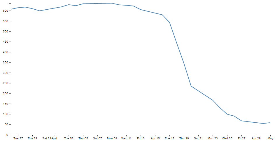
And here’s the code that makes it happen;
<!DOCTYPE html>
<meta charset="utf-8">
<style> /* set the CSS */

.line {
  fill: none;
  stroke: steelblue;
  stroke-width: 2px;
}

</style>
<body>

<!-- load the d3.js library -->
<script src="https://d3js.org/d3.v4.min.js"></script>
<script>

// set the dimensions and margins of the graph
var margin = {top: 20, right: 20, bottom: 30, left: 50},
    width = 960 - margin.left - margin.right,
    height = 500 - margin.top - margin.bottom;

// parse the date / time
var parseTime = d3.timeParse("%d-%b-%y");

// set the ranges
var x = d3.scaleTime().range([0, width]);
var y = d3.scaleLinear().range([height, 0]);

// define the line
var valueline = d3.line()
    .x(function(d) { return x(d.date); })
    .y(function(d) { return y(d.close); });

// append the svg obgect to the body of the page
// appends a 'group' element to 'svg'
// moves the 'group' element to the top left margin
var svg = d3.select("body").append("svg")
    .attr("width", width + margin.left + margin.right)
    .attr("height", height + margin.top + margin.bottom)
  .append("g")
    .attr("transform",
          "translate(" + margin.left + "," + margin.top + ")");

// Get the data
d3.csv("data.csv", function(error, data) {
  if (error) throw error;

  // format the data
  data.forEach(function(d) {
      d.date = parseTime(d.date);
      d.close = +d.close;
  });

  // Scale the range of the data
  x.domain(d3.extent(data, function(d) { return d.date; }));
  y.domain([0, d3.max(data, function(d) { return d.close; })]);

  // Add the valueline path.
  svg.append("path")
      .data([data])
      .attr("class", "line")
      .attr("d", valueline);

  // Add the X Axis
  svg.append("g")
      .attr("transform", "translate(0," + height + ")")
      .call(d3.axisBottom(x));

  // Add the Y Axis
  svg.append("g")
      .call(d3.axisLeft(y));

});

</script>
</body>
The full code for this example can be found on github or in the code samples bundled with this book (simple-graph.html and data.csv). A live example can be found on bl.ocks.org. Please note that the <head></head> tags are omitted which is a common thing for d3 examples (It’s presumably an effort to reduce potentially distracting code for when modern browsers can cope with the omission).
Once we’ve finished working through the explanation of the functional blocks that make up the graph, we’ll start looking at what we need to add in and adjust so that we can incorporate other useful functions that are completely reusable in other diagrams as well.
Working on the premiss that we can break the file down into component parts we will explain the major blocks as HTML, CSS and JavaScript. I’m going to play kind of fast and loose here, but never fear, it’ll all make sense.
HTML
Here’s the HTML portion of the code;
<!DOCTYPE html>
<meta charset="utf-8">
<style>

    The CSS is in here

</style>
<body>
<script src="https://d3js.org/d3.v4.min.js"></script>

<script>

    The D3 JavaScript code is here

</script>
</body>
Compare it with the full code. It kind of looks like a wrapping for the CSS and JavaScript. You can see that it really doesn’t boil down to much at all (that doesn’t mean it’s not important).
There are plenty of good options for adding additional HTML stuff into this very basic part of the file, but for what we’re going to be doing, we really don’t need to bother too much.
One thing probably worth mentioning is the line;
<script src="https://d3js.org/d3.v4.min.js"></script>
That’s the line that identifies the file that needs to be loaded to get D3 up and running. In this case the file is sourced from the official d3.js repository on the Internet (that way we are using the most up to date version). The D3 file is actually called d3.v4.min.js which may come as a bit of a surprise. That tells us that this is version 4 of the d3.js file (the v4 part) which is an indication that it is separate from the v3 release, which was superseded in the middle of 2016. The other point to note is that this version of d3.js is the minified version (hence min). This means that any extraneous information has been removed from the file to make it quicker to load.
Later when doing things like implementing integration with bootstrap (a pretty layout framework) we will be doing a great deal more, but for now, that’s the basics done.
The two parts that we left out are the CSS and the D3 JavaScript.
Cascading Style Sheets (CSS)
The CSS is as follows;
.line {
  fill: none;
  stroke: steelblue;
  stroke-width: 2px;
}
Cascading Style Sheets (CSS) give you control over the look / feel / presentation of web content. The idea is to define a set of properties to objects in the web page.
They are made up of ‘rules’. Each rule has a ‘selector’ and one or more ‘declarations’ and each declaration has a property and a value (or a group of properties and values).
For instance in the example code for this web page we have the following rule;
.line {
  fill: none;
  stroke: steelblue;
  stroke-width: 2px;
}
line is the selector. The period (.) in front of line indicates that the selector is a ‘class’. This tells us that on the web page, any particular element (and we are going to apply this rule to the line of our graph) which we decorate with the ‘class’, line will have the various declarations applied to it.
There are three declarations as part of the rule. These are contained within the curly braces and separated by semi-colons.
One of the declarations is for the width of the graph line (stroke-width: 2px;) The property is stroke-width: and the value is 2px (2 pixels). This tells the web page that any element in the web page that has the class line will have lines drawn that are (amongst other things) 2 pixels wide.
Sure enough if we look at the line of the graph…

That looks as if the line might actually be 2 pixels wide!
Let’s try a test. We can change that particular declaration to the following;
stroke-width: 20px;
and the result is…

Ahh…. 20 pixels of goodness!
Because we’re getting the hang of things now, let’s change the colour declaration to…
stroke: red;
and we get…

Awesome! I think we can safely say that this has had the desired effect.
So what else is there?
Since there’s only one declaration left, it seems like a shame not to try something different with it;
fill: blue;
We’ll get…
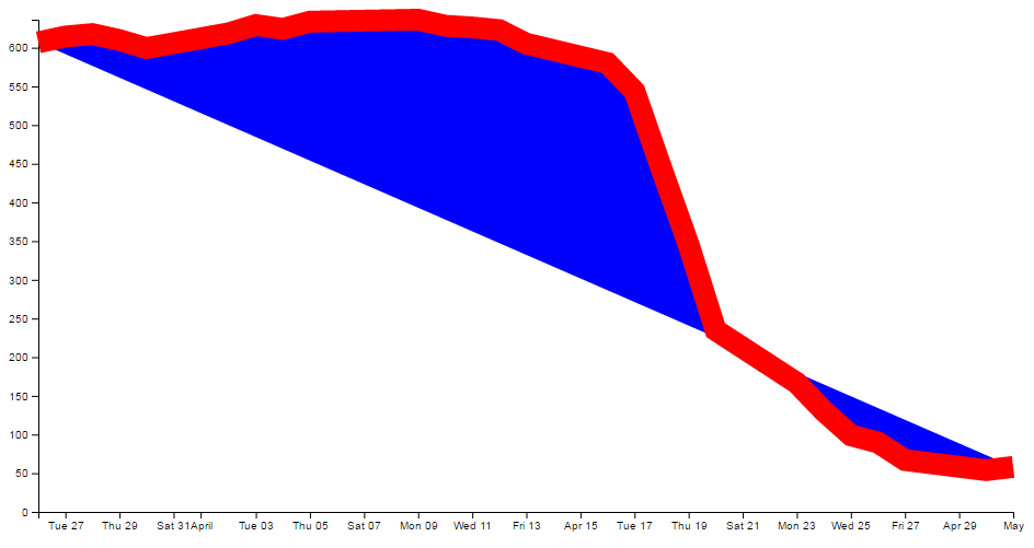
So the ‘fill’ property looks like it will change the colour of the area that would be closed by the line. Nice.
The one thing to take away from this small exercise is that there is a good deal of flexibility in adjusting properties of elements on the web page via CSS.
D3 JavaScript
The D3 JavaScript part of the code is as follows;
// set the dimensions and margins of the graph
var margin = {top: 20, right: 20, bottom: 30, left: 50},
    width = 960 - margin.left - margin.right,
    height = 500 - margin.top - margin.bottom;

// parse the date / time
var parseTime = d3.timeParse("%d-%b-%y");

// set the ranges
var x = d3.scaleTime().range([0, width]);
var y = d3.scaleLinear().range([height, 0]);

// define the line
var valueline = d3.line()
    .x(function(d) { return x(d.date); })
    .y(function(d) { return y(d.close); });

// append the svg obgect to the body of the page
// appends a 'group' element to 'svg'
// moves the 'group' element to the top left margin
var svg = d3.select("body").append("svg")
    .attr("width", width + margin.left + margin.right)
    .attr("height", height + margin.top + margin.bottom)
  .append("g")
    .attr("transform",
          "translate(" + margin.left + "," + margin.top + ")");

// Get the data
d3.csv("data.csv", function(error, data) {
  if (error) throw error;

  // format the data
  data.forEach(function(d) {
      d.date = parseTime(d.date);
      d.close = +d.close;
  });

  // Scale the range of the data
  x.domain(d3.extent(data, function(d) { return d.date; }));
  y.domain([0, d3.max(data, function(d) { return d.close; })]);

  // Add the valueline path.
  svg.append("path")
      .data([data])
      .attr("class", "line")
      .attr("d", valueline);

  // Add the X Axis
  svg.append("g")
      .attr("transform", "translate(0," + height + ")")
      .call(d3.axisBottom(x));

  // Add the Y Axis
  svg.append("g")
      .call(d3.axisLeft(y));

});
Again there’s quite a bit of detail in the code, but it’s not so long that we can’t work out what’s doing what.
The first thing to note is that throughout the code we have lines that are adding a description of what the code does. These have two forward-stroke characters (//) preceding them which the computer will recognise as a line that only contains comments. I recommend that you add them into your own code where you think that you might want reminding of a function or description.
Let’s examine the blocks bit by bit to get a feel for it.
Setting up the margins and the graph area.
The part of the code responsible for defining the canvas (or the area where the graph and associated bits and pieces is placed ) is this part.
var margin = {top: 20, right: 20, bottom: 30, left: 50},
    width = 960 - margin.left - margin.right,
    height = 500 - margin.top - margin.bottom;
This is really (really) well explained on Mike Bostock’s page on margin conventions here http://bl.ocks.org/3019563, but at the risk of confusing you here’s my crude take on it.
The first line defines the four margins which surround the block where the graph (as an object) is positioned.
var margin = {top: 20, right: 20, bottom: 30, left: 50},
So there will be a border of 20 pixels at the top, 20 at the right and 30 and 50 at the bottom and left respectively. Now the cool thing about how these are set up is that they use a JavaScript object to define everything. That means if you want to do calculations in the JavaScript later, you don’t need to put the numbers in, you just use the variable that has been set up. In this case margin.right = 20!
So when we go to the next line;
width = 960 - margin.left - margin.right,
The width of the inner block of the area where the graph will be drawn is 960 pixels – margin.left – margin.right or 960-50-20 or 890 pixels wide. Of course now we have another variable ‘width’ that we can use later in the code.
Obviously the same treatment is given to height.
Another cool thing about all of this is that just because we appear to have defined separate areas for the graph and the margins, the whole area in there is available for use. It just makes it really useful to have areas designated for the axis labels and graph labels without having to juggle them and the graph proper at the same time.
So, let’s have a play and change some values.
var margin = {top: 80, right: 20, bottom: 80, left: 50},
    width = 400 - margin.left - margin.right,
    height = 270 - margin.top - margin.bottom;
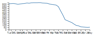
Here we’ve made the graph narrower (400 pixels) but retained the left / right margins and increased the top / bottom margins while changing the overall height of the canvas to 270 pixels. The really cool thing that you can tell from this is that while we shrank the dimensions of the area that we had to draw the graph in, it was still able to dynamically adapt the axes and line to fit properly (Although the x axis values got a bit squished. Don’t worry we’ll work through that shortly). That is the really cool part of this whole business. D3 is running in the background looking after the drawing of the objects, while you get to concentrate on how the data looks without too much maths!
Getting the Data
We’re going to jump forward a little bit here to the portion of the JavaScript code that loads the data for the graph.
I’m going to go out of the sequence of the code here, because if you know what the data is that you’re using, it will make explaining some of the other functions much easier.
The section that grabs the data is this bit.
d3.csv("data.csv", function(error, data) {
  if (error) throw error;

// format the data
  data.forEach(function(d) {
      d.date = parseTime(d.date);
      d.close = +d.close;
  });
There’s lots of different ways that we can get data into our web page and turn it into graphics. The method that we’ll want to use will probably depend more on the format that the data is in than the mechanism we want to use for importing.
For instance, if it’s only a few points of data we could include the information directly in the JavaScript.
That would make it look something like;
var data = [
    {date:"1-May-12",close:"58.13"},
    {date:"30-Apr-12",close:"53.98"},
    {date:"27-Apr-12",close:"67.00"},
    {date:"26-Apr-12",close:"89.70"},
    {date:"25-Apr-12",close:"99.00"}
];
The format of the data shown above is called JSON (JavaScript Object Notation) and it’s a great way to include data since it’s easy for humans to read what’s in there and it’s easy for computers to parse the data out. For a brief overview of JSON there is a separate section in the “Assorted Tips and Tricks Chapter” that may assist.
But if you’ve got a fair bit of data or if the data you want to include is dynamic and could be changing from one moment to the next, you’ll want to load it from an external source. That’s when we call on D3’s ‘Request’ functions.
The different types of data that can be requested by D3 are;
- text: A plain old piece of text that has options to be encoded in a particular way.
- json: This is the aforementioned JavaScript Object Notation.
- xml: Extensible Markup Language is a language that is widely used for encoding documents in a human readable forrm.
- html: HyperText Markup Language is the language used for displaying web pages.
- csv: Comma Separated Values is a widely used format for storing data where plain text information is separated by (wait for it) commas.
- tsv: Tab Separated Values is a widely used format for storing data where plain text information is separated by a tab-stop character.
Details on these ingestion methods and the formats for the requests are well explained on the D3 Wiki page. In this particular script we will look at the csv request method.
Back to our request…
d3.csv("data.csv", function(error, data) {
  if (error) throw error;

// format the data
  data.forEach(function(d) {
      d.date = parseTime(d.date);
      d.close = +d.close;
  });
The first line of that piece of code invokes the d3.csv request (d3.csv) and then the function is pointed to the data file that should be loaded (data.csv). This is referred to as the ‘URL’ (Unique Resource Locator) of the file. In this case the file is stored locally (in the same directory as the simple-graph.html file), but the URL could just as easily point to a file somewhere on the Internet.
The format of the data in the data.csv file looks a bit like this (although the file is longer (about 26 data points));
The ‘date’ and the ‘close’ heading labels are separated by a comma as are each subsequent date and number. Hence the ‘comma separated values’ :-).
The next part is part of the coolness of JavaScript. With the request for the file made, the script is told to carry out a function on the data (which will now be called ‘data’).
function(error, data) {
The function statement will catch any error that is generated and load the data that is ingested as the array ‘data’. The following line ensures that any errors that are generated are captured and ‘thrown’ to an appropriate ‘catch’ block (if it exists) in the function. If it doesn’t exist the program will terminate.
There are actually more things that get acted on as part of the function call (which we will examine soon), but the one we will consider here is contained in the following lines;
  data.forEach(function(d) {
      d.date = parseTime(d.date);
      d.close = +d.close;
  });
This block of code ensures that all the values that are pulled out of the csv file are set and formatted correctly. The first line declares that the data array called ‘data’ (confusingly) is being dealt with and tells the block of code that, for each group within the ‘data’ array it should carry out a function on it. Furthermore, when it carries out the formatting of each part of the array, it should designate the equivalent of each row as being ‘d’.
data.forEach(function(d) {
The information in the array can be considered as being stored in rows. Each row consists of two values: one value for ‘date’ and another value for ‘close’.
The function is pulling out values of ‘date’ and ‘close’ one row at a time.
Each time (Get it? forEach?) it gets a value of ‘date’ and ‘close’ it carries out the following operations;
d.date = parseTime(d.date);
For each value of date being operated on (d.date), d3.js changes it into a date format that is processed via a separate function ‘parseTime’. (The parseTime function is defined in a separate part of the script, and we will examine that later.) For the moment, be satisfied that it takes the raw date information from the CSV file in each row and converts it into a format that D3 can recognise as a date/time. That value is then re-saved in the same variable space.
The next line then sets the ‘close’ variable to a numeric value (if it isn’t already) using the ‘+’ operator.
d.close = +d.close;
At the end of this section of code, we have gone out and picked up a file with data in it of a particular type (comma separated values) and ensured that it is formatted in a way that the rest of the script can use correctly.
Now, the astute amongst you will have noticed that in the first line of that block of code (d3.csv("data.csv", function(error, data) {) we opened a normal bracket ( ( ) and a curly bracket ( { ), but we never closed them. That’s because they stay open until the very end of the file. That means that all those blocks that occur after the d3.csv bit are referenced to the data array. Or put another way, it uses the data in the data array to draw stuff!
But anyway, let’s get back to figuring what the code is doing by jumping back to the end of the margins block.
Formatting the Date / Time.
One of the glorious things about the World is that we all do things a bit differently. One of those things is how we refer to dates and time.
In my neck of the woods, it’s customary to write the date as day - month – year. E.g 23-12-2012. But in the United States the more common format would be 12-23-2012. Likewise, the data may be in formats that name the months or weekdays (E.g. January, Tuesday) or combine dates and time together (E.g. 2012-12-23 15:45:32). So, if we were to attempt to try to load in some data and to try and get D3 to recognise it as date / time information, we really need to tell it what format the date / time is in.
Time for a little demonstration (see what I did there).
We will change our data.csv file so that it only includes two points. The first one and the last one with a separation of a month and a bit. It will therefore look a little like this;
The graph now looks like this;
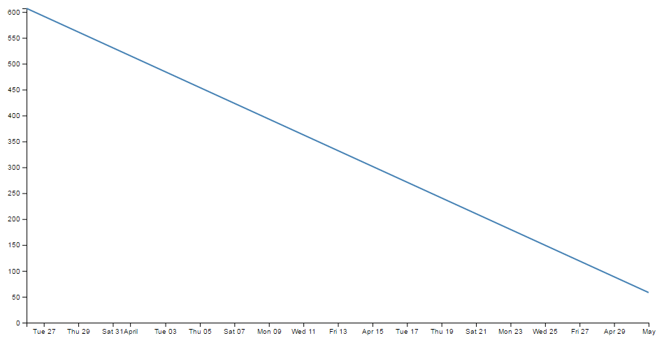
Nothing too surprising here, a very simple graph (note the time scale on the x axis).
Now we will change the later date in the data.csv file so that it is a lot closer to the starting date;
So, just a three day difference. Let’s see what happens.
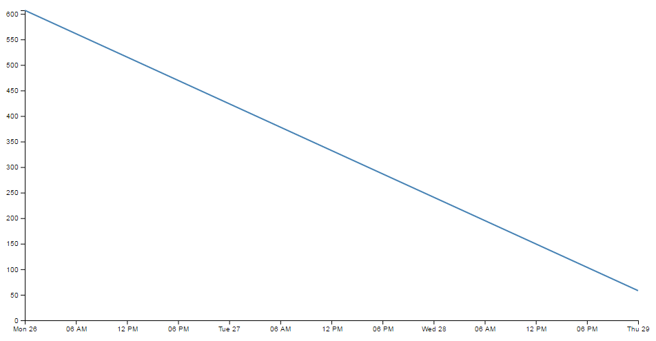
Ahh…. Not only did we not have to make any changes to our JavaScript code, but it was able to recognise the dates were closer and fill in the intervening gaps with appropriate time / day values. Now, one more time for giggles.
This time we’ll stretch the interval out by a few years.
and the result is…
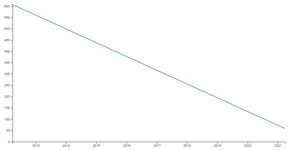
Hopefully that’s enough encouragement to impress upon you that formatting the time is a REALLY good thing to get right. Trust me, it will never fail to impress :-).
Back to formatting.
The line in the JavaScript that parses the time is the following;
var parseTime = d3.timeParse("%d-%b-%y");
This line is used when the data.forEach(function(d) portion of the code (that we looked at a couple of pages back) used d.date = parseTime(d.date) as a way to take a date in a specific format and to get it recognised by D3. In effect it said “take this value that is supposedly a date and make it into a value I can work with”.
The function used is the d3.timeParse(specifier) function where the specifier in this case is the mysterious combination of characters %d-%b-%y. The good news is that these are just a combination of directives specific for the type of date we are presenting.
The % signs are used as prefixes to each separate format type and the ‘-’ (minus) signs are literals for the actual ‘-’ (minus) signs that appear in the date to be parsed.
The d refers to a zero-padded day of the month as a decimal number [01,31].
The b refers to an abbreviated month name.
And the y refers to the year (without the centuries) as a decimal number.
If we look at a subset of the data from the data.csv file we see that indeed, the dates therein are formatted in this way.
That’s all well and good, but what if your data isn’t formatted exactly like that?
Good news. There are multiple different formatters for different ways of telling time and you get to pick and choose which one you want. Check out the Time Formatting page on the D3 Wiki for the authoritative list and some great detail, but the following is the list of currently available formatters (from the d3 wiki);
- %a - abbreviated weekday name.
- %A - full weekday name.
- %b - abbreviated month name.
- %B - full month name.
- %c - date and time, as “%a %b %e %H:%M:%S %Y”.
- %d - zero-padded day of the month as a decimal number [01,31].
- %e - space-padded day of the month as a decimal number [ 1,31].
- %H - hour (24-hour clock) as a decimal number [00,23].
- %I - hour (12-hour clock) as a decimal number [01,12].
- %j - day of the year as a decimal number [001,366].
- %m - month as a decimal number [01,12].
- %M - minute as a decimal number [00,59].
- %p - either AM or PM.
- %S - second as a decimal number [00,61].
- %U - week number of the year (Sunday as the first day of the week) as a decimal number [00,53].
- %w - weekday as a decimal number [0(Sunday),6].
- %W - week number of the year (Monday as the first day of the week) as a decimal number [00,53].
- %x - date, as “%m/%d/%y”.
- %X - time, as “%H:%M:%S”.
- %y - year without century as a decimal number [00,99].
- %Y - year with century as a decimal number.
- %Z - time zone offset, such as “-0700”.
- There is also a a literal “%” character that can be presented by using double % signs.
As an example, if you wanted to input date / time formatted as a generic MySQL ‘YYYY-MM-DD HH:MM:SS’ TIMESTAMP format the D3 parse script would look like;
parseTime = d3.timeParse("%Y-%m-%d %H:%M:%S");
Setting Scales Domains and Ranges
This is another example where, if you set it up right, D3 will look after you forever.
From our basic web page we have now moved to the section that includes the following lines;
// set the ranges
var x = d3.scaleTime().range([0, width]);
var y = d3.scaleLinear().range([height, 0]);
The purpose of these portions of the script is to ensure that the data we ingest fits onto our graph correctly. Since we have two different types of data (date/time and numeric values) they need to be treated separately (but d3 manages them in almost the same way). To examine this whole concept of scales, domains and ranges properly, we will also move slightly out of sequence and (in conjunction with the earlier scale statements) take a look at the lines of script that occur later and set the domain. They are as follows;
  // Scale the range of the data
  x.domain(d3.extent(data, function(d) { return d.date; }));
  y.domain([0, d3.max(data, function(d) { return d.close; })]);
The idea of scaling is to take the range of values of data that we have and to fit them into the space we have available.
If we have data that goes from 53.98 to 636.23 (as the data we have for ‘close’ in our csv file does), but we have a graph that is 450 pixels high (height = 500 - margin.top – margin.bottom;) we clearly need to make an adjustment.
Not only that. Even though our data goes from 53.98 to 636.23, that would look slightly misleading on the graph and it should really go from 0 to a bit over 636.23. It sounds really complicated, so let’s simple it up a bit.
First we make sure that any quantity we specify on the x axis fits onto our graph.
var x = d3.scaleTime().range([0, width]);
Here we set our variable (x) that will tell D3 where to draw something on the x axis. By using the d3.scaleTime() function we make sure that D3 knows to treat the values as date / time entities (with all their ingrained peculiarities). Then we specify the range that those values will cover (.range) and we specify the range as being from 0 to the width of our graphing area (See? Setting those variables for margins and widths are starting to pay off now!).
Then we do the same for the Y axis.
var y = d3.scaleLinear().range([height, 0]);
There’s a different function call (d3.scaleLinear()) but the .range setting is still there. In the interests of drawing a (semi) pretty picture to try and explain, hopefully this will assist;
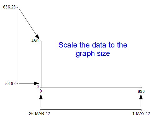
I know, I know, it’s a little misleading because nowhere have we actually said to D3 this is our data from 53.98 to 636.23. All we’ve said is when we get the data, we’ll be scaling it into this space.
Now hang on, what’s going on with the [height, 0] part in y axis scale statement? The astute amongst you will note that for the time scale we set the range as [0, width] but for this one ([height, 0]) the values look backwards.
Well spotted.
This is all to do with how the screen is laid out and referenced. Take a look at the following diagram showing how the coordinates for drawing on your screen work;
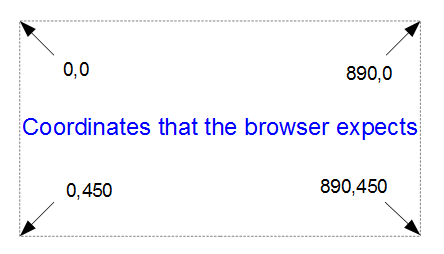
The top left hand of the screen is the origin or 0,0 point and as we go left or down the corresponding x and y values increase to the full values defined by height and width.
That’s good enough for the time values on the x axis that will start at lower values and increase, but for the values on the y axis we’re trying to go against the flow. We want the low values to be at the bottom and the high values to be at the top.
No problem. We just tell D3 via the statement y = d3.scaleLinear().range([height, 0]); that the larger values (height) are at the low end of the screen (at the top) and the low values are at the bottom (as you most probably will have guessed by this stage, the .range statement uses the format .range([closer_to_the_origin, further_from_the_origin]). So when we put the height variable first, that is now associated with the top of the screen.
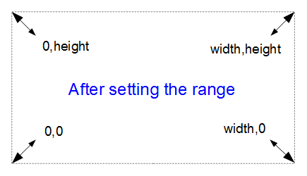
We’ve scaled our data to the graph size and ensured that the range of values is set appropriately. What’s with the domain part that was in this section’s title?
Come on, you remember this little piece of script don’t you?
  x.domain(d3.extent(data, function(d) { return d.date; }));
  y.domain([0, d3.max(data, function(d) { return d.close; })]);
While it exists in a separate part of the file from the scale / range part, it is certainly linked.
That’s because there’s something missing from what we have been describing so far with the set up of the data ranges for the graphs. We haven’t actually told D3 what the range of the data is. That’s also the reason this part of the script occurs where it does. It is within the section where the data.csv file has been loaded as ‘data’ and it’s therefore ready to use it.
So, the .domain function is designed to let D3 know what the scope of the data will be. This is what is then passed to the scale function.
Looking at the first part that is setting up the x axis values, it is saying that the domain for the x axis values will be determined by the d3.extent function which in turn is acting on a separate function which looks through all the ‘date’ values that occur in the ‘data’ array. In this case the .extent function returns the minimum and maximum value in the given array.
-
function(d) { return d.date; }returns all the ‘date’ values in ‘data’. This is then passed to… - The
.extentfunction that finds the maximum and minimum values in the array and then… - The
.domainfunction which returns those maximum and minimum values to D3 as the range for the x axis.
Pretty neat really. At first you might think it was overly complex, but breaking the function down into these components allows additional functionality with differing scales, values and quantities. In short, don’t sweat it. It’s a good thing.
The x axis values are dates; so the domain for them is basically from the 26th of March 2012 till 1st of May 2012. The y axis is done slightly differently
y.domain([0, d3.max(data, function(d) { return d.close; })]);
Because the range of values desired on the y axis goes from 0 to the maximum in the data range, that’s exactly what we tell D3. The ‘0’ in the .domain function is the starting point and the finishing point is found by employing a separate function that sorts through all the ‘close’ values in the ‘data’ array and returns the largest one. Therefore the domain is from 0 to 636.23.
Let’s try a small experiment. Let’s change the y axis domain to use the .extent function (the same way the x axis does) to see what it produces.
The JavaScript for the y domain will be;
y.domain(d3.extent(data, function(d) { return d.close; }));
You can see apart from a quick copy paste of the internals, all I had to change was the reference to ‘close’ rather than ‘date’.
And the result is…
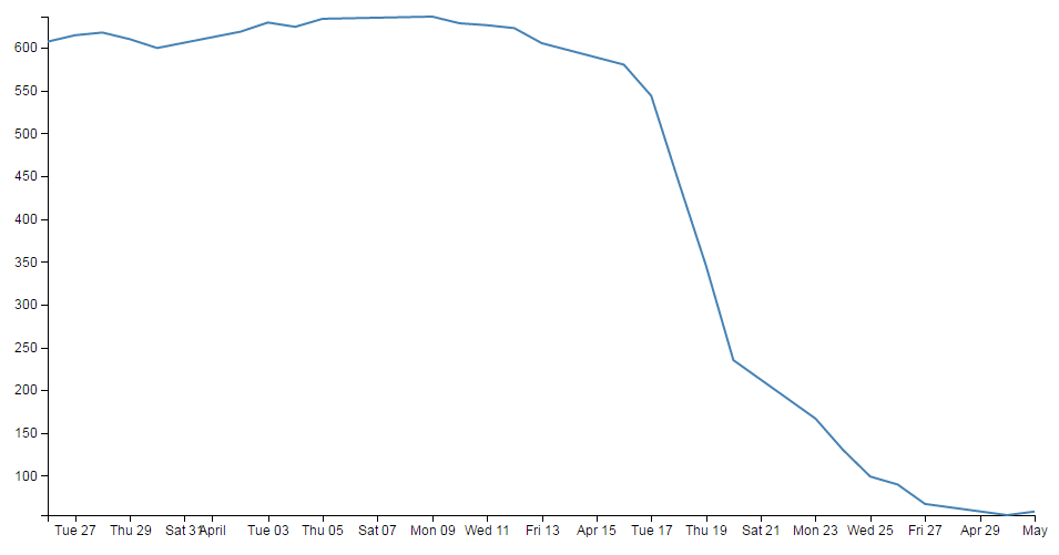
Look at that! The starting point for the y axis looks like it’s pretty much on the 53.98 mark and the graph itself certainly touches the x axis where the data would indicate it should.
Now, I’m not really advocating making a graph like this since I think it looks a bit nasty (and a casual observer might be fooled into thinking that the x axis was at 0). However, this would be a useful thing to do if the data was concentrated in a narrow range of values that are quite distant from zero.
For instance, if I change the data.csv file so that the values are represented like the following;
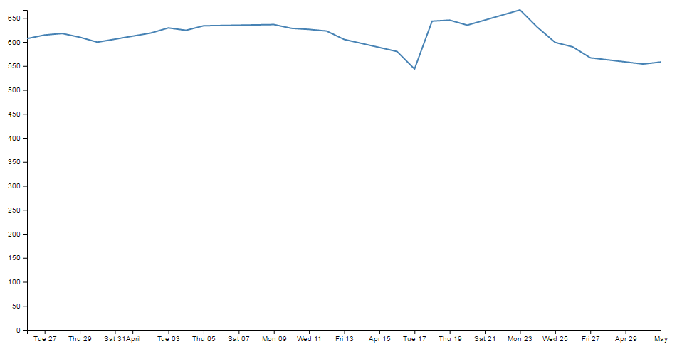
Then it kind of loses the ability to distinguish between values around the median of the data.
But, if I put in our magic .extent function for the y axis and redraw the graph…
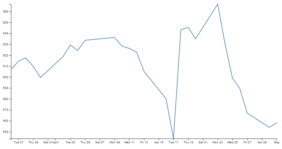
How about that?
The same data as the previous graph, but with one simple piece of the script changed and D3 takes care of the details.
Adding data to the line function
We’re getting towards the end of our journey through the script now. The next step is to associate the array ‘data’ with a new array that consists of a set of coordinates that we are going to plot.
I’m aware that the statement above may be somewhat ambiguous. You would be justified in thinking that we already had the data stored and ready to go. But that’s not strictly correct.
// define the line
var valueline = d3.line()
    .x(function(d) { return x(d.date); })
    .y(function(d) { return y(d.close); });
What we have is data in a raw format, we have added pieces of code that will allow the data to be adjusted for scale and range to fit in the area that we want to draw, but we haven’t actually taken our raw data and adjusted it for our desired coordinates. That’s what the code above does.
The main function that gets used here is the d3.line() function. This function uses accessor functions to store the appropriate information in the right area and in the case above they use the x and y accessors (that would be the bits that are .x and .y). The d3.line() function is called a ‘path generator’ and this is an indication that it can carry out some pretty clever things on its own accord. But in essence its job is to assign a set of coordinates in a form that can be used to draw a line.
Each time this line function is called on, it will go through the data and will assign coordinates to ‘date’ and ‘close’ pairs using the ‘x’ and ‘y’ functions that we set up earlier (which are responsible for scaling and setting the correct range / domain).
Of course, it doesn’t get the data all by itself, we still need to actually call the valueline function with ‘data’ as the source to act on. But never fear, that’s coming up soon.
Adding the SVG element.
As the title states, the next piece of script forms and adds the SVG element to the web page that D3 will then use to draw on.
var svg = d3.select("body").append("svg")
    .attr("width", width + margin.left + margin.right)
    .attr("height", height + margin.top + margin.bottom)
  .append("g")
    .attr("transform",
          "translate(" + margin.left + "," + margin.top + ")");
So what exactly does that all mean?
Well D3 needs to be able to have a space defined for it to draw things. When you define the space it’s going to use, you can also give the space you’re going to use an identifying name and attributes.
In the example we’re using here, we are ‘appending’ an SVG element (an element designed for drawing graphics on) to the <body> of the HTML page.
We also add a group element ‘g’ that is referenced to the top left corner of the actual graph area on the canvas. ‘g’ is a grouping element in the sense that it is normally used for grouping together several related elements. So in this case those grouped elements will have a common reference.
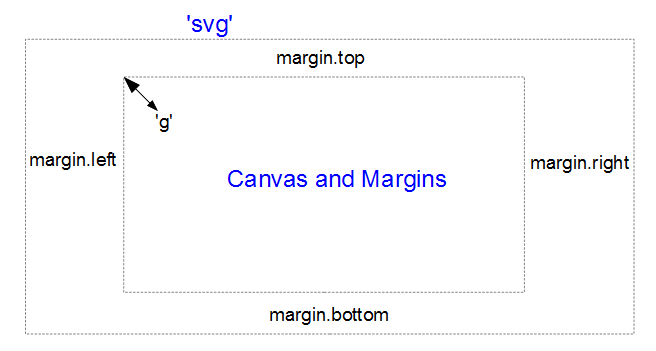
(the image above is definitely not to scale, but I hope you get the general idea)
Interesting things to note about the code. The .attr("stuff in here") parts are attributes of the appended elements they are part of.
For instance;
   .append("svg")
    .attr("width", width + margin.left + margin.right)
    .attr("height", height + margin.top + margin.bottom)
tells us that the ‘svg’ element has a “width” of width + margin.left + margin.right and the “height” of height + margin.top + margin.bottom.
Likewise…
  .append("g")
    .attr("transform",
          "translate(" + margin.left + "," + margin.top + ")");
tells us that the group element ‘g’ has been transformed by moving (translating) to the point margin.left, margin.top. Or to the top left of the graph space proper. This way when we tell something to be drawn on our page, we can use this reference point ‘g’ to make sure everything is in the right place.
Actually Drawing Something!
Up until now we have spent a lot of time defining, loading and setting up. Good news! We’re about to finally draw something!
Drawing the line
We jump lightly over some of the code that we have already explained and land on the part that draws the line.
  // Add the valueline path.
  svg.append("path")
      .data([data])
      .attr("class", "line")
      .attr("d", valueline);
This area occurs in the part of the code that has the data loaded (via the d3.csv block) and it’s ready for action.
The svg.append("path") portion adds a new path element . A path element represents a shape that can be manipulated in lots of different ways (see more here: http://www.w3.org/TR/SVG/paths.html).
We join our array of data (confusingly the array is called ‘data’) to the path element with the .data([data]) line. We could have used an alternative method here with a line that read .datum(data). Both are completely valid to use, but have different strengths.
The next line down applies the ‘line’ styles from the CSS section that we experimented with earlier.
In the final line (.attr("d", valueline);), we add the attribute ‘d’ to the path with the data from the valueline function that we had declared earlier.
Drawing the Axes
Then we get to draw in the axes;
  // Add the X Axis
  svg.append("g")
      .attr("transform", "translate(0," + height + ")")
      .call(d3.axisBottom(x));

  // Add the Y Axis
  svg.append("g")
      .call(d3.axisLeft(y));
Both axes start by appending a group element (‘g’). Each axis will be bound to its own element.
The y axis can be drawn from the default position at the origin of the svg element (which we recall is 0,0 at the top left of the graph). However the x axis needs to be moved to the bottom of our graph.
On the x axis, we have a transform statement (.attr("transform", "translate(0," + height + ")")). If we want our x axis to be on the bottom of the graph, we need to move (transform) it to the bottom by a set amount. The set amount in this case is the height of the graph proper (height). So, for the point of demonstration we will remove the transform line and see what happens;
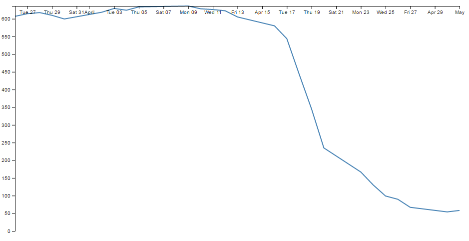
Yep, pretty much as anticipated.
The last part of the two sections of script ( .call(d3.axisBottom(x)); and .call(d3.axisLeft(y)); ) call the D3 x and y axis functions respectively and initiate the drawing action.
The method by which D3 orientates the axes is relatively self-evident and there are four options;
-
.axisTop: An axis with values and ticks drawn above a horizontal axis. -
.axisRight: An axis with values and ticks drawn to the right of a vertical axis. -
.axisBottom: An axis with values and ticks drawn below a horizontal axis. -
.axisLeft: An axis with values and ticks drawn to the left of a vertical axis.
Just to illustrate the point, we can reverse the orientation of .axisBottom to .axisTop and .axisLeft to .axisRight to see what it looks like;
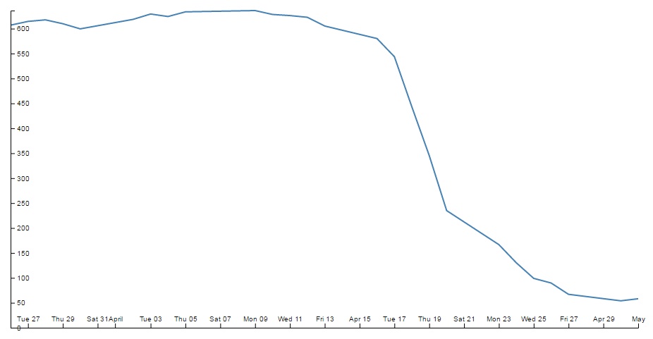
There we go.
It is worth stating that the axes as presented for this simple graph are very much a ‘straight out of the box’ configuration. Later in the book we will look at options for configuring and styling axes in more depth.
Wrap Up
Well that’s it. In theory, you should now be a complete D3 ninja.
OK, perhaps a slight exaggeration. In fact there is a strong possibility that the information I have laid out here is at best borderline useful and at worst laden with evil practices and gross inaccuracies.
But look on the bright side. Irrespective of the nastiness of the way that any of it was accomplished or the inelegance of the code, if the picture drawn on the screen is pretty, you can walk away with a smile. :-)
This section concludes a very basic description of one type of a graphic that can be built with D3. We will look at adding value to it in subsequent chapters.
I’ve said it before and I’ll say it again. This is not a how-to for learning D3. This is how I have managed to muddle through and achieve what I wanted to do. If some small part of it helps you. All good. Those with a smattering of knowledge of any of the topics I have butchered above (or below) are fully justified in feeling a large degree of righteous indignation. To those I say, please feel free to amend where practical and possible, but please bear in mind this was written from the point of view of someone with no experience in the topic and therefore try to keep any instructions at a level where a new entrant can step in :-).
Things we can do with the simple graph
The following headings in this section are intended to be a list of relatively simple ‘block’ type improvements that you can do to your graph to add functionality. The idea is to be able to use the simple graph that was used for the explanation of how D3 worked and just slot in code to add functionality (let’s hope it works for you :-)).
Setting up and configuring the Axes
As referenced in the chapter where we initially developed our simple graph, the axes of that graph had no styling or configuration changes made to them at all. One of the results of this is that the font size, type, number of ticks and the way that the values are represented is very much at the default settings. This means that when we change our initial graph…

… and compress the margins or graph size we end up with axes that are not really suitable for the purpose;

Luckily, the D3 axis component has a wide range of configuration options and we can make changes simply via either the CSS styling or in the JavaScript code.
Change the text size
The first thing that we will change is the text size for the axes. The default size (built into D3) is 10px with the font type of sans-serif.
There are a couple of different ways that we could change the font size and either one is valid. The first way is to specify the font as a style when drawing an individual axis. To do this we simply add in a font style as follows;
  svg.append("g")
      .style("font", "14px times")
      .attr("transform", "translate(0," + height + ")")
      .call(d3.axisBottom(x));
This will increase the x axis font size to 14px and change the font type to ‘times’. Just like this;
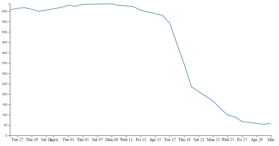
There are a few things to notice here.
Firstly, we do indeed have a larger font and it appears to be of the type ‘times’. Yay!
Secondly, the y axis has remained as 10px sans-serif (which is to be expected since we only added the style to the x axis code block)
Lastly, the number of values represented on the x axis has meant that with the increase in font size there is some overlapping going on. We will deal with that shortly…
The addition of the styling for the x axis has been successful and in a situation where only one element on a page is being adjusted, this is a perfectly valid way to accomplish the task. However, in this case we should be interested in changing the font on both the x and y axes. We could do this by adding a duplicate style line to the y axis block, but we have a slightly better way of accomplishing the task by declaring the style in the HTML style block at the start of the code and then applying the same style to both blocks.
In the <style> ... </style> section at the start of the file add in the following line;
.axis { font: 14px sans-serif; }
This will set the font to 14px sans-serif (I prefer this to ‘times’) for anything that has the axis class applied to it. All we have to do then is to tell our x and y axes blocks to use the axis class as an attribute. We can do this as follows;
  // Add the X Axis
  svg.append("g")
      .attr("class", "axis")
      .attr("transform", "translate(0," + height + ")")
      .call(d3.axisBottom(x));

  // Add the Y Axis
  svg.append("g")
      .attr("class", "axis")
      .call(d3.axisLeft(y));
It could be argued that this doesn’t really conserve more code, but in my humble opinion it adds a more elegant way to alter styling in this case.
The end result now looks like the following;

Changing the number of ticks on an axis
Now we shall address the other problem that cropped up when we changed the size of the text. We have overlapping values on the x axis.

If I was to be brutally honest, I think that the number of values (ticks) on the graph is a bit too many. The format of the values (especially on the x axis) is too wide and this type of overlap was bound to happen eventually.
Good news. D3 has got us covered.
The axis component includes a function to specify the number of ticks on an axis. All we need to do is add in the function and the number of ticks like so;
  // Add the X Axis
  svg.append("g")
      .attr("class", "axis")
      .attr("transform", "translate(0," + height + ")")
      .call(d3.axisBottom(x)
              .ticks(5));
With the end result looking like this;

We can see that D3 has picked tick values that seem nice and logical. There’s one that starts on the 1st of April that’s just labelled ‘April’ and they go at a nice interval of one week for the subsequent ticks. Nice.
Hopefully you just did a quick count across the bottom of the previous graph and went “Yep, five ticks. Spot on”. Well done if you did, but there’s a little bit of a sneaky trick up D3’s sleeve with the number of ticks on a graph axis.
For instance, here’s what the graph looks like when the .ticks(5) value is changed to .ticks(4).

Eh? Hang on. Isn’t that some kind of mistake? There are still five ticks. Yep, sure is! But wait… we can keep dropping the ticks value till we get to two and it will still be the same. At .ticks(2) though, we finally see a change.

How about that? At first glance that just doesn’t seem right, then you have a bit of a think about it and you go “Hmm… When there were 5 ticks, they were separated by a week each, and that stayed that way till we got to a point where it could show a separation of a month”.
D3 is making a command decision for you as to how your ticks should be best displayed. This is great for simple graphs and indeed for the vast majority of graphs. Like all things related to D3, if you really need to do something bespoke, it will let you if you understand enough code.
The following is the list of time intervals that D3 will consider when setting automatic ticks on a time based axis;
- 1, 5, 15 and 30-second.
- 1, 5, 15 and 30-minute.
- 1, 3, 6 and 12-hour.
- 1 and 2-day.
- 1-week.
- 1 and 3-month.
- 1-year.
And yes. If you increase the number of ticks, you need to wait till you get to 10 before they change to an axis with interval of two days. And yes, the overlap is still there;

If we do a quick count we should also notice that we have 19 ticks!
The question should be asked. Can we specify our own intervals? Great question! Yes we can.
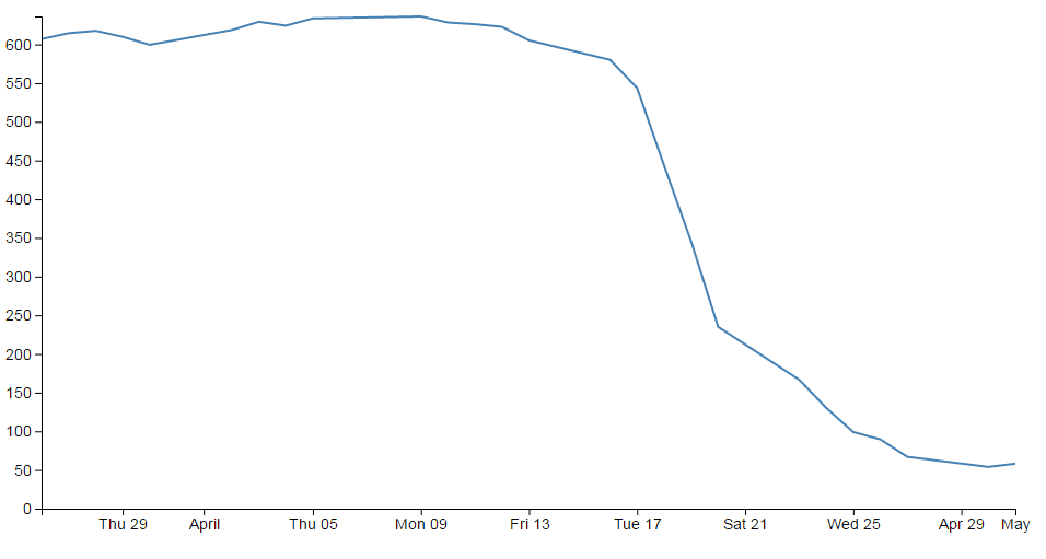
What we need to do is to use another D3 trick and specify an exact interval using the d3 time component. In our particular situation all we need to do is specify an interval inside the .ticks function. Specifically for an interval of 4 days for example we would use something like;
  // Add the X Axis
  svg.append("g")
      .attr("class", "axis")
      .attr("transform", "translate(0," + height + ")")
      .call(d3.axisBottom(x)
              .ticks(d3.timeDay.every(4)));
Here we use the timeDay unit of ‘days’ and specify an interval of 4 days.
The graph will subsequently appear as follows;
Intervals have a number of standard units (including UTC time) such as;
-
d3.timeMillisecond: Milliseconds -
d3.timeSecond: Seconds -
d3.timeMinute: Minutes -
d3.timeHour: Hours -
d3.timeDay: Days -
d3.timeWeek: This is an alias ford3.timeSundayfor a week -
d3.timeSunday: A week starting on Sunday -
d3.timeMonday: A week starting on Monday -
d3.timeTuesday: A week starting on Tuesday -
d3.timeWednesday: A week starting on Wednesday -
d3.timeThursday: A week starting on Thursday -
d3.timeFriday: A week starting on Friday -
d3.timeSaturday: A week starting on Saturday -
d3.timeMonth: Months starting on the 1st of the month -
d3.timeYear: Years Starting on the 1st day of the year
But what if we really wanted that two day separation of ticks without the overlap?
Rotating text labels for a graph axis
An answer to the problem of overlapping axis values might be to rotate the text to provide more space.
The answer I found most usable was provided by Aaron Ward on Google Groups.
The full code for this example can be found on github or in the code samples bundled with this book (simple-axis-rotated.html and data.csv). A working example can be found on bl.ocks.org.
The first substantive change would be a little housekeeping. Because we are going to be rotating the text at the bottom of the graph, we are going to need some extra space to fit in our labels. So we should change our bottom margin appropriately.
var margin = {top: 20, right: 20, bottom: 70, left: 50},
I found that 70 pixels was sufficient.
The remainder of our changes occur in the block that draws the x axis.
  // Add the X Axis
  svg.append("g")
      .attr("class", "axis")
      .attr("transform", "translate(0," + height + ")")
      .call(d3.axisBottom(x).ticks(10))
      .selectAll("text")
        .style("text-anchor", "end")
        .attr("dx", "-.8em")
        .attr("dy", ".15em")
        .attr("transform", "rotate(-65)");
It’s pretty standard until the .call(d3.axisBottom(x).ticks(10)) portion of the code. Here we remove the semicolon that was there so that the block continues with its function.
Then we select all the text elements that comprise the x axis with the .selectAll("text"). From this point onwards, we are operating on the text elements associated with the x axis. In effect; the following four ‘actions’ are applied to the text labels.
The .style("text-anchor", "end") line ensures that the text label has the end of the label ‘attached’ to the axis tick. This has the effect of making sure that the text rotates about the end of the date. This makes sure that the text all ends up at a uniform distance from the axis ticks.
The dx and dy attribute lines move the end of the text just far enough away from the axis tick so that they don’t crowd it and not too far away so that it appears disassociated. This took a little bit of fiddling to ‘look’ right and you will notice that I’ve used the ‘em’ units to get an adjustment if the size of the font differs.
The final action is kind of the money shot.
The transform attribute applies itself to each text label and rotates each line by -65 degrees. I selected -65 degrees just because it looked OK. There was no deeper reason.
The end result then looks like the following;
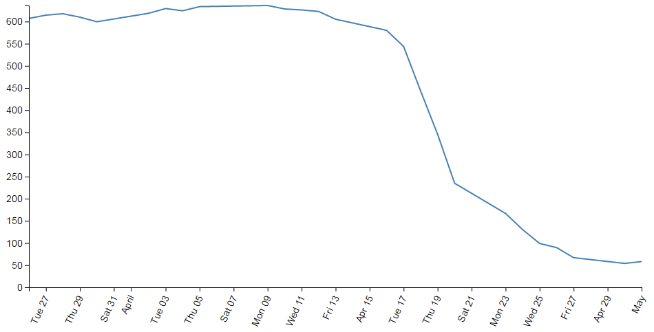
This was a surprisingly difficult problem to find a solution to that I could easily understand (well done Aaron). That makes me think that there are some far deeper mysteries to it that I don’t fully appreciate that could trip this solution up. But in lieu of that, enjoy!
Formatting a date / time axis with specified values
OK then. We’ve been very clever in rotating our text, but you will notice that D3 has used its own good judgement as to what format the days / date will be represented as.
Not that there’s anything wrong with it, but what if we want to put a specific format of date / time nomenclature as axis labels?
No problem. D3 to the rescue again!
This is actually a pretty easy thing to do, but there are plenty of options for the formatting, so the only really tricky part is deciding what to put where.
But, before we start doing anything we are going to have to expand our bottom margin even more than we did with the rotate the axis labels feature.
var margin = {top: 20, right: 20, bottom: 100, left: 50},
That should see us right.
Now the simple part :-). Changing the format of the label is as simple as inserting the tickFormat command into the xAxis declaration and including a D3 time formatting function a little like this;
  svg.append("g")
      .attr("class", "axis")
      .attr("transform", "translate(0," + height + ")")
      .call(d3.axisBottom(x)
              .tickFormat(d3.timeFormat("%Y-%m-%d")))
      .selectAll("text")
        .style("text-anchor", "end")
        .attr("dx", "-.8em")
        .attr("dy", ".15em")
        .attr("transform", "rotate(-65)");
The timeFormat formatters are the same as those we used when parsing our time values when reading our data with the simple graph;
- %a - abbreviated weekday name.
- %A - full weekday name.
- %b - abbreviated month name.
- %B - full month name.
- %c - date and time, as “%a %b %e %H:%M:%S %Y”.
- %d - zero-padded day of the month as a decimal number [01,31].
- %e - space-padded day of the month as a decimal number [ 1,31].
- %H - hour (24-hour clock) as a decimal number [00,23].
- %I - hour (12-hour clock) as a decimal number [01,12].
- %j - day of the year as a decimal number [001,366].
- %m - month as a decimal number [01,12].
- %M - minute as a decimal number [00,59].
- %p - either AM or PM.
- %S - second as a decimal number [00,61].
- %U - week number of the year (Sunday as the first day of the week) as a decimal number [00,53].
- %w - weekday as a decimal number [0(Sunday),6].
- %W - week number of the year (Monday as the first day of the week) as a decimal number [00,53].
- %x - date, as “%m/%d/%y”.
- %X - time, as “%H:%M:%S”.
- %y - year without century as a decimal number [00,99].
- %Y - year with century as a decimal number.
- %Z - time zone offset, such as “-0700”.
- There is also a literal “%” character that can be presented by using double % signs.
So the format we have specified (%Y-%m-%d) will show the year with the century as a decimal number (%Y) followed by a hyphen, followed by a zero padded month as a decimal number (%m) followed by another hyphen and lastly the day as a zero padded day of the month (%d).
The end result looking a bit like this;
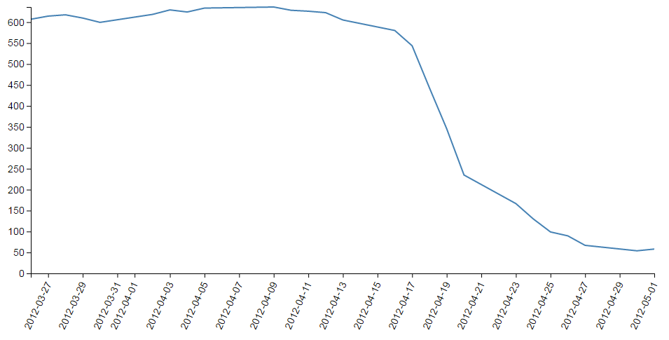
An example using this code can be found on github or in the code samples bundled with this book (simple-axis-rotated-formatted.html and data.csv). A working example can be found on bl.ocks.org. The example code also includes the rotating of the x axis text as described in the previous section.
So how about we try something a little out of the ordinary (extreme)?
How about the full weekday name (%A), the day (%d), the full month name (%B) and the year (%Y) as a four digit number?
  svg.append("g")
      .attr("class", "axis")
      .attr("transform", "translate(0," + height + ")")
      .call(d3.axisBottom(x)
              .tickFormat(d3.timeFormat("%A %d %B %Y")))
      .selectAll("text")
        .style("text-anchor", "end")
        .attr("dx", "-.8em")
        .attr("dy", ".15em")
        .attr("transform", "rotate(-65)");
We will also need some extra space for the bottom margin, so how about 170?
var margin = {top: 20, right: 20, bottom: 170, left: 50},
And….
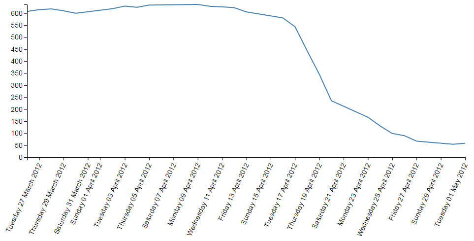
Oh yeah… When axis ticks go bad…
But seriously, that does work as a pretty good example of the flexibility available.
Adding Axis Labels
What’s the first thing you get told at school when drawing a graph?
“Always label your axes!”
So, time to add a couple of labels!
We’ll start with our default code for our simple graph. The full code for this can be found on github or in the code samples bundled with this book (simple-graph.html and data.csv). A live example can be found on bl.ocks.org.
Preparation: Because we’re going to be adding labels to the bottom and left of the graph we need to increase the bottom and left margins. Changes like the following should suffice;
var margin = {top: 20, right: 20, bottom: 50, left: 70},
The x axis label
First things first (because they’re done slightly differently), the x axis. If we begin by describing what we want to achieve, it may make the process of implementing a solution a little more logical.
What we want to do is to add a simple piece of text under the x axis and in the centre of the total span. Wow, that does sound easy.
And it is, but there are different ways of accomplishing it, and I think I should take an opportunity to demonstrate them. Especially since one of those ways is a BAD idea.
Lets start with the bad idea first :-).
This is the code we’re going to add to the simple line graph script;
  // text label for the x axis
  svg.append("text")
      .attr("x", 480 )
      .attr("y",  475 )
      .style("text-anchor", "middle")
      .text("Date");
We will put it in between the blocks of script that add the x axis and the y axis.
  // Add the x Axis
  svg.append("g")
      .attr("transform", "translate(0," + height + ")")
      .call(d3.axisBottom(x));

  // PUT THE NEW CODE HERE!

  // Add the y Axis
  svg.append("g")
      .call(d3.axisLeft(y));
Before we describe what’s happening, let’s take a look at the result;
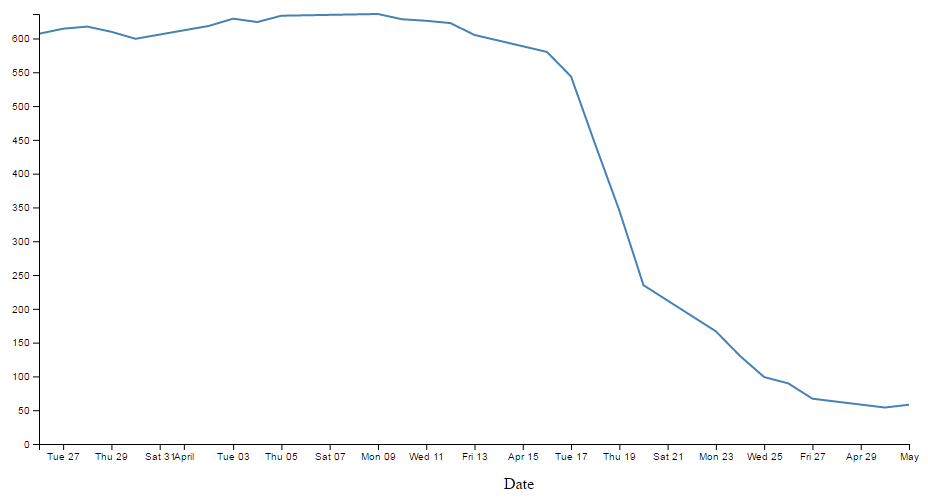
Well, it certainly did what it was asked to do. There’s a ‘Date’ label as advertised! (Yes, I know it’s not pretty.) Let’s describe the code and then work out why there’s a better way to do it.
  // text label for the x axis
  svg.append("text")
      .attr("x", 480 )
      .attr("y",  475 )
      .style("text-anchor", "middle")
      .text("Date");
The first line appends a “text” element to our svg element. There is a lot more to learn about “text” elements at the home of the World Wide Web Consortium (W3C).
The next two lines ( .attr("x", 480 ) and .attr("y", 475 ) ) set the attributes for the x and y coordinates to position the text on the svg.
The second last line (.style("text-anchor", "middle")) ensures that the text ‘style’ is such that the text is centre aligned and therefore remains nicely centred on the x, y coordinates that we send it to.
The final line (.text("Date");) adds the actual text that we are going to place.
That seems really simple and effective and it is. However, the bad part about it is that we have hard coded the location for the date into the code. This means if we change any of the physical aspects of the graph, we will end up having to re-calculate and edit our code. And we don’t want to do that.
Here’s an example. If I decide that I would prefer to decrease the height of the graph by editing the line here;
height = 500 - margin.top - margin.bottom;
and making the height 490 pixels;
height = 490 - margin.top - margin.bottom;
The result is as follows;
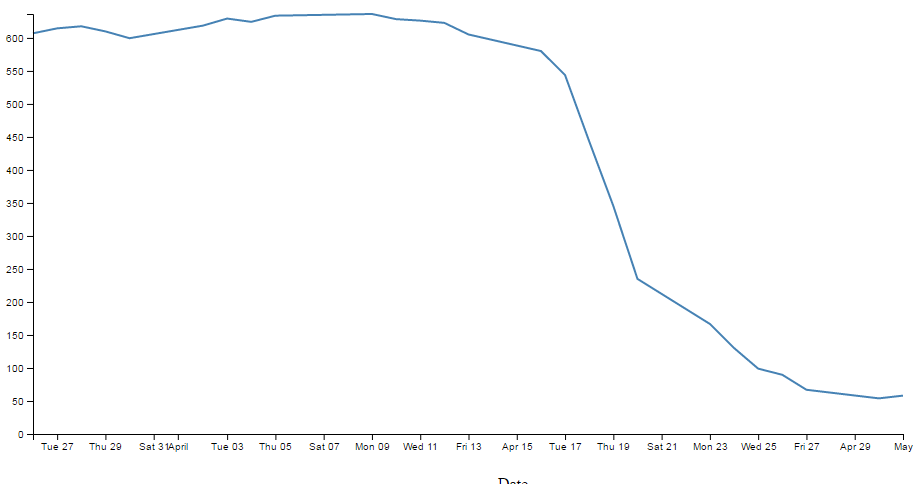
EVERYTHING about the graph has adjusted itself, except our nasty, hard coded ‘Date’ label which has been cruelly cut off. This is far from ideal and can be easily fixed by using the variables that we set up ever so carefully earlier.
So, instead of;
      .attr("x", 480 )
      .attr("y",  475 )
lets let our variables do the walking and use;
      .attr("x", width / 2 )
      .attr("y",  height + margin.top + 20)
So with this code we tell the script that the ‘Date’ label will always be halfway across the width of the graph (no matter how wide it is) and at the bottom of the graph with respect to its height plus the top margin and 20 pixels (as a fixed offset) (remember it uses a coordinates system that increases from the top down).
The end result of using variables is that if I go to an extreme of changing the height and width of my graph to;
    width = 560 - margin.left - margin.right,
    height = 300 - margin.top - margin.bottom;
We still finish up with an acceptable result;
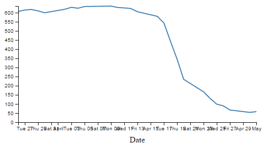
Well, for the label position at least :-).
So the changes to using variables is just a useful lesson that variables rock and mean that you don’t have to worry about your graph staying in relative shape while you change the dimensions. The astute readers amongst you will have learned this lesson very early on in your programming careers, but it’s never a bad idea to make sure that users that are unfamiliar with the concept have an indicator of why it’s a good idea.
Now the third method that I mentioned at the start of our x axis odyssey. This is not mentioned because it’s any better or worse way to implement your script (The reason that I say this is because I’m not sure if it’s better or worse.) but because it’s sufficiently different to make it look confusing if you didn’t think of it in the first place.
So, we’ll take our marvellous coordinates code;
      .attr("x", width / 2 )
      .attr("y",  height + margin.top + 20))
And replace it with a single (longer) line;
      .attr("transform",
            "translate(" + (width/2) + " ," +
                           (height + margin.top + 20) + ")")
This uses the "transform" attribute to move (translate) the point to place the ‘Date’ label to exactly the same spot that we’ve been using for the other two examples (using variables of course).
The y axis label
So, that’s the x axis label. Time to do the y axis. The code we’re going to use looks like this;
  svg.append("text")
      .attr("transform", "rotate(-90)")
      .attr("y", 0 - margin.left)
      .attr("x",0 - (height / 2))
      .attr("dy", "1em")
      .style("text-anchor", "middle")
      .text("Value");
For the sake of neatness we will put the piece of code in a nice logical spot and this would be following the block of code that added the y axis (but before the closing curly bracket)
  // Add the y Axis
  svg.append("g")
      .call(d3.axisLeft(y));

  // PUT THE NEW CODE HERE!

});
And the result looks like this;
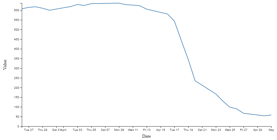
There we go, a label for the y axis that is nicely centred and (gasp!) rotated by 90 degrees! Woah, does the leetness never end! (No. No it does not.)
So, how do we get to this incredible result?
The first thing we do is the same as for the x axis and append a text element to our svg element (svg.append("text")).
Then things get interesting.
.attr("transform", "rotate(-90)")
Because that line rotates everything by -90 degrees. While it’s obvious that the text label ‘Value’ has been rotated by -90 degrees (from the picture), the following lines of code show that we also rotated our reference point (which can be a little confusing).
      .attr("y", 0 - margin.left)
      .attr("x",0 - (height / 2))
Let’s get graphical to illustrate how this works;
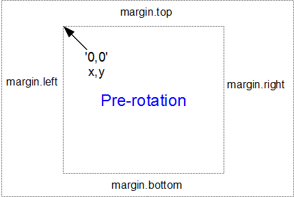
Here’s our starting position, with x,y in the 0,0 coordinate of the graph drawing area surrounded by the margins.
When we apply a -90 degrees transform we get the equivalent of this;
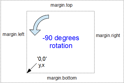
Here the 0,0 coordinate has been shifted by -90 degrees and the x,y designations are flipped so that we now need to tell the script that we’re moving a ‘y’ coordinate when we would have otherwise been moving ‘x’.
Hence, when the script runs…
.attr("y", 0 - margin.left)
… we can see that this is moving the x position to the left from the new 0 coordinate by the margin.left value.
Likewise when the script runs…
.attr("x",0 - (height / 2))
… this is actually moving the y position from the new 0 coordinate halfway up the height of the graph area.
Right, we’re not quite done yet. The following line has the effect of shifting the text slightly to the right.
.attr("dy", "1em")
Firstly the reason we do this is that our previous translation of coordinates means that when we place our text label it sits exactly on the line of 0 – margin.left. But in this case that takes the text to the other side of the line, so it actually sits just outside the boundary of the svg element.
The "dy" attribute is another coordinate adjustment move, but this time a relative adjustment and the “1em” is a unit of measure that equals exactly one unit of the currently specified text point size. So what ends up happening is that the ‘Value’ label gets shifted to the right by exactly the height of the text, which neatly places it exactly on the edge of the canvas.
The two final lines of this part of the script are the same as for the x axis. They make sure the reference point is aligned to the centre of the text (.style("text-anchor", "middle")) and then it prints the text (.text("Value");). There, that wasn’t too painful.
The full code for this example can be found on github or in the code samples bundled with this book (axis-labels.html and data.csv). A live example can be found on bl.ocks.org.
How to add a title to your graph
If you’ve read through the adding the axis labels section most of this will come as no surprise.
What we want to do to add a title to the graph is to add a text element (just a few words) that will appear above the graph and centred left to right.
We’ll start with our default code for our simple graph. The full code for this can be found on github or in the code samples bundled with this book (simple-graph.html and data.csv). A live example can be found on bl.ocks.org.
Preparation: Because we’re going to be adding a title to the top of the graph we need to increase the top margin. Changes like the following should suffice;
var margin = {top: 40, right: 20, bottom: 50, left: 70},
To add the title this is the code we’re going to add to the simple line graph script;
  // add a title
  svg.append("text")
      .attr("x", (width / 2))
      .attr("y", 0 - (margin.top / 2))
      .attr("text-anchor", "middle")
      .style("font-size", "20px")
      .style("text-decoration", "underline")
      .text("Value vs Date Graph");
And the end result will look like this;
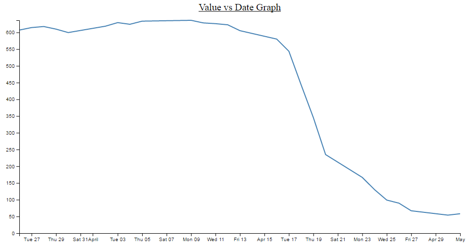
A nice logical place to put the block of code would be towards the end of the JavaScript. In fact I would put it as the last element we add. So here;
  // add the Y Axis
  svg.append("g")
      .call(d3.axisLeft(y));

  // PUT THE NEW CODE HERE!

});
Now since the vast majority of the code for this block is a regurgitation of the axis labels code, I don’t want to revisit that and bloat up this document even more, so I will direct you back to that section if you need to refresh yourself on any particular line. But….. There are a couple of new ones in there which could benefit from a little explanation.
Both of them are style descriptors and as such their job is to apply a very specific style to this element.
        .style("font-size", "20px")
        .style("text-decoration", "underline")
What they do is pretty self explanatory. Make the text a specific size and underline it. But what is perhaps slightly more interesting is that we have this declaration in the JavaScript code and not in the CSS portion of the file.
Change a line chart into a scatter plot
Confession time.
I didn’t actually intend to add in a section with a scatter plot in it because I thought it would be;
- tricky
- not useful
- all of the above
I was wrong on all counts.
All you need to do is take the simple graph example file. The full code for this can be found on github or in the code samples bundled with this book (simple-graph.html and data.csv). A live example can be found on bl.ocks.org.
We then slot the following block in between the ‘Add the valueline path’ and the ‘add the x axis’ blocks.
  // Add the scatterplot
  svg.selectAll("dot")
      .data(data)
    .enter().append("circle")
      .attr("r", 5)
      .attr("cx", function(d) { return x(d.date); })
      .attr("cy", function(d) { return y(d.close); });
And you will get…
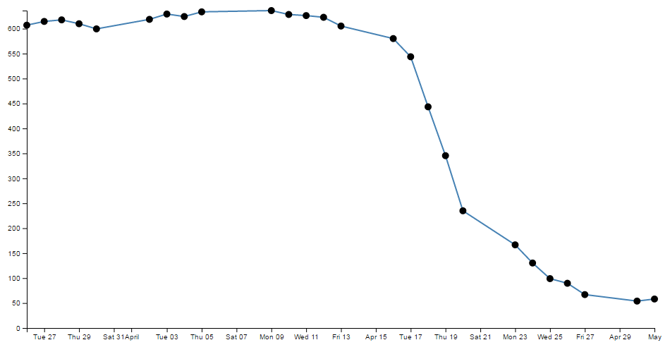
The full code for this graph can also be found on github or in the code samples bundled with this book (scatterplot.html and data.csv). A live example can be found on bl.ocks.org.
I deliberately put the dots after the line in the drawing section, because I thought they would look better, but you could put the block of code before the line drawing block to get the following effect;
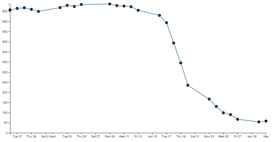
(just trying to reinforce the concept that ‘order’ matters when drawing objects :-)).
You could of course just remove the line block all together…
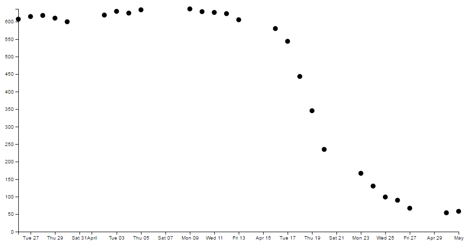
But in my humble opinion it loses something.
So what do the individual lines in the scatter plot block of JavaScript do?
The first line (svg.selectAll("dot")) essentially provides a suitable grouping label for the svg circle elements that will be added. The next line associates the range of data that we have to the group of elements we are about to add in.
Then we add a circle for each data point (.enter().append("circle")) with a radius of 5 pixels (.attr("r", 5)) and appropriate x (.attr("cx", function(d) { return x(d.date); })) and y (.attr("cy", function(d) { return y(d.close); });) coordinates.
There is lots more that we could be doing with this piece of code (check out the scatter plot example) including varying the colour or size or opacity of the circles depending on the data and all sorts of really neat things, but for the mean time, there we go. Scatter plot!
Smoothing out graph lines
When you draw a line graph, what you’re doing is taking two (or more) sets of coordinates and connecting them with a line (or lines). I know that sounds simplistic, but bear with me. When you connect these points, you’re telling the viewer of the graph that in between the individual points, you expect the value to vary in keeping with the points that the line passes through. So in a way, you’re trying to interpret the change in values that are not shown.
Now this is not strictly true for all graph types, but it does hold for a lot of line graphs.
So… when connecting these known coordinates together, you want to make the best estimate of how the values would be represented. In this respect, sometimes a straight line between points is not the best representation.
For instance. Earlier, when demonstrating the extent function for graphing we showed a graph of the varying values with the y axis showing a narrow range.

The resulting variation of the graph shows a fair amount of extremes and you could be forgiven for thinking that if this represented a smoothly flowing analog system of some kind then some of those sharp peaks and troughs would not be a true representation of how the system or figures varied.
So how should it look? Ahh… The $64,000 question. I don’t know :-). You will have a better idea since you are the person who will know your data best. However, what I do know is that D3 has some tricks up its sleeve to help.
We can easily change what we see above into;
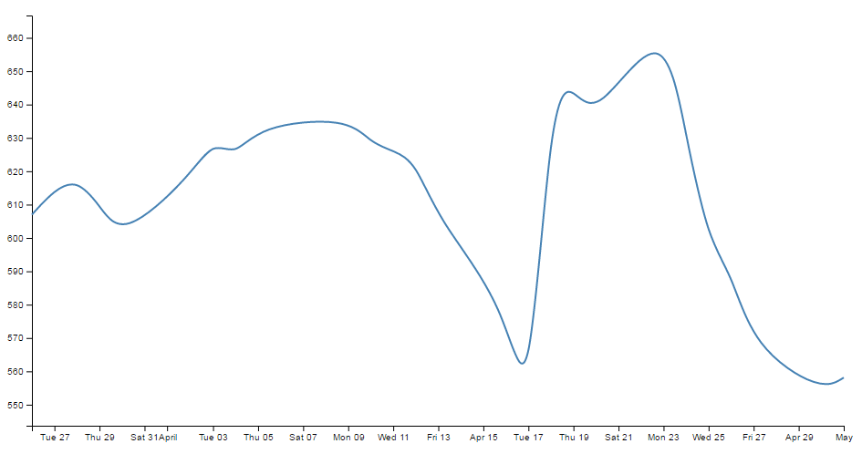
How about that? And the massive amount of code required to carry out what must be a ridiculously difficult set of calculations?
.curve(d3.curveBasis);
So where does this neat piece of code go? Here;
// define the line
var valueline = d3.line()
    .curve(d3.curveBasis)	 		// <=== THERE IT IS!
    .x(function(d) { return x(d.date); })
    .y(function(d) { return y(d.close); });
So is that it? Nooooo…….. There’s more! This is one form of interpolation effect that can be applied to your data, but there is a range and depending on your data you can select the one that is appropriate.
Here’s the list of available options and for more about them head on over to the D3 wiki.
- linear (
d3.curveLinear) – Normal line (jagged). - linear-closed (
d3.curveLinearClosed) – A normal line (jagged) families of curves available with the start and the end closed in a loop. - step (
d3.curveStep)- a stepping graph alternating between vertical and horizontal segments. The y values change at the mid point of the adjacent x values - step-before (
d3.curveStepBefore) - a stepping graph alternating between vertical and horizontal segments. The y values change before the x value. - step-after (
d3.curveStepAfter) - a stepping graph alternating between horizontal and vertical segments. The y values change after the x value. - basis (
d3.curveBasis) - a B-spline, with control point duplication on the ends (that’s the one above). - basis-open (
d3.curveBasisOpen) - an open B-spline; may not intersect the start or end. - basis-closed (
d3.curveBasisClosed) - a closed B-spline, with the start and the end closed in a loop. - bundle (
d3.curveBundle) - equivalent to basis, except a separate tension parameter is used to straighten the spline. This could be really cool with varying tension. - cardinal (
d3.curveCardinal) - a Cardinal spline, with control point duplication on the ends. It looks slightly more ‘jagged’ than basis. - cardinal-open (
d3.curveCardinalOpen) - an open Cardinal spline; may not intersect the start or end, but will intersect other control points. So kind of shorter than ‘cardinal’. - cardinal-closed (
d3.curveCardinalClosed) - a closed Cardinal spline, looped back on itself. - monotone (
d3.curveMonotoneX) - cubic interpolation that makes the graph only slightly smoother. - catmull-Rom (
d3.curveCatmullRom) - New for v4 - a cubic Catmull–Rom spline - catmull-Rom-closed (
d3.curveCatmullRomClosed) - New for v4 - a closed cubic Catmull–Rom spline - catmull-Rom-open (
d3.curveCatmullRomOpen) - New for v4 - an open cubic Catmull–Rom spline
Because in the course of writing this I took an opportunity to play with each of them, I was pleasantly surprised to see some of the effects and it seems like a shame to deprive the reader of the same joy :-). So at the risk of deforesting the planet (so I hope you are reading this in electronic format) here is each of the above interpolation types applied to the same data.
This is also an opportunity to add some reader feedback awesomeness. Many thanks to ‘enjalot’ for the great suggestion to plot the points of the data as separate circles on the graphs. Since the process of interpolation has the effect of ‘interpreting’ the trends of the data to the extent that in some cases, the lines don’t intersect the actual data much at all.
Each of the following shows the smoothing curve and the data that is used to plot the graph (as a scatterplot).

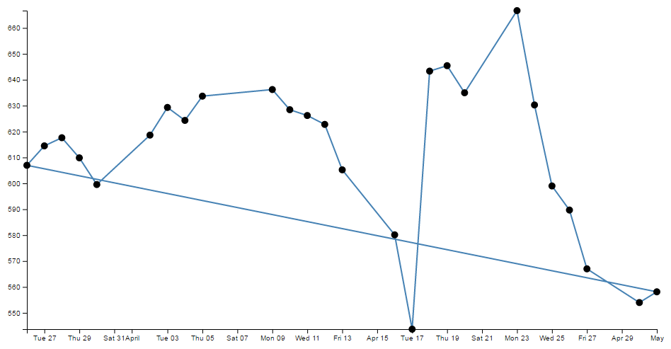
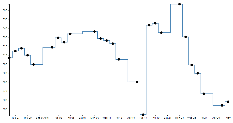
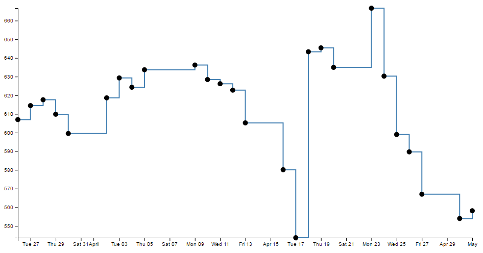
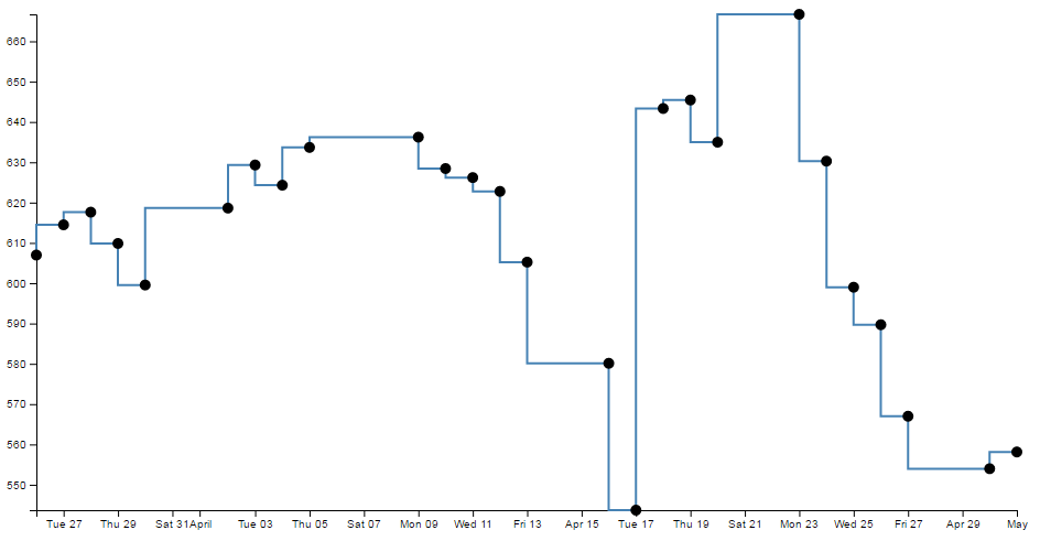
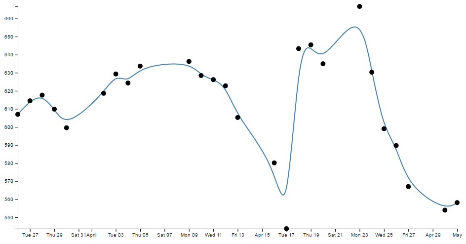
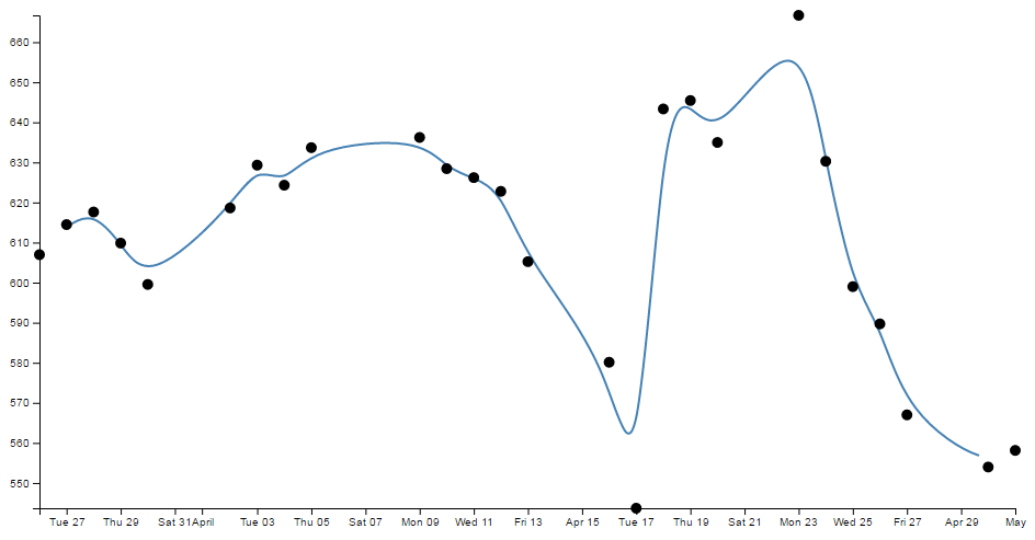
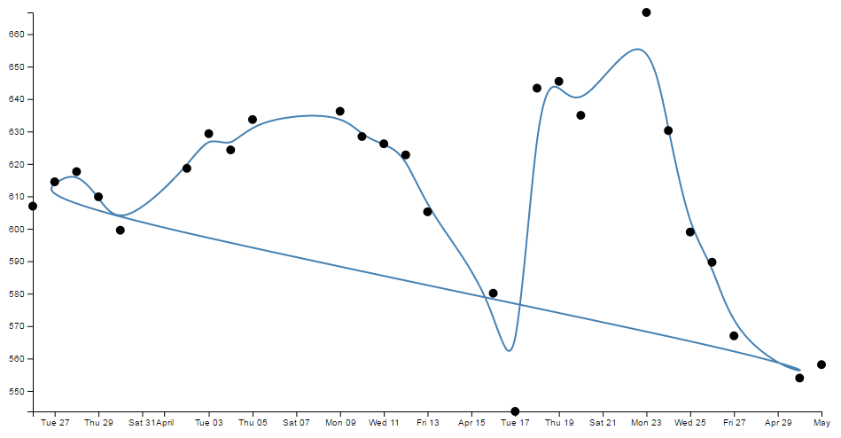
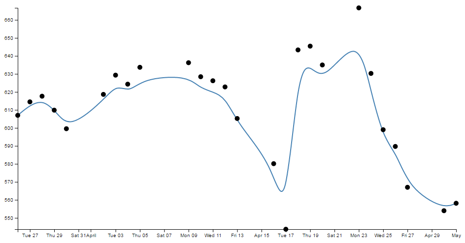
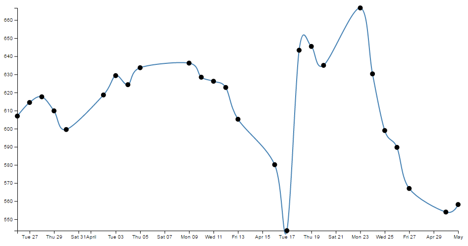
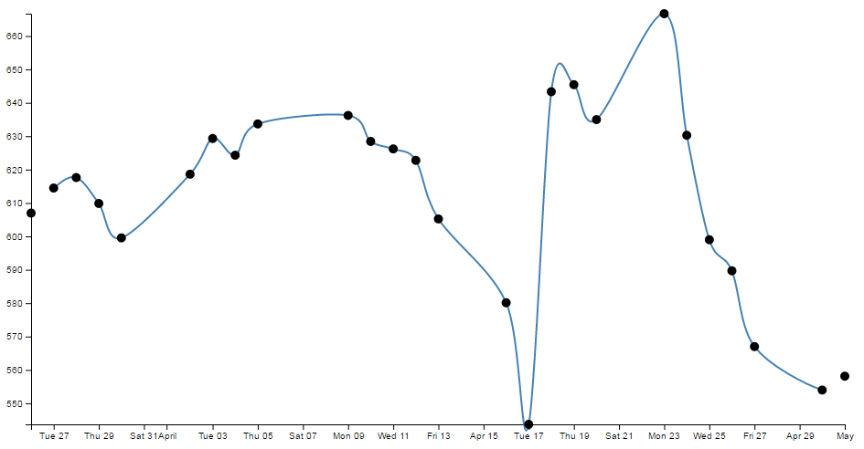
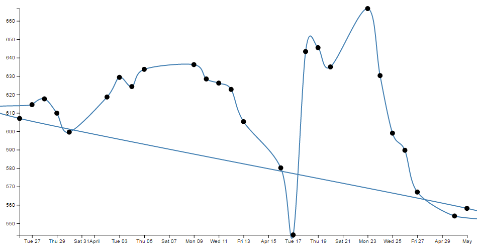

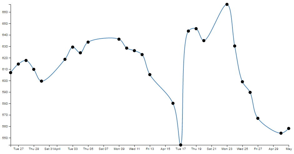
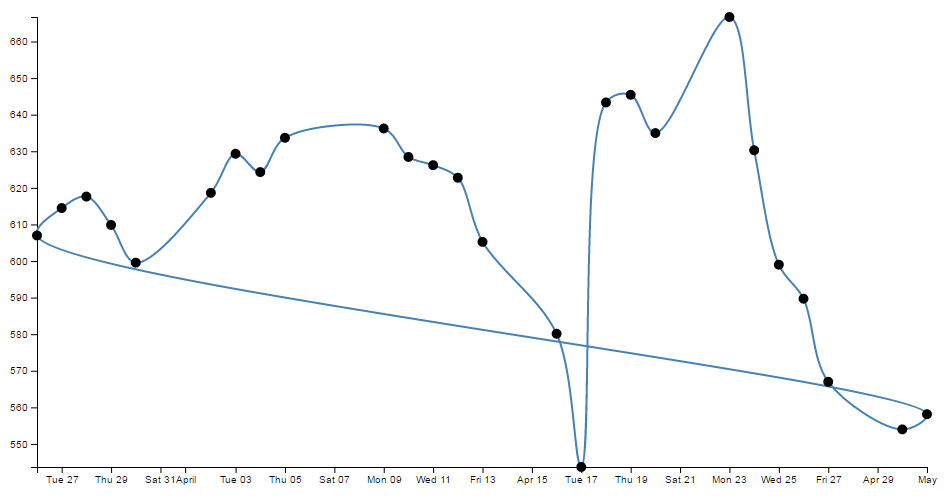
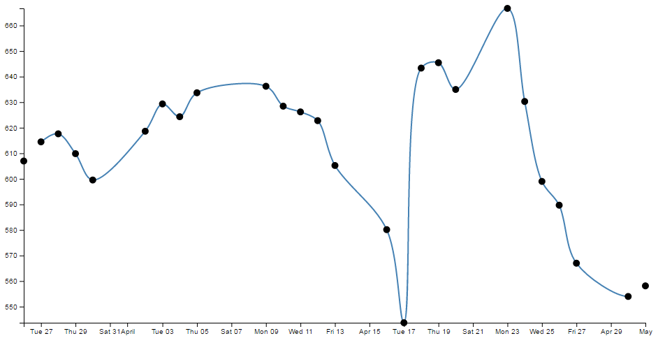
Just in case you’re in the mood for another example, feel free to check out the bl.ock here which shows all of the basic forms of the curve types (I didn’t include the open and closed versions or ‘bundle’ since it is the equivalent of ‘basis’). The full code for this can also be found in the code samples bundled with this book (interpolate.html and data-3.csv). A live example can be found on bl.ocks.org.
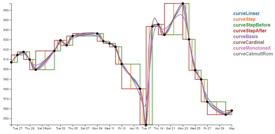
So, over to you to decide which format of interpolation is going to suit your data best:-).
Make a dashed line
Dashed lines totally rock!
One of the best parts about it is that they’re so simple to do!
Literally one line!!!!
So lets imagine that we want to make the line on our simple graph dashed. All we have to do is insert the following line in our JavaScript code here;
  // Add the valueline path.
  svg.append("path")
      .data([data])
      .attr("class", "line")
      .style("stroke-dasharray", ("3, 3"))  // <== This line here!!
      .attr("d", valueline);
And our graph ends up like this;
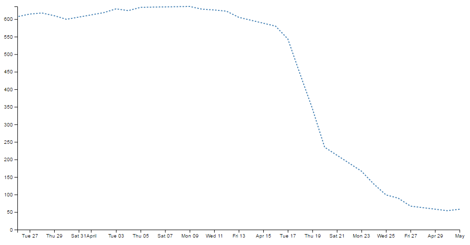
Hey! It’s dashtastic!
So how does it work?
Well, obviously "stroke-dasharray" is a style for the path element, but the magic is in the numbers.
Essentially they describe the on length and off length of the line. So "3, 3" translates to 3 pixels (or whatever they are) on and 3 pixels off. Then it repeats. Simple eh?
So, experiment time :-)
What would the following represent?
"5, 5, 5, 5, 5, 5, 10, 5, 10, 5, 10, 5"
Try not to cheat…
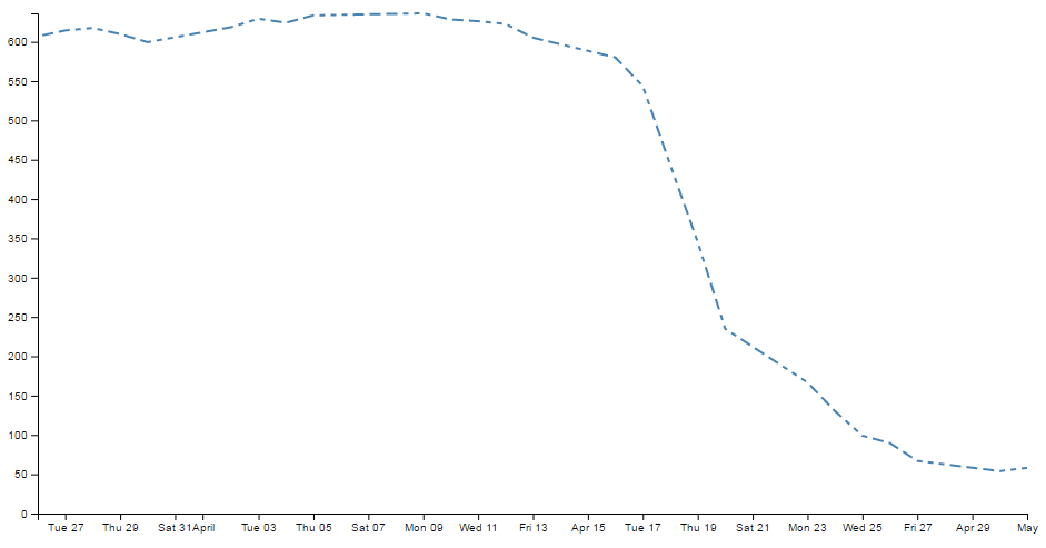
Ahh yes, Mr. Morse would be proud.
And you can put them anywhere. Here are our axes perverted with dashes;
  // Add the X Axis
  svg.append("g")
      .attr("transform", "translate(0," + height + ")")
      .style("stroke-dasharray", ("3, 3"))
      .call(d3.axisBottom(x));

  // Add the Y Axis
  svg.append("g")
      .style("stroke-dasharray", ("3, 3"))
      .call(d3.axisLeft(y));
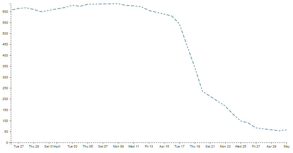
Well… I suppose you can have too much of a good thing. With great power comes great responsibility. Use your dash skills wisely and only for good.
Filling an area under the graph
Lines are all very well and good, but that’s not the whole story for graphs. Sometimes you’ve just got to go with a fill.
Filling an area with a solid colour isn’t too hard. I mean we did it by mistake back a few pages when we were trying to draw a line.
But to do it in a nice coherent way is fairly straight forward.
It takes three sections of code in much the same way that we drew our grid lines earlier;
- One in the CSS section to define what style the area will have.
- One to define the functions that generate the area. And…
- One to draw the area.
The end result will looks a bit like this;
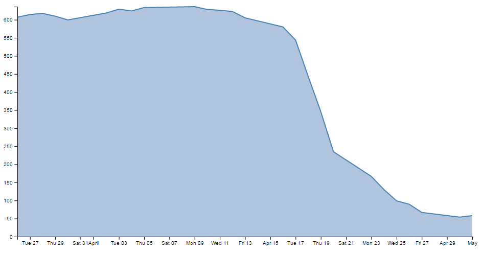
While we’ll start with our default code for our simple graph, the full code for this area graph can be found on github or in the code samples bundled with this book (area.html and data.csv). A live example can be found on bl.ocks.org.
CSS for an area fill
This is pretty straight forward and only consists of one rule;
.area {
  fill: lightsteelblue;
}
Put it at the bottom of your <style> section.
The style (fill: lightsteelblue;) sets the colour of our fill (and in this case we have chosen a lighter shade of the same colour as our line to match it).
Define the area function
We need a function that will tell the area what space to fill. This is accessed from the d3.area function
The code that we will use is as follows;
// define the area
var area = d3.area()
    .x(function(d) { return x(d.date); })
    .y0(height)
    .y1(function(d) { return y(d.close); });
I have placed it in between the range variable definitions and the line definitions here;
// set the ranges
var x = d3.scaleTime().range([0, width]);
var y = d3.scaleLinear().range([height, 0]);

                         <==== Put the new code here!

// define the line
var valueline = d3.line()
    .x(function(d) { return x(d.date); })
    .y(function(d) { return y(d.close); });
So the only changes to the code are the addition of the y0 line and the renaming of the y line y1.
Here’s a picture that might help explain;
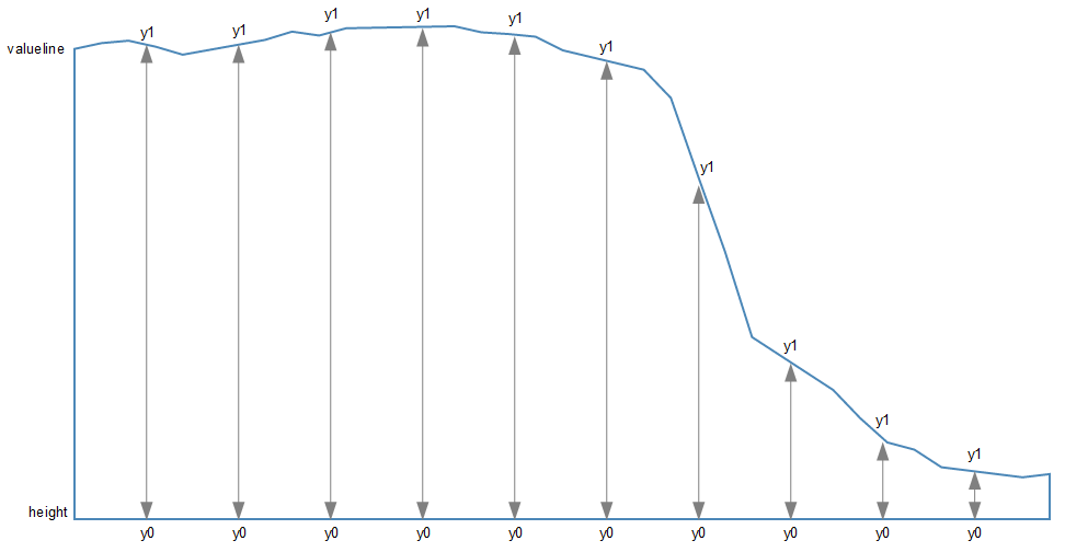
As should be apparent, the top line (y1) follows the valueline line and the bottom line is at the constant ‘height’ value. Everything in between these lines is what gets filled. The function in this section describes the area.
Draw the area
Now to the money maker.
The final section of code in the area filling odyssey is as follows;
  // add the area
    svg.append("path")
       .data([data])
       .attr("class", "area")
       .attr("d", area);
We should place this block directly after the domain functions but before the drawing of the valueline path;
  // scale the range of the data
  x.domain(d3.extent(data, function(d) { return d.date; }));
  y.domain([0, d3.max(data, function(d) { return d.close; })]);

                                //   <== Area drawing code here!

  // add the valueline path.
  svg.append("path")
      .data([data])
      .attr("class", "line")
      .attr("d", valueline);
This is actually a pretty good idea to put it there since the various bits and pieces that are drawn in the graph are done so one after the other. This means that the filled area comes first, then the valueline is layered on top and then the axes come last. This is a pretty good sequence since if there are areas where two or more elements overlap, it might cause the graph to look ‘wrong’.
For instance, here is the graph drawn with the area added last.
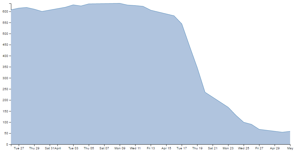
You should be able to notice that part of the valueline line has been obscured and the line for the y axis where it coincides with the area is obscured also.
Looking at the code we are adding here, the first line appends a path element (svg.append("path")) much like the script that draws the line.
The second line (.data([data])) declares the data we will be utilising for describing the area and the third line (.attr("class", "area")) makes sure that the style we apply to it is as defined in the CSS section (under ‘area’).
The final line (.attr("d", area);) declares “d” as the attributer for path data and calls the ‘area’ function to do the drawing.
And that’s it!
Filling an area above the line
Pop Quiz:
How would you go about filling the area ABOVE the graph?
In this instance, you could fill the lower area as has been demonstrated here, and with a small change you can fill another area with a solid colour above another line.
How is this incredible feat achieved?
Well, remember the code that defined the area?
// define the area
var area = d3.area()
    .x(function(d) { return x(d.date); })
    .y0(height)
    .y1(function(d) { return y(d.close); });
All we have to do is tell it that instead of setting the y0 constant value to the height of the graph (remember, this is the bottom of the graph) we will set it to the constant value that is at the top of the graph. In other words zero (0).
.y0(0)
That’s it.
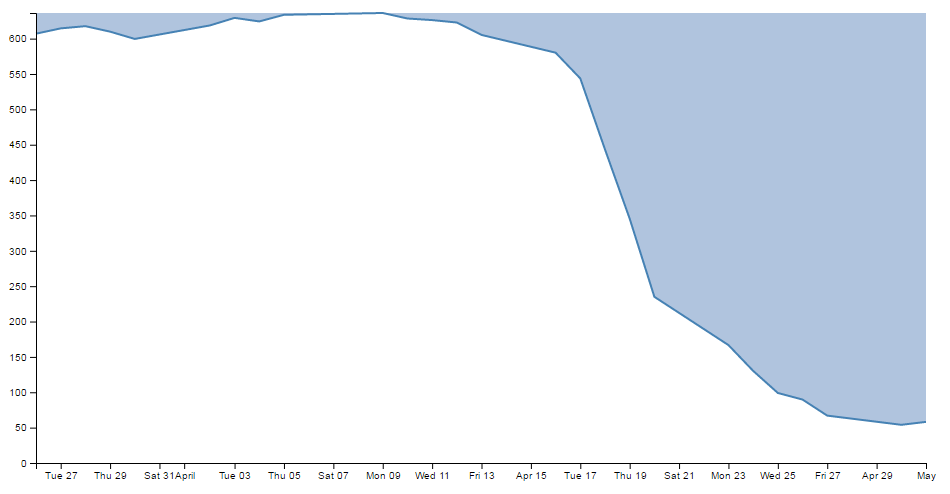
Now, I’m not going to go over the process of drawing two lines and filling each in different directions to demonstrate the example I described, but this provides a germ of an idea that you might be able to flesh out :-)
Adding a drop shadow to allow text to stand out on graphics.
I’ve deliberately positioned this particular tip to follow the ‘filling an area’ description because it provides an opportunity to demonstrate the principle to slightly better effect.
While we’ll start with our code for our area graph, the full code for the graph with shadowy text can be found on github or in the code samples bundled with this book (shadow.html and data.csv). A live example can be found on bl.ocks.org.
There have been several opportunities where I have wanted to place text overlaid on graphs for convenience sake only to have it look overly messy as the text interferes with the graph.
Anyway, what we’ll do is leave the area fill in place and place the title back on the graph, but position the title so that it lays on top of the fill like so;
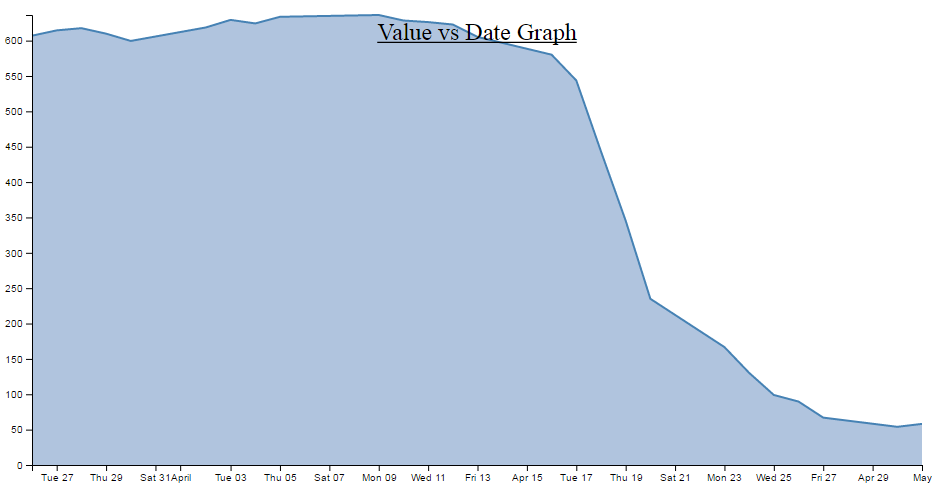
The additional code for the title is the following and appears just after the drawing of the axes.
  svg.append("text")
      .attr("x", (width / 2))
      .attr("y", 25 )
      .attr("text-anchor", "middle")
      .style("font-size", "24px")
      .style("text-decoration", "underline")
      .text("Value vs Date Graph");
(the only change from the previous title example is the ‘y’ attribute which has been hard coded to 25 to place it inconveniently on the filled area and the size of the font)
So, what we want to end up with is something like the following…

In my humble opinion, it’s just enough to make the text acceptable :-).
The method that I’ll describe to carry this out is designed so that the drop shadow effect can be applied to any text elements in the graph, not the isolated example that we will use here. In order to implement this marvel of utility we will need to make changes in two areas. One in the CSS where we will define a style for white shadowy backgrounds and the second to draw it.
CSS for white shadowy background
The code to add to the CSS section is as follows;
text.shadow {
  stroke: white;
  stroke-width: 4px;
  opacity: 0.8;
}
The first line designates that the style applies to text with a ‘shadow’ label. The stroke is set to white. The width of the line is set to 4px and it is made to be slightly see-through. So by setting the line that surrounds the text to be thick, white and see-through gives it a slightly ‘cloudy’ effect. If we remove the black text from over the top we get a slightly better look;

Of course if you want to have a play with any of these settings, you should have a go and see what works best for your graph.
Drawing the white shadowy background.
Now that we’ve set the style for our background, we need to draw it in.
The code for this should be extremely familiar;
  svg.append("text")
      .attr("x", (width / 2))
      .attr("y", 25 )
      .attr("text-anchor", "middle")
      .style("font-size", "24px")
      .style("text-decoration", "underline")
      .attr("class", "shadow")			// <=== Here's the different line
      .text("Value vs Date Graph");
That’s because it’s identical to the piece of code that was used to draw the title except for the one line that is indicated above. The reason that it’s identical is that what we are doing is placing a white shadow on the graph and then the text on top of it, if it deviated by a significant amount it will just look silly. Of course a slight amount could look effective, in which case adjust the ‘x’ or ‘y’ attributes.
One of the things I pointed out in the previous paragraph was extremely important. That’s the bit that tells you that we needed to place the shadow before we placed the black text. For the same reason that we placed the area fill on first in the area fill example, If black text goes on before the shadow, it will look pretty silly. So place this block of code just before the block that draws the title.
So the line that has been added in is the one that tells D3 that the text that is being drawn will have the white cloudy effect. And at the risk of repeating myself, if you have several text elements that could benefit from this effect, once you have the CSS code in place, all you need to do is duplicate the block that adds the text and add in that single line and voila!
Adding grid lines to a graph
Grid lines are an important feature for some graphs as they allow the eye to associate three analogue scales (the x and y axis and the displayed line).
There is currently a tendency to use graphs without grid lines online as it gives the appearance of a ‘cleaner’ interface, but they are still widely used and a necessary component for graphing.
This is what we’re going to draw;

While we’ll start with our default code for our simple graph, the full code for the graph with grid lines can be found on github or in the code samples bundled with this book (grid.html and data.csv). A live example can be found on bl.ocks.org.
How to build grid lines?
We’re going to use the axis function to generate two more axis elements (one for x and one for y) but for these ones instead of drawing the main lines and the labels, we’re just going to draw the tick lines. Really long tick lines (I’m considering calling them long cat lines).
To create them we have to add in 3 separate blocks of code.
- One in the CSS section to define what style the grid lines will have.
- One to define the functions that generate the grid lines. And…
- One to draw the lines.
The grid line CSS
This is the total styling that we need to add for the tick lines;
.grid line {
  stroke: lightgrey;
  stroke-opacity: 0.7;
  shape-rendering: crispEdges;
}

.grid path {
  stroke-width: 0;
}
Just add this block of code at the end of the current CSS that is in the simple graph template (just before the </style> tag).
The CSS here is done in two parts.
The first portion sets the line colour (stroke), the opacity (transparency) of the lines and make sure that the lines are narrow (crispEdges).
  stroke: lightgrey;
  stroke-opacity: 0.7;
  shape-rendering: crispEdges;
The colour is pretty standard, but in using the opacity style we give ourselves the opportunity to use a good shade of colour (if grey actually is a colour) and to juggle the degree to which it stands out a little better.
The second part is the stroke width.
stroke-width: 0;
Now it might seem a little weird to be setting the stroke width to zero, but if you don’t (and we remove the style) this is what happens;
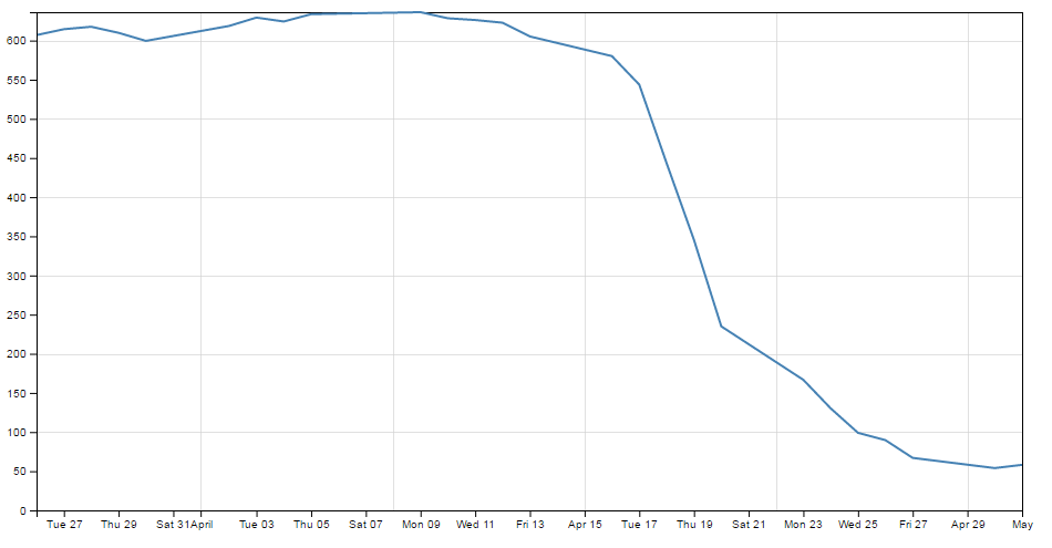
If you look closely (compare with the previous picture if necessary) the grid lines for the top and right edges have turned black. The stroke width style is obviously adding in new axis lines and we’re not interested in them at the moment. Therefore, if we set the stroke width to zero, we get rid of the problem.
Define the grid line functions
We will need to define two functions to generate the grid lines and they look a little like this;
// gridlines in x axis function
function make_x_gridlines() {
    return d3.axisBottom(x)
        .ticks(5)
}

// gridlines in y axis function
function make_y_gridlines() {
    return d3.axisLeft(y)
        .ticks(5)
}
Each function will carry out its configuration when called from the later part of the script (the drawing part).
A good spot to place the code is just before we load the data with the d3.csv
        //   <== Put the functions here!

// Get the data
d3.csv("data.csv", function(error, data) {
  if (error) throw error;
Both functions are almost identical. They give the function a name (make_x_gridlines and make_y_gridlines) which will be used later when the piece of code that draws the lines calls out to them.
Both functions also show which parameters will be fed back to the drawing process when called. Both make sure they use the d3.axis function and then they set individual attributes which make sense.
They make sure they’ve got the right axes (with the x and y variables in the function).
They set the orientation of the axes to match the incumbent axes (d3.axisBottom(x) and d3.axisLeft(y)).
And they set the number of ticks to match the number of ticks in the main axis (.ticks(5) and .ticks(5)). You have the opportunity here to do something slightly different if you want. For instance, think back to when we were setting up the axis for the basic graph and we messed about, seeing how many ticks we could get to appear. If we increase the number of ticks that appear in the grid (lets say to .ticks(30) and .ticks(10))) we get the following;

So the grid lines can now show divisions of 20 on the y axis and per 2 days on the x axis :-)
Draw the lines
The final block of code we need is the bit that draws the lines.
  // add the X gridlines
  svg.append("g")
      .attr("class", "grid")
      .attr("transform", "translate(0," + height + ")")
      .call(make_x_gridlines()
          .tickSize(-height)
          .tickFormat("")
      )

  // add the Y gridlines
  svg.append("g")
      .attr("class", "grid")
      .call(make_y_gridlines()
          .tickSize(-width)
          .tickFormat("")
      )
The first two lines of both the x and y axis grid lines code above should be pretty familiar by now. The first one appends the element to be drawn to the group “g”. the second line (.attr("class", "grid")) makes sure that the style information set out in the CSS is applied.
The x axis grid lines portion makes a slight deviation from conformity here to adjust its positioning to take into account the coordinates system .attr("transform", "translate(0," + height + ")").
Then both portions call their respective make axis functions (.call(make_x_gridlines() and .call(make_y_gridlines()).
Now comes the really interesting bit.
What you will see if you go to the D3 API wiki is that for the .tickSize function, the following is the format.
axis.tickSize([size])
So in our example we are setting our ticks to a length that corresponds to the full height or width of the graph. Which of course means that they extend across the graph and have the appearance of grid lines! What a neat trick.
The last thing that is included in the code to draw the grid lines is the instruction to suppress printing any label for the ticks;
.tickFormat("")
After all, that would become a bit confusing to have two sets of labels. Even if one was on top of the other. They do tend to become obvious if that occurs (they kind of bulk out a bit like bold text).
And that’s it. Grid lines!
Adding more than one line to a graph
All right, we’re starting to get serious now. Two lines on a graph is a bit of a step into a different world in one respect. I mean that in the sense that there’s more than one way to carry out the task, and I tend to do it one way and not the other mainly because I don’t fully understand the other way :-(.
How are we going to do this? I think that the best way will be to make the executive decision that we have suddenly come across more data and that it is also in our data.csv file (which we’ll rename data2.csv just to highlight the difference between the two data sets). In fact it looks a little like this (apologies in advance for the big ugly block of data);
Three columns, date open and close. The first two are exactly what we have been dealing with all along and the last (open) is our new made up data. Each column is separated by a comma (hence .csv (comma separated values)), which is the format we’re currently using to import data.
We should save this as a new file so we don’t mess up our previous data, so (as mentioned earlier) let’s call it data2.csv.
There is a copy of this file and the sample code at github and in the code samples bundled with this book (multiple-lines.html and data2.csv). A live example can be found on bl.ocks.org.
We will build our new code using our simple graph template to start with, so the immediate consequence of this is that we need to edit the line that was looking for ‘data.csv’ to reflect the new name.
d3.csv("data2.csv", function(error, data) {
So when you browse to our new graph’s html file, we don’t see any changes. It still happily loads the new data, but because it hasn’t been told to do anything with it, nothing new happens.
What we need to do now it to essentially duplicate the code blocks that drew the first line for the second line.
The good news is that in the simplest way possible that’s just two code blocks. The first sets up the function that defines the new line;
// define the 2nd line
var valueline2 = d3.line()
    .x(function(d) { return x(d.date); })
    .y(function(d) { return y(d.open); });
You should notice that this block is identical to the block that sets up the function for the first line, except this one is called (imaginatively) valueline2 and instead of including the variable ‘close’ for our datapoint we are using our new variable (from the extra column in the csv file) ‘open’. We should put it directly after the block that sets up the function for valueline.
The second block draws our new line;
  // Add the valueline2 path.
  svg.append("path")
      .data([data])
      .attr("class", "line")
      .attr("d", valueline2);
Again, this is identical to the block that draws the first line, except this one is called valueline2. We should put it directly after the block that draws valueline.
After those three small changes, check out your new graph;
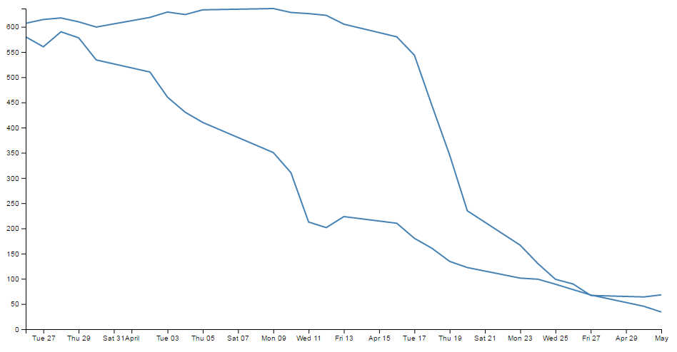
Hey! Two lines! Hmm…. Both being the same colour is a bit confusing. Good news. We can change the colour of the second line by inserting a line that adjusts its stroke (colour) very simply.
So here’s what our new drawing block looks like;
  // Add the valueline2 path.
  svg.append("path")
      .data([data])
      .attr("class", "line")
      .style("stroke", "red")
      .attr("d", valueline2);
And as if by magic, here’s our new graph;
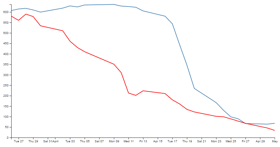
Wow. Right about now, we’re thinking ourselves pretty clever. But there are two places where we’re not doing things right. We took a simple way, but we took some short cuts that might bite us in the posterior.
The first mistake we made was not ensuring that our variable "d.open" is being treated as a number or a string. We’re fortunate in this case that it is, but this can’t always be assumed. So, this is an easy fix and we just need to put the following (indicated line) in our code;
  // format the data
  data.forEach(function(d) {
      d.date = parseTime(d.date);
      d.close = +d.close;
      d.open = +d.open;         //  <=== Add this line in!
  });
The second and potentially more fatal flaw is that nowhere in our code do we make allowance for our second set of data (the second line’s values) exceeding our first lines values.
That might not sound too normal straight away, but consider this. What if when we made up our data earlier, some of the new data exceeded our maximum value in our original data? As a means of demonstration, here’s what happens when our second line of data has values higher than the first lines;
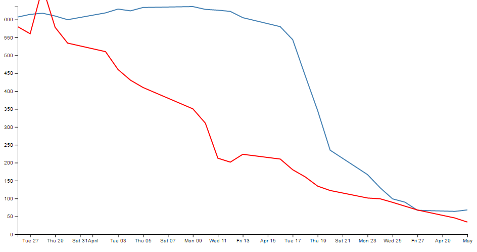
Ahh…. We’re not too clever now.
Good news though, we can fix it!
The problem comes about because when we set the domain for the y axis this is what we put in the code;
y.domain([0, d3.max(data, function(d) { return d.close; })]);
So that only considers d.close when establishing the domain. With d.open exceeding our domain, it just keeps drawing off the graph!
The good news is that ‘Bill’ has provided a solution for just this problem here;
All you need to replace the y.domain line with is this;
  y.domain([0, d3.max(data, function(d) {
	  return Math.max(d.close, d.open); })]);
It does much the same thing, but this time it returns the maximum of d.close and d.open (whichever is largest). Good work Bill.
If we put that code into the graph with the higher values for our second line we are now presented with this;
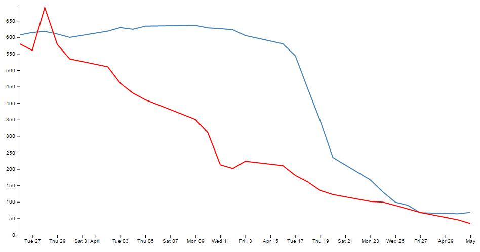
And it doesn’t matter which of the two sets of data is largest, the graph will always adjust :-)
You will also have noticed that our y axis has auto adjusted again to cope. Clever eh?
Labelling multiple lines on a graph
Our previous example of a graph with multiple lines is a thing of rare beauty, but which line relates to which set of data? We have data that defines values for open and close, but we don’t know which line is which.
In this section we will add labels to our lines so that we know what it what.
This section was inspired by a question from a reader (Arun b.s) of the d3noob.org blog where the question was asked “How can we put text at the end of each line on the graph?”.
The question was so good I realised that it had to be part of the book, so here you go :-).
It’s actually not too difficult. What we are trying to achieve is to find the position of the end of each line and to add a text label at that position so that the association of proximity denotes the linkage. Of course we’re going to go a little further and colour the text so that it’s really clear which label belongs with which line, but you get the idea.
Each line requires a single block of script to add the text. The block that adds the open label is as follows;
  svg.append("text")
      .attr("transform", "translate("+(width+3)+","+y(data[0].open)+")")
      .attr("dy", ".35em")
      .attr("text-anchor", "start")
      .style("fill", "red")
      .text("Open");
So firstly it appends a textual element to the svg object;
svg.append("text")
Then it finds the position of the end of the line;
.attr("transform", "translate("+(width+3)+","+y(data[0].open)+")")
To do this we use the transform and translate attribute and find the x position that equates to the end of the graph plus 3 pixels ((width+3)) (we add in the three pixels to create a small separation between the end of the line and the label). The y position is far more interesting. We need to find the position of the last point in our line for the open data. Because the data is in the form of an indexed array and because the data has the latest date at the start of the array, we only need to find the point at the 0 position of the array. This is data[0].open. But of course, we also need to adjust our data for our scale and range, so we transform it using the y function (in the same way that we do it for the valueline and valueline2 points. So the script to find the point on the screen in the y direction is y(data[0].open).
If our data was arranged with the last date at the end of our data we would have to find the final index point and we would use y(data[data.length-1].open)).
Then it’s just a matter of aligning and justifying our text correctly;
      .attr("dy", ".35em")
      .attr("text-anchor", "start")
Then colouring it the correct colour;
.style("fill", "red")
And adding out text;
.text("Open");
We put this block of code after the blocks that add in the axes so that they make sure they’re on top of anything else we draw. Of course we will want to add another (almost) duplicate of the block for the ‘close’ column.
The only other small change we want to make is to change the right margin for the graph that we set at the start of our script from 20 to 40 so that there is enough room to add our label without cutting it off.
After that you have a marvellously labelled multi-line graph!
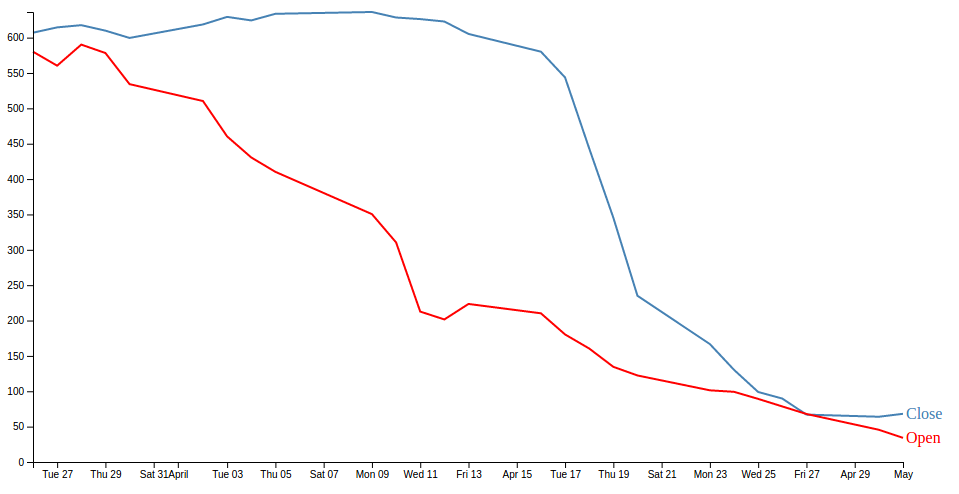
The full code for this example can be found on github or in the code samples bundled with this book (dual-labels.html and data2.csv). A working example can be found on bl.ocks.org.
Now, I’d like to pretend that this is perfection, but it isn’t. If our lines end too close together, the labels will interfere with each other, so in the ideal world I would include a bit of fanciness to prevent that, but for the purposes of this exercise we can consider ourselves happy.
Multiple axes for a graph
Alrighty… Let’s imagine that we want to show our wonderful graph with two lines, much like we already have, but imagine that the data that the lines are made from is significantly different in magnitude from the original data (in the example below, the data for the second line has been reduced by approximately a factor of 10 from our original data).
Now this isn’t a problem in itself. D3 will still make a reasonable graph of the data, but because of the difference in range, the detail of the second line will be lost.
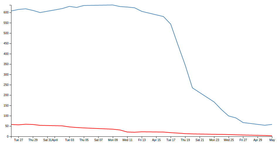
What I’m proposing is that we have a second y axis on the right hand side of the graph that relates to the red line.
The mechanism used is based on the great examples put forward by Ben Christensen here.
The full code for this example can be found on github or in the code samples bundled with this book (dual-axes.html and data4.csv). A working example can be found on bl.ocks.org.
First things first, there won’t be space on the right hand side of our graph to show the extra axis, so we should make our right hand margin a little larger.
var margin = {top: 20, right: 40, bottom: 30, left: 50},
I went for 40 and it seems to fit pretty well.
Then (and here’s where the main point of difference for this graph comes in) you want to amend the code to separate out the two scales for the two lines in the graph. This is actually a lot easier than it sounds, since it consists mainly of finding anywhere that mentions y and replacing it with y0 and then adding in a reciprocal piece of code for y1.
Let’s get started.
In order to colour the text on the two different y axes we will need to declare their styles in the <style> section at the start of the code. In the declaration shown below we are calling the two different classes ‘axisSteelBlue’ and ‘axisRed’. The style that we set for each is ‘fill’ since this is the style that will colour the text
.axisSteelBlue text{
  fill: steelblue;
}

.axisRed text{
  fill: red;
}
Then into the JavaScript and we want to change the variable declaration for y to y0 and add in y1.
// set the ranges
var x = d3.scaleTime().range([0, width]);
var y0 = d3.scaleLinear().range([height, 0]);
var y1 = d3.scaleLinear().range([height, 0]);
Now change our valueline declarations so that they refer to the y0 and y1 scales.
// define the 1st line
var valueline = d3.line()
    .x(function(d) { return x(d.date); })
    .y(function(d) { return y0(d.close); });

// define the 2nd line
var valueline2 = d3.line()
    .x(function(d) { return x(d.date); })
    .y(function(d) { return y1(d.open); });
There are a few different ways for the scaling to work, but we’ll stick with the fancy max method we used in the dual line example (although technically it’s not required).
  y0.domain([0, d3.max(data, function(d) {return Math.max(d.close);})]);
  y1.domain([0, d3.max(data, function(d) {return Math.max(d.open); })]);
Again, here’s the y0 and y1 changed and added and the maximums for d.close and d.open are separated out).
The final piece of the puzzle is to draw the new axis, but we also want to colour code the text in the axes to match the lines. We do this using the styling that we declared earlier
  // Add the Y0 Axis
  svg.append("g")
      .attr("class", "axisSteelBlue")
      .call(d3.axisLeft(y0));

  // Add the Y1 Axis
  svg.append("g")
      .attr("class", "axisRed")
      .attr("transform", "translate( " + width + ", 0 )")
      .call(d3.axisRight(y1));
In the above code you can see where we have added in a ‘style’ change for the axisLeft to make it ‘steelblue’ and a complementary change in the new section for axisRight to make that text red.
The yAxisRight section obviously needs to be added in, but the only significant difference is the transform / translate attribute that moves the axis to the right hand side of the graph.
And after all that, here’s the result…
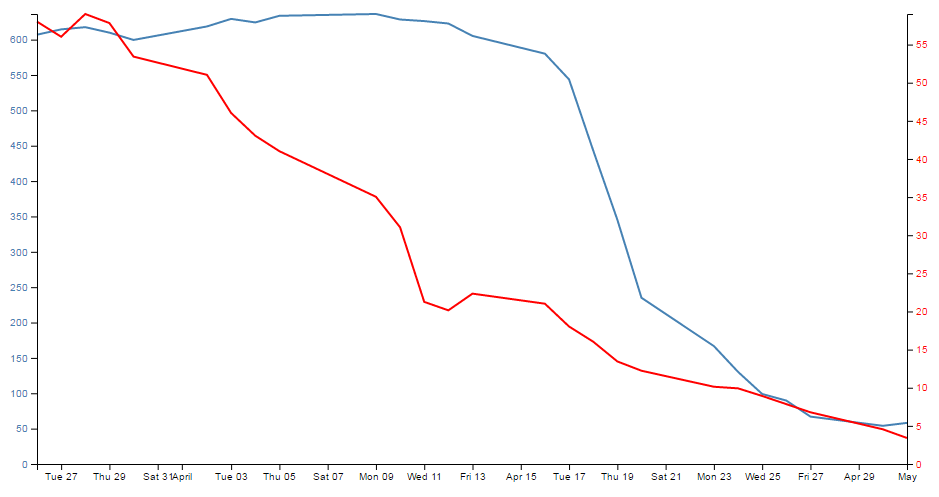
Now, let’s not kid ourselves that it’s a thing of beauty, but we should console our aesthetic concerns with the warm glow of understanding how the function works :-).
Elements, Attributes and Styles
This chapter is intended to provide an overview of some of the simpler things that d3.js can do, but in a way that may help some understand a little more about how images can be added to a web page and how they can be manipulated.
Loosely speaking we will look at how objects (elements (like circles, rectangles, lines and even text)) can be declared and added to a page, how their attributes in relation to the page (position, size, shape, actions) can be changed and how their style (colour, width, transparency) can be applied.
As we go through the explanation of different changes that can be applied to different elements there will be a small amount of repetition where there is cross-over with related drawing features. Please be patient :-). The aim is to have each section as complete in its own right as practical.
The Framework
To be able to demonstrate how these three related aspects of drawing objects work we will have to use a small, simple script to draw them in your web browser.
We will just take a moment to explain the script that draws a circle.
Here’s the contents of the file in its entirety. I have imaginatively called it circle.html and you can find it in the code samples that can be downloaded with the book.
<!DOCTYPE html>
<meta charset="utf-8">

<body>

<!-- load the d3.js library -->
<script src="https://d3js.org/d3.v4.min.js"></script>

<script>

var holder = d3.select("body") // select the 'body' element
      .append("svg")           // append an SVG element to the body
      .attr("width", 449)      // make the SVG element 449 pixels wide
      .attr("height", 249);    // make the SVG element 249 pixels high

// draw a circle
holder.append("circle")        // attach a circle
    .attr("cx", 200)           // position the x-center
    .attr("cy", 100)           // position the y-center
    .attr("r", 50);            // set the radius

</script>

</body>
Please feel free to jump ahead slightly if you understand how a HTML file with JavaScript goes together :-).
The HTML part of the file can be thought of as a wrapper for the JavaScript that will draw our circle. These are the HTML parts here…
<!DOCTYPE html>
<meta charset="utf-8">

<body>

<!-- load the d3.js library -->
<script src="https://d3js.org/d3.v4.min.js"></script>

<script>

</script>

</body>
This portion of the file is built using HTML ‘tags’. These will set up the environment for the JavaScript.
The tags tell the web browser what sort of language is being used and the type of characters used to write the code…
<!DOCTYPE html>
<meta charset="utf-8">
Areas of the code are labelled.
Like the body…
<body>

In this area we can put the stuff that will be
displayed on our web page.

</body>
And the place where we put the JavaScript…
<script>

Our d3.js code will go here.

</script>
We even load an external file that contains JavaScript that will help run our code.
<!-- load the d3.js library -->
<script src="https://d3js.org/d3.v4.min.js"></script>
Yes, that’s the line that loads d3.js. Once it’s loaded we can use the instructions that it makes available to make other JavaScript code (in this case ours) work.
Then we have the JavaScript code that allows us to use the functions made possible by d3.js.
var holder = d3.select("body") // select the 'body' element
      .append("svg")           // append an SVG element to the body
      .attr("width", 449)      // make the SVG element 449 pixels wide
      .attr("height", 249);    // make the SVG element 249 pixels high

// draw a circle
holder.append("circle")        // attach a circle
    .attr("cx", 200)           // position the x-center
    .attr("cy", 100)           // position the y-center
    .attr("r", 50);            // set the radius
I’ve broken the code into two separate blocks to provide some clarity to their function. We could make it one block, but that wouldn’t necessarily make it easier to understand.
Firstly we add a ‘holder’ for our graphics on the web page. I’ve named it holder but we could just as easily named it anything we wanted.
var holder = d3.select("body") // select the 'body' element
      .append("svg")           // append an SVG element to the body
      .attr("width", 449)      // make the SVG element 449 pixels wide
      .attr("height", 249);    // make the SVG element 249 pixels high
The first thing we do when declaring our holder is to select the body element of our web page (Remember those <body> tags in the HTML part earlier?).
Then we append a Scalable Vector Graphic (SVG) object to the body and we make it 449 pixels wide and 249 pixels high.
The width and height are ‘attributes’ of the SVG object. That is to say they describe a property of the object.
The second block of our JavaScript finally draws our circle.
holder.append("circle")        // attach a circle
    .attr("cx", 200)           // position the x-center
    .attr("cy", 100)           // position the y-center
    .attr("r", 50);            // set the radius
The first line appends a new element (a circle) to our SVG ‘holder’.
The second and third lines declare the attribute of our circle that specify where the centre of the circle is. In this case it’s at the x/y position 200/100 (cx/cy).
The last line adds the radius attribute r. Here it is set to 50 pixels.
The three attributes cx, cy and r are all required when drawing a circle. There are other attributes we can put in there (and when we look at some of the upcoming elements, you should get a feel for them), but these are the minimum.
The purpose of describing this block of code that draws a circle isn’t to show you how to draw a circle. This has only been a way of showing you how the code in the following sections is laid out and how it works. The elements we are going to generate can be drawn with exactly the same file but with just the section that adds the circle altered.
For example if you were to change this block of code;
holder.append("circle")        // attach a circle
    .attr("cx", 200)           // position the x-center
    .attr("cy", 100)           // position the y-center
    .attr("r", 50);            // set the radius
For this block of code;
holder.append("rect")          // attach a circle
    .attr("x", 150)            // x position of the top-left corner
    .attr("y", 50)             // y position of the top-left corner
    .attr("width", 100)        // set the rectangle width
    .attr("height", 100);      // set the rectangle height
Instead of drawing a circle we would be drawing a rectangle.
So this is what our circle will look like;
Because it will help a great deal to have a common frame of reference, I’m going to display the elements on a grid that looks a little like this;
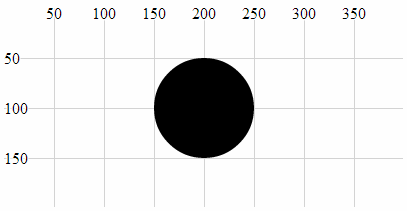
With the grid in place it’s far easier to see that the centre of our circle is indeed at the coordinates x = 200, y = 100 and that the radius is 50.
The circle is still somewhat plain, but bear with me because as we start to explore what we can do with styles and attributes we can add some variation to our elements.
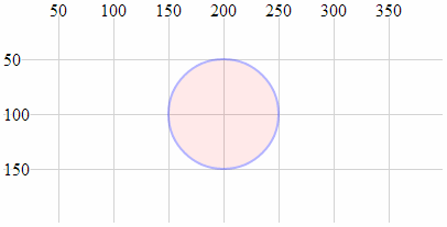
With that explanation behind us we should begin our odyssey into the world of d3 elements.
Elements
We will begin by describing what we mean when we talk about an ‘element’.
There is considerable scope for confusion when talking about elements on a web page. Are we talking about HTML elements, SVG elements or something different?
In fact we are going to be describing a subset of SVG elements. Specifically a collection of common shapes and objects which include circles, ellipses, rectangles, lines, polylines, polygons, text and paths.
“Text?” I hear you say. “Doesn’t sound like a shape.” I suppose it depends on how you think of it. We can use text in different ways in d3, but for this particular exercise we can regard text as an SVG element.
Circle
A circle is a simple SVG shape that is described by three required attributes.
-
cx: The position of the centre of the circle in the x direction (left / right) measured from the left side of the screen. -
cy: The position of the centre of the circle in the y direction (up / down) measured from the top of the screen. -
r: The radius of the circle from thecx,cyposition to the perimeter of the circle.
The following is an example of the code section required to draw a circle in conjunction with the HTML file outlined at the start of this chapter;
holder.append("circle")        // attach a circle
    .attr("cx", 200)           // position the x-center
    .attr("cy", 100)           // position the y-center
    .attr("r", 50);            // set the radius
This will produce a circle as follows;

The centre of the circle is at x = 200 and y = 100 and the radius is 50 pixels.
Ellipse
An ellipse is described by four required attributes;
-
cx: The position of the centre of the ellipse in the x direction (left / right) measured from the left side of the screen. -
cy: The position of the centre of the ellipse in the y direction (up / down) measured from the top of the screen. -
rx: The radius of the ellipse in the x dimension from thecx,cyposition to the perimeter of the ellipse. -
ry: The radius of the ellipse in the y dimension from thecx,cyposition to the perimeter of the ellipse.
The following is an example of the code section required to draw an ellipse in conjunction with the HTML file outlined at the start of this chapter;
holder.append("ellipse")       // attach an ellipse
    .attr("cx", 200)           // position the x-centre
    .attr("cy", 100)           // position the y-centre
    .attr("rx", 100)           // set the x radius
    .attr("ry", 50);           // set the y radius
This will produce an ellipse as follows;
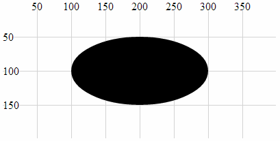
The centre of the ellipse is at x = 200 and y = 100 and the radius is 50 pixels vertically and 100 pixels horizontally.
Rectangle
A rectangle is described by four required attributes and two optional ones;
-
x: The position on the x axis of the left hand side of the rectangle (required). -
y: The position on the y axis of the top of the rectangle (required). -
width: the width (in pixels) of the rectangle (required). -
height: the height (in pixels) of the rectangle (required). -
rx: The radius curve of the corner of the rectangle in the x dimension (optional). -
ry: The radius curve of the corner of the rectangle in the y dimension (optional).
The following is an example of the code section required to draw a rectangle (using only the required attributes) in conjunction with the HTML file outlined at the start of this chapter;
holder.append("rect")       // attach a rectangle
    .attr("x", 100)         // position the left of the rectangle
    .attr("y", 50)          // position the top of the rectangle
    .attr("height", 100)    // set the height
    .attr("width", 200);    // set the width
This will produce a rectangle as follows;
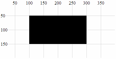
The top left corner of the rectangle is at 100, 50 and the rectangle is 200 pixels wide and 100 pixels high.
The following code section includes the optional attributes for the curved corners;
holder.append("rect")       // attach a rectangle
    .attr("x", 100)         // position the left of the rectangle
    .attr("y", 50)          // position the top of the rectangle
    .attr("height", 100)    // set the height
    .attr("width", 200)     // set the width
    .attr("rx", 10)         // set the x corner curve radius
    .attr("ry", 10);        // set the y corner curve radius
This will produce a rectangle (with curved corners) as follows;
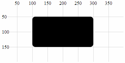
The corners are curved with radii in the x and y direction of 10 pixels.
Line
A line is a simple line between two points and is described by four required attributes.
-
x1: The x position of the first end of the line as measured from the left of the screen. -
y1: The y position of the first end of the line as measured from the top of the screen. -
x2: The x position of the second end of the line as measured from the left of the screen. -
y2: The y position of the second end of the line as measured from the top of the screen.
The following is an example of the code section required to draw a line in conjunction with the HTML file outlined at the start of this chapter. A notable addition to this code is the style declaration. In this case the line has no colour and this can be added with the stroke style which applies a colour to a line;
holder.append("line")          // attach a line
    .style("stroke", "black")  // colour the line
    .attr("x1", 100)     // x position of the first end of the line
    .attr("y1", 50)      // y position of the first end of the line
    .attr("x2", 300)     // x position of the second end of the line
    .attr("y2", 150);    // y position of the second end of the line
This will produce a line as follows;
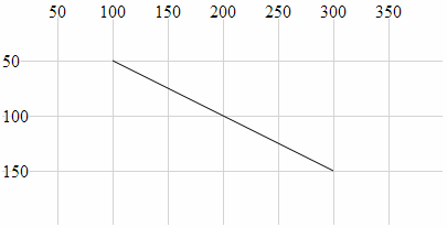
The line extends from the point 100,50 to 300,150.
Polyline
A polyline is a sequence of connected lines described with a single attribute, points.
-
points: Thepointsattribute is a list of x,y coordinates that are the locations of the connecting points of the polyline.
The following is an example of the code section required to draw a polyline in conjunction with the HTML file outlined at the start of this chapter. A notable addition to this code are the style declarations. In this case the line of the polyline has no colour and this can be added with the stroke style which applies the colour black to a line. Likewise the area that is bounded by the polyline will be automatically filled with black unless we explicitly tell the object not to. This is achieved in this example by addition of the fill style to none.
holder.append("polyline")      // attach a polyline
    .style("stroke", "black")  // colour the line
    .style("fill", "none")     // remove any fill colour
    .attr("points", "100,50, 200,150, 300,50");  // x,y points
This will produce a polyline as follows;
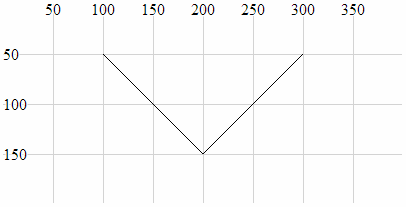
The polyline extends from the point 100,50 to 200,150 to 300,50.
Polygon
A polygon is a sequence of connected lines which form a closed shape described with a single attribute, points.
-
points: Thepointsattribute is a list of x,y coordinates that are the locations of the connecting points of the polygon. The last point is in turn connected to the first point.
The following is an example of the code section required to draw a polygon in conjunction with the HTML file outlined at the start of this chapter. A notable addition to this code are the style declarations. In this case the line of the polygon has no colour and this can be added with the stroke style which applies the colour black to a line. Likewise the area that is bounded by the polygon will be automatically filled with black unless we explicitly tell the object not to. This is achieved in this example by addition of the fill style to none.
holder.append("polygon")       // attach a polygon
    .style("stroke", "black")  // colour the line
    .style("fill", "none")     // remove any fill colour
    .attr("points", "100,50, 200,150, 300,50");  // x,y points
This will produce a polygon as follows;
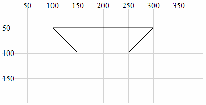
The polygon extends from the point 100,50 to 200,150 to 300,50 and then back to 100,50.
Path
A path is an outline of an SVG shape which is described with a ‘mini-language’ inside a single attribute.
-
d: This attribute is a list of instructions that allow a shape to be drawn in a complex way using a ‘mini-language’ of commands. These commands are written in a shorthand of single letters such asM-moveto,Z-closepath,L-lineto,C-curveto. These commands can be absolute (normally designated by capital letters) or relative (lower case).
The following is an example of the code section required to draw a triangle in conjunction with the HTML file outlined at the start of this chapter. A notable addition to this code are the style declarations. In this case the line of the path has no colour and this can be added with the stroke style which applies the colour black to a line. Likewise the area that is bounded by the path will be automatically filled with black unless we explicitly tell the object not to. This is achieved in this example by addition of the fill style to none.
holder.append("path")          // attach a path
    .style("stroke", "black")  // colour the line
    .style("fill", "none")     // remove any fill colour
    .attr("d", "M 100,50, L 200,150, L 300,50 Z");  // path commands
This will produce a path as follows;
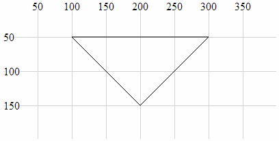
The path mini-language first moves (M) to 100,50 then draws a line (L) to 200,150 then draws another line (L) to 300,50 then closes the path (Z).
Clipped Path (AKA clipPath)
A clipPath is the path of a SVG shape that can be used in combination with another shape to remove any parts of the combined shape that doesn’t fall within the clipPath. That sounds slightly confusing, so we will break it down a bit to hopefully clarify the explanation.
Let’s imagine that we want to display the intersection of two shapes. What we will do is define our clipPath which will act as a ‘cookie cutter’ which can cut out the shape we want (we will choose an ellipse). Then we will draw our base shape (which is analogous to the dough) that we will use our cookie cutter on (our dough will be shaped as a rectangle). The intersection of the cookie cutter and the dough is our clipped path.
Our clipPath (cookie cutter) element is an ellipse;
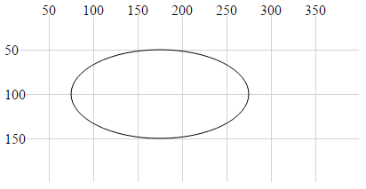
Our shape that we will be clipping (the dough) is a rectangle;
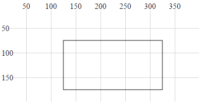
The intersection of the two is the clipped path (shaded grey);
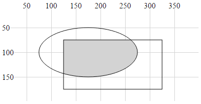
The graphic examples above are misleading in the sense that the two basic shapes are not actually displayed. All that results from the use of the clipPath is the region that is the intersection of the two.
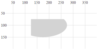
The following is an example of the code section required to draw the clipped path in conjunction with the HTML file outlined at the start of this chapter. The clipPath element is given the ID ‘ellipse-clip’ and a specified size and location. Then when the rectangle is appended. the clipPath is specified as an attribute (via a URL) using clip-path.
// define the clipPath
holder.append("clipPath")       // define a clip path
	.attr("id", "ellipse-clip") // give the clipPath an ID
  .append("ellipse")            // shape it as an ellipse
	.attr("cx", 175)            // position the x-centre
	.attr("cy", 100)            // position the y-centre
	.attr("rx", 100)            // set the x radius
	.attr("ry", 50);            // set the y radius

// draw clipped path on the screen
holder.append("rect")       // attach a rectangle
    .attr("x", 125)         // position the left of the rectangle
    .attr("y", 75)          // position the top of the rectangle
    .attr("clip-path", "url(#ellipse-clip)") // clip the rectangle
    .style("fill", "lightgrey")   // fill the clipped path with grey
    .attr("height", 100)    // set the height
    .attr("width", 200);    // set the width
This will produce a path as follows;

An example of this in use can bee seen in the difference chart explanation later in the book.
Text
A text element is an SVG object which is shaped as text. It is described by two required attributes and three optional ones.
-
x: This attribute designates the anchor point location for the text in the x dimension (required). -
y: This attribute designates the anchor point location for the text in the y dimension (required). -
dx: This attribute designates the offset of the text from the anchor point in the x dimension (optional). There are several different sets of units that can be used to designated the offset of the text from an anchor point. These includeemwhich is a scalable unit (used in these examples),px(pixels),pt(points (kind of like pixels)) and5(percent (scalable and kind of likeem)) -
dy: This attribute designates the offset of the text from the anchor point in the y dimension (optional). -
text-anchor: This attribute controls the horizontal text alignment (optional). It has three values;start(left aligned),middle(centre aligned) andend(right aligned).
The following is an example of the code section required to draw the text “Hello World” in conjunction with the HTML file outlined at the start of this chapter. A notable addition to this code is the style declaration which applies a black fill to the text. Additionally there is the declaration .text which defines the text that will be displayed.
holder.append("text")         // append text
    .style("fill", "black")   // fill the text with the colour black
    .attr("x", 200)           // set x position of left side of text
    .attr("y", 100)           // set y position of bottom of text
    .text("Hello World");     // define the text to display
This will produce text as follows;
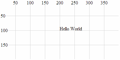
It can be seen from the image that the anchor point for the text is at 200,100 and that the text is positioned with this anchor point at the bottom, left of the text.
The following examples will demonstrate the various options for positioning and aligning text so that you can arrange it correctly.
Anchor at the bottom, middle of the text:
holder.append("text")         // append text
    .style("fill", "black")   // fill the text with the colour black
    .attr("x", 200)           // set x position of left side of text
    .attr("y", 100)           // set y position of bottom of text
    .attr("text-anchor", "middle") // set anchor y justification
    .text("Hello World");          // define the text to display
This will produce text as follows;
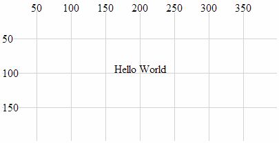
Anchor at the bottom, right of the text:
holder.append("text")         // append text
    .style("fill", "black")   // fill the text with the colour black
    .attr("x", 200)           // set x position of left side of text
    .attr("y", 100)           // set y position of bottom of text
    .attr("text-anchor", "end")  // set anchor y justification
    .text("Hello World");        // define the text to display
This will produce text as follows;
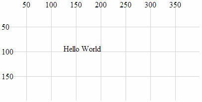
Anchor at the middle, left of the text:
holder.append("text")         // append text
    .style("fill", "black")   // fill the text with the colour black
    .attr("x", 200)           // set x position of left side of text
    .attr("y", 100)           // set y position of bottom of text
    .attr("dy", ".35em")           // set offset y position
    .attr("text-anchor", "start")  // set anchor y justification
    .text("Hello World");          // define the text to display
This will produce text as follows;
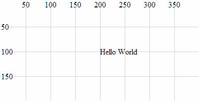
Anchor in the middle, centre of the text:
holder.append("text")         // append text
    .style("fill", "black")   // fill the text with the colour black
    .attr("x", 200)           // set x position of left side of text
    .attr("y", 100)           // set y position of bottom of text
    .attr("dy", ".35em")           // set offset y position
    .attr("text-anchor", "middle") // set anchor y justification
    .text("Hello World");          // define the text to display
This will produce text as follows;
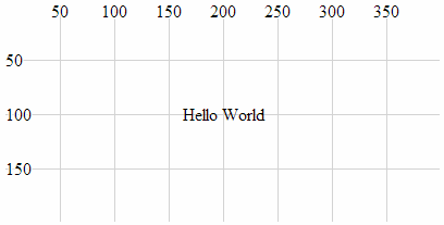
Anchor in the middle, right of the text:
holder.append("text")         // append text
    .style("fill", "black")   // fill the text with the colour black
    .attr("x", 200)           // set x position of left side of text
    .attr("y", 100)           // set y position of bottom of text
    .attr("dy", ".35em")         // set offset y position
    .attr("text-anchor", "end")  // set anchor y justification
    .text("Hello World");        // define the text to display
This will produce text as follows;
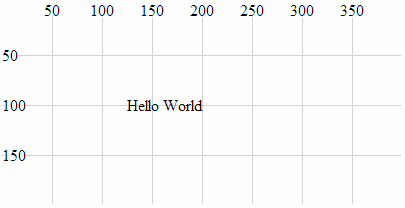
Anchor at the top, left of the text:
holder.append("text")         // append text
    .style("fill", "black")   // fill the text with the colour black
    .attr("x", 200)           // set x position of left side of text
    .attr("y", 100)           // set y position of bottom of text
    .attr("dy", ".71em")           // set offset y position
    .attr("text-anchor", "start")  // set anchor y justification
    .text("Hello World");          // define the text to display
This will produce text as follows;
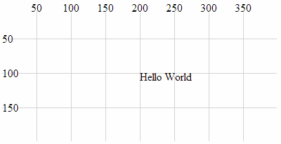
Anchor at the top, middle of the text:
holder.append("text")         // append text
    .style("fill", "black")   // fill the text with the colour black
    .attr("x", 200)           // set x position of left side of text
    .attr("y", 100)           // set y position of bottom of text
    .attr("dy", ".71em")            // set offset y position
    .attr("text-anchor", "middle")  // set anchor y justification
    .text("Hello World");           // define the text to display
This will produce text as follows;
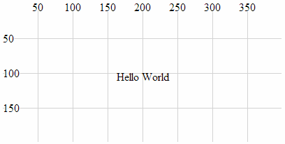
Anchor at the top, right of the text:
holder.append("text")         // append text
    .style("fill", "black")   // fill the text with the colour black
    .attr("x", 200)           // set x position of left side of text
    .attr("y", 100)           // set y position of bottom of text
    .attr("dy", ".71em")          // set offset y position
    .attr("text-anchor", "end")   // set anchor y justification
    .text("Hello World");         // define the text to display
This will produce text as follows;
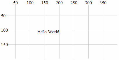
Attributes
At the start of writing this section I was faced with the question “What’s an attribute?”. But a reasonable answer has eluded me, so I will make the assumption that the answer will be something of a compromise :-). I like to think that an attribute of an element is something that is a characteristic of the object without defining it, and/or it may affect the object’s position or orientation on the page. There could be a strong argument to say that the following section on styles could be seen to cross-over into attributes and I agree. However, for the purposes of providing a description of the syntax and effects, I’m happy with the following list :-).
Because not all attributes are applicable to all elements, there will be a bit of variation in the type of shapes we deal with in the description below, but there won’t be any that are different to those that we’ve already looked at. There will be some repetition with recurring information from the elements section. This is intentional to hopefully allow each section to exist in its own right.
x, y
The x and y attributes are used to designate a position on the web page that is set from the top, left hand corner of the web page.
Using the x and y attributes places the anchor points for these elements at a specified location. Of the elements that we have examined thus far, the rectangle element and the text element have anchor points to allow them to be positioned.
For example the following is a code section required to draw a rectangle (using only the required attributes) in conjunction with the HTML file outlined at the start of this chapter;
holder.append("rect")       // attach a rectangle
    .attr("x", 100)         // position the left of the rectangle
    .attr("y", 50)          // position the top of the rectangle
    .attr("height", 100)    // set the height
    .attr("width", 200);    // set the width
This will produce a rectangle as follows;

x,y at 100,50The top left corner of the rectangle is specified using x and y at 100 and 50 respectively.
x1, x2, y1, y2
The x1, x2, y1 and y2 attributes are used to designate the position of two points on a web page that are set from the top, left hand corner of the web page. These two points are connected with a line as part of the line element.
The attributes are described as follows;
-
x1: The x position of the first end of the line as measured from the left of the screen. -
y1: The y position of the first end of the line as measured from the top of the screen. -
x2: The x position of the second end of the line as measured from the left of the screen. -
y2: The y position of the second end of the line as measured from the top of the screen.
The following is an example of the code section required to draw a line in conjunction with the HTML file outlined at the start of this chapter. The attributes connect the point 100,50 (x1, y1) with 300,150 (x2, y2);
holder.append("line")          // attach a line
    .style("stroke", "black")  // colour the line
    .attr("x1", 100)     // x1 position of the first end of the line
    .attr("y1", 50)      // y1 position of the first end of the line
    .attr("x2", 300)     // x2 position of the second end of the line
    .attr("y2", 150);    // y2 position of the second end of the line
This will produce a line as follows;

The line extends from the point 100,50 to 300,150.
points
The points attribute is used to set a series of points which are subsequently connected with a line and / or which may form the bounds of a shape. These are specifically associated with the polyline and polygon elements. Like the x, y and x1, x2, y1, y2 attributes, the coordinates are set from the top, left hand corner of the web page.
The data for the points is entered as a sequence of x,y points in the following format;
.attr("points", "100,50, 200,150, 300,50");
Where 100,50 is the first x,y point then 200,150 is the second.
The following is an example of the code section required to draw a polyline in conjunction with the HTML file outlined at the start of this chapter. The additional style declarations are included to illustrate the shape better. The points values can be compared with the subsequent image.
holder.append("polyline")      // attach a polyline
    .style("stroke", "black")  // colour the line
    .style("fill", "none")     // remove any fill colour
    .attr("points", "100,50, 200,150, 300,50");  // x,y points
This will produce a polyline as follows;

points attributeThe polyline extends from the point 100,50 to 200,150 to 300,50.
cx, cy
The cx, cy attributes are associated with the circle and ellipse elements and designate the centre of each shape. The coordinates are set from the top, left hand corner of the web page.
-
cx: The position of the centre of the element in the x axis measured from the left side of the screen. -
cy: The position of the centre of the element in the y axis measured from the top of the screen.
The following is an example of the code section required to draw an ellipse in conjunction with the HTML file outlined at the start of this chapter. In it the centre of the ellipse is set by cx, cy as 200, 100.
holder.append("ellipse")       // attach an ellipse
    .attr("cx", 200)           // position the x-centre
    .attr("cy", 100)           // position the y-centre
    .attr("rx", 100)           // set the x radius
    .attr("ry", 50);           // set the y radius
This will produce an ellipse as follows;

The centre of the ellipse is at x = 200 and y = 100 and the radius is 50 pixels vertically and 100 pixels horizontally.
r
The r attribute determines the radius of a circle element from the cx, cy position (the centre of the circle) to the perimeter of the circle.
The following is an example of the code section required to draw a circle in conjunction with the HTML file outlined at the start of this chapter;
holder.append("circle")        // attach a circle
    .attr("cx", 200)           // position the x-center
    .attr("cy", 100)           // position the y-center
    .attr("r", 50);            // set the radius
This will produce a circle with a radius of 50 pixels as follows;

The centre of the circle is at x = 200 and y = 100 and the radius is 50 pixels.
rx, ry
The rx, ry attributes are associated with the ellipse element and designate the radius in the x direction (rx) and the radius in the y direction (ry).
-
rx: The radius of the ellipse in the x direction from thecx,cyposition to the perimeter of the ellipse. -
ry: The radius of the ellipse in the y direction from thecx,cyposition to the perimeter of the ellipse.
The following is an example of the code section required to draw an ellipse in conjunction with the HTML file outlined at the start of this chapter. In it, the centre of the ellipse is set by cx, cy as 200, 100 and the radius in the x direction (rx) is 100 pixels and the radius in the y direction (ry) is 50 pixels.
holder.append("ellipse")       // attach an ellipse
    .attr("cx", 200)           // position the x-centre
    .attr("cy", 100)           // position the y-centre
    .attr("rx", 100)           // set the x radius
    .attr("ry", 50);           // set the y radius
This will produce an ellipse as follows;

The centre of the ellipse is at x = 200 and y = 100 and the radius is 50 pixels vertically and 100 pixels horizontally.
transform (translate(x,y), scale(k), rotate(a))
The transform attribute is a powerful one which allows us to change the properties of an element in several different ways.
-
translate: Where the element is moved by a relative value in the x,y direction. -
scale: Where the element’s attributes are increased or reduced by a specified factor. -
rotate: Where the element is rotated about its reference point by an angular value.
Without a degree of prior understanding, these transforms can appear to behave in unusual ways, but hopefully we’ll explain it sufficiently here so that you can appreciate the logic in the way they work.
transform (translate(x,y))
The transform-translate attribute will take an element’s position and adjust it based on a specified value(s) in the x,y directions.
The best way to illustrate this is with an example;
This is the code snippet from the HTML file outlined at the start of this chapter which draws a circle at the position 200,100 (cx,cy);
holder.append("circle")        // attach a circle
    .attr("cx", 200)           // position the x-center
    .attr("cy", 100)           // position the y-center
    .attr("r", 50);            // set the radius
This will produce a circle as follows;

If we add in a transform (translate(*x*,*y*)) attribute for values of x,y of 50,50 this will shift our circle by an additional 50 pixels in the x direction and 50 pixels in the y direction.
Here’s the code snippet that will draw our new circle;
holder.append("circle")        // attach a circle
    .attr("cx", 200)           // position the x-center
    .attr("cy", 100)           // position the y-center
    .attr("transform", "translate(50,50)") // translate the circle
    .attr("r", 50);            // set the radius
And here’s the resulting change;
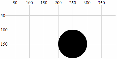
The circle was positioned at the point 200,100 and then translated by 50 pixels in both axes to 250,150.
The original code snippet could in fact be written as follows;
holder.append("circle")        // attach a circle
    .attr("transform", "translate(200,100)") // translate the circle
    .attr("r", 50);            // set the radius
Since by default our starting position is 0,0 if we apply a translation of 200,100 we will end up at 200,100.
transform (scale(k))
The translate-scale attribute will take an element’s attributes and scale them by a factor k.
Originally I thought that this attribute would affect the size of the element, but it affects more than that! As with the transform-translate attribute, the best way to illustrate this is with an example;
The following code snippet (in conjunction with the HTML file outlined at the start of this chapter) which draws a circle at the position 150,50 with a radius of 25 pixels;
holder.append("circle")     // attach a circle
    .attr("cx", 150)        // position the x-centre
    .attr("cy", 50)         // position the y-centre
    .attr("r", 25);         // set the radius
This will produce a circle as follows;
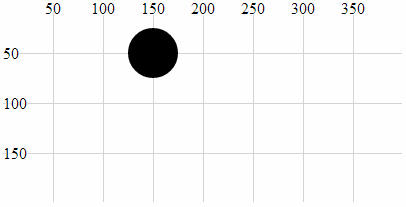
If we now introduce a transform-scale attribute with a scale of 2 we will see all three of the other attributes (cx, cy and r) scaled by a factor of two to 300, 100 and 50 respectively.
Here is the code;
holder.append("circle")             // attach a circle
    .attr("cx", 150)                // position the x-centre
    .attr("cy", 50)                 // position the y-centre
    .attr("r", 25)                  // set the radius
    .attr("transform", "scale(2)"); // scale the circle attributes
Which will produce a circle as follows;
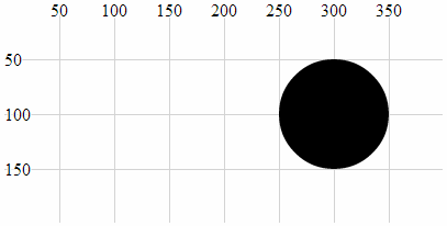
In this example we can see that the position (cx, cy) and the radius (r) have been scaled up by a factor of 2.
transform (rotate(a))
The translate-rotate attribute will rotate an element and its attributes by a declared angle in degrees.
The ability to rotate elements is obviously a valuable tool. The transform-rotate attribute does a great job of it, but the key to making sure that you know exactly what will happen to an object is to remember where the anchor point is for the object and to ensure that the associated attributes are set appropriately. As with the transform translate & scale attributes, the best way to illustrate this is with an example;
The following is the code snippet (in conjunction with the HTML file outlined at the start of this chapter) which draws the text “Hello World” at the position 200,100 with the anchor point being the the middle of the text;
holder.append("text")         // append text
    .style("fill", "black")   // fill the text with the colour black
    .attr("x", 200)           // set x position of left side of text
    .attr("y", 100)           // set y position of bottom of text
    .attr("dy", ".35em")           // set offset y position
    .attr("text-anchor", "middle") // set anchor y justification
    .text("Hello World");          // define the text to display
This will produce text as follows;

If we then apply a transform-rotate of 10 degrees as follows;
holder.append("text")         // append text
    .style("fill", "black")   // fill the text with the colour black
    .attr("x", 200)           // set x position of left side of text
    .attr("y", 100)           // set y position of bottom of text
    .attr("dy", ".35em")           // set offset y position
    .attr("text-anchor", "middle") // set anchor y justification
    .attr("transform", "rotate(10)")
    .text("Hello World");          // define the text to display
We will see the following on the screen;
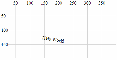
Obviously the text has been rotated, but hopefully you’ll have noticed that it’s also been displaced. This is because the transform-rotate attribute has been applied to both the text element (which has been rotated by 10 degrees) and the x,y attributes. If you imagine the origin point for the element being at 0,0, the centre, middle of the text element has been rotated about the point 0,0 by 10 degrees (hopefully slightly better explained in the following picture).
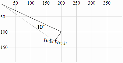
This could be seen as an impediment to getting things to move / change as you want to, but instead it’s an indication of a different way of doing things. The solution to this particular feature is to combine the transform-rotate with the transform-translate that we used earlier so that the code looks like this;
holder.append("text")         // append text
    .style("fill", "black")   // fill the text with the colour black
    .attr("dy", ".35em")           // set offset y position
    .attr("text-anchor", "middle") // set anchor y justification
    .attr("transform", "translate(200,100) rotate(10)")
    .text("Hello World");          // define the text to display
And the image on the page looks like this;
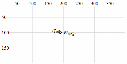
Which leads us to the final example which is a combination of all three aspects of the transform attribute.
holder.append("text")         // append text
    .style("fill", "black")   // fill the text with the colour black
    .attr("dy", ".35em")           // set offset y position
    .attr("text-anchor", "middle") // set anchor y justification
    .attr("transform", "translate(200,100) scale(2) rotate(10)")
    .text("Hello World");          // define the text to display
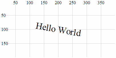
Here we have a text element translated to its position on the page, rotated by 10 degrees about the centre of the text and scaled by a factor of two.
width, height
width and height are required attributes of the rectangle element. width designates the width of the rectangle and height designates the height (If you’re wondering, I often struggle defining the obvious).
The following is an example of the code section required to draw a rectangle (using only the required attributes) in conjunction with the HTML file outlined at the start of this chapter;
holder.append("rect")       // attach a rectangle
    .attr("x", 100)         // position the left of the rectangle
    .attr("y", 50)          // position the top of the rectangle
    .attr("height", 100)    // set the height
    .attr("width", 200);    // set the width
This will produce a rectangle as follows;

The width of the triangle is 200 pixels and the height is 100 pixels.
text-anchor
The text-anchor attribute determines the justification of a text element
Text can have one of three text-anchor types;
-
startwhere the text is left justified. -
middlewhere the text is centre justified. -
endwhere the text is right justified.
The following is an example of code that will draw three separate lines of text with the three different text-anchor types in conjunction with the HTML file outlined at the start of this chapter;
holder.append("text")         // append text
    .style("fill", "black")   // fill the text with the colour black
    .attr("x", 200)           // set x position of left side of text
    .attr("y", 50)            // set y position of bottom of text
    .attr("text-anchor", "start") // set anchor y justification
    .text("Hello World - start"); // define the text to display

holder.append("text")         // append text
    .style("fill", "black")   // fill the text with the colour black
    .attr("x", 200)           // set x position of left side of text
    .attr("y", 100)           // set y position of bottom of text
    .attr("text-anchor", "middle") // set anchor y justification
    .text("Hello World - middle"); // define the text to display

holder.append("text")         // append text
    .style("fill", "black")   // fill the text with the colour black
    .attr("x", 200)           // set x position of left side of text
    .attr("y", 150)           // set y position of bottom of text
    .attr("text-anchor", "end") // set anchor y justification
    .text("Hello World - end"); // define the text to display
This will produce an output as follows;
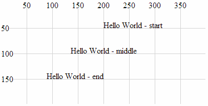
text-anchor Attributes
dx, dy
dx and dy are optional attributes that designate an offset of text elements from the anchor point in the x and y dimension . There are several different sets of units that can be used to designate the offset of the text from an anchor point. These include em which is a scalable unit, px (pixels), pt (points (kind of like pixels)) and % (percent (scalable and kind of like em))
We can demonstrate the offset effect by noting the difference in two examples.
The first is a simple projection of SVG text that aligns the text “Hello World” above and to the right of the anchor point at 200,100 (It does this in conjunction with the HTML file outlined at the start of this chapter.).
holder.append("text")         // append text
    .style("fill", "black")   // fill the text with the colour black
    .attr("x", 200)           // set x position of left side of text
    .attr("y", 100)           // set y position of bottom of text
    .text("Hello World");     // define the text to display
Which produces the following on the page;

The second example introduces the dx attribute setting the offset to 50 pixels. This adds another 50 pixels to the x dimension. We also introduce the dy attribute with an offset of .35em. This scalable unit allows the text to be set as a factor of the size of the text. In this case .35em will add half the height of the text to the y dimension placing the text so that it is exactly in the middle (vertically) of the 100 pixel line on the y dimension.
holder.append("text")         // append text
    .style("fill", "black")   // fill the text with the colour black
    .attr("x", 200)           // set x position of left side of text
    .attr("y", 100)           // set y position of bottom of text
    .attr("dx", "50px")       // set offset x position
    .attr("dy", ".35em")      // set offset y position
    .text("Hello World");     // define the text to display
Which produces the following on the page;
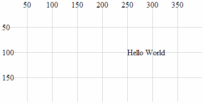
The text has been moved 50 pixels to the right and half the height of the text down the page.
textLength
The textLength attribute adjusts the length of the text to fit a specified value.
The following is a code snippet that prints the text “Hello World” above and to the right of the anchor point at 200,100 (It does this in conjunction with the HTML file outlined at the start of this chapter.). The addition of the textLength attribute declaration in the code stretches the “Hello World” out so that it fills 150 pixels.
holder.append("text")          // append text
    .style("fill", "black")    // fill the text with the colour black
    .attr("x", 200)            // set x position of left side of text
    .attr("y", 100)            // set y position of bottom of text
    .attr("textLength", "150") // set text length
    .text("Hello World");      // define the text to display
Which produces the following on the page;
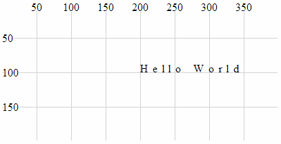
It is worth noting that while the text has been spread out, the individual letters remain un-stretched. Only the letter and word spacing has been adjusted. However, using the lengthAdjust attribute can change this.
lengthAdjust
The lengthAdjust attribute allows the textLength attribute to have the spacing of a text element controlled to be either spacing or spacingAndGlyphs;
-
spacing: In this option the letters remain the same size, but the spacing between the letters and words are adjusted. -
spacingAndGlyphs: In this option the text is stretched or squeezed to fit.
The attribute can be best illustrated via an example. The following code snippet (which works in conjunction with the HTML file outlined at the start of this chapter) shows three versions of the text element. The top line is the standard text. The middle line is the textLength set to 150 and the lengthAdjust set to spacing (which is the default). The bottom line is the textLength set to 150 and the lengthAdjust set to spacingAndGlyphs.
holder.append("text")          // append text
    .style("fill", "black")    // fill the text with the colour black
    .attr("x", 200)            // set x position of left side of text
    .attr("y", 50)             // set y position of bottom of text
    .text("Hello World");      // define the text to display

holder.append("text")          // append text
    .style("fill", "black")    // fill the text with the colour black
    .attr("x", 200)            // set x position of left side of text
    .attr("y", 100)            // set y position of bottom of text
    .attr("textLength", "150") // set text length
    .attr("lengthAdjust", "spacing")
    .text("Hello World");      // define the text to display

holder.append("text")          // append text
    .style("fill", "black")    // fill the text with the colour black
    .attr("x", 200)            // set x position of left side of text
    .attr("y", 150)            // set y position of bottom of text
    .attr("textLength", "150") // set text length
    .attr("lengthAdjust", "spacingAndGlyphs")
    .text("Hello World");      // define the text to display
The image on the screen will look like the following;
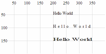
The image shows that the top line looks normal, the middle line has had the spaces increased to increase the length of the text and the bottom line has been stretched.
Styles
What’s a style?
Believe it or not, that’s as difficult a question to answer as “What’s an attribute?”. I like to think that an element can be selected and arranged on a web page with select and attr, but once it’s there, changes to how it looks are a matter for style. We will cover a range of qualities that neatly fit into this definition in the following section (such as fill, opacity and stroke-width) but there are also a range of unusual style declarations that many may not have come across (I certainly hadn’t before writing this).
The other important thing to mention about setting styles for elements is that there are different ways to accomplish the task. We’ll go through the process of describing different styles as they can be applied to individual elements in isolation, but there is a more powerful way to manage styles across a range of elements via Cascading Style Sheets (CSS) in the <style> section of a web page or even via an external style sheet. We will examine these possibilities at the end of the section.
Full disclosure: I have not figured out how to work some of the styles for d3.js I’m afraid that clip-path and mask have exceeded my skill-set and I will have to leave them for another day :-(. I found that there are several good examples that make use of these styles, but I have struggled (unsuccessfully) to present them in a simple example.
fill
The fill style will fill the element being presented with a specified colour.
By default, most elements will be filled with black (the majority of the examples used in this chapter make no fill declaration).
The following example (which works in conjunction with the HTML file outlined at the start of this chapter) shows the syntax for filling a simple circle with the colour red;
holder.append("circle")        // attach a circle
    .attr("cx", 200)           // position the x-centre
    .attr("cy", 100)           // position the y-centre
    .attr("r", 50)             // set the radius
    .style("fill", "red");     // set the fill colour
Which results in the following image;
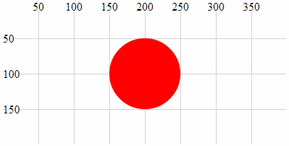
As we saw with the polyline and polygon examples earlier in the chapter some shapes may need to have their fill colour turned off in some circumstances and this can be accomplished by declaring the colour to be none (.style("fill", "none");).
There are several different ways to define exactly what colour we want as a fill. The example above uses a ‘named colour code’ to declare the colour as “red” but we could also have defined it as rgb (.style("fill", "rgb(255,0,0)");) or in hexadecimal (.style("fill", "#f00");)
stroke
The stroke style applies a colour to lines.
By default many elements do not have a stroke colour set, so it’s a matter of declaring the colour with either a named colour code (“red”), an rgb value (“rgb(255,0,0)”) or the appropriate hex (“#f00”).
The following example (which works in conjunction with the HTML file outlined at the start of this chapter) shows the syntax for applying the colour red to a simple circle. The fill has been set to none to help the colour stand out.
holder.append("circle")        // attach a circle
    .attr("cx", 200)           // position the x-centre
    .attr("cy", 100)           // position the y-centre
    .attr("r", 50)             // set the radius
    .style("stroke", "red")    // set the line colour
    .style("fill", "none");    // set the fill colour
Which results in the following image;
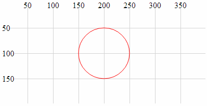
opacity
The opacity style has the effect of varying an element’s transparency.
The valid range for opacity is from 0 (completely transparent) to 1 (solid colour). We should make the distinction at this point that opacity affects the entire element, whereas the following fill-opacity and stroke-opacity affect only the fill and stroke respectively.
The following code snippet (which works in conjunction with the HTML file outlined at the start of this chapter) creates a green circle with a red border. The opacity value of .2 creates a degree of transparency which will show the grid lines underneath the element.
holder.append("circle")        // attach a circle
    .attr("cx", 200)           // position the x-centre
    .attr("cy", 100)           // position the y-centre
    .attr("r", 50)             // set the radius
    .style("opacity", .2)      // set the element opacity
    .style("stroke", "red")    // set the line colour
    .style("fill", "green");   // set the fill colour
Which results in the following image;
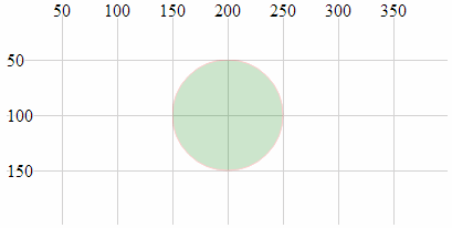
fill-opacity
The fill-opacity style changes the transparency of the fill of an element.
The valid range for fill-opacity is from 0 (completely transparent) to 1 (solid colour). We should make the distinction at this point that fill-opacity affects only the fill of an element, whereas opacity will affect the entire element.
The following code snippet (which works in conjunction with the HTML file outlined at the start of this chapter) creates a green circle with a red border. The opacity value of .2 creates a degree of transparency for the fill which will show the grid lines underneath.
holder.append("circle")        // attach a circle
    .attr("cx", 200)           // position the x-centre
    .attr("cy", 100)           // position the y-centre
    .attr("r", 50)             // set the radius
    .style("fill-opacity", .2) // set the fill opacity
    .style("stroke", "red")    // set the line colour
    .style("fill", "green");   // set the fill colour
Which results in the following image;
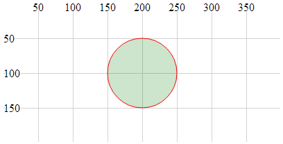
The distinction between this image and the one for the opacity style clearly shows the line around the outside of the object as still a solid (opaque) colour.
stroke-opacity
The stroke-opacity style changes the transparency of the stroke (line) of an element.
The valid range for stroke-opacity is from 0 (completely transparent) to 1 (solid colour). We should make the distinction at this point that stroke-opacity affects only the line or border of an element, whereas opacity will affect the entire element.
The following code snippet (which works in conjunction with the HTML file outlined at the start of this chapter) creates an empty circle with a red border. The opacity value of .2 creates a degree of transparency for the stroke which will show the grid lines underneath (or at least make it appear more ‘muted’).
holder.append("circle")          // attach a circle
    .attr("cx", 200)             // position the x-centre
    .attr("cy", 100)             // position the y-centre
    .attr("r", 50)               // set the radius
    .style("stroke-opacity", .2) // set the stroke opacity
    .style("stroke", "red")      // set the line colour
    .style("fill", "none");      // set the fill colour
Which results in the following image;
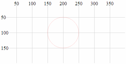
Although it is not necessarily easy to see in this example because the line is quite thin, the lines of the grid behind the circle will be showing through the line of the circle.
stroke-width
The stroke-width style adjusts the width of the line of an element.
The value specified when setting stroke-width is in pixels.
The following code snippet (which works in conjunction with the HTML file outlined at the start of this chapter) creates an empty circle with a red border. The stroke-width is set to 5 which equates to 5 pixels (it can also be specified as “5px”).
holder.append("circle")          // attach a circle
    .attr("cx", 200)             // position the x-centre
    .attr("cy", 100)             // position the y-centre
    .attr("r", 50)               // set the radius
    .style("stroke-width", 5)    // set the stroke width
    .style("stroke", "red")      // set the line colour
    .style("fill", "none");      // set the fill colour
Which results in the following image;
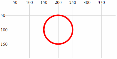
The width of the line that forms the border of the circle is now 5 pixels wide :-).
stroke-dasharray
The stroke-dasharray style allows us to form element lines with dashes instead of solid lines.
We have covered dashed lines in practical way in a previous section of the book (‘Make a Dashed Line’) but for the sake of completeness I will include dashed lines here as well.
We create a dashed line by specifying the length of a dash and then the length of a space. We can include a long list of dashes and spaces and once complete our line will simply repeat the pattern we have specified.
For example the following code snippet (which works in conjunction with the HTML file outlined at the start of this chapter) creates a line with a dash of 10 pixels followed by a space of 3 pixels;
holder.append("circle")       // attach a circle
    .attr("cx", 200)          // position the x-centre
    .attr("cy", 100)          // position the y-centre
    .attr("r", 50)            // set the radius
    .style("stroke-dasharray", ("10,3")) // make the stroke dashed
    .style("stroke", "red")   // set the line colour
    .style("fill", "none");   // set the fill colour
Which results in the following image;
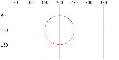
More complex combinations of dashes and spaces are possible as are complex animation sequences that leverage the ability to move objects along a path (these are certainly more advanced examples).
stroke-linecap
The stroke-linecap style allows control of the shape of the ends of lines in d3.js.
There are three shape options;
-
buttwhere the line simply butts up to the starting or ending position and is cut off squarely. -
roundwhere the line is rounded in proportion to its width. -
squarewhere the line is squared off but extended in proportion to its width.
The following code snippet (which works in conjunction with the HTML file outlined at the start of this chapter) generates three lines showing each stroke-linecap style option. The top line uses butt. The middle line uses round and the bottom line uses square.
holder.append("line")                 // attach a line
    .style("stroke", "black")         // colour the line
    .style("stroke-width", 20)        // adjust line width
    .style("stroke-linecap", "butt")  // stroke-linecap type
    .attr("x1", 100)     // x position of the first end of the line
    .attr("y1", 50)      // y position of the first end of the line
    .attr("x2", 300)     // x position of the second end of the line
    .attr("y2", 50);     // y position of the second end of the line

holder.append("line")                  // attach a line
    .style("stroke", "black")          // colour the line
    .style("stroke-width", 20)         // adjust line width
    .style("stroke-linecap", "round")  // stroke-linecap type
    .attr("x1", 100)     // x position of the first end of the line
    .attr("y1", 100)     // y position of the first end of the line
    .attr("x2", 300)     // x position of the second end of the line
    .attr("y2", 100);    // y position of the second end of the line

holder.append("line")                   // attach a line
    .style("stroke", "black")           // colour the line
    .style("stroke-width", 20)          // adjust line width
    .style("stroke-linecap", "square")  // stroke-linecap type
    .attr("x1", 100)     // x position of the first end of the line
    .attr("y1", 150)     // y position of the first end of the line
    .attr("x2", 300)     // x position of the second end of the line
    .attr("y2", 150);    // y position of the second end of the line
Which results in the following image;
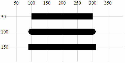
The shapes are quite distinct for each type and it is useful to note the degree to which the lines extend beyond their start and end points.
stroke-linejoin
The stroke-linejoin style specifies the shape of the join of two lines. This would be used on path, polyline and polygon elements (and possibly more).
There are three line join options;
-
miterwhere the join is squared off as would be expected at the join of two lines. -
roundwhere the outside portion of the join is rounded in proportion to its width. -
bevelwhere the join has a straight edged outer portion clipped off to provide a slightly more contoured effect while still being angular.
The following code snippet (which works in conjunction with the HTML file outlined at the start of this chapter) generates a poly line where the join has the connection shaped using the stroke-linejoin round style.
holder.append("polyline")       // attach a polyline
    .style("stroke", "black")   // colour the line
    .style("fill", "none")      // remove any fill colour
	.style("stroke-width", 20)  // colour the line
	.style("stroke-linejoin", "round")  // shape the line join
    .attr("points", "100,50, 200,150, 300,50");  // x,y points
Which results in the following image;
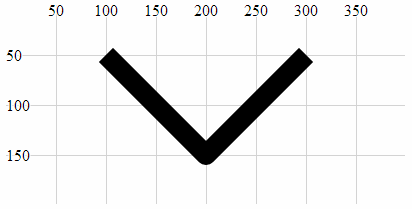
Note the curve on the outer of the join.
Changing the shape of the line join to bevel produces the following;
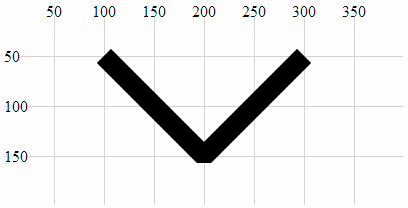
Here we can see the clipping of the outer portion of the join.
And using miter produces a standard connection;
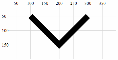
This is the default setting for line joins and does not need to be added unless the line join type has already been set to a different default.
writing-mode
The writing-mode style changes the orientation of the text so that it prints out top to bottom. It has a single option “tb” that accomplishes this. It is relatively limited in scope compared to the equivalent for CSS, but for the purposes of generating some text it has a definite use.
The following code snippet (which works in conjunction with the HTML file outlined at the start of this chapter) creates a line of text that is now printed from top to bottom instead of left to right.
holder.append("text")            // append text
    .style("fill", "black")      // make the text black
    .style("writing-mode", "tb") // set the writing mode
    .attr("x", 200)         // set x position of left side of text
    .attr("y", 100)         // set y position of bottom of text
    .text("Hello World");   // define the text to display
Which results in the following image;
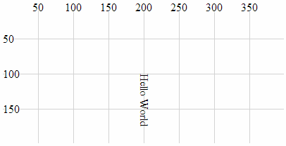
It is significant to note that while it looks like the text has been rotated about its anchor point, this actually isn’t the case since the anchor point should be at 200,100. Also, the glyph-orientation-vertical style (which follows) will allow the text to be orientated vertically which will be useful.
glyph-orientation-vertical
The glyph-orientation-vertical style changes the rotation of the individual glyphs (characters) in text and if used in conjunction with the writing-mode style (and set to 0) will allow the text to be displayed vertically with the letters orientated vertically as well.
The following code snippet (which works in conjunction with the HTML file outlined at the start of this chapter) creates a line of text that is now printed from top to bottom with letters orientated vertically.
holder.append("text")            // append text
    .style("fill", "black")      // make the text black
    .style("writing-mode", "tb") // set the writing mode
    .style("glyph-orientation-vertical", 0)
    .attr("x", 200)         // set x position of left side of text
    .attr("y", 25)          // set y position of bottom of text
    .text("Hello World");   // define the text to display
Which results in the following image;
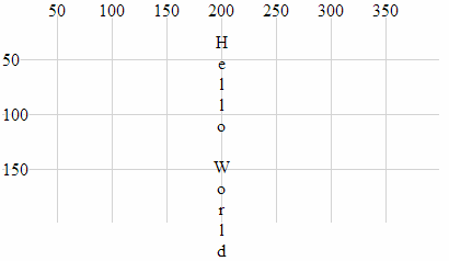
It is worth noting that the text spacing increases dramatically as the spacing for each letter relies on the normal distance between the bottom and top of a line of text.
Using styles in Cascading Style Sheets
Declaring styles on an element by element basis is an OK way to apply styles, but when our visualizations become more complex, this can be an inefficient use of code.
A smarter way to provide a common set of styles to elements is to declare them in the <style> section of our HTML document using Cascading Style Sheets (CSS). These will then be automatically applied to our elements.
We start with an example script that draws our three lines that have different styles of linecaps. Our previous example looked like the following (in conjunction with the HTML file outlined at the start of this chapter)
holder.append("line")                 // attach a line
    .style("stroke", "black")         // colour the line
    .style("stroke-width", 20)        // adjust line width
    .style("stroke-linecap", "butt")  // stroke-linecap type
    .attr("x1", 100)     // x position of the first end of the line
    .attr("y1", 50)      // y position of the first end of the line
    .attr("x2", 300)     // x position of the second end of the line
    .attr("y2", 50);     // y position of the second end of the line

holder.append("line")                  // attach a line
    .style("stroke", "black")          // colour the line
    .style("stroke-width", 20)         // adjust line width
    .style("stroke-linecap", "round")  // stroke-linecap type
    .attr("x1", 100)     // x position of the first end of the line
    .attr("y1", 100)     // y position of the first end of the line
    .attr("x2", 300)     // x position of the second end of the line
    .attr("y2", 100);    // y position of the second end of the line

holder.append("line")                   // attach a line
    .style("stroke", "black")           // colour the line
    .style("stroke-width", 20)          // adjust line width
    .style("stroke-linecap", "square")  // stroke-linecap type
    .attr("x1", 100)     // x position of the first end of the line
    .attr("y1", 150)     // y position of the first end of the line
    .attr("x2", 300)     // x position of the second end of the line
    .attr("y2", 150);    // y position of the second end of the line
Which resulted in the following image;

The block of code for each of the three lines contains three separate style declarations. Two of which are identical for all three blocks of code;
    .style("stroke", "black")         // colour the line
    .style("stroke-width", 20)        // adjust line width
To make these styles available from a common point, we declare them in the <style> section of our HTML file as follows;
<style>
line.linecap {
  stroke: black;
  stroke-width: 20;
}
</style>
The <style> tags simply tell our browser which part of the HTML file we are using to define our styles.
The line.linecap portion identifies the following styles as belonging to the line elements that are also identified as belonging to the ‘class’ linecap (We have used the linecap name as a convenience only and it could just as easily have been foobar.).
The two styles are enclosed within curly braces and are declared in the form <style-name>: <style-value>;. So for our example here, the stroke is black and its width is 20 pixels.
Then our example script can have the two styles removed from each of the blocks that draws the lines and in their place we add a new attribute class that assigns a class to the element (in this case the class linecap). Our new code will look like this;
holder.append("line")           // attach a line
    .style("stroke-linecap", "butt")  // stroke-linecap type
    .attr("class", "linecap")   // inherits styles from CSS
    .attr("x1", 100)     // x position of the first end of the line
    .attr("y1", 50)      // y position of the first end of the line
    .attr("x2", 300)     // x position of the second end of the line
    .attr("y2", 50);     // y position of the second end of the line

holder.append("line")           // attach a line
    .style("stroke-linecap", "round")  // stroke-linecap type
    .attr("class", "linecap")   // inherits styles from CSS
    .attr("x1", 100)     // x position of the first end of the line
    .attr("y1", 100)     // y position of the first end of the line
    .attr("x2", 300)     // x position of the second end of the line
    .attr("y2", 100);    // y position of the second end of the line

holder.append("line")           // attach a line
    .style("stroke-linecap", "square")  // stroke-linecap type
    .attr("class", "linecap")   // inherits styles from CSS
    .attr("x1", 100)     // x position of the first end of the line
    .attr("y1", 150)     // y position of the first end of the line
    .attr("x2", 300)     // x position of the second end of the line
    .attr("y2", 150);    // y position of the second end of the line
While this has only replaced two lines with one in our code, the potential for use in far more complex examples should be obvious. There is significantly more detail that can be gone into with regard to CSS, but that would be beyond my meagre abilities.
Manipulating data
How to use data imported from a csv file with spaces in the header.
When importing data from a csv file (dataSpace.csv) that has headers with spaces in the middle of some of the fields there is a need to address the data slightly differently in order for it to be used easily in your JavaScript.
For example the following csv data has a column named ‘Date Purchased’;
This is not an uncommon occurrence since RFC 4180 which specifies csv content allows for it and d3.js supports the RFC;
Within the header and each record, there may be one or more fields, separated by commas. Each line should contain the same number of fields throughout the file. Spaces are considered part of a field and should not be ignored.
When we go to import the data using the d3.csv function, we need to reference the ‘Data Purchased’ column in a way that makes allowances for the space. The following piece of script (with grateful thanks to Stephen Thomas for answering my Stack Overflow question) appears to be the most basic solution.
d3.csv("dataSpace.csv", function(error, data) {
  if (error) throw error;

  data.forEach(function(d) {
      d.date = parseTime(d['Date Purchased']);
  });
...
});
In the example above the ‘Date Purchased’ column is re-declared as ‘date’ making working in the following script much easier.
Extracting data from a portion of a string.
Suppose we have a set of values we want to extract from a string because they cannot be used in their original form.
For example, the following csv file contains the column ‘value’ and the values of the data in that column are prefixed with a dollar sign ($).
We can use the JavaScript substring() method to easily remove the leading character from the data.
The following example processes our csv file after loading it and for each ‘value’ entry on each row takes a substring of the entry that removes the first character and retains the rest.
d3.csv("dataSample.csv", function(error, data) {
  if (error) throw error;

    data.forEach(function(d) {
        d.value = +d.value.substring(1);
    });
...
});
The substring() function includes a ‘start’ index (as used above) and optionally a ‘stop’ index. More on how these can be configured can be found on the w3schools site.
Grouping and summing data (d3.nest)
Often we will wish to group elements in an array into a hierarchical structure similar to the GROUP BY operator in SQL (but with the scope for multiple levels). This can be achieved using the d3.nest operator. Additionally we will sometimes wish to collapse the elements that we are grouping in a specific way (for instance to sum values). This can be achieved using the rollup function.
The example we will use is having the following csv file consisting of a column of dates and corresponding values;
We will nest the data according to the date and sum the data for each date so that our data is in the equivalent form of;
We will do this with the following script;
d3.csv("source-data.csv", function(error, csv_data) {
  if (error) throw error;

var data = d3.nest()
    .key(function(d) { return d.date;})
    .rollup(function(d) {
        return d3.sum(d, function(g) {return g.value; });
    }).entries(csv_data);

});
We are assuming the data is in a csv file and is named source-data.csv.
The first thing we do is load that file and assign the loaded array the variable name csv_data.
d3.csv("source-data.csv", function(error, csv_data) {
  if (error) throw error;
Then we declare our new array’s name will be data and we initiate the nest function;
var data = d3.nest()
We assign the key for our new array as date. A ‘key’ is like a way of saying “This is the thing we will be grouping on”. In other words our resultant array will have a single entry for each unique date value.
.key(function(d) { return d.date;})
Then we include the rollup function that takes all the individual value variables that are in each unique date field and sums them;
    .rollup(function(d) {
        return d3.sum(d, function(g) {return g.value; });
Lastly we tell the entire nest function which data array we will be using for our source of data.
}).entries(csv_data);
What if your data turns out to be unsorted? Never fear, we can easily sort on the key value by tacking on the sortKeys function like so;
.key(function(d) { return d.date;}).sortKeys(d3.ascending)
You should note that our data will have changed name from date and value. This is as a function of the nest and rollup process. But never fear, it’s a simple task to re-name them if necessary using the following function (which could include a call to parse the date, but I have omitted it for clarity);
data.forEach(function(d) {
    d.date = d.key;
    d.value = d.values;
});
Selecting a random string from an array.
What if we had a situation where we wanted to be able to select a random colour for the fill of a set of objects from a restricted set of colour options.

The colours we want are green, orange, red and blue and the solution uses an adaptation of the one presented by Jacob Relkin on stackoverflow.
First we start by declaring the colours in an array;
var colorRange = ['green', 'orange', 'red', 'blue'];
From there we set up the function that will return one of the elements of the array at random by calculating an index number from the array of possible options based on the length of the array;
function randomColor() {
    return colorRange[Math.floor(Math.random() * colorRange.length)];
}
colorRange.length returns the number of elements in the array (in this case 4). This is multiplied by a random number between 0 and 1 (Math.random()). Then we get the largest integer that is less than or equal to our generated number using Math.floor. This ‘flattens out’ the result to be one of 0,1,2 or 3.
Then when we want to find one of our random colours we simply call our randomColour function a little like the following for a fill.
...
    .style("fill", randomColor)
...
Bar Charts and Histograms
Yes! There is a difference! I know they look similar but for a bar charts, each column represents a group defined by a category and with a histogram, each column represents a group defined by a range.
Bar Chart
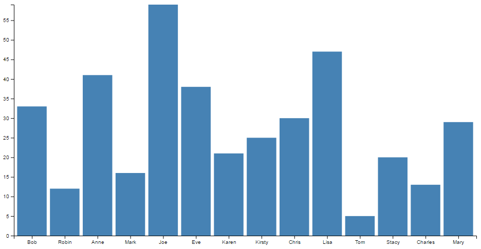
- Each column is positioned over a label that represents a categorical variable.
- The height of the column indicates the size of the group defined by the category.
Histogram
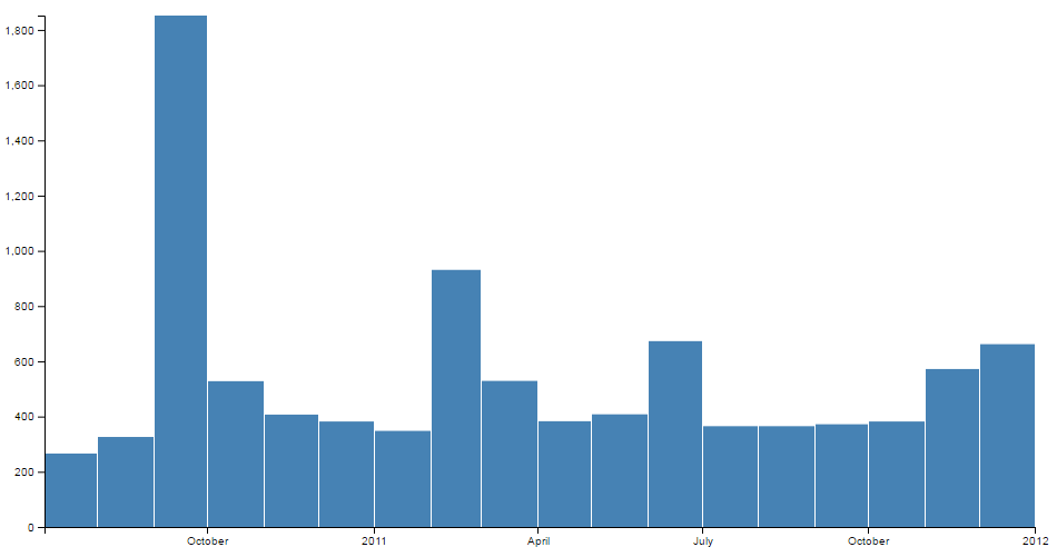
- Each column is positioned over a label that represents a quantitative variable.
- The column label can be a single value or a range of values.
Bar Charts
A bar chart is a visual representation using either horizontal or vertical bars to show comparisons between discrete categories. There are a number of variations of bar charts including stacked, grouped, horizontal and vertical.
We will work through a simple vertical bar chart that uses a value on the y axis and category in the form of a name on the x axis.
The end result will look like this;

The data
The data for this example will be sourced from an external (purely fictional) csv file named sales.csv. It consists of a column of names and ‘sales’ and its contents are as follows;
The code
The full code listing for the example we are going to work through is as follows;
<!DOCTYPE html>
<meta charset="utf-8">
<style> /* set the CSS */

.bar { fill: steelblue; }

</style>
<body>

<!-- load the d3.js library -->
<script src="//d3js.org/d3.v4.min.js"></script>
<script>

// set the dimensions and margins of the graph
var margin = {top: 20, right: 20, bottom: 30, left: 40},
    width = 960 - margin.left - margin.right,
    height = 500 - margin.top - margin.bottom;

// set the ranges
var x = d3.scaleBand()
          .range([0, width])
          .padding(0.1);
var y = d3.scaleLinear()
          .range([height, 0]);

// append the svg object to the body of the page
// append a 'group' element to 'svg'
// moves the 'group' element to the top left margin
var svg = d3.select("body").append("svg")
    .attr("width", width + margin.left + margin.right)
    .attr("height", height + margin.top + margin.bottom)
  .append("g")
    .attr("transform",
          "translate(" + margin.left + "," + margin.top + ")");

// get the data
d3.csv("sales.csv", function(error, data) {
  if (error) throw error;

  // format the data
  data.forEach(function(d) {
    d.sales = +d.sales;
  });

  // Scale the range of the data in the domains
  x.domain(data.map(function(d) { return d.salesperson; }));
  y.domain([0, d3.max(data, function(d) { return d.sales; })]);

  // append the rectangles for the bar chart
  svg.selectAll(".bar")
      .data(data)
    .enter().append("rect")
      .attr("class", "bar")
      .attr("x", function(d) { return x(d.salesperson); })
      .attr("width", x.bandwidth())
      .attr("y", function(d) { return y(d.sales); })
      .attr("height", function(d) { return height - y(d.sales); });

  // add the x Axis
  svg.append("g")
      .attr("transform", "translate(0," + height + ")")
      .call(d3.axisBottom(x));

  // add the y Axis
  svg.append("g")
      .call(d3.axisLeft(y));

});

</script>
</body>
The bar chart explained
In the course of describing the operation of the file I will gloss over the aspects of the structure of an HTML file which have already been described at the start of the book. Likewise, aspects of the JavaScript functions that have already been covered will only be briefly explained.
The start of the file deals with setting up the document’s head and body, loading the d3.javascript script and setting up the CSS in the <style> section.
The CSS section sets styling for the colour of the bars. In all reality we could have placed it as a style later in the code, but it’s nice to have something in the CSS area because you never know, we might want it later.
.bar { fill: steelblue; }
Then our JavaScript section starts and the first thing that happens is that we set the size of the area that we’re going to use for the chart and the margins;
// set the dimensions and margins of the graph
var margin = {top: 20, right: 20, bottom: 30, left: 40},
    width = 960 - margin.left - margin.right,
    height = 500 - margin.top - margin.bottom;
The next section of our code includes some of the functions that will be called from the main body of the code. This includes the functions to determine positioning in the x and y domains.
// set the ranges
var x = d3.scaleBand()
          .range([0, width])
          .padding(0.1);
var y = d3.scaleLinear()
          .range([height, 0]);
The band scale set up for the x domain is a neat function that allows the creation of a series of uniform bands that can be computed from the assigned range. For the purposes of our bar chart, these will be the equivalent of the bars. These bands and their properties (the spacing between them and other details) can be assigned for display purposes.
For example, in this case the padding is the space made available between bars. This is set to 0.1, or 1/10th of the width of the space available for each band. If we were to alter the padding to 0.5 (or half the width of the band) we would have the following;
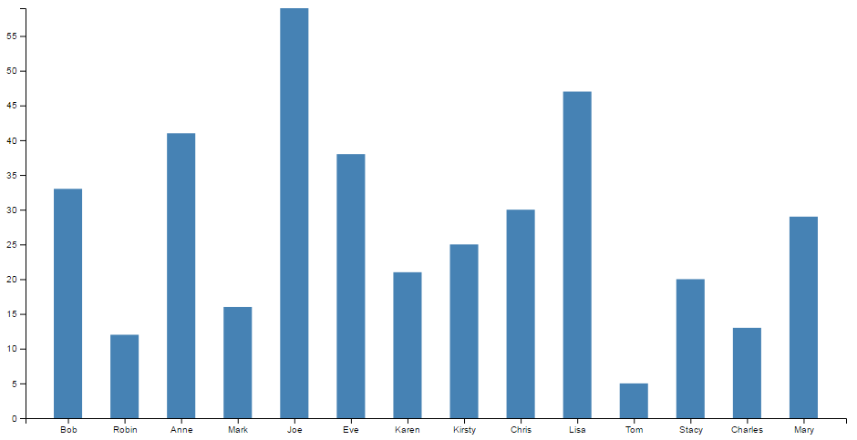
For the full description of band scales, check out the D3 wiki.
The function to set the scaling in the y domain is the same as most of our other graph examples;
var y = d3.scaleLinear()
          .range([height, 0])
The next block of code selects the body on the web page and appends an svg object to it of the size that we have set up with our width, height and margins.
var svg = d3.select("body").append("svg")
    .attr("width", width + margin.left + margin.right)
    .attr("height", height + margin.top + margin.bottom)
  .append("g")
    .attr("transform",
          "translate(" + margin.left + "," + margin.top + ")")
It also adds a g element that provides a reference point for adding our axes.
Then we begin the main body of our JavaScript. We load our csv file and then loop through it making sure that the dates and numerical values are recognised correctly;
// get the data
d3.csv("sales.csv", function(error, data) {
  if (error) throw error;

  // format the data
  data.forEach(function(d) {
    d.sales = +d.sales;
  });
We then work through our x and y data and ensure that it is scaled to the domains we are working in;
  // Scale the range of the data in the domains
  x.domain(data.map(function(d) { return d.salesperson; }));
  y.domain([0, d3.max(data, function(d) { return d.sales; })]);
Then we add the bars to our chart;
  // append the rectangles for the bar chart
  svg.selectAll(".bar")
      .data(data)
    .enter().append("rect")
      .attr("class", "bar")
      .attr("x", function(d) { return x(d.salesperson); })
      .attr("width", x.bandwidth())
      .attr("y", function(d) { return y(d.sales); })
      .attr("height", function(d) { return height - y(d.sales); });
This block of code creates the bars (selectAll("bar")) and associates each of them with a data set (.data(data)).
We then append a rectangle (.append("rect")) with the colour assigned by our class (set in the <style> section) along with values for x/y position. The width of the bars is determined from our band scale function we assigned earlier and is found by retrieving the value via the .bandwidth() call. The height is as configured in our earlier code.
Finally we append our axes;
  // add the x Axis
  svg.append("g")
      .attr("transform", "translate(0," + height + ")")
      .call(d3.axisBottom(x));

  // add the y Axis
  svg.append("g")
      .call(d3.axisLeft(y));
The end result is our pretty looking bar chart;

Histograms
A histogram is a graphical representation of the distribution of numerical data. It is typically formed by creating ‘bins’ of a larger dataset that group the data into a range of values and count the number of pieces of data fall into each bin. Each bin is then represented as a bar showing the relationship between each range.
The example we will work through shows the frequency of earthquakes above magnitude 3 between July 2010 and January 2012 in Christchurch, New Zealand (A time of some significant seismic activity). Data was sourced from New Zealand’s Geonet site.

We can see that the data has been ‘binned’ by month and that between the 1st of September and the 1st of October there were over 1800 earthquakes registering over magnitude 3.
The data
The data for this example will be sourced from an external (purely fictional) csv file named sales.csv. It consists of a column of dates in day-month-year format (and magnitudes, which won’t be used in this graph) and its contents looks similar to the following;
The code
The full code listing for the example we are going to work through is as follows;
<!DOCTYPE html>
<meta charset="utf-8">
<style> /* set the CSS */

rect.bar { fill: steelblue; }

</style>
<body>

<!-- load the d3.js library -->
<script src="//d3js.org/d3.v4.min.js"></script>
<script>

// set the dimensions and margins of the graph
var margin = {top: 10, right: 30, bottom: 30, left: 40},
    width = 960 - margin.left - margin.right,
    height = 500 - margin.top - margin.bottom;

// parse the date / time
var parseDate = d3.timeParse("%d-%m-%Y");

// set the ranges
var x = d3.scaleTime()
          .domain([new Date(2010, 6, 3), new Date(2012, 0, 1)])
          .rangeRound([0, width]);
var y = d3.scaleLinear()
          .range([height, 0]);

// set the parameters for the histogram
var histogram = d3.histogram()
    .value(function(d) { return d.date; })
    .domain(x.domain())
    .thresholds(x.ticks(d3.timeMonth));

// append the svg object to the body of the page
// append a 'group' element to 'svg'
// moves the 'group' element to the top left margin
var svg = d3.select("body").append("svg")
    .attr("width", width + margin.left + margin.right)
    .attr("height", height + margin.top + margin.bottom)
  .append("g")
    .attr("transform",
          "translate(" + margin.left + "," + margin.top + ")");

// get the data
d3.csv("earthquakes.csv", function(error, data) {
  if (error) throw error;

  // format the data
  data.forEach(function(d) {
      d.date = parseDate(d.dtg);
  });

  // group the data for the bars
  var bins = histogram(data);

  // Scale the range of the data in the y domain
  y.domain([0, d3.max(bins, function(d) { return d.length; })]);

  // append the bar rectangles to the svg element
  svg.selectAll("rect")
      .data(bins)
    .enter().append("rect")
      .attr("class", "bar")
      .attr("x", 1)
      .attr("transform", function(d) {
		  return "translate(" + x(d.x0) + "," + y(d.length) + ")"; })
      .attr("width", function(d) { return x(d.x1) - x(d.x0) -1 ; })
      .attr("height", function(d) { return height - y(d.length); });

  // add the x Axis
  svg.append("g")
      .attr("transform", "translate(0," + height + ")")
      .call(d3.axisBottom(x));

  // add the y Axis
  svg.append("g")
      .call(d3.axisLeft(y));

});

</script>
</body>
The histogram explained
In the course of describing the operation of the file I will gloss over the aspects of the structure of an HTML file which have already been described at the start of the book. Likewise, aspects of the JavaScript functions that have already been covered will only be briefly explained.
The start of the file deals with setting up the document’s head and body, loading the d3.javascript script and setting up the CSS in the <style> section.
The CSS section sets styling for the colour of the rectangles that make up the bars. Similar to the Bar graph, we could have placed it as a style later in the code, but it’s nice to have something in the CSS area.
rect.bar { fill: steelblue; }
Then our JavaScript section starts and the first thing that happens is that we set the size of the area that we’re going to use for the chart and the margins;
// set the dimensions and margins of the graph
var margin = {top: 10, right: 30, bottom: 30, left: 40},
    width = 960 - margin.left - margin.right,
    height = 500 - margin.top - margin.bottom;
Then we declare the code that parses the time;
// parse the date / time
var parseDate = d3.timeParse("%d-%m-%Y");
Here we have it set to look for time that is formatted as day-month-year.
The next section of our code scales the ranges for x and y.
// set the ranges
var x = d3.scaleTime()
          .domain([new Date(2010, 6, 3), new Date(2012, 0, 1)])
          .rangeRound([0, width]);
var y = d3.scaleLinear()
          .range([height, 0]);
y is pretty standard, but for x we specify a time scale that has a domain that goes from one date to another. The date specified here is mildly artificial in the sense that I selected it to look good with the graph when I adjust the bins (you’ll see later), but a bit of experimentation will see you right. Lastly for the x range we get it to round itself to logical values using rangeRound.
Now we start to setup the function that will apply the D3 magic required to form our histogram with the code;
// set the parameters for the histogram
var histogram = d3.histogram()
    .value(function(d) { return d.date; })
    .domain(x.domain())
    .thresholds(x.ticks(d3.timeMonth));
The d3.histogram function allows us to form our data into ‘bins’ that form “discrete samples into continuous, non-overlapping intervals”. In other words in this case we are going to take a data set of close to 10,000 points and we are going to form them into bins corresponding to the months that they occurred in. The value that we’re going to bin will be the variable date and they will fit into the domain that we have already specified in the range section (via .domain(x.domain())). Lastly, we apply the thresholds that we are going to use for the bins which in this case is monthly via .thresholds(x.ticks(d3.timeMonth));.
We can very crudely change our histogram by simply changing that to .thresholds(x.ticks(d3.timeWeek)); to produce the following;
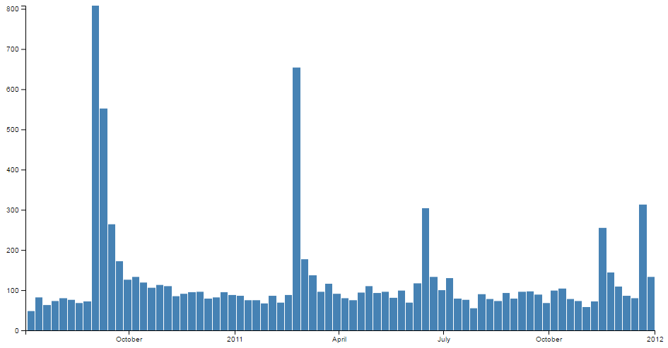
And we can go slightly more extreme by specifying a daily bin and produce the following;
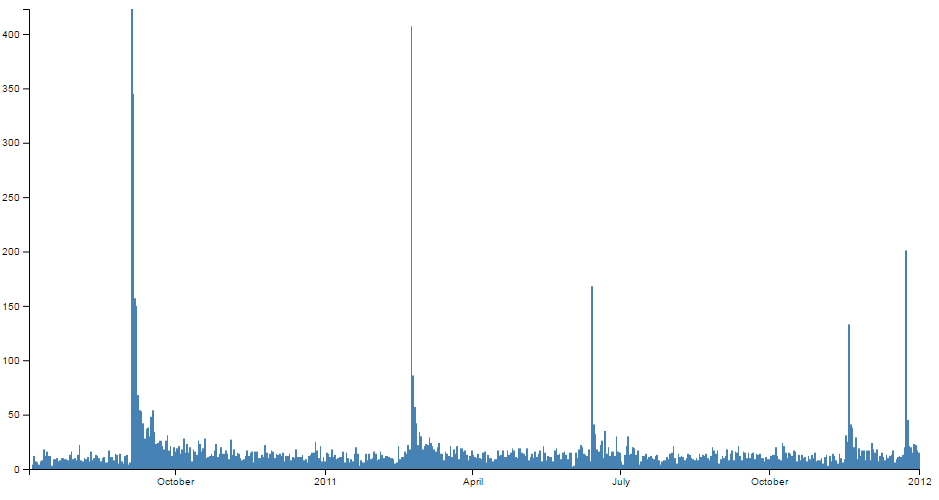
(Although technically I cheated slightly with this version and I removed the padding between the bars to allow the data to be presented a bit more faithfully.)
The next block of code selects the body on the web page and appends an svg object to it of the size that we have set up with our width, height and margins.
var svg = d3.select("body").append("svg")
    .attr("width", width + margin.left + margin.right)
    .attr("height", height + margin.top + margin.bottom)
  .append("g")
    .attr("transform",
          "translate(" + margin.left + "," + margin.top + ")");
It also adds a g element that provides a reference point for adding our axes.
Then we begin the main body of our JavaScript. We load our csv file and then loop through it making sure that the dates converted into a time format correctly;
// get the data
d3.csv("earthquakes.csv", function(error, data) {
  if (error) throw error;

  // format the data
  data.forEach(function(d) {
      d.date = parseDate(d.dtg);
  });
Now that we have our data we can put it into the appropriate bins using the histogram function that we declared earlier;
  // group the data for the bars
  var bins = histogram(data);
At this point we have two data sets. The first is our array of information from our earthquakes.csv file which is called ‘data’. The second is an array of grouped data called ‘bins’. We use the ‘bins’ data to draw our histogram.
We then use our ‘bin’ data to ensure that the y domain is scaled to the longest bar in the ‘bins’ data set;
  // Scale the range of the data in the y domain
  y.domain([0, d3.max(bins, function(d) { return d.length; })]);
Then we add the bars to our chart;
  // append the bar rectangles to the svg element
  svg.selectAll("rect")
      .data(bins)
    .enter().append("rect")
      .attr("class", "bar")
      .attr("x", 1)
      .attr("transform", function(d) {
		  return "translate(" + x(d.x0) + "," + y(d.length) + ")"; })
      .attr("width", function(d) { return x(d.x1) - x(d.x0) -1 ; })
      .attr("height", function(d) { return height - y(d.length); });
This block of code selects all the rectangles (selectAll("rect")) and associates each of them with our binned data set (.data(bins)).
We then append the rectangles (.append("rect")) with the colour assigned by our class (set in the <style> section) and we offset all the bars by 1 to make sure that we have a nice symmetrical set of bars with a thin separation (.attr("x", 1)).
The transform function sets the starting point for where we begin drawing the rectangles and the height and width attributes set the height and width of the rectangles. If you really want to stop and look at the transform and height attributes you will notice that it seems a bit ‘odd’. That is because it draws the graph from the top of the screen down. The origin is at the top left of the screen remember and we are trying to represent bars that appear to extend upwards from a ‘0’ point (on the y axis) that exists at a distance ‘height’ from the top of the screen. Sound weird. It is a little, but at the very least it’s logical. You can do it in several different ways, some more confusing than this, and I think that this represents a good balance between code complexity and understandability.
It’s also useful to note that when our histogram function was creating our bins, it also associated some variables with each bin. x0 and x1 to denote the start and stop point for each bin in the x domain and length for the number of data points in each bin. You can see more details in the D3 wiki here.
Finally we append our axes;
  // add the x Axis
  svg.append("g")
      .attr("transform", "translate(0," + height + ")")
      .call(d3.axisBottom(x));

  // add the y Axis
  svg.append("g")
      .call(d3.axisLeft(y));
The end result is our sharp looking histogram;

Tree Diagrams
What is a Tree Diagram?
The ‘Tree layout’ is not a distinct type of diagram per se. Instead, it’s representative of D3’s family of hierarchical layouts.
It’s designed to produce a ‘node-link’ diagram that lays out the connection between nodes in a method that displays the relationship of one node to another in a parent-child fashion.
For example, the following diagram shows a root node (the starting position) labelled ‘Top Node’ which has two children (Bob: Child of Top Node and Sally: Child of Top Node). Subsequently, Bob:Child of Top Node has two dependant nodes (children) ‘Son of Bob’ and ‘Daughter of Bob’.
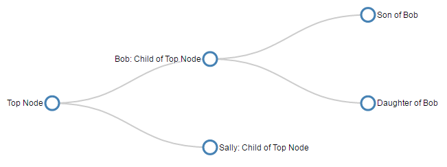
The clear advantage to this style of diagram is that describing it in text is difficult, but representing it graphically makes the relationships easy to determine.
The data required to produce this type of layout needs to describe the relationships, but this is not necessarily an onerous task. For example, the following is the data (in JSON form) for the diagram above and it shows the minimum information required to form the correct layout hierarchy.
It shows each node as having a name that identifies it on the tree and, where appropriate, the children it has (as an array).
There is a wealth of examples of tree diagrams on the web, but I would recommend a visit to blockbuilder.org as a starting point to get some ideas.
In this chapter we’re going to look at a very simple piece of code to generate a tree diagram before looking at different ways to adapt it. Including rotating it to be vertical, adding some dynamic styling to the nodes, importing from a flat file and from an external source. Finally we’ll look at a more complex example that is more commonly used on the web that allows a user to expand and collapse nodes interactively.
A simple Tree Diagram explained
We are going to work through a simple example of the code that draws a tree diagram, This is more for the understanding of the process rather than because it is a good example of code for drawing a tree diagram. It is a very limited example that lacks any real interactivity which is one of the strengths of d3.js graphics. However, we will outline the operation of an interactive version towards the end of the chapter once we have explored some possible configuration options that we might want to make.
The graphic that we are going to generate will look like this…
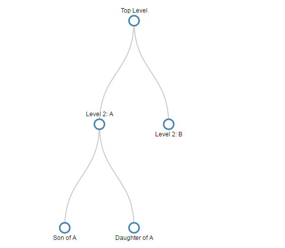
The full code for it looks like this;
<!DOCTYPE html>
<meta charset="utf-8">
<style> /* set the CSS */

.node circle {
  fill: #fff;
  stroke: steelblue;
  stroke-width: 3px;
}

.node text { font: 12px sans-serif; }

.node--internal text {
  text-shadow: 0 1px 0 #fff, 0 -1px 0 #fff, 1px 0 0 #fff, -1px 0 0 #fff;
}

.link {
  fill: none;
  stroke: #ccc;
  stroke-width: 2px;
}

</style>

<body>

<!-- load the d3.js library -->
<script src="//d3js.org/d3.v4.min.js"></script>
<script>

var treeData =
  {
    "name": "Top Level",
    "children": [
      {
		"name": "Level 2: A",
        "children": [
          { "name": "Son of A" },
          { "name": "Daughter of A" }
        ]
      },
      { "name": "Level 2: B" }
    ]
  };

// set the dimensions and margins of the diagram
var margin = {top: 40, right: 30, bottom: 50, left: 30},
    width = 660 - margin.left - margin.right,
    height = 500 - margin.top - margin.bottom;

// declares a tree layout and assigns the size
var treemap = d3.tree()
    .size([width, height]);

//  assigns the data to a hierarchy using parent-child relationships
var nodes = d3.hierarchy(treeData);

// maps the node data to the tree layout
nodes = treemap(nodes);

// append the svg obgect to the body of the page
// appends a 'group' element to 'svg'
// moves the 'group' element to the top left margin
var svg = d3.select("body").append("svg")
      .attr("width", width + margin.left + margin.right)
      .attr("height", height + margin.top + margin.bottom),
    g = svg.append("g")
      .attr("transform",
            "translate(" + margin.left + "," + margin.top + ")");

// adds the links between the nodes
var link = g.selectAll(".link")
    .data( nodes.descendants().slice(1))
  .enter().append("path")
    .attr("class", "link")
    .attr("d", function(d) {
       return "M" + d.x + "," + d.y
         + "C" + d.x + "," + (d.y + d.parent.y) / 2
         + " " + d.parent.x + "," +  (d.y + d.parent.y) / 2
         + " " + d.parent.x + "," + d.parent.y;
       });

// adds each node as a group
var node = g.selectAll(".node")
    .data(nodes.descendants())
  .enter().append("g")
    .attr("class", function(d) {
      return "node" +
        (d.children ? " node--internal" : " node--leaf"); })
    .attr("transform", function(d) {
      return "translate(" + d.x + "," + d.y + ")"; });

// adds the circle to the node
node.append("circle")
  .attr("r", 10);

// adds the text to the node
node.append("text")
  .attr("dy", ".35em")
  .attr("y", function(d) { return d.children ? -20 : 20; })
  .style("text-anchor", "middle")
  .text(function(d) { return d.data.name; });

</script>
</body>
In the course of describing the operation of the file I will gloss over the aspects of the structure of an HTML file which have already been described at the start of the book. Likewise, aspects of the JavaScript functions that have already been covered will only be briefly explained.
The start of the file deals with setting up the document’s head and body loading the d3.js script and setting up the CSS in the <style> section.
The CSS section sets styling for the circle that represents the nodes, the text alongside them and the links between them.
.node circle {
  fill: #fff;
  stroke: steelblue;
  stroke-width: 3px;
}

.node text { font: 12px sans-serif; }

.node--internal text {
  text-shadow: 0 1px 0 #fff, 0 -1px 0 #fff, 1px 0 0 #fff, -1px 0 0 #fff;
}

.link {
  fill: none;
  stroke: #ccc;
  stroke-width: 2px;
}
Then our JavaScript section starts and the first thing that happens is that we declare our array of data in the following code;
var treeData =
  {
    "name": "Top Level",
    "children": [
      {
		"name": "Level 2: A",
        "children": [
          { "name": "Son of A" },
          { "name": "Daughter of A" }
        ]
      },
      { "name": "Level 2: B" }
    ]
  };
As outlined at the start of the chapter, this data is encoded hierarchically in JavaScript Object Notation (JSON). Each node must have a name and if it is going to have subordinate nodes it must include a ‘children’ element. There are many examples of hierarchical data that can be encoded in this way. From the traditional parent - offspring example to directories on a hard drive or a breakdown of materials for a complex object. Any system of encoding where there is a single outcome from multiple sources like an election or an alert encoding system dependent on multiple trigger points.
The next section of our code declares some of the standard features for our diagram such as the size and shape of the svg container with margins included.
// set the dimensions and margins of the diagram
var margin = {top: 40, right: 90, bottom: 50, left: 90},
    width = 660 - margin.left - margin.right,
    height = 500 - margin.top - margin.bottom;
Now we start to get into the specifics for the diagram. The next block of code invokes the D3 .tree component, configures the data and assigns it to the tree structure (no actual drawing mind you, just getting the data ready).
// declares a tree layout and assigns the size
var treemap = d3.tree()
    .size([width, height]);

//  assigns the data to a hierarchy using parent-child relationships
var nodes = d3.hierarchy(treeData);

// maps the node data to the tree layout
nodes = treemap(nodes);
The first part of this is the declaration of treemap as using the d3.tree function and assigning the size of the diagram from our earlier variables;
// declares a tree layout and assigns the size
var treemap = d3.tree()
    .size([width, height]);
Then we assign our data (with the variable treeData) to nodes using the d3.hierarchy function.
//  assigns the data to a hierarchy using parent-child relationships
var nodes = d3.hierarchy(treeData, function(d) {
    return d.children;
  });
This assigns a range of properties to each node including;
-
node.data- the data associated with the node (in our case it will include the name accessible asnode.data.name) -
node.depth- a representation of the depth or number of hops from the initial ‘root’ node. -
node.height- the greatest distance from any descendant leaf nodes -
node.parent- the parent node, or null if it’s the root node -
node.children- child nodes or undefined for any leaf nodes
While we’re telling the function to use the ‘children’ elements from ‘treeData’, to generate the properties for the nodes, by default it will use the name ‘children’ if a name is not specified.
Lastly for this block we map the ‘nodes’ data to the tree layout;
// maps the node data to the tree layout
nodes = treemap(nodes);
The next block of code appends our SVG working area to the body of our web page and creates a group element (<g>) that will contain our svg objects (our nodes, text and links).
var svg = d3.select("body").append("svg")
      .attr("width", width + margin.left + margin.right)
      .attr("height", height + margin.top + margin.bottom),
    g = svg.append("g")
      .attr("transform",
            "translate(" + margin.left + "," + margin.top + ")");
Now we’re going to start drawing something! First up is the trickiest part. The links between the nodes.
// adds the links between the nodes
var link = g.selectAll(".link")
    .data( nodes.descendants().slice(1))
  .enter().append("path")
    .attr("class", "link")
    .attr("d", function(d) {
       return "M" + d.x + "," + d.y
         + "C" + d.x + "," + (d.y + d.parent.y) / 2
         + " " + d.parent.x + "," +  (d.y + d.parent.y) / 2
         + " " + d.parent.x + "," + d.parent.y;
       });
I say tricky because we’re going to be using the svg mini language again, and while it will work just fine if we simply paste it in and move on, if we want to understand a bit more about how it works, we will need to take a bit of a detour.
But first we need to get the details for this block of code explained. We declare and select all the ‘links’ and then assign the nodes as ‘data’ (.data(nodes.descendants().slice(1))). When we do this we are using .descendants() to return the array of ‘descendant’ nodes. We also specify .slice(1) to not include the main ‘root’ node since the links will be drawn by drawing a line from a child node to its parent (which we wouldn’t be able to do with the root node).
We append a path (.enter().append("path")) and apply some styling (.attr("class", "link")) and then embark on drawing the link lines with the SVG mini language via the ‘d’ attribute.
As we have mentioned previously the ‘d’ attribute allows for the creation of a string of instructions that describe a path. These instructions include;
- Moveto : moves the drawing point using
Mfor absolute coordinates andmfor relative movements - Lineto : draws a straight line from the current position to the next specified location using
Lfor absolute coordinates andlfor relative movement. - Curveto : draws a Bezier curve using control points from the current position to an end point.
Cdesignates absolute coordinates andcis used for relative movement. Either one or two sets of control points are used depending on whether a quadratic or cubic Bezier curve is used. - Arcto : describes a curved path as an elliptical curve rather than a Bezier with additional complexity
- ClosePath : draws a straight line from the current position to the first point in the path
If we look at a single node instance and break down the ‘d’ attribute path we can see the following;
-
"M" + d.x + "," + d.y: Moves to the starting point of our node -
"C" + d.x + "," + (d.y + d.parent.y) / 2: Establishes that we are going to draw a Cubic (C) Bezier curve and the first control point for it is atd.xin the x dimension and halfway between the starting node and its parent. -
" " + d.parent.x + "," + (d.y + d.parent.y) / 2: Sets the second control point for the curve in line with the parent node in the x dimension and still halfway between the starting node and its parent in the y dimension. -
" " + d.parent.x + "," + d.parent.y: sets the end point for our curve at the parent node location.
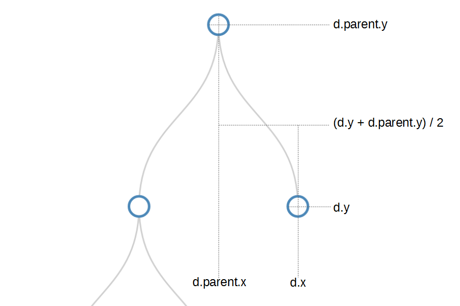
If we wanted to make the code easier to follow we could change the curve between nodes to a straight line with the following code;
// adds the links between the nodes
var link = g.selectAll(".link")
    .data( nodes.descendants().slice(1))
  .enter().append("path")
    .attr("class", "link")
    .attr("d", function(d) {
       return "M" + d.x + "," + d.y
         + "L" + d.parent.x + "," + d.parent.y;
       });
Which would result in lines being drawn with coordinates from the ‘d’ attribute as follows;
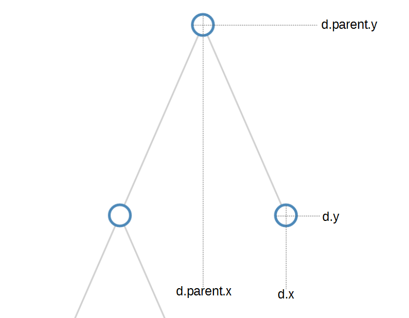
Then we create a variable node that creates a group element (g) for each node;
// adds each node as a group
var node = g.selectAll(".node")
    .data(nodes.descendants())
  .enter().append("g")
    .attr("class", function(d) {
      return "node" +
        (d.children ? " node--internal" : " node--leaf"); })
    .attr("transform", function(d) {
      return "translate(" + d.x + "," + d.y + ")"; });
This time we can see that;
- We don’t slice off the root node (
.data(nodes.descendants())) from our data set. - We apply a different ‘class’ to the node depending on whether it’s an internal node (it has children) or it’s a leaf node (it has no children)
d.children ? " node--internal" : " node--leaf". - We place each node ‘group’ at the appropriate location.
- We don’t actually draw anything. All we’re doing is getting the properties for each node set.
Once we have everything set up we can start to add objects to our node groups.
First we add our circle;
// adds the circle to the node
node.append("circle")
  .attr("r", 10);
And then we add the text;
// adds the text to the node
node.append("text")
  .attr("dy", ".35em")
  .attr("y", function(d) { return d.children ? -20 : 20; })
  .style("text-anchor", "middle")
  .text(function(d) { return d.data.name; });
When we’re adding the text, we make sure that we add it on the side appropriate for either a leaf node or an internal node.
And there’s our tree diagram.

A horizontal tree diagram explained
As we discussed at the start of the previous section, we wanted to start describing tree diagrams with a vertical version because there was an added degree of complexity with the horizontal version that might cause some confusion. If you have worked through and understood the vertical version, the horizontal won’t present any problems other than when you go “Oh, I see what’s going on.”. If you find yourself part way through this description of the changes to the code and can’t see what’s going on, revisit the vertical code and come back.
The graphic that we are going to generate will look like this…
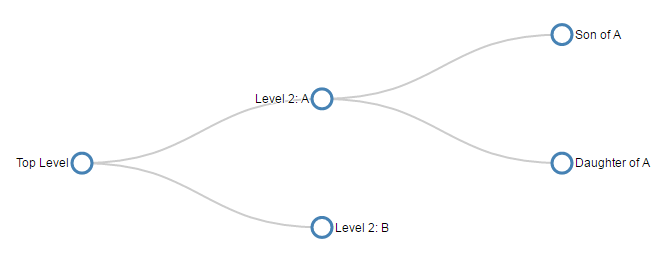
The full code for this is almost identical to the code for the vertical tree diagram with a couple of simple, yet major changes.
The first change is that the way that we draw the diagram relies on changing our reference by rotating everything by 90 degrees.
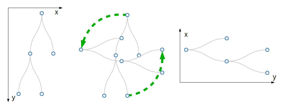
The (very simplistic) diagram shows that what used to be our ‘x’ dimension is now our ‘y’ dimension and visa versa.
The second change is that where we rotated our axes above we are now left with y and x dimensions that have an origin in the bottom left of the graph. Of course when we draw our diagram, the origin is in the top left corner. This vertical flip occurs automatically and is the reason the diagram doesn’t appear to have ‘just’ rotated.

Now we have our origin in the top left again and the layout of our tree looks pretty much as the example we will be producing.
Believe it or not, this is WAY more difficult to explain than it is to actually do. Again, D3 takes care of the heavy lifting, the explanation of the changes above is just to help us understand why we make some of the changes.
The first change we make is just to give ourselves some extra margin space since some of the labels extend slightly more left and right with a horizontal diagram;
var margin = {top: 20, right: 90, bottom: 30, left: 90},
The second change sets the size of the graphic. Here the width and height are swapped as part of the rotation.
// declares a tree layout and assigns the size
var treemap = d3.tree()
    .size([height, width]);
When we add the links we need to incorporate the rotation and the easiest way to appreciate the change is to compare the two pieces of code at the same time. In fact it is only when we draw the ‘d’ attribute for the path that we see the changes.
Firstly the vertical tree code;
    .attr("d", function(d) {
       return "M" + d.x + "," + d.y
         + "C" + d.x + "," + (d.y + d.parent.y) / 2
         + " " + d.parent.x + "," +  (d.y + d.parent.y) / 2
         + " " + d.parent.x + "," + d.parent.y;
       });
Then the horizontal tree code;
    .attr("d", function(d) {
       return "M" + d.y + "," + d.x
         + "C" + (d.y + d.parent.y) / 2 + "," + d.x
         + " " + (d.y + d.parent.y) / 2 + "," + d.parent.x
         + " " + d.parent.y + "," + d.parent.x;
       });
While there is a bit of math involved, the easiest way to tell that there is a difference is that for the horizontal tree, each coordinate is being described in y,x fashion rather than the conventional x,y.
A similar coordinate change is made when we translate the positions for the nodes;
    .attr("transform", function(d) {
      return "translate(" + d.y + "," + d.x + ")"; });
And lastly when we place the text next to the circles we need to adjust the default ‘y’ distance value with an ‘x’ distance value and to ensure that the labels are spaced at an appropriate distance and to align the text to either the left or right depending on whether it has children or not. We adjust the text anchor appropriately with an ‘end’ or ‘start’.
node.append("text")
  .attr("dy", ".35em")
  .attr("x", function(d) { return d.children ? -13 : 13; })
  .style("text-anchor", function(d) {
    return d.children ? "end" : "start"; })
  .text(function(d) { return d.data.name; });
And there we are….

The full code for this example can be found on github, or in the code samples bundled with this book (simple-horizontal-tree-diagram.html). A working example can be found on bl.ocks.org.
Styling nodes in a tree diagram
Changing node and link colours
The nodes in a tree diagram are objects that exist to provide a representation of the structure of data, but on a tree diagram they should also be viewed as an opportunity to encode additional information about the underlying data.
From the horizontal example shown we have encoded a certain amount of information already. The position of the text relative to each node is determined by whether or not the node is the parent of another node (if it’s a parent it’s on the left) or a child that is on the edge of the tree (in which case it is on the right of the node).

Now, that’s nice, but are we going to be satisfied with that??? (The answer is “No” by the way.)
This example is fairly simple, but it is an example of applying different styles to the nodes to convey additional information. I should be clear at this stage that I am not advocating turning your tree diagram into something that looks like it came out of a circus, because that would be a crime against style, so don’t repeat my upcoming example, but let some of the features be a trigger for developing your own subtle, yet compelling visualizations.
Brace yourself. Here’s a picture of the tree diagram that we’re going to generate. Those with weaker constitutions should look away and flip forward a few pages;
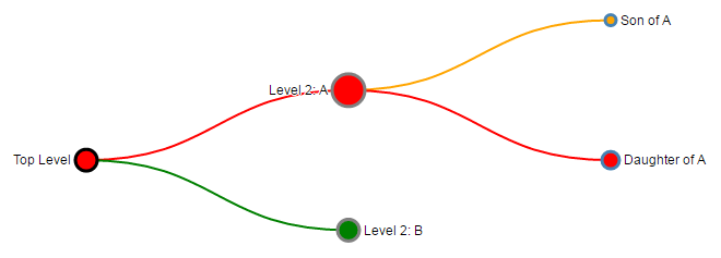
The changes that have been made are as a result of additional data fields that have been added to the JSON array and these fields have been applied to various style options throughout the code.
The types of style changes we have made are - Variation of the diameter of nodes - Changing the fill and stroke colour of nodes - Changing the colour of links depending on the associated node they are connected to.
The code changes we describe from here are assuming that we start with our simple horizontal tree diagram from the previous chapter. We’ll start by looking at the new JSON data set;
Each node now has a value which might represent a degree of importance (we will use this to affect the radius of the nodes), a type which might indicate a difference in the type of node (they might be in active, inactive or undetermined states) and a level which might indicate an alert level for determining problems (red = bad, orange = caution and green = normal).
Irrespective of the contrived nature of our styling options, they are applied to our tree in fairly similar ways with some subtle differences.
The full code for this example can be found on github or in the code samples bundled with this book (tree-styling.html). A working example can be found on bl.ocks.org.
The first change is to the node radius, stroke colour and fill colour.
We simply change the portion of the code that appends the circle from this…
// adds the circle to the node
node.append("circle")
.attr("r", 10);
… to this …
// adds the circle to the node
node.append("circle")
.attr("r", function(d) { return d.data.value; })
.style("stroke", function(d) { return d.data.type; })
.style("fill", function(d) { return d.data.level; });
The changes return the radius attribute as a function using data.value, the stroke colour is returned using data.type and the fill colour is returned with data.level. This is nice and simple, but we do need to make a slight adjustment to the code that sets the distance that the text is from the nodes so that when the radius expands or contracts, the text distance from the edge of the node adjusts as well.
To do this we take the clever piece of code that adjusts the distance that the text is in the x dimension from the node that looks like this …
.attr("x", function(d) { return d.children ? -13 : 13; })
… and we add in a dynamic aspect using the data.value field.
.attr("x", function(d) { return d.children ?
(d.data.value + 4) * -1 : d.data.value + 4 })
The last thing we wanted to do is to change the colour of the link based on the colour of the node. We accomplish this by taking the code that inserts the links…
// adds the links between the nodes
var link = g.selectAll(".link")
.data( nodes.descendants().slice(1))
.enter().append("path")
.attr("class", "link")
.attr("d", function(d) {
return "M" + d.y + "," + d.x
+ "C" + (d.y + d.parent.y) / 2 + "," + d.x
+ " " + (d.y + d.parent.y) / 2 + "," + d.parent.x
+ " " + d.parent.y + "," + d.parent.x;
});;
… and adding in a line that styles the link colour (the stroke) based on the data.level colour of node.
// adds the links between the nodes
var link = g.selectAll(".link")
.data( nodes.descendants().slice(1))
.enter().append("path")
.attr("class", "link")
.style("stroke", function(d) { return d.data.level; })
.attr("d", function(d) {
return "M" + d.y + "," + d.x
+ "C" + (d.y + d.parent.y) / 2 + "," + d.x
+ " " + (d.y + d.parent.y) / 2 + "," + d.parent.x
+ " " + d.parent.y + "," + d.parent.x;
});
Use the concepts here wisely. I don’t want to see any heinously styled tree diagrams floating around the internet with “Thanks to the help from D3 Tips and Tricks” next to them. Be subtle, be thoughtful :-).
Changing the nodes to different shapes
Many thanks to Josiah who asked a question on the d3noob.org blog on how the shapes of the nodes could be varied based on an associated value in the data.
There is more than one way to do this, but perhaps the simplest is to replace the section of the JavaScript that appends the circle with one that appends a symbol from d3’s symbol generator.
There are six pre-defined symbol types as follows;
- circle (
d3.symbolCircle) - a circle. - cross (
d3.symbolCross) - a Greek cross or plus sign. - diamond (
d3.symbolDiamond) - a rhombus. - square (
d3.symbolSquare) - an axis-aligned square. - triangle (
d3.symbolTriangle) - an upward-pointing equilateral triangle. - star (
d3.symbolStar) - a five pointed star. - ‘Y’ (
d3.symbolWye) - a ‘Y’ shape.
If we start with our ‘tree-styling’ script from above we can replace the code block that added the circles with the following script will look at the value in the data and assign either a cross or a diamond depending on the value
// adds symbols as nodes
node.append("path")
.style("stroke", function(d) { return d.data.type; })
.style("fill", function(d) { return d.data.level; })
.attr("d", d3.symbol()
.size(function(d) { return d.data.value * 30; } )
.type(function(d) { if
(d.data.value >= 9) { return d3.symbolCross; } else if
(d.data.value <= 9) { return d3.symbolDiamond;}
}));
It will also adjust the size of the symbol along with the stroke and fill.
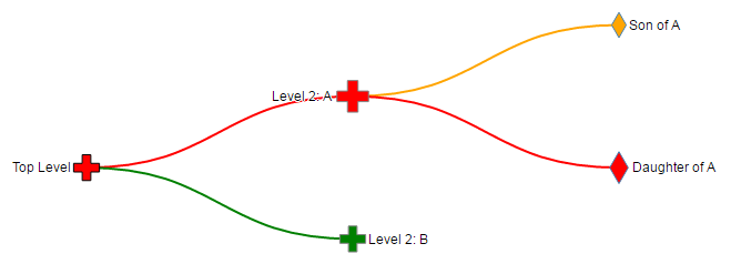
The full code for this example can be found on github or in the code samples bundled with this book (tree-symbol.html). A working online example can be found on bl.ocks.org.
Using images as nodes
Many thanks to nbhatta who asked a question on the d3noob.org blog on how to use images as nodes.
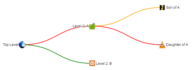
This was a slightly simpler change and just involved replacing the code snippet that added the circles with one that added an image;
// adds images as nodes
node.append("image")
.attr("xlink:href", function(d) { return d.data.icon; })
.attr("x", "-12px")
.attr("y", "-12px")
.attr("width", "24px")
.attr("height", "24px");
The images I chose were all 48 x 48 pixel for the sake of consistency and in the code above I formatted them to be half that size and moved them in the x and y direction so that they were centred correctly.
The cool thing that you will notice is that the specific icon that is placed at each node position is set by the name of the icon which is gathered from the JSON file with the tree details;
var treeData =
{
"name": "Top Level",
"value": 10,
"type": "black",
"level": "red",
"icon": "earth.png",
"children": [
{
"name": "Level 2: A",
"value": 5,
"type": "grey",
"level": "red",
"icon": "cart.png",
"children": [
{
"name": "Son of A",
"value": 5,
"type": "steelblue",
"icon": "lettern.png",
"level": "orange"
},
{
"name": "Daughter of A",
"value": 18,
"type": "steelblue",
"icon": "vlc.png",
"level": "red"
}
]
},
{
"name": "Level 2: B",
"value": 10,
"type": "grey",
"icon": "random.png",
"level": "green"
}
]
};
It’s possible to just have a single image and to hard-code it into the script, but where’s the fun in that?
The full code for this example can be found on github or in the code samples bundled with this book (tree-images.html, cart.png, earth.png, lettern.png, random.png and vlc.png). A working online example can be found on bl.ocks.org.
Generating a tree diagram from external data
In all the examples we have looked at so far we have used data that we have declared from within the file itself. Being able to import data from an external file is an important feature that we need to know how to implement.
Starting from the simple tree diagram example that we began with at the start of the chapter, the first change that we need to make is to remove the section of code that declares our data. But don’t throw it away since we will use it to create a separate file called treeData.json. Its contents will be;
(don’t include the treeData = part, or the semicolon at the end (you can delete those))
Then all we need to do is include a section that uses the d3.json accessor to load the file treeData.json (Remember to correctly address the file. This one assumes that the treeData.json file is in the same directory as the html file we are opening).
// load the external data
d3.json("treeData.json", function(error, treeData) {
if (error) throw error;
We can put it somewhere near the start of the JavaScript, but make sure it comes before the ‘nodes’ declaration (when in doubt, check out the sample code).
We also need to make sure that we include the wrapping, closing curly braces and bracket / semicolon (});) at the end of the script.
The full code for this example can be found on github or in the code samples bundled with this book (tree-from-external.html and treeData.json). A working example can be found on bl.ocks.org.
Generating a tree diagram from ‘flat’ data
Tree diagrams are a fantastic way of displaying information, but one of the drawbacks (to the examples we’ve been using so far) is the need to have your data encoded hierarchically. Most data in a raw form will be flat. That is to say, it won’t be formatted as an array with the parent - child relationships. Instead it will be a list of objects (which we will want to turn into nodes) that might describe the relationship to each other, but they won’t be encoded that way. For example, the following is the flat representation of the example data we have been using thus far.
It is actually fairly simple and consists of only the name of the node and the name of its parent node. It’s easy to see how this data could be developed into a hierarchical form, but it would take a little time and for a larger data set, that would be tiresome.
Luckily computers are built for shuffling data about and with the advent of v4 of d3.js we now have the d3.stratify operator that will convert flat data into a hierarchy suitable for use in our tree diagram.
We will be using the simple example that we started with at the start of the chapter and the first change we need to make is to replace our original data…
var treeData =
{
"name": "Top Level",
"children": [
{
"name": "Level 2: A",
"children": [
{ "name": "Son of A" },
{ "name": "Daughter of A" }
]
},
{ "name": "Level 2: B" }
]
};
… with our flat data array…
var flatData = [
{"name": "Top Level", "parent": null},
{"name": "Level 2: A", "parent": "Top Level" },
{"name": "Level 2: B", "parent": "Top Level" },
{"name": "Son of A", "parent": "Level 2: A" },
{"name": "Daughter of A", "parent": "Level 2: A" }
];
It’s worth noting here that we have also changed the name of the array (to flatData) since we are going to convert, then declare our newly massaged data with our original variable name treeData so that the remainder of our code thinks there have been no changes.
Then we use the d3.stratify operator on our flat data;
// convert the flat data into a hierarchy
var treeData = d3.stratify()
.id(function(d) { return d.name; })
.parentId(function(d) { return d.parent; })
(flatData);
The stratify function requires a unique identifier to be used for each node and it will be declared as .id. In this example each of our nodes has a unique ‘name’, so we are using that as our id (.id(function(d) { return d.name; })). We also need to understand the hierarchy by having each node identify who its parent is. This will be stored as parentId (.parentId(function(d) { return d.parent; }))
That’s it!
Because we want to be able to use our code as intact as possible from our horizontal tree example we will want to run through our dataset and assign the ‘name’ to each node that has been stored as id;
// assign the name to each node
treeData.each(function(d) {
d.name = d.id;
});
That’s it!
The brevity of the code to do this is fantastic and well done to Mike Bostock for including the new function in v4. Of course, the end result looks exactly the same;

… but it adds a significant capability for use of additional data.
The full code for this example can be found on github or in the code samples bundled with this book (tree-from-flat.html). A working example can be found on bl.ocks.org.
Generating a tree diagram from a CSV file.
Creating a tree diagram from a csv file is an extension of the sections where we create a diagram from flat data and where we create a diagram from an external file.
By mashing these together and using a csv file something like the following…
… we can ingest the name of the nodes and their relationships and then format the data correctly.
The main piece of code that we would add that is different from the standard horizontal tree diagram is as follows;
// load the external data
d3.csv("treeCsv.csv", function(error, flatData) {
if (error) throw error;
// assign null correctly
flatData.forEach(function(d) {
if (d.parent == "null") { d.parent = null};
});
// convert the flat data into a hierarchy
var treeData = d3.stratify()
.id(function(d) { return d.name; })
.parentId(function(d) { return d.parent; })
(flatData);
// assign the name to each node
treeData.each(function(d) {
d.name = d.id;
});
The only part of that code which is new is the portion where we look for the node whose parent is ‘“null”’ and change it to null. This is necessary since the script interprets the name as actually being the text ‘null’ so we have to force the code to realise that we want it to refer to a null amount.
The end result looks very familiar.

The full code for this example can be found on github or in the code samples bundled with this book (tree-from-csv.html and treeCsv.csv). A working example can be found on bl.ocks.org.
An interactive tree diagram
The examples presented thus far have all been static in the sense that they present information on a web page, but that’s where they stop. One of the strengths of web content is the ability to involve the reader to a greater extent. Therefore the following tree diagram example includes an interactive element where the user can click on any parent node and it will collapse on itself to make more room for others or to simplify a view. Additionally, any collapsed parent node can be clicked on and it will re-grow to its previous condition.
The example included here has it’s roots in the is v3 tree diagram of Mike Bostock’s example. Kudos and thanks also go out to Soumya Ranjan for steering me in the fight direction for the diagonal solution. This was necessary to work around the deprecation of svg.diagonal in v3.
The full code for this example can be found on github, in the appendices of this book or in the code samples bundled with this book (interactive-tree.html). A working online example can be found on bl.ocks.org.
For a brief visual description of the action. The diagram will initially display a partially collapsed tree…
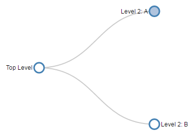
Then when clicking on the ‘Level 2: A’ node, the tree expands to…

We could also click on the root node (`Top Level’) to fully collapse the tree…

Then clicking on the nodes opens the diagram back up again.
One of the important changes is to allow the diagram to follow the d3.js model of enter - update - exit for the nodes with a suitable transition in between.
Nodes are coloured (“steelblue”) if they have been collapsed and at the end of the script we have a function that makes use of the d._children reference we have been using in most of our examples.
function click(d) {
if (d.children) {
d._children = d.children;
d.children = null;
} else {
d.children = d._children;
d._children = null;
}
update(d);
}
This allows the action of clicking on the nodes to update the data associated with the node and as a consequence change it’s properties in the script based on if statements (Such as "fill", function(d) { return d._children ? "lightsteelblue" : "#fff"; } which will fill the node with “lightsteelblue” if d._children exists, otherwise make it white.)
The examples we have looked at in the previous sections in this chapter are all applicable to this interactive version, so this should provide you with the capability to generate some interesting visualizations.
Sankey Diagrams
What is a Sankey Diagram?
A Sankey diagram is a type of flow diagram where the ‘flow’ is represented by arrows of varying thickness depending on the quantity of flow.
They are often used to visualize energy, material or cost transfers and are especially useful in demonstrating proportionality to a flow where different parts of the diagram represent different quantities in a system.
Probably the most famous example of a Sankey diagram is Charles Minard’s Map of Napoleon’s Russian Campaign of 1812.

From Wikipedia;
“Étienne-Jules Marey first called notice to this dramatic depiction of the fate of Napoleon’s army in the Russian campaign, saying it defies the pen of the historian in its brutal eloquence. Edward Tufte says it “may well be the best statistical graphic ever drawn” and uses it as a prime example in The Visual Display of Quantitative Information.”
Wikipedia has a great explanation of the diagram type and there is a wealth of information dedicated to it on the inter-web. I heartily recommend http://www.sankey-diagrams.com/ for all things Sankey!
So it would come as little surprise that Mike Bostock has developed a plugin for Sankey diagrams (http://bost.ocks.org/mike/sankey/) so that we can all enjoy Sankey goodness with lashings of D3.
For a great page dedicated to Sankey diagrams, check out sankey-diagrams.com.
Which Sankey plugin should we use?
Hmmmm…… Good question.
As at the time of writing there were 4 different sankey plugins listed on the d3 wiki (including the vertical one). The examples we will walk through have used the plugins from Stefaan Lippens and Jason Davies without problem. I have used the Jason Davies version for no other reason than it appears to be the originator from which others have been derived.
How d3.js Sankey Diagrams want their data formatted
If we think of Sankey diagrams consisting of ‘nodes’ and ‘links’…
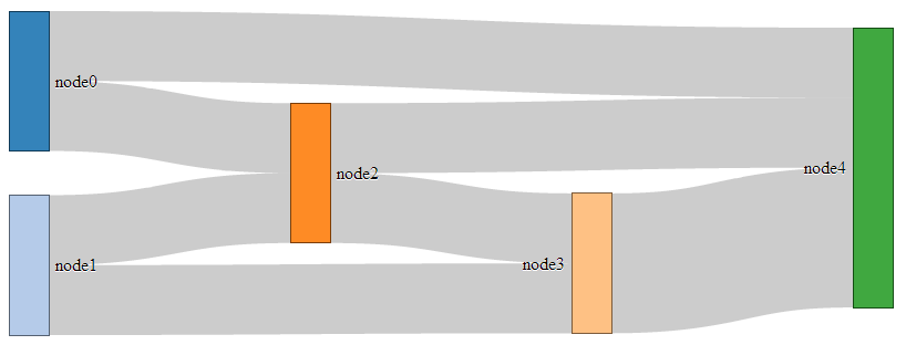
… the data that generates them must be formatted as nodes and links as well.
For instance a JSON file with appropriate data to build the diagram above could look like the following;
In the file above we have 6 nodes (0-5) sequentially numbered and with names appropriate to their position in the list.
The sequential numbering is only for the purpose of highlighting the structure of the data, since when we get D3 running, it will automatically index each of the nodes according to its position. In other words, we could have omitted the “node”:n parts since D3 will know where each node is anyway. The big deal is that WE need to know what each node is as well. Especially if we’re going to be building the data by hand (doing it dynamically would be cool, but let’s not get ahead of ourselves just yet).
The ‘links’ part of the data can be broken down into individual source to target ‘links’ that have an associated value (could be a quantity or strength, but at least a numeric value).
The ‘source’ and ‘target’ numbers are references to the list of nodes. So, “source”:1, “target”:2 means that this link is whatever node appears at position 1 going to whatever node appears at position 2. The important point to make here is that D3 will not be interested in the numerical value of the node, just its position in the list (starting at zero).
Description of the code
The code for the Sankey diagram is significantly different to that for a line graph although it shares the same core language and programming methodology.
The code we’ll go through is an adaptation of the version first demonstrated by Mike Bostock so it’s got a pretty good pedigree. We will begin with a version that uses data that is formatted so that it can be used directly with no manipulation, then in subsequent sections we will work on different techniques for getting data from different formats (and with different structures) to work.
I found that getting data in the correct format was the biggest hurdle for getting a Sankey diagram to work. We will start off assuming that the data is perfectly formatted, then where only the link data is available, then where there is just names to work with (no numeric node values) and lastly, one that can be used for people with changeable data from a MySQL database.
We won’t try to go over every inch of the code as we did with the simple graph example (I’ll skip things like the HTML header) and will focus on the style sheet (CSS) portion and the JavaScript.
The full code for this example can be found on github or in the code samples bundled with this book (sankey-formatted-json.html, sankey.js and sankey.json). A live example can be found on bl.ocks.org.
On to the code…
<!DOCTYPE html>
<meta charset="utf-8">
<title>SANKEY Experiment</title>
<style>
.node rect {
cursor: move;
fill-opacity: .9;
shape-rendering: crispEdges;
}
.node text {
pointer-events: none;
text-shadow: 0 1px 0 #fff;
}
.link {
fill: none;
stroke: #000;
stroke-opacity: .2;
}
.link:hover {
stroke-opacity: .5;
}
</style>
<body>
<script src="https://d3js.org/d3.v4.min.js"></script>
<script src="sankey.js"></script>
<script>
var units = "Widgets";
// set the dimensions and margins of the graph
var margin = {top: 10, right: 10, bottom: 10, left: 10},
width = 700 - margin.left - margin.right,
height = 300 - margin.top - margin.bottom;
// format variables
var formatNumber = d3.format(",.0f"), // zero decimal places
format = function(d) { return formatNumber(d) + " " + units; },
color = d3.scaleOrdinal(d3.schemeCategory20);
// append the svg object to the body of the page
var svg = d3.select("body").append("svg")
.attr("width", width + margin.left + margin.right)
.attr("height", height + margin.top + margin.bottom)
.append("g")
.attr("transform",
"translate(" + margin.left + "," + margin.top + ")");
// Set the sankey diagram properties
var sankey = d3.sankey()
.nodeWidth(36)
.nodePadding(40)
.size([width, height]);
var path = sankey.link();
// load the data
d3.json("sankey.json", function(error, graph) {
sankey
.nodes(graph.nodes)
.links(graph.links)
.layout(32);
// add in the links
var link = svg.append("g").selectAll(".link")
.data(graph.links)
.enter().append("path")
.attr("class", "link")
.attr("d", path)
.style("stroke-width", function(d) { return Math.max(1, d.dy); })
.sort(function(a, b) { return b.dy - a.dy; });
// add the link titles
link.append("title")
.text(function(d) {
return d.source.name + " → " +
d.target.name + "\n" + format(d.value); });
// add in the nodes
var node = svg.append("g").selectAll(".node")
.data(graph.nodes)
.enter().append("g")
.attr("class", "node")
.attr("transform", function(d) {
return "translate(" + d.x + "," + d.y + ")"; })
.call(d3.drag()
.subject(function(d) {
return d;
})
.on("start", function() {
this.parentNode.appendChild(this);
})
.on("drag", dragmove));
// add the rectangles for the nodes
node.append("rect")
.attr("height", function(d) { return d.dy; })
.attr("width", sankey.nodeWidth())
.style("fill", function(d) {
return d.color = color(d.name.replace(/ .*/, "")); })
.style("stroke", function(d) {
return d3.rgb(d.color).darker(2); })
.append("title")
.text(function(d) {
return d.name + "\n" + format(d.value); });
// add in the title for the nodes
node.append("text")
.attr("x", -6)
.attr("y", function(d) { return d.dy / 2; })
.attr("dy", ".35em")
.attr("text-anchor", "end")
.attr("transform", null)
.text(function(d) { return d.name; })
.filter(function(d) { return d.x < width / 2; })
.attr("x", 6 + sankey.nodeWidth())
.attr("text-anchor", "start");
// the function for moving the nodes
function dragmove(d) {
d3.select(this)
.attr("transform",
"translate("
+ d.x + ","
+ (d.y = Math.max(
0, Math.min(height - d.dy, d3.event.y))
) + ")");
sankey.relayout();
link.attr("d", path);
}
});
</script>
</body>
So, going straight to the style sheet bounded by the <style> tags;
.node rect {
cursor: move;
fill-opacity: .9;
shape-rendering: crispEdges;
}
.node text {
pointer-events: none;
text-shadow: 0 1px 0 #fff;
}
.link {
fill: none;
stroke: #000;
stroke-opacity: .2;
}
.link:hover {
stroke-opacity: .5;
}
The CSS in this example is mainly concerned with formatting of the mouse cursor as it moves around the diagram.
The first part…
.node rect {
cursor: move;
fill-opacity: .9;
shape-rendering: crispEdges;
}
… provides the properties for the node rectangles. It changes the icon for the cursor when it moves over the rectangle to one that looks like it will move the rectangle (there is a range of different icons that can be defined here http://www.echoecho.com/csscursors.htm), sets the fill colour to mostly opaque and keeps the edges sharp.
The next block…
.node text {
pointer-events: none;
text-shadow: 0 1px 0 #fff;
}
… sets the properties for the text at each node. The mouse is told to essentially ignore the text in favour of anything that’s under it (in the case of moving or highlighting something else) and a slight shadow is applied for readability).
The following block…
.link {
fill: none;
stroke: #000;
stroke-opacity: .2;
}
… makes sure that the link has no fill (it actually appears to be a bendy rectangle with very thick edges that make the element appear to be a solid block), colours the edges black (#000) and makes the edges almost transparent.
The last block….
.link:hover {
stroke-opacity: .5;
}
… simply changes the opacity of the link when the mouse goes over it so that it’s more visible. If so desired, we could change the colour of the highlighted link by adding in a line to this block changing the colour like this stroke: red;.
Just before we get into the JavaScript, we do something a little different for d3.js. We tells it to use a plug-in with the following line;
<script src="sankey.js"></script>
The concept of a plug-in is that it is a separate piece of code that will allow additional functionality to a core block (which in this case is d3.js). There are a range of plug-ins available and we will need to source the sankey.js file from the repository and place that somewhere where our HTML code can access it. In this case I have put it in the same directory as the main sankey web page.
The start of our JavaScript begins by defining a range of variables that we’ll be using.
Our units are set as ‘Widgets’ (var units = "Widgets";), which is just a convenient generic (nonsense) term to provide the impression that the flow of items in this case is widgets being passed from one person to another.
We then set our canvas size and margins…
var margin = {top: 10, right: 10, bottom: 10, left: 10},
width = 700 - margin.left – margin.right,
height = 300 - margin.top – margin.bottom;
… before setting some formatting.
var formatNumber = d3.format(",.0f"), // zero decimal places
format = function(d) { return formatNumber(d) + " " + units; },
color = d3.scaleOrdinal(d3.schemeCategory20);
The formatNumber function acts on a number to set it to zero decimal places in this case. In the original Mike Bostock example it was to three places, but for ‘widgets’ I’m presuming we don’t divide :-).
format is a function that returns a given number formatted with formatNumber as well as a space and our units of choice (‘Widgets’). This is used to display the values for the links and nodes later in the script.
The color = d3.scaleOrdinal(d3.schemeCategory20); line is really interesting and provides access to a colour scale that is pre-defined for your convenience! Later in the code we will see it in action.
Our next block of code positions our svg element onto our page in relation to the size and margins we have already defined;
var svg = d3.select("body").append("svg")
.attr("width", width + margin.left + margin.right)
.attr("height", height + margin.top + margin.bottom)
.append("g")
.attr("transform",
"translate(" + margin.left + "," + margin.top + ")");
Then we set the variables for our sankey diagram;
var sankey = d3.sankey()
.nodeWidth(36)
.nodePadding(40)
.size([width, height]);
Without trying to state the obvious, this sets the width of the nodes (.nodeWidth(36)), the padding between the nodes (.nodePadding(40)) and the size of the diagram(.size([width, height]);).
The following line defines the path variable as a pointer to the sankey function that makes the links between the nodes do their clever thing of bending into the right places;
var path = sankey.link();
I make the presumption that this is a defined function within sankey.js.
Then we load the data for our sankey diagram with the following line;
d3.json("sankey.json", function(error, graph) {
As we have seen in previous usage of the d3.json, d3.csv and d3.tsv functions, this is a wrapper that acts on all the code within it bringing the data in the form of graph to the remaining code.
I think it’s a good time to take a slightly closer look at the data that we’ll be using;
I want to look at the data now, because it highlights how it is accessed throughout this portion of the code. It is split into two different blocks, ‘nodes’ and ‘links’. The subset of variables available under ‘nodes’ is ‘node’ and ‘name’. Likewise under ‘links’ we have ‘source’, ‘target’ and ‘value’. This means that when we want to act on a subset of our data we define which piece by defining the hierarchy that leads to it. For instance, if we want to define an action for all the links, we would use graph.links (they’re kind of chained together).
Now that we have our data loaded, we can assign the data to the sankey function so that it knows how to deal with it behind the scenes;
sankey
.nodes(graph.nodes)
.links(graph.links)
.layout(32);
In keeping with our previous description of what’s going on with the data, we have told the sankey function that the nodes it will be dealing with are in graph.nodes of our data structure.
I’m not sure what the .layout(32); portion of the code does, but I’d be interested to hear from any more knowledgeable readers. I’ve tried changing the values to no apparent effect and googling has drawn a blank. Internally to the sankey.js file it seems to indicate ‘iterations’ while it establishes computeNodeLinks, computeNodeValues, computeNodeBreadths, computeNodeDepths (iterations) and computeLinkDepths.
Then we add our links to the diagram with the following block of code;
var link = svg.append("g").selectAll(".link")
.data(graph.links)
.enter().append("path")
.attr("class", "link")
.attr("d", path)
.style("stroke-width", function(d) { return Math.max(1, d.dy); })
.sort(function(a, b) { return b.dy - a.dy; });
This is an analogue of the block of code we examined way back in the section that we covered in explaining the code of our first simple graph.
We append svg elements for our links based on the data in graph.links, then add in the paths (using the appropriate CSS). We set the stroke width to the width of the value associated with each link or ‘1’. Whichever is the larger (by virtue of the Math.max function). As an interesting sideline, if we force this value to ‘10’ thusly…
.style("stroke-width", 10)
… the graph looks quite interesting.
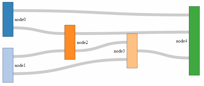
The sort function (.sort(function(a, b) { return b.dy - a.dy; });) makes sure the link for which the target has the highest y coordinate departs first out of the rectangle. Meaning if you have flows of 30,40,50 out of node 1, heading towards nodes 2, 3 and 4, with node 3 located above node 2 and that above node 4, the outflow order from node 1 will be 40,50,30. This makes sure there are a minimum of flow crosses. It’s slightly confusing and for a long time it was a mystery (big thanks and kudos to ‘napicool’ who was able to explain it on d3noob.org.
The next block adds the titles to the links;
link.append("title")
.text(function(d) {
return d.source.name + " → " +
d.target.name + "\n" + format(d.value); });
This code appends a text element to each link when moused over that contains the source and target name (with a neat little arrow in between and the value) which, when applied with the format function, adds the units.
The next block appends the node objects (but not the rectangles or text) and contains the instructions to allow them to be arranged with the mouse.
var node = svg.append("g").selectAll(".node")
.data(graph.nodes)
.enter().append("g")
.attr("class", "node")
.attr("transform", function(d) {
return "translate(" + d.x + "," + d.y + ")"; })
.call(d3.drag()
.subject(function(d) {
return d;
})
.on("start", function() {
this.parentNode.appendChild(this);
})
.on("drag", dragmove));
While it starts off in familiar territory with appending the node objects using the graph.nodes data and putting them in the appropriate place with the transform attribute, I can only assume that there is some trickery going on behind the scenes to make sure the mouse can do what it needs to do with the d3.behaviour,drag function. There is some excellent documentation on the wiki, but I can only presume that it knows what it’s doing :-). The dragmove function is laid out at the end of the code, and we will explain how that operates later. Kudos for this code portion should go to @syntagmatic.
I really enjoyed the next block;
node.append("rect")
.attr("height", function(d) { return d.dy; })
.attr("width", sankey.nodeWidth())
.style("fill", function(d) {
return d.color = color(d.name.replace(/ .*/, "")); })
.style("stroke", function(d) {
return d3.rgb(d.color).darker(2); })
.append("title")
.text(function(d) {
return d.name + "\n" + format(d.value); });
It starts off with a fairly standard appending of a rectangle with a height generated by its value { return d.dy; } and a width dictated by the sankey.js file to fit the area (.attr("width", sankey.nodeWidth())).
Then it gets interesting.
The colours are assigned in accordance with our earlier colour declaration and the individual colours are added to the nodes by finding the first part of the name for each node and assigning it a colour from the palate (the script looks for the first space in the name using a regular expression). For instance: ‘Widget X’, ‘Widget Y’ and ‘Widget’ will all be coloured the same even if the ‘Widget X’ and ‘Widget Y’ are inputs on the left and ‘Widget’ is a node in the middle.
The stroke around the outside of the rectangle is then drawn in the same shade, but darker.
Then we return to the basics where we add the title of the node in a tool tip type effect along with the value for the node.
From here we add the titles for the nodes;
node.append("text")
.attr("x", -6)
.attr("y", function(d) { return d.dy / 2; })
.attr("dy", ".35em")
.attr("text-anchor", "end")
.attr("transform", null)
.text(function(d) { return d.name; })
.filter(function(d) { return d.x < width / 2; })
.attr("x", 6 + sankey.nodeWidth())
.attr("text-anchor", "start");
Again, this looks pretty familiar. We position the text titles carefully to the left of the nodes. All except for those affected by the filter function (return d.x < width / 2;). Where if the position of the node on the x axis is less than half the width, the title is placed on the right of the node and anchored at the start of the text. Very neat.
The last block is also pretty neat, and contains a little surprise for those who are so inclined.
function dragmove(d) {
d3.select(this)
.attr("transform",
"translate("
+ d.x + ","
+ (d.y = Math.max(
0, Math.min(height - d.dy, d3.event.y))
) + ")");
sankey.relayout();
link.attr("d", path);
This declares the function that controls the movement of the nodes with the mouse.
It selects the item that it’s operating over (d3.select(this)) and then allows translation in the y axis while maintaining the link connection (sankey.relayout(); link.attr("d", path);).
But that’s not the cool part. A quick look at the code should reveal that if you can move a node in the y axis, there should be no reason why you can’t move it in the x axis as well!
Sure enough, if you replace the code above with this…
function dragmove(d) {
d3.select(this).attr("transform",
"translate(" + (
d.x = Math.max(0, Math.min(width - d.dx, d3.event.x))
)
+ "," + (
d.y = Math.max(0, Math.min(height - d.dy, d3.event.y))
) + ")");
sankey.relayout();
link.attr("d", path);
… you can move your nodes anywhere on the canvas.
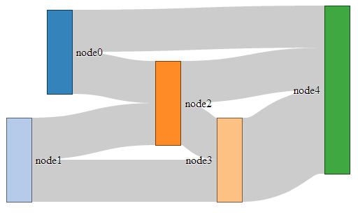
I know it doesn’t seem to add anything to the diagram (in fact, it could be argued that there is a certain aspect of detraction) however, it doesn’t mean that one day the idea doesn’t come in handy :-). You can see a live version on bl.ocks.org.
Formatting data for Sankey diagrams
From a JSON file with numeric link values
As explained in the previous section, data to form a Sankey diagram needs to be a combination of nodes and links.
{
"nodes":[
{"node":0,"name":"node0"},
{"node":1,"name":"node1"},
{"node":2,"name":"node2"},
{"node":3,"name":"node3"},
{"node":4,"name":"node4"}
],
"links":[
{"source":0,"target":2,"value":2},
{"source":1,"target":2,"value":2},
{"source":1,"target":3,"value":2},
{"source":0,"target":4,"value":2},
{"source":2,"target":3,"value":2},
{"source":2,"target":4,"value":2},
{"source":3,"target":4,"value":4}
]}
As we also noted earlier, the "node" entries in the "nodes" section of the JSON file are superfluous and are really only there for our benefit since D3 will automatically index the nodes starting at zero. As a test to check this out we can change our data to the following;
{
"nodes":[
{"name":"Barry"},
{"name":"Frodo"},
{"name":"Elvis"},
{"name":"Sarah"},
{"name":"Alice"}
],
"links":[
{"source":0,"target":2,"value":2},
{"source":1,"target":2,"value":2},
{"source":1,"target":3,"value":2},
{"source":0,"target":4,"value":2},
{"source":2,"target":3,"value":2},
{"source":2,"target":4,"value":2},
{"source":3,"target":4,"value":4}
]}
This will produce the following graph;
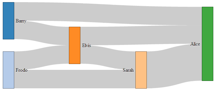
As you can see, essentially the same, but with easier to understand names.
As you can imagine, while the end result is great, the creation of the JSON file manually would be painful at best. Doing something similar but with a greater number of nodes / links would be a nightmare.
Let’s see if we can make the process a bit easier and more flexible.
From a JSON file with links as names
It would make thing much easier, if you are building the data from hand, to have nodes with names, and the ‘source’ and ‘target’ links to have those same name values as identifiers.
In other words a list of unique names for the nodes (and perhaps some details) and a list of the links between those nodes using the names for the nodes.
So, something like this;
{
"nodes":[
{"name":"Barry"},
{"name":"Frodo"},
{"name":"Elvis"},
{"name":"Sarah"},
{"name":"Alice"}
],
"links":[
{"source":"Barry","target":"Elvis","value":2},
{"source":"Frodo","target":"Elvis","value":2},
{"source":"Frodo","target":"Sarah","value":2},
{"source":"Barry","target":"Alice","value":2},
{"source":"Elvis","target":"Sarah","value":2},
{"source":"Elvis","target":"Alice","value":2},
{"source":"Sarah","target":"Alice","value":4}
]}
Once again, D3 to the rescue!
The little piece of code that can do this for us is here;
var nodeMap = {};
graph.nodes.forEach(function(x) { nodeMap[x.name] = x; });
graph.links = graph.links.map(function(x) {
return {
source: nodeMap[x.source],
target: nodeMap[x.target],
value: x.value
};
});
This elegant solution comes from Stack Overflow and was provided by Chris Pettitt (nice job).
So if we sneak this piece of code into here…
d3.json("sankey-names.json", function(error, graph) {
// <= Put the code here.
sankey
.nodes(graph.nodes)
.links(graph.links)
.layout(32);
… and this time we use our JSON file with just names (sankey-names.json) and our new html file (sankey-formatted-names.html) we find our Sankey diagram working perfectly!
The full code for this example can be found on github or in the code samples bundled with this book (sankey-formatted-names.html, sankey.js and sankey-names.json). A live example can be found on bl.ocks.org.

Looking at our new piece of code…
var nodeMap = {};
graph.nodes.forEach(function(x) { nodeMap[x.name] = x; });
… the first thing it does is create an object called nodeMap (The difference between an array and an object in JavaScript is one that is still a little blurry to me and judging from online comments, I am not alone).
Then for each of the graph.node instances (where x is a range of numbers from 0 to the last node), we assign each node name to a number.
Then in the next piece of code…
graph.links = graph.links.map(function(x) {
return {
source: nodeMap[x.source],
target: nodeMap[x.target],
value: x.value
};
… we go through all the links we have and for each link, we map the appropriate number to the correct name.
Very clever.
From a CSV with ‘source’, ‘target’ and ‘value’ info only.
In the first iteration of this section of the book I had no solution to creating a Sankey diagram using a csv file as the source of the data.
But cometh the hour, cometh the man. Enter @timelyportfolio who, while claiming no expertise in D3 or JavaScript was able to demonstrate a solution to exactly the problem I was facing! Well done Sir! I salute you and name the technique the timelyportfolio csv method!
The full code for this example can be found on github or in the code samples bundled with this book (sankey-formatted-csv.html, sankey.js and sankey.csv). A live example can be found on bl.ocks.org.
So here’s the cleverness that @timelyportfolio demonstrated;
Using a csv file (in this case called sankey.csv) that looks like this;
We take this single line from our original Sankey diagram code;
d3.json("sankey-formatted.json", function(error, graph) {
And replace it with the following block;
d3.csv("sankey.csv", function(error, data) {
//set up graph in same style as original example but empty
graph = {"nodes" : [], "links" : []};
data.forEach(function (d) {
graph.nodes.push({ "name": d.source });
graph.nodes.push({ "name": d.target });
graph.links.push({ "source": d.source,
"target": d.target,
"value": +d.value });
});
// return only the distinct / unique nodes
graph.nodes = d3.keys(d3.nest()
.key(function (d) { return d.name; })
.object(graph.nodes));
// loop through each link replacing the text with its index from node
graph.links.forEach(function (d, i) {
graph.links[i].source = graph.nodes.indexOf(graph.links[i].source);
graph.links[i].target = graph.nodes.indexOf(graph.links[i].target);
});
// now loop through each nodes to make nodes an array of objects
// rather than an array of strings
graph.nodes.forEach(function (d, i) {
graph.nodes[i] = { "name": d };
});
The comments in the code (and they are fuller in @timelyportfolio’s original gist solution) explain the operation;
d3.csv("sankey.csv", function(error, data) {
… Loads the csv file from the data directory.
graph = {"nodes" : [], "links" : []};
… Declares graph to consist of two empty arrays called nodes and links.
data.forEach(function (d) {
graph.nodes.push({ "name": d.source });
graph.nodes.push({ "name": d.target });
graph.links.push({ "source": d.source,
"target": d.target,
"value": +d.value });
});
… Takes the data loaded with the csv file and for each row loads variables for the source and target into the nodes array. Then for each row it loads variables for the source target and value into the links array.
graph.nodes = d3.keys(d3.nest()
.key(function (d) { return d.name; })
.object(graph.nodes));
… Is a routine that Mike Bostock described on Google Groups that (as I understand it) nests each node name as a key so that it returns with only unique nodes.
graph.links.forEach(function (d, i) {
graph.links[i].source = graph.nodes.indexOf(graph.links[i].source);
graph.links[i].target = graph.nodes.indexOf(graph.links[i].target);
});
… Goes through each link entry and, for each source and target, it finds the unique index number of that name in the nodes array and assigns the link source and target an appropriate number.
And finally…
graph.nodes.forEach(function (d, i) {
graph.nodes[i] = { "name": d };
});
… Goes through each node and (in the words of @timelyportfolio) “make nodes an array of objects rather than an array of strings” (I don’t really know what that means :-(. I just know it works :-).)
There you have it. A Sankey diagram from a csv file. Well played @timelyportfolio!
Assorted Tips and Tricks
Change a line chart into a scatter plot
Confession time.
In the original book I didn’t actually intend to add in a section with a scatter plot in it for its own sake because I thought it would be;
- tricky
- not useful
- all of the above
I was wrong on all counts.
All we need to do is take the simple graph example file and slot the following block in between the ‘Add the valueline path’ and the ‘add the x axis’ blocks.
// add the dots
svg.selectAll("dot")
.data(data)
.enter().append("circle")
.attr("r", 5)
.attr("cx", function(d) { return x(d.date); })
.attr("cy", function(d) { return y(d.close); });
And we will get…

The full code for this graph can also be found on github or in the code samples bundled with this book (simple-scatterplot.html and data.csv). A live example can be found on bl.ocks.org.
I deliberately put the dots after the line in the drawing section, because I thought they would look better, but we could put the block of code before the line drawing block to get the following effect;

(just trying to reinforce the concept that ‘order’ matters when drawing objects :-)).
We could of course just remove the line block all together…

But in my humble opinion it loses something.
So what do the individual lines in the scatter plot block of JavaScript do?
The first line (svg.selectAll("dot")) essentially provides a suitable group label for the svg circle elements that will be added. The next line associates the range of data that we have to the group of elements we are about to add in.
Then we add a circle for each data point (.enter().append("circle")) with a radius of 5 pixels (.attr("r", 5)) and appropriate x (.attr("cx", function(d) { return x(d.date); })) and y (.attr("cy", function(d) { return y(d.close); });) coordinates.
There is lots more that we could be doing with this piece of code including varying the colour or size or opacity of the circles depending on the data and all sorts of really neat things, but for the mean time, there we go. Scatter plot!
Adding tooltips.
Tooltips have a marvellous duality. They are on one hand a pretty darned useful thing that aids in giving context and information where required and on the other hand, if done with a bit of care, they can look very stylish :-).
Technically, they represent a slight deviation from what we have been playing with so far into a mildly more complex arena of ‘transitions’ and ‘events’. You will probably regard this one of two ways. Either accepting that it just works and using it as shown, or you will actually know what’s going on in which case feel free to deride my efforts as those of a rank amateur :-).
Just in case there is some confusion, a tooltip (one word or two?) is a discrete piece of information that will pop into view when the mouse hovers over somewhere specific. Most of us have seen and used them, but I suppose we all tend to call them different things such as ‘infotip’, ‘hint’ or ‘hover box’ I don’t know if there’s a right name for them, but here’s an example of what we’re trying to achieve;
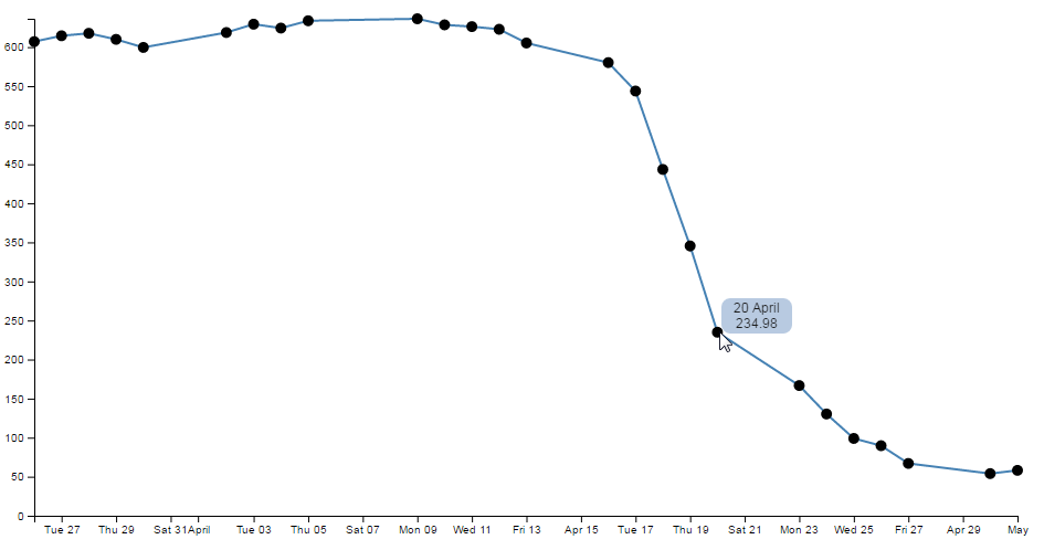
We can see the mouse has hovered over one of the scatter plot circles and a tip has appeared that provides us with the exact date and value for that point.
We can also notice that there’s a certain degree of ‘fancy’ here as the information is bound by a rectangular shape with rounded corners and a slight opacity. The other piece of ‘fancy’ which you don’t see in a PDF (or whatever format this distinguished tome will be published in on its 33rd reprint in the year 2034), is that when these tool tips appear and disappear, they do so in an elegant fade-in, fade-out way. Pretty!
Before we get started describing how the code goes together, let’s take a quick look at the two technique specifics that I mentioned earlier, ‘transitions’ and ‘events’.
Transitions
From the main d3.js web page (d3js.org) transitions are described as gradually interpolating styles and attributes over time. So what I take that to mean is that if you want to change an object, you can do so by simply specifying the attribute / style end point that you want it to end up with and the time you want it to take and go!
Of course, it’s not quite that simple, but luckily, smarter people than I have done some fantastic work describing different aspects of transitions so please see the following for a more complete description of the topic;
- Mike Bostock’s Transition tutorial
- Christophe Viau’s ‘Try D3 Now!’ tutorial
Hopefully observing the mouseover and mouseout transitions in the tooltips example will whet your appetite for more!
Events
The other technique is related to mouse ‘events’. This describes the browser watching for when ‘something’ happens with the mouse on the screen and when it does, it takes a specified action. A (probably non-comprehensive) list of the types of events are the following;
- mousedown: Triggered by an element when a mouse button is pressed down over it
- mouseup: Triggered by an element when a mouse button is released over it
- mouseover: Triggered by an element when the mouse comes over it
- mouseout: Triggered by an element when the mouse goes out of it
- mousemove: Triggered by an element on every mouse move over it.
- click: Triggered by a mouse click: mousedown and then mouseup over an element
- contextmenu: Triggered by a right-button mouse click over an element.
- dblclick: Triggered by two clicks within a short time over an element
How many of these are valid to use within d3 I’m not sure, but I’m willing to bet that there are probably more than those here as well. Please go to http://javascript.info/tutorial/mouse-events for a far better description of the topic if required.
Get tipping
So, bolstered with a couple of new concepts to consider, let’s see how they are enacted in practice.
The full code for this graph can also be found on github or in the code samples bundled with the book (simple-tooltips.html and data.csv). A live example can be found on bl.ocks.org.
If we start with our simple-scatter plot graph there are 4 areas in it that we will want to modify (it may be easier to check the simple-tooltips.html file in the code samples bundled with this book).
The first area is the CSS. The following code should be added just before the </style> tag;
div.tooltip {
position: absolute;
text-align: center;
width: 60px;
height: 28px;
padding: 2px;
font: 12px sans-serif;
background: lightsteelblue;
border: 0px;
border-radius: 8px;
pointer-events: none;
}
These styles are defining how our tooltip will appear . Most of them are fairly straight forward. The position of the tooltip is done in absolute measurements, not relative. The text is centre aligned, the height, width and colour of the rectangle is 28px, 60px and lightsteelblue respectively. The ‘padding’ is an interesting feature that provides a neat way to grow a shape by a fixed amount from a specified size.
We set the border to 0px so that it doesn’t show up and a neat style (attribute?) called border-radius provides the nice rounded corners on the rectangle.
Lastly, but by no means least, the pointer-events: none line is in place to instruct the mouse event to go ‘through’ the element and target whatever is ‘underneath’ that element instead (Read more here). That means that even if the tooltip partly obscures the circle, the code will still act as if the mouse is only over the circle.
The second addition is a simple one-liner that should (for forms sake) be placed under the parseTime variable declaration;
var formatTime = d3.timeFormat("%e %B");
This line formats the date when it appears in our tooltip. Without it, the time would default to a disturbingly long combination of temporal details. In the case here we have declared that we want to see the day of the month (%e) and the full month name(%B).
The third block of code is the function declaration for ‘div’.
var div = d3.select("body").append("div")
.attr("class", "tooltip")
.style("opacity", 0);
We can place that just after the valueline definition in the JavaScript. Again there’s not too much here that’s surprising. We tell it to attach a div element to the body element, we set the class to the tooltip class (from the CSS) and we set the opacity to zero. It might sound strange to have the opacity set to zero, but remember, that’s the natural state of a tooltip. It will live unseen until it’s moment of revelation arrives and it pops up!
The final block of code is slightly more complex and could be described as a mutant version of the neat little bit of code that we used to do the drawing of the dots for the scatter plot. That’s because the tooltips are all about the scatter plot circles. Without a circle to ‘mouseover’, the tooltip never appears :-).
So here’s the code that includes the scatter plot drawing (it’s included since it’s pretty much integral);
// add the dots with tooltips
svg.selectAll("dot")
.data(data)
.enter().append("circle")
.attr("r", 5)
.attr("cx", function(d) { return x(d.date); })
.attr("cy", function(d) { return y(d.close); })
.on("mouseover", function(d) {
div.transition()
.duration(200)
.style("opacity", .9);
div.html(formatTime(d.date) + "<br/>" + d.close)
.style("left", (d3.event.pageX) + "px")
.style("top", (d3.event.pageY - 28) + "px");
})
.on("mouseout", function(d) {
div.transition()
.duration(500)
.style("opacity", 0);
});
The first six lines of the code are a repeat of the scatter plot drawing script. The only changes are that we’ve removed the semicolon from the cy attribute line since the code now has to carry on.
So the additions are broken into two areas that correspond to the two events. mouseover and mouseout. When the mouse moves over any of the circles in the scatter plot, the mouseover code is executed on the div element. When the mouse is moved off the circle a different set of instructions are executed.
on.mouseover
The .on("mouseover" line initiates the introduction of the tooltip. Then we declare the element we will be introducing (‘div’) and that we will be applying a transition to its introduction (.transition()). The next two lines describe the transition. It will take 200 milliseconds (.duration(200)) and will result in changing the element’s opacity to .9 (.style("opacity", .9);). Given that the natural state of our tooltip is an opacity of 0, this make sense for something appearing, but it doesn’t go all the way to a solid object and it retains a slight transparency just to make it look less permanent.
The following three lines format our tooltip. The first one adds an html element that contains our x and y information (the date and the close value). Now this is done in a slightly strange way. Other tooltips that I have seen have used a ‘.text’ element instead of a ‘.html’ one, but I have used ‘.html’ in this case because I wanted to include the line break tag <br/> to separate the date and value. I’m sure there are other ways to do it, but this worked for me. The other interesting part of this line is that this is where we call our time formatting function that we described earlier. The next two lines position the tooltip on the screen and to do this they grab the x and y coordinates of the mouse when the event takes place (with the d3.event.pageX and d3.event.pageY snippets) and apply a correction in the case of the y coordinate to raise the tooltip up by the same amount as its height (28 pixels).
on.mouseout
The .on("mouseout" section is slightly simpler in that it doesn’t have to do any fancy text / html / coordinate stuff. All it has to do is to fade out the ‘div’ element. And that is done by simply reversing the opacity back to 0 and setting the duration for the transition to 500 milliseconds (being slightly longer than the fade-in makes it look slightly cooler IMHO).
Right, there you go. As a description it’s ended up being a bit of a wall of text I’m afraid. But hopefully between the explanation and the example code you will get the idea. Please take the time to fiddle with the settings described here to find the ones that work for you and in the process you will reinforce some of the principles that help D3 do its thing.
Including an HTML link in a tool tip
There was an interesting question on d3noob.org about adding an HTML link to a tooltip. While the person asking the question had the problem pretty much solved already, I thought it might be useful for others.
The premise is that you want to add a tool tip to your visualization using the method described here, but you also want to include an HTML link in the tooltip that will link somewhere else. This might look a little like the following;
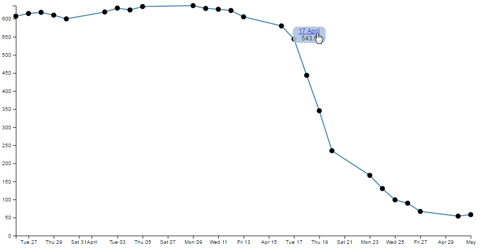
In the image above the date has been turned into a link. In this case the link goes to google.com, but that can obviously be configurable.
The full code for this example can be found on github or in the code samples bundled with this book (simple-tooltips-link.html and data.csv). A working example can be found on bl.ocks.org.
There are a few changes that we would want to make to our original tooltip code to implement this feature.
First of all, we’ll add the link to the date element. Adding an HTML link can be as simple as wrapping the ‘thing’ to be used as a link in <a> tags with an appropriate URL to go to.
The following adaptation of the code that prints the information into our tooltip code does just that;
div .html(
'<a href= "http://google.com">' + // The first <a> tag
formatTime(d.date) +
"</a>" + // closing </a> tag
"<br/>" + d.close)
.style("left", (d3.event.pageX) + "px")
.style("top", (d3.event.pageY - 28) + "px");
<a href= "http://google.com"> places our first <a> tag and declares the URL and the second tag follows after the date.
The second change we will want to make is to ensure that the tooltip stays in place long enough for us to actually click on the link. The problem being solved here is that our original code relies on the mouse being over the dot on the graph to display the tooltip. if the tooltip is displayed and the cursor moves to press the link, it will move off the dot on the graph and the tooltip vanishes (Darn!).
To solve the problem we can leave the tooltip in place adjacent to a dot while the mouse roams freely over the graph until the next time it reaches a dot and then the previous tooltip vanishes and a new one appears. The best way to appreciate this difference is to check out the live example on bl.ocks.org.
The code is as follows (you may notice that this also includes the link as described above);
// add the dots with tooltips
svg.selectAll("dot")
.data(data)
.enter().append("circle")
.attr("r", 5)
.attr("cx", function(d) { return x(d.date); })
.attr("cy", function(d) { return y(d.close); })
.on("mouseover", function(d) {
div.transition()
.duration(200)
.style("opacity", .9);
div .html(
'<a href= "http://google.com">' + // The first <a> tag
formatTime(d.date) +
"</a>" + // closing </a> tag
"<br/>" + d.close)
.style("left", (d3.event.pageX) + "px")
.style("top", (d3.event.pageY - 28) + "px");
});
We have removed the .on("mouseout" portion and moved the function that it used to carry out to the start of the .on("mouseover" portion. That way the first thing that occurs when the mouse cursor moves over a dot is that it removes the previous tooltip and then it places the new one.
The last change we need to make is to remove from the <style> section the line that told the mouse to ignore the tooltip;
Moar Links!
One link is interesting, but let’s face it, we didn’t go to all the trouble of putting a link into a tool tip to just go to one location. Now we shift it up a gear and start linking to different places depending on our data. At the same time (and because someone asked) we will make the link open in a new tab!
The changes to the script are fairly minor, but one fairly large change is the need to have links to go to. For this example I have added a range of links to visit to our csv file so it now looks like this;
The code change is to the piece of JavaScript where we add the HTML. This is what we end up with;
div .html(
'<a href= "'+d.link+'" target="_blank">' + //with a link
formatTime(d.date) +
"</a>" +
"<br/>" + d.close)
.style("left", (d3.event.pageX) + "px")
.style("top", (d3.event.pageY - 28) + "px");
We’ve replaced the URL http://google.com with the variable for our link column d.link and we’ve also added in the target="_blank" statement so that our link opens in a new tab.
The full code for this multi link example can be found on github or in the code samples bundled with this book (tooltips-link-multi.html and data-link.csv). A working example can be found on bl.ocks.org.
Hopefully that helps people with a similar desire to include links in their tooltips. Many thanks to the reader who suggested it :-).
What are the predefined, named colours?
Throughout this document I generally use colours defined by name. This is mainly because I can, and not for any other reason. In fact there several different ways to define colours used in D3 / JavaScript / CSS and HTML. I have no idea what the limitations for use are and / or how their use in different browsers impacts on correct representation. But I do know that they’re used widely.
There seem to be several different standards for what constitutes an authoritative list of named colours. After a cursory search I was able to find a great list on about.com and there are some nice representations on Wikipedia.
The overriding point of all this is that there’s more than one way to define colours in your graphs.
It means that considering…
.style("fill", "steelblue")
and…
.style("fill", "#4682b4")
and…
.style("fill", "rgb(70,130,180)")
All three alternatives result in the same colour being applied.
For a long time I didn’t actually have the images of the colours represented here in D3 Tips and Tricks, but like all things, one day I thought ‘Hey, I could just write a simple script that placed them on the screen’. So here they are :-).
I have tried to group them as ‘like’ colours per the entry in Wikipedia.


You can also see a live page with the script that produces the rectangles at bl.ocks.org.
Selecting / filtering a subset of objects
Imagine a scenario where you want to select (or should we say filter) a particular range of objects from a larger set.
For example, what if we wanted to use our scatter plot example to show the line as normal, but we are particularly interested in the points where the values of the points fall below 400. Therefore, when the value falls below 400 we want them highlighted with a circle as we have done with *the scatter plot points previously.
So that we end up with something that looks a little like this…
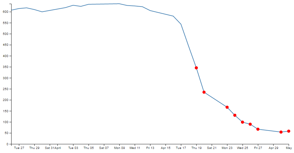
Err… Yes, for those among you who are of the observant persuasion, I have deliberately coloured them red as well (red for DANGER!).
This is a fairly simple example, but serves to illustrate the principle adequately. From our simple scatter plot example we only need to add in two lines to the block of code that draws the circles as follows;
// Add the scatterplot
svg.selectAll("dot")
.data(data)
.enter().append("circle")
.filter(function(d) { return d.close < 400 }) // <== This line
.style("fill", "red") // <== and this one
.attr("r", 5)
.attr("cx", function(d) { return x(d.date); })
.attr("cy", function(d) { return y(d.close); });
The full code for this example can be found on github or in the code samples bundled with this book (filter-selection.html and data.csv). A working example can be found on bl.ocks.org.
The first added line uses the .filter function to act on the data points and according to the arguments passed to it in this case, only return those where the value of d.close is less than 400 (return d.close < 400).
The second added line simply colours the circles red (.style("fill", "red")).
That’s all there is to it. Pretty simple, but the filter function can be very powerful when used wisely.
Select items with an IF statement.
The filtering – selection section above is a good way to adapt what you see on a graph, but so is a more familiar friend… The ‘if’ statement.
An ‘if’ statement will act to carry out a task in a particular way dependant on a condition that you specify.
Starting with the simple scatter plot example all we have to do is include the if statement in the block of code that draws the circles. Here’s the entire block with the additions highlighted;
// Add the scatterplot
svg.selectAll("dot")
.data(data)
.enter().append("circle")
.attr("r", 5)
.style("fill", function(d) { // <== Add these
if (d.close <= 400) {return "red"} // <== Add these
else { return "black" } // <== Add these
;}) // <== Add these
.attr("cx", function(d) { return x(d.date); })
.attr("cy", function(d) { return y(d.close); });
Our first added line introduces the style modifier and the rest of the code acts to provide a return for the ‘fill’ attribute.
The second line introduces our if statement. There’s very little difference using if statements between languages. Just look out for maintaining the correct syntax and you should be fine. In this case we’re asking if the value of ‘d.close’ is less than or equal to 400 and if it is it will return the "red" statement for our fill.
The third line covers our rear and make sure that if the colour isn’t going to be red, it’s going to be black. The last line just closes the style and function statements.
The result?
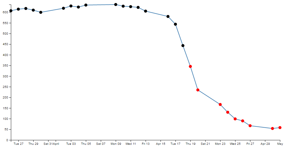
Aww….. nice.
The full code for this example can be found on github or in the code samples bundled with this book (if-selection.html and data.csv). A working example can be found on bl.ocks.org.
Could it be any cooler? I’m glad you asked.
What if we wanted to have all the points where close was less than 400 red and all those where close was greater than 620 green? Oh yeah! Now we’re talking.
So with one small change to the if statement;
.style("fill", function(d) {
if (d.close <= 400) {return "red"}
else if (d.close >= 620) {return "lawngreen"} // <== Right here
else { return "black" }
;})
Check it out…
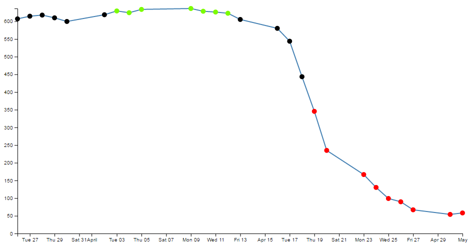
Nice.
Applying a colour gradient to a line based on value.
I know that we were impressed with the changing dots in a scatter plot based on the value. But could we go one better?
How about we try to reproduce the same effect but by varying the colour of the plotted line. This is a neat feature and a useful example of the flexibility of d3.js and SVG in general. I used the appropriate bits of code from Mike Bostock’s Threshold Encoding example. And I should take the opportunity to heartily recommend browsing through his collection of examples on bl.ocks.org.
The full code for this example can be found on github or in the code samples bundled with this book (line-graph-gradient.html and data.csv). A working example can be found on bl.ocks.org.
Here then is a plotted line that is red below 400, green above 620 and black in between.
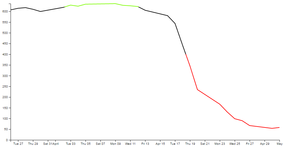
How cool is that?
Enough beating around the bush, how is the magic line produced?
Starting with our simple line graph, there are only two blocks of code to go in. One is CSS in the <style> area and the second is a tricky little piece of code that deals with gradients.
First the CSS.
.line {
fill: none;
stroke: url(#line-gradient);
stroke-width: 2px;
}
This block will go in the <style> area.
There’s the fairly standard fill of none and a stroke width of 2 pixels, but the stroke: url(#line-gradient); is something different.
In this case the stroke (the colour of the line) is being determined at a link within the page which is set by the anchor #line-gradient. We will see shortly that this is in our second block of code, so the colour is being defined in a separate portion of the script.
And now the JavaScript gradient code;
// set the gradient
svg.append("linearGradient")
.attr("id", "line-gradient")
.attr("gradientUnits", "userSpaceOnUse")
.attr("x1", 0).attr("y1", y(0))
.attr("x2", 0).attr("y2", y(1000))
.selectAll("stop")
.data([
{offset: "0%", color: "red"},
{offset: "40%", color: "red"},
{offset: "40%", color: "black"},
{offset: "62%", color: "black"},
{offset: "62%", color: "lawngreen"},
{offset: "100%", color: "lawngreen"}
])
.enter().append("stop")
.attr("offset", function(d) { return d.offset; })
.attr("stop-color", function(d) { return d.color; });
There’s our anchor on the third line!
But let’s not get ahead of ourselves. This block should be placed after the x and y domains are set, but before the line is drawn.
Our second line adds our linear gradient. Gradients consist of continuously smooth colour transitions along a vector from one colour to another. We can have a linear or radial gradient and depending on which you select, there are a few options to define. There is some great information on gradients at http://www.w3.org/TR/SVG/pservers.html (more than I ever thought existed).
The third line (.attr("id", "line-gradient")) sets our anchor for the CSS that we saw earlier.
The fourth, fifth and sixth lines define the bounds of the area over which the gradient will act. Since the coordinates x1, y1, x2, y2 will describe an area. The values for y1 (0) and y2 (1000) are used more for convenience to align with our data (which has a maximum value around 630 or so). For more information on the ‘gradientUnits’ attribute I found this page useful https://developer.mozilla.org/en-US/docs/SVG/Attribute/gradientUnits. We’ll come back to the coordinates in a moment.
The next block selects all the ‘stop’ elements for the gradients. These stop elements define where on the range covered by our coordinates the colours start and stop. These have to be defined as either percentages or numbers (where the numbers are really just percentages in disguise (i.e. 45% =0.45)).
The best way to consider the stop elements is in conjunction with the gradientUnits. The image following may help.
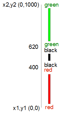
In this case our coordinates describe a vertical line from 0 to 1000. Our colours transition from red (0) to red (400) at which point they change to black (400) and this will continue until it gets to black (620). Then this changes to green (620) and from there, any value above that will be green.
After defining the stop elements, we enter and append the elements to the gradient (.enter().append("stop")) with attributes for offset and colour that we defined in the stop elements area.
Now, that IS cool, but by now, I hope that you have picked that a gradient function really does mean a gradient, and not just a straight change from one colour to another.
So, let’s try changing the stop element offsets to the following (and making the stroke-width slightly larger to see more clearly what’s going on);
.data([
{offset: "0%", color: "red"},
{offset: "30%", color: "red"},
{offset: "45%", color: "black"},
{offset: "55%", color: "black"},
{offset: "60%", color: "lawngreen"},
{offset: "100%", color: "lawngreen"}
])
And here we go…
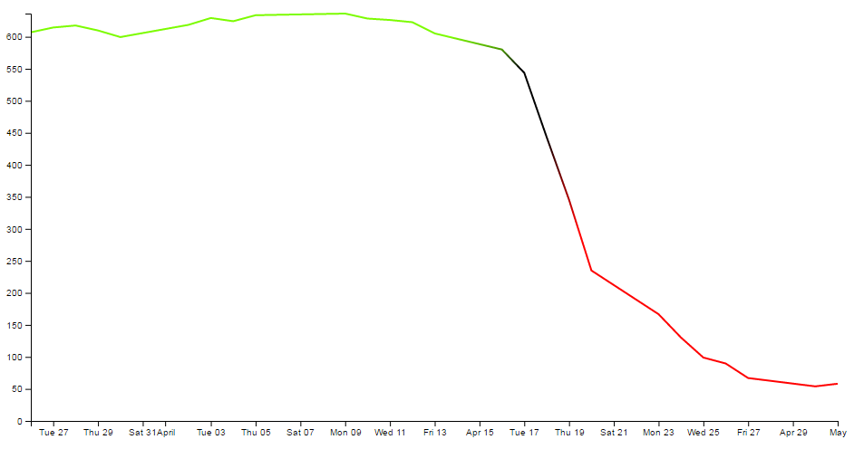
Ahh… A real gradient.
I have tended to find that I need to have a good think about how I set the offsets and bounds when doing this sort of thing since it can get quite complicated quite quickly :-)
Applying a colour gradient to an area fill.
The previous example of a varying gradient on a line is neat, but hopefully you’re already thinking “Hang on, can’t that same thing be applied to an area fill?”.
Damn! You’re catching on.
To do this there’s only a few things we need to change;
First of all the CSS for the line needs to be amended to refer to the area. So this…
.line {
fill: none;
stroke: url(#line-gradient);
stroke-width: 2px;
}
…gets changed to this…
.area {
fill: url(#area-gradient);
stroke-width: 0px;
}
We’ve defined the styles for the area this time, but instead of the stroke being defined by the separate script, now it’s the area. While we’ve changed the url name, it’s actually the same piece of code, with a different id (because it seemed wrong to be talking about an area when the label said line). We’ve also set the stroke width to zero, because we don’t want any lines around our filled area.
Now we want to take the block of code that defined our line…
// define the line
var valueline = d3.line()
.x(function(d) { return x(d.date); })
.y(function(d) { return y(d.close); });
… and we need to replace it with the standard block that defined an area fill.
// define the area
var area = d3.area()
.x(function(d) { return x(d.date); })
.y0(height)
.y1(function(d) { return y(d.close); });
So we’re not going to be drawing a line at all. Just the area fill.
Next, as I mentioned earlier, we change the id for the linearGradient block from "line-gradient" to "area-gradient"
.attr("id", "area-gradient")
And lastly, we remove the block of code that drew the line and replace it with a block that draws an area. So change this….
// Add the valueline path.
svg.append("path")
.data([data])
.attr("class", "line")
.attr("d", valueline);
… to this;
// Add the area.
svg.append("path")
.data([data])
.attr("class", "area")
.attr("d", area);
And then sit back and marvel at your creation;
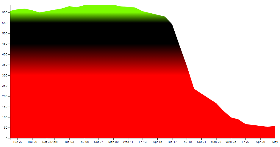
The full code for this example can be found on github or in the code samples bundled with this book (area-graph-gradient.html and data.csv). A working example can be found on bl.ocks.org.
For a slightly ‘nicer’ looking example, you could check out a variation of one of Mike Bostock’s (v3) originals here; http://bl.ocks.org/4433087.
Transitions
A transition in d3 is an application of an animation to an element on the page. For the purpose of demonstration we can think of an element being one of the common shapes and objects which include circles, ellipses, rectangles, lines, polylines, polygons, text and paths. This is a gross oversimplification as transitions can be applied in far more complex ways, but this will help us get started. An animation could be described as a change in an attribute or style of an element over time.
If we use a circle as an example we know that a circle is described by three required attributes;
-
cx: The position of the centre of the circle in the x direction (left / right) measured from the left side of the screen. -
cy: The position of the centre of the circle in the y direction (up / down) measured from the top of the screen. -
r: The radius of the circle from thecx,cyposition to the perimeter of the circle.
To animate a circle we would therefore be changing (or transitioning) one of those attributes over time.
The following JavaScript will draw a simple blue circle with radius 20 pixels at the position 40,250
var svg = d3.select("body") // Select the body element
.append("svg") // Append an SVG element to the body
.attr("width", 960) // make it 960 pixels wide
.attr("height", 500) // make it 500 pixels high
.append("circle") // append a cicle to the svg
.attr("style", "blue") // fill the circle with 'blue'
.attr("r", 20) // set the radius to 10 pixels
.attr('cx', 40) // position the circle at 40 on the x axis
.attr('cy', 250); // position the circle at 250 on the y axis
To transition that circle from left to right we would change the cx attribute by simply including the transition instruction the new value of the attribute to be changed and the time that it should be completed in;
.transition() // apply a transition
.duration(4000) // apply it over 4000 milliseconds
.attr('cx', 920); // new horizontal position at 920 on x axis
The total amount of code required is;
<!DOCTYPE html>
<meta charset="utf-8">
<body>
<!-- load the d3.js library -->
<script src="https://d3js.org/d3.v4.min.js"></script>
<script>
var svg = d3.select("body") // Select the body element
.append("svg") // Append an SVG element to the body
.attr("width", 960) // make it 960 pixels wide
.attr("height", 500) // make it 500 pixels high
.append("circle") // append a circle to the svg
.attr("style", "blue") // fill the circle with 'blue'
.attr("r", 20) // set the radius to 10 pixels
.attr('cx', 40) // position the circle at 40 on the x axis
.attr('cy', 250) // position the circle at 250 on the y axis
.transition() // apply a transition
.duration(4000) // apply it over 4000 milliseconds
.attr('cx', 920); // new horizontal position at 920 on x axis
</script>
</body>
And seen on the web page our circle moves from left to right.

A transition can be of more than one attribute at the same time. If we add lines to change the radius and fill colour as well we will have some JavaScript that looks a bit like this;
var svg = d3.select("body") // Select the body element
.append("svg") // Append an SVG element to the body
.attr("width", 960) // make it 960 pixels wide
.attr("height", 500) // make it 500 pixels high
.append("circle") // append a circle to the svg
.style("fill", "blue") // fill the circle with 'blue'
.attr("r", 20) // set the radius to 10 pixels
.attr('cx', 40) // position the circle at 40 on the x axis
.attr('cy', 250) // position the circle at 250 on the y axis
.transition() // apply a transition
.duration(4000) // apply it over 4000 milliseconds
.attr('cx', 920) // new horizontal position at 920 on x axis
.attr('r', 40) // new radius of 40 pixels
.style('fill', "red"); // new colour red
And when we load the page we see our circle move from left to right wile at the same time increasing in radius and changing colour from blue to red.

Transitioning Chaining
Instead of having multiple attributes / styles changing at once we can stagger them using transition chaining. This is where we can employ several different transitions to an element one after the other.
For example, the following JavaScript will move our circle from left to right then it will increase the radius from 20 to 40 and then it will change it’s colour from blue to red.
var svg = d3.select("body") // Select the body element
.append("svg") // Append an SVG element to the body
.attr("width", 960) // make it 960 pixels wide
.attr("height", 500) // make it 500 pixels high
.append("circle") // append a circle to the svg
.style("fill", "blue") // fill the circle with 'blue'
.attr("r", 20) // set the radius to 10 pixels
.attr('cx', 40) // position the circle at 40 on the x axis
.attr('cy', 250) // position the circle at 250 on the y axis
// 1st transition
.transition() // apply a transition
.duration(4000) // apply it over 4000 milliseconds
.attr('cx', 920) // new horizontal position at 920 on x axis
// 2nd transition
.transition() // apply a transition
.duration(4000) // apply it over 4000 milliseconds
.attr('r', 40) // new radius of 40 pixels
// 3rd transition
.transition() // apply a transition
.duration(4000) // apply it over 4000 milliseconds
.style('fill', "red"); // new colour red

Transition Easing
The reader who runs the code or checks out the simple example here will notice that our circle does not move from one side to the other at a constant speed. It starts off slowly, builds up speed towards the middle of its travels and then slows down before stopping. This gives the movement a pleasing appearance, but it is an example of the ‘easing’ of the transition from one point to another.
To apply a linear motion to the movement we can introduce .ease(d3.easeLinear) to the code as follows;
var svg = d3.select("body") // Select the body element
.append("svg") // Append an SVG element to the body
.attr("width", 960) // make it 960 pixels wide
.attr("height", 500) // make it 500 pixels high
.append("circle") // append a circle to the svg
.style("fill", "blue") // fill the circle with 'blue'
.attr("r", 20) // set the radius to 10 pixels
.attr('cx', 40) // position the circle at 40 on the x axis
.attr('cy', 250) // position the circle at 250 on the y axis
.transition() // apply a transition
.ease(d3.easeLinear) // control the speed of the transition
.duration(4000) // apply it over 4000 milliseconds
.attr('cx', 920); // new horizontal position at 920 on x axis
The easing of an element describes a distortion in the apparent flow of time. There are a range of different types of easing described in the d3 wiki. Most are representative of a function although there are some which are intended to represent specific real-world motions.
- linear
- quad
- cubic
- poly
- sin
- exp
- circle
- bounce
- back
- elastic
Each easing (except linear) can be further modified using ‘In’, ‘Out’ or InOut’ which allows for variations in the animation that can give the appearance of starting or stopping at different points in the curves or in the case of ‘InOut’ of going through a complete transition. For example, .ease(d3.easeExpIn) or .ease(d3.easePolyInOut).
If an easing function is not specified, the default used is cubic and if ‘In’, ‘Out’ or InOut’ aren’t specified, the default is ‘InOut’ except for bounce and elastic which use ‘Out’. Therefore we can use .ease(d3.easePoly) which is an alias for .ease(d3.easePolyInOut). ‘easePoly’ is also an alias for ‘easeCubic’ (and vice versa).
To get a good impression of the way that each easing method is represented, Mike Bostock has an ‘Easing Explorer’ block set up here. There is also a block to do a side by side comparison here (this is also in the code samples bundled with this book (transition-easing-multiple.html)).
Looping a Transition
We can use a transition to create a convincing impression of an element that is in a constant rate of change in a looping condition. We achieve this by creating a transition chain that starts and ends in the same state and then we instruct the transition code to repeat itself.
In the example we will have a circle that moves from left to right and then back again constantly.

<!DOCTYPE html>
<meta charset="utf-8">
<body>
<!-- load the d3.js library -->
<script src="https://d3js.org/d3.v4.min.js"></script>
<script>
var svg = d3.select("body")
.append("svg")
.attr("width", 960)
.attr("height", 500);
function circleTransition() {
var timeCircle = svg.append("circle")
.attr("fill", "steelblue")
.attr("r", 20);
repeat();
function repeat() {
timeCircle
.attr('cx', 40) // position the circle at 40 on the x axis
.attr('cy', 250) // position the circle at 250 on the y axis
.transition() // apply a transition
.duration(2000) // apply it over 2000 milliseconds
.attr('cx', 920) // move the circle to 920 on the x axis
.transition() // apply a transition
.duration(2000) // apply it over 2000 milliseconds
.attr('cx', 40) // return the circle to 40 on the x axis
.on("end", repeat); // when the transition finishes start again
};
};
circleTransition();
</script>
</body>
The JavaScript starts by creating an SVG element;
var svg = d3.select("body")
.append("svg")
.attr("width", 960)
.attr("height", 500);
We then declare the function circleTransition which starts by creating the component that defines the circle and gives it a colour and radius;
var timeCircle = svg.append("circle")
.attr("fill", "steelblue")
.attr("r", 20);
We then call a sub function repeat that performs the transition chaining loop. Then the looping transition is declared;
function repeat() {
timeCircle
.attr('cx', 40) // position the circle at 40 on the x axis
.attr('cy', 250) // position the circle at 250 on the y axis
.transition() // apply a transition
.duration(2000) // apply it over 2000 milliseconds
.attr('cx', 920) // move the circle to 920 on the x axis
.transition() // apply a transition
.duration(2000) // apply it over 2000 milliseconds
.attr('cx', 40) // return the circle to 40 on the x axis
.on("end", repeat); // when the transition finishes start again
};
Here we can see the familiar parts of a transition where the attributes and transition details are declared in a chain so that when it completes, the circle has moved from the left to the right and then back to the starting position. At that point the code listens for the end of the transformations, and when this occurs it calls the transition function repeat again. This will continue to cycle indefinitely.
The last part of the code is the instruction to call our initial function;
circleTransition();
Because the code is executing asynchronously, it can continue to oscillate while other code could be carrying out other tasks.
Show / hide an element by clicking on another element
This is a trick that I found I wanted to implement in order to present a graph with a range of lines and to then provide the reader with the facility to click on the associated legend to toggle the visibility of the lines off and on as required.
The example we’ll follow is our friend from earlier, a slightly modified example of the graph with two lines.
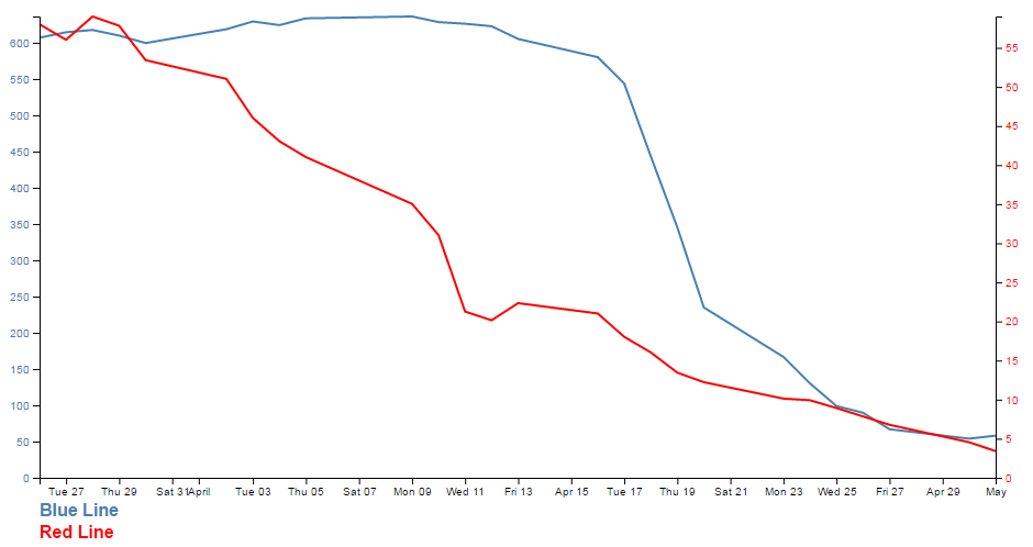
In this example we will be able to click on either of the two titles at the bottom of the graph (‘Blue Line’ or ‘Red Line’) and have it toggle the respective line and Y axis.
The code
The code for the example is available online at bl.ocks.org or GitHub. It is also available as the file ‘show-hide.html’ that can be a download when you download the book from Leanpub.
There are more changes in the example code than we will explain below such as the addition of CSS to the <style> area and the code that allows both of the lines to be shown / hidden (we’ll only go through the blue line code).
There are two main parts to implementing this technique. Firstly we have to label the element (or elements) that we wish to show / hide and then we have to give the object that will get clicked on the attribute that allows it to recognise a mouse click and the code that it subsequently uses to show / hide our labelled element.
Labelling the element that is to be switched on and off is dreadfully easy. It simply involves including an id attribute to an element that identifies it uniquely.
// add the valueline path.
svg.append("path")
.data([data])
.attr("class", "line")
.attr("id", "blueLine")
.attr("d", valueline);
In the example above we have applied the id blueLine to the path that draws the blue line on our graph.
The second part is a little trickier. The following is the portion of JavaScript that places our text label under the graph. The only part of it that is unusual is the .on("click", function() section of the code.
// add the blue line legend
svg.append("text")
.attr("x", 0)
.attr("y", height + margin.top + 15)
.attr("class", "legend")
.style("fill", "steelblue")
.on("click", function(){
// determine if current line is visible
var active = blueLine.active ? false : true,
newOpacity = active ? 0 : 1;
// hide or show the elements
d3.select("#blueLine").style("opacity", newOpacity);
// update whether or not the elements are active
blueLine.active = active;
})
.text("Blue Line");
When we click on our ‘Blue Line’ text element the .on("click", function() section executes.
We’re using a short-hand version of the if statement a couple of times here. Firstly we check to see if the variable blueLine.active is true or false and if it’s true it gets set to false and if it’s false it gets set to true (not at all confusing).
var active = blueLine.active ? false : true,
newOpacity = active ? 0 : 1;
Then after toggling this variable we set the value of newOpacity to either 0 or 1 depending on whether active is false or true (the second short-hand JavaScript if statement).
We can then select our identifiers that we have declared using the id attributes in the earlier pieces of code and modify their opacity to either 0 (off) or 1 (on)
d3.select("#blueLine").style("opacity", newOpacity);
Lastly we update our blueLine.active variable to whatever the active state is so that it can toggle correctly the next time it is clicked on.
blueLine.active = active;
Quite a neat piece of code. Kudos to Max Leiserson for providing the example on which it is largely based in an answer to a question on Stack Overflow.
Using HTML inputs with d3.js
Part of the attraction of using technologies like d3.js is that it expands the scope of what is possible in a web page. At the same time, there are many different options for displaying content on a page and plenty of ways of interacting with it.
Some of the most basic of capabilities has been the use of HTML entities that allow the entry of data on a page. This can take a range of different forms (pun intended) and the <input> tag is one of the most basic.
What is an HTML input?
An HTML input is an element in HTML that allows a web page to input data. There are a range of different input types (with varying degrees of compatibility with browsers) and they are typically utilised inside a <form> element.
For example the following code allows a web page to place two fields on a web page so that a user can enter their first and last names in separate boxes;
<form>
First name: <input type="text" name="firstname"><br>
Last name: <input type="text" name="lastname">
</form>
The page would then display the following;

The range of input types is large and includes;
- text: A simple text field that a user can enter information into.
- radio: Buttons that let a user select only one of a limited number of choices.
- button: A clickable button that can activate JavaScript.
- range: A slider control for setting a number whose exact value is not important.
- number: A field for entering a number or toggling a number up and down.
… and many more. To check out others and get further background, it would be worthwhile visiting the Mozilla developer pages or w3schools.com.
While d3.js has the power to control and manipulate a web page to an extreme extent, sometimes it’s desirable to use a simple process to get a result. The following explanations will demonstrate a simple use case linking an HTML input with a d3.js element and will go on to provide examples of using multiple inputs, affecting multiple elements and using different input types. The examples are deliberately kept simple. They are intended to demonstrate functionality and to provide a starting position for you to go forward :-).
Using a range input with d3.js
The first example we will follow will use a range input to adjust the radius of a circle.
The code
The following is the full code for the example. A live version is available online at bl.ocks.org or GitHub. It is also available as the file ‘input-radius.html’ as a separate download with the book D3 Tips and Tricks v4.x. A copy of the files that appear in the book can be downloaded (in a zip file) when you download the book from Leanpub.
<!DOCTYPE html>
<meta charset="utf-8">
<title>Input test (circle)</title>
<p>
<label for="nRadius"
style="display: inline-block; width: 240px; text-align: right">
radius = <span id="nRadius-value">…</span>
</label>
<input type="range" min="1" max="150" id="nRadius">
</p>
<script src="https://d3js.org/d3.v4.min.js"></script>
<script>
var width = 600;
var height = 300;
var holder = d3.select("body")
.append("svg")
.attr("width", width)
.attr("height", height);
// draw the circle
holder.append("circle")
.attr("cx", 300)
.attr("cy", 150)
.style("fill", "none")
.style("stroke", "blue")
.attr("r", 120);
// when the input range changes update the circle
d3.select("#nRadius").on("input", function() {
update(+this.value);
});
// Initial starting radius of the circle
update(120);
// update the elements
function update(nRadius) {
// adjust the text on the range slider
d3.select("#nRadius-value").text(nRadius);
d3.select("#nRadius").property("value", nRadius);
// update the circle radius
holder.selectAll("circle")
.attr("r", nRadius);
}
</script>
The explanation
As with the other examples in the book I will not go over some of the simpler lines of code that are covered in greater detail in earlier sections of the book and will concentrate on those sections that contain new concepts, code or look like they might need expanding :-).
The first section is the portion that sets out the html range input;
<p>
<label for="nRadius"
style="display: inline-block; width: 240px; text-align: right">
radius = <span id="nRadius-value">…</span>
</label>
<input type="range" min="1" max="150" id="nRadius">
</p>
The entire block is enclosed in a paragraph (<p>) tag so that is appears on a single line. It can be broken down into the label that occurs before the input slider which is given the id nRadius-value and the input proper.
The for attribute of the label tag equals to the id attribute of the input element to bind them together. This allows us to update the text later as the slider is moved.
The input tag can include four attributes that specify restrictions on the operation of the slider;
-
max: specifies the maximum value allowed -
min: specifies the minimum value allowed -
step: specifies the number intervals as you move the slider -
value: Specifies the default value
The ids supplied for both the label and the input are important since they provide the reference for our d3.js script.
The first portion of our JavaScript is fairly routine if you’ve been following along with the rest of the book.
var width = 600;
var height = 300;
var holder = d3.select("body")
.append("svg")
.attr("width", width)
.attr("height", height);
// draw the circle
holder.append("circle")
.attr("cx", 300)
.attr("cy", 150)
.style("fill", "none")
.style("stroke", "blue")
.attr("r", 120);
We append an SVG element to the body of our page and then we append a circle with some particular styling to the SVG element.
Then things start to get more interesting…
d3.select("#nRadius").on("input", function() {
update(+this.value);
});
We select our input using the id that we had declared earlier in the html (nRadius). Then we use the .on operator which adds what is called an ‘event listener’ to the element so that when there is a change in the element (in this case an adjustment of the slider of the input) a function is called (function()) that in turn calls the update function with the value from the input (+this.value). We haven’t seen the update function yet, but never fear, it’s coming.
We also call the update function with a specific value in the next line;
update(120);
This might seem slightly redundant, but unless the function gets a value, the text associated with the range input doesn’t get a reading and remains on ‘…’ until the slider is moved.
Lastly we have our update function;
function update(nRadius) {
// adjust the text on the range slider
d3.select("#nRadius-value").text(nRadius);
d3.select("#nRadius").property("value", nRadius);
// update the circle radius
holder.selectAll("circle")
.attr("r", nRadius);
}
The first part of the function selects the label associated with our input (with the id, nRadius-value) and applies the value that has been passed into the function (nRadius). The next line selects the input itself and applies the value to it (this would be the equivalent of having value="<number here>" as a property in the html).
Lastly, we select the circle element and apply the new radius value based on our input value nRadius (.attr("r", nRadius)).
And there we have it, a fully adjustable radius for our circle controlled with an HTML input.
Using more than one input
In this example we will use two separate inputs (range type) to adjust the height and width of a rectangle.
This is not too much of a stretch from the previous single input example with the radius of a circle, but it may be useful to reinforce the concept and illustrate something slightly different.
The code
The following is the full code for the example. A live version is available online at bl.ocks.org or GitHub. It is also available as the file ‘input-double.html’ as a separate download with D3 Tips and Tricks v4.x. A copy of the files that appear in the book can be downloaded (in a zip file) when you download the book from Leanpub.
<!DOCTYPE html>
<meta charset="utf-8">
<title>Double Input Test</title>
<p>
<label for="nHeight"
style="display: inline-block; width: 240px; text-align: right">
height = <span id="nHeight-value">…</span>
</label>
<input type="range" min="1" max="280" id="nHeight">
</p>
<p>
<label for="nWidth"
style="display: inline-block; width: 240px; text-align: right">
width = <span id="nWidth-value">…</span>
</label>
<input type="range" min="1" max="400" id="nWidth">
</p>
<script src="https://d3js.org/d3.v4.min.js"></script>
<script>
var width = 600;
var height = 300;
var holder = d3.select("body")
.append("svg")
.attr("width", width)
.attr("height", height);
// draw a rectangle
holder.append("rect")
.attr("x", 300)
.attr("y", 150)
.style("fill", "none")
.style("stroke", "blue")
.attr("height", 150)
.attr("width", 200);
// read a change in the height input
d3.select("#nHeight").on("input", function() {
updateHeight(+this.value);
});
// read a change in the width input
d3.select("#nWidth").on("input", function() {
updateWidth(+this.value);
});
// update the values
updateHeight(150);
updateWidth(100);
// Update the height attributes
function updateHeight(nHeight) {
// adjust the text on the range slider
d3.select("#nHeight-value").text(nHeight);
d3.select("#nHeight").property("value", nHeight);
// update the rectangle height
holder.selectAll("rect")
.attr("y", 150-(nHeight/2))
.attr("height", nHeight);
}
// Update the width attributes
function updateWidth(nWidth) {
// adjust the text on the range slider
d3.select("#nWidth-value").text(nWidth);
d3.select("#nWidth").property("value", nWidth);
// update the rectangle width
holder.selectAll("rect")
.attr("x", 300-(nWidth/2))
.attr("width", nWidth);
}
</script>
The explanation
For the sake of brevity, this explanation will simply concentrate on the differences between the previous single input example and this one.
The declarations for the inputs in the HTML at the start of the code are simply duplicates of each other in terms of function;
<p>
<label for="nHeight"
style="display: inline-block; width: 240px; text-align: right">
height = <span id="nHeight-value">…</span>
</label>
<input type="range" min="1" max="280" id="nHeight">
</p>
<p>
<label for="nWidth"
style="display: inline-block; width: 240px; text-align: right">
width = <span id="nWidth-value">…</span>
</label>
<input type="range" min="1" max="400" id="nWidth">
</p>
The only significant difference is the declaration of the id’s for each input and their respective labels.
The JavaScript selection of the inputs is more duplication;
d3.select("#nHeight").on("input", function() {
updateHeight(+this.value);
});
d3.select("#nWidth").on("input", function() {
updateWidth(+this.value);
});
Again the only substantive difference is the use of the appropriate id values.
The updating of the width and height is done via two different functions;
function updateHeight(nHeight) {
// adjust the text on the range slider
d3.select("#nHeight-value").text(nHeight);
d3.select("#nHeight").property("value", nHeight);
// update the rectangle height
holder.selectAll("rect")
.attr("y", 150-(nHeight/2))
.attr("height", nHeight);
}
// Update the width attributes
function updateWidth(nWidth) {
// adjust the text on the range slider
d3.select("#nWidth-value").text(nWidth);
d3.select("#nWidth").property("value", nWidth);
// update the rectangle width
holder.selectAll("rect")
.attr("x", 300-(nWidth/2))
.attr("width", nWidth);
}
The rectangle is selected using a common rect designator, so multiple rectangles could be controlled. But each function controls only a specific attribute (height or width).
Rotate text with an input
This example is really just a derivative of the adjustment of a single attribute of an element.
I happen to think it’s just a little bit ‘neater’ because it includes text, but in reality, it’s just another attribute that can be adjusted.
Here we let our range input adjust the rotation of a piece of text.
The explanation
We’ll dispense with the full code listing since it’s just a regurgitation of the adjusting of the radius of the circle example, but the code for the example is available online at bl.ocks.org or GitHub. It is also available as the file ‘input-text-rotate.html’ as a separate download with D3 Tips and Tricks v4.x. A copy of the files that appear in the book can be downloaded (in a zip file) when you download the book from Leanpub.
The only, thing of even a slight difference (other than some naming conventions) is the initial drawing of the text…
holder.append("text")
.style("fill", "black")
.style("font-size", "56px")
.attr("dy", ".35em")
.attr("text-anchor", "middle")
.attr("transform", "translate(300,150) rotate(0)")
.text("d3noob.org");
… and the update function;
function update(nAngle) {
// adjust the text on the range slider
d3.select("#nAngle-value").text(nAngle);
d3.select("#nAngle").property("value", nAngle);
// rotate the text
holder.select("text")
.attr("transform", "translate(300,150) rotate("+nAngle+")");
}
Use a number input with d3.js
There are obviously different inputs types that can be implemented. The following example still rotates our text, but uses a number type of input to do it;
<p>
<label for="nValue"
style="display: inline-block; width: 240px; text-align: right">
angle = <span id="nValue-value"></span>
</label>
<input type="number" min="0" max="360" step="5" value="0" id="nValue">
</p>
We have set the step value to speed things up a bit when rotating, but it’s completely optional.
The input itself can be adjusted up or down using a mouse click or have a number typed into the input box.
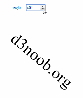
This type of input is slightly different from the range type since it isn’t fully supported under Firefox and as a result when I was testing it the arrow keys for going up and down weren’t present.
The full code for the example is available online at bl.ocks.org or GitHub. It is also available as the file ‘input-number-text.html’ as a separate download with D3 Tips and Tricks v4.x. A copy of the files that appear in the book can be downloaded (in a zip file) when you download the book from Leanpub.
Change more than one element with an input
The final example looking at using HTML inputs with d3.js incorporates a single input acting or two different elements. This might seem self evident, but if you’re as unfamiliar with HTML as I am (it’s embarrassing I know, but what can you do?) it may be of assistance.
The end result is to produce a single slider as a range input that rotates two separate text objects in different directions simultaneously.
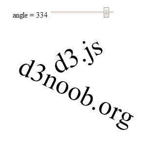
The code
The following is the full code for the example. A live version is available online at bl.ocks.org or GitHub. It is also available as the file ‘input-text-rotate-2.html’ as a separate download with D3 Tips and Tricks v4.x. A copy of the files that appear in the book can be downloaded (in a zip file) when you download the book from Leanpub.
<!DOCTYPE html>
<meta charset="utf-8">
<title>Input test</title>
<p>
<label for="nAngle"
style="display: inline-block; width: 240px; text-align: right">
angle = <span id="nAngle-value">…</span>
</label>
<input type="range" min="0" max="360" id="nAngle">
</p>
<script src="https://d3js.org/d3.v4.min.js"></script>
<script>
var width = 600;
var height = 300;
var holder = d3.select("body")
.append("svg")
.attr("width", width)
.attr("height", height);
// draw d3.js text
holder.append("text")
.attr("class", "d3js")
.style("fill", "black")
.style("font-size", "56px")
.attr("dy", ".35em")
.attr("text-anchor", "middle")
.attr("transform", "translate(300,55) rotate(0)")
.text("d3.js");
// draw d3noob.org text
holder.append("text")
.attr("class", "d3noob")
.style("fill", "black")
.style("font-size", "56px")
.attr("dy", ".35em")
.attr("text-anchor", "middle")
.attr("transform", "translate(300,130) rotate(0)")
.text("d3noob.org");
// when the input range changes update the rectangle
d3.select("#nAngle").on("input", function() {
update(+this.value);
});
// Initial starting height of the rectangle
update(0);
// update the elements
function update(nAngle) {
// adjust the range text
d3.select("#nAngle-value").text(nAngle);
d3.select("#nAngle").property("value", nAngle);
// adjust d3.js text
holder.select("text.d3js")
.attr("transform", "translate(300,55) rotate("+nAngle+")");
// adjust d3noob.org text
holder.select("text.d3noob")
.attr("transform", "translate(300,130) rotate("+(360 - nAngle)+")");
}
</script>
The explanation
The explanation for this example differs from the others in the way that the d3.js elements (the two pieces of text) are initially appended and then updated.
When they are initially drawn…
holder.append("text")
.attr("class", "d3js")
.style("fill", "black")
.style("font-size", "56px")
.attr("dy", ".35em")
.attr("text-anchor", "middle")
.attr("transform", "translate(300,55) rotate(0)")
.text("d3.js");
holder.append("text")
.attr("class", "d3noob")
.style("fill", "black")
.style("font-size", "56px")
.attr("dy", ".35em")
.attr("text-anchor", "middle")
.attr("transform", "translate(300,130) rotate(0)")
.text("d3noob.org");
… both elements are declared with a class attribute that serves as a reference for the future updating. Here, the text ‘d3.js’ is given a class name of d3js and the text ‘d3noob.org’ is given a class name of d3noob.
Then when we call the update function each of the two text elements is adjusted seperatly by selecting each based on the class name that was applied in the initial setup;
function update(nAngle) {
// adjust the range text
d3.select("#nAngle-value").text(nAngle);
d3.select("#nAngle").property("value", nAngle);
// adjust d3.js text
holder.select("text.d3js")
.attr("transform", "translate(300,55) rotate("+nAngle+")");
// adjust d3noob.org text
holder.select("text.d3noob")
.attr("transform", "translate(300,130) rotate("+(360 - nAngle)+")");
}
So the ‘d3.js’ text is selected using text.d3js and ‘d3noob.org’ is selected using text.d3noob. That’s a pretty neat trick and a good lesson for applying specific transformations to specific objects.
Add an HTML table to your graph
So graphs and graphics are D3’s bread and butter you’d think. Hmm…
Well yes and no.
Yes D3 has extraordinary powers for presenting and manipulating images in a web page. But if you’ve read through the entirety of the d3.js main site (haven’t we all) you will recall that D3 actually stands for Data Driven Documents. It’s not necessarily about the pretty pictures and the swirling cascade of colour. It’s about generating something in a web browser based on data.
This transitions nicely into consideration of adding a table of information that can accompany your graph (it could just as easily (or easier) be stand alone, but for the sake of continuity, we’ll use the graph).
What we’ll do is add the data that we’ve used to make our simple graph under the graph itself. To make sure that it’s all nicely aligned, we’ll place it in a table.
It should end up looking a little like this (and this has been cropped slightly at the bottom to avoid expanding the page with rows of numbers / dates).
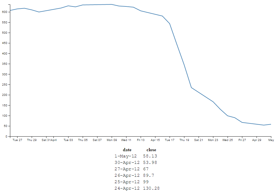
The code was drawn from an example provided by Shawn Allen on Google Groups. In fact, the post itself is an excellent one if you are considering creating a table straight from a csv file.
HTML Tables
Tables are made up of rows, columns and data (that goes in each cell). All you need to do to successfully place a table on a web page is to lay out the rows and columns in a logical sequence using the appropriate HTML tags and you’re away.
For example here’s the total HTML code for a web page to display a simple table;
<!DOCTYPE html>
<body>
<table border="1">
<tr>
<th>Header 1</th>
<th>Header 2</th>
</tr>
<tr>
<td>row 1, cell 1</td>
<td>row 1, cell 2</td>
</tr>
<tr>
<td>row 2, cell 1</td>
<td>row 2, cell 2</td>
</tr>
</table>
</body>
This will result in a table that looks a little like this in a web browser;
| Header 1 | Header 2 |
| row 1, cell 1 | row 1, cell 2 |
| row 2, cell 1 | row 2, cell 2 |
The entire table itself is enclosed in <table> tags. Each row is enclosed in <tr> tags. Each row has two items which equate to the two columns. Each piece of data for each cell is enclosed in a <td> tag except for the first row, which is a header and therefore has a special tag <th> that denotes it as a header making it bold and centred. For the sake of ease of viewing we have told the table to place a border around each cell and we do this in the first <table> tag with the border="1" statement (although in this book view it may be absent).
There are three main things you need to do to the basic line graph to get your table to display.
- Add some CSS
- Add some table building d3.js code
- Make a small but cunning change…
There is a copy of the code and the data file for this example at github and in the code samples bundled with this book (simple-graph-plus-table.html and data.csv). A live example can be found on bl.ocks.org.
First the CSS
This just helps the table with formatting and making sure the individual cells are spaced appropriately;
td, th {
padding: 1px 4px;
}
This sets a padding of 1 px around each cell and 4 px between each column.
I’ve placed this portion of CSS at the end of our <style> section.
Now the d3.js code
Oki doki… Hopefully you have a loose understanding of the html layout of a table as explained above, but if not you can always go with the ‘it just works’ approach.
Here’s what we should add into our simple graph example;
// The table generation function
function tabulate(data, columns) {
var table = d3.select("body").append("table")
.attr("style", "margin-left: 400px"),
thead = table.append("thead"),
tbody = table.append("tbody");
// append the header row
thead.append("tr")
.selectAll("th")
.data(columns)
.enter()
.append("th")
.text(function(column) { return column; });
// create a row for each object in the data
var rows = tbody.selectAll("tr")
.data(data)
.enter()
.append("tr");
// create a cell in each row for each column
var cells = rows.selectAll("td")
.data(function(row) {
return columns.map(function(column) {
return {column: column, value: row[column]};
});
})
.enter()
.append("td")
.attr("style", "font-family: Courier") // sets the font style
.html(function(d) { return d.value; });
return table;
}
// render the table
var peopleTable = tabulate(data, ["date", "close"]);
And we should take care to add it into the code at the end of the portion where we’ve finished drawing the graph, but before the enclosing curly and regular brackets that complete the portion of the graph that has loaded our data.csv file. This is because we want our new piece of code to have access to that data and if we place it after those brackets it won’t know what data to display.
So, right about here;
// Add the Y Axis
svg.append("g")
.attr("class", "y axis")
.call(yAxis);
// <= Add the code right here!
});
Now, we’re going to break with tradition a bit here and examine what our current state of code produces. Then we’re going to explain something different. THEN we’re going to come back and explain the code…
Check it out…
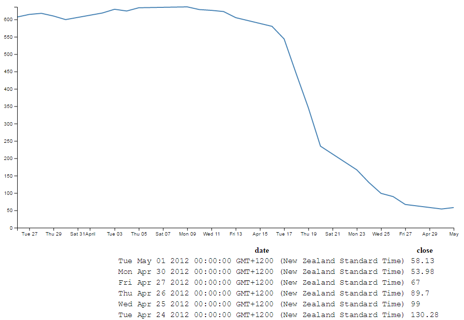
Not quite as we has originally envisaged?
Indeed, the date has taken it upon itself to expand from a relatively modest format of day-abbreviated month-two digit year (30-Apr-12) to a behemoth of a thing (Mon Apr 30 2012 00:00:00 GMT+1200 (New Zealand Standard Time)) that we certainly didn’t intend, let alone have in our data.csv file.
What’s going on here?
I’m no expert, but this is what I tell myself is happening. The JavaScript code recognises and deals with the ‘date’ variable as being a date/time (not a string of numbers, letters and characters). Therefore, when we proceed to display the variable on the screen, the browser says, “this is a date / time value, therefore in lieu of any other instructions, I will format it in the following way”. This is perfectly valid and we could work through a method of re-formatting the code to display in a specific way, but there is a simpler way to solve the problem. Hence the third small but cunning change to our original code.
A small but cunning change…
Our table has decided to develop a mind of it’s own and format the date time as it sees fit. Well fair enough (I for one welcome our web time formatting overlords). How do we convince it to display the values in their natural form?
Well, one solution that we could employ is to not tell the JavaScript that our date value in the data is actually time. In that condition, the code should treat the values as an ordinary string and print it directly as it appears.
The good news is that this is pretty easy to do. Where originally we had a block of data that consisted of date and close, all at different times, we will now add a new variable called date1 which will be the variable that we convert to a time and draw the graph with. Leaving date to be the text string that will be printed in our table.
How to do it?
It’s actually remarkably easy. Just change the following lines in the basic line graph code to amend date to date1 and you’re good to go.
.x(function(d) { return x(d.date1); })
d.date1 = parseTime(d.date);
x.domain(d3.extent(data, function(d) { return d.date1; }));
The middle line is probably the most significant, since this is the point where we declare date1, assign a time format and bring a new column of data into being. The others simply refer to the data.
So we’ll make those small changes and now we can return to explain the d3.js code…
Explaining the d3.js code (reloaded).
So back we come to explain what is going on in the d3.js code that we presented a page or two back. Obviously it’s a fairly large chunk, and we can break it down into two chunks.
The first chunk we’ll look at is in fact the last part of the code that look like this;
// render the table
var peopleTable = tabulate(data, ["date", "close"]);
This portion simply calls the tabulate function using the date and close columns of our data array. Simply add or remove whichever columns you want to appear in your table (so long as they are in your data.csv file) and they will be in your table. The tabulate function makes up all of the other part of the added code.
So we come to the first block of the tabulate function;
// The table generation function
function tabulate(data, columns) {
var table = d3.select("body").append("table")
.attr("style", "margin-left: 400px"),
thead = table.append("thead"),
tbody = table.append("tbody");
Here the tabulate function is declared (function tabulate) and the variables that the function will be using are specified ((data, columns)). In our case data is of course our data array and columns refers to ["date", "close"].
The next line appends the table to the body of the web page (so it will occur just under the graph in this case). Then we do something slightly sneaky. The line .attr("style", "margin-left: 400px"), is actually not the code that was used to produce the table with the huge date/ time formatted info on. I deliberately used .attr("style", "margin-left: 0px"), for the huge date / time table since it’s job is to indent the table by a specified amount from the left hand side of the page. And since the huge date time values would have pushed the table severely to the right, I cheated and used 0 instead of 400. For the purposes of the final example where the date / time values are formatted as expected, 400 is a good value.
The next two lines declare the functions we will use to add in the header cells (since they use the <th> tags for content) and the cells for the main body of the table (they use <td>).
The next block of code adds in the header row;
// append the header row
thead.append("tr")
.selectAll("th")
.data(columns)
.enter()
.append("th")
.text(function(column) { return column; });
Here we first append a row tag (<tr>), then we gather all the columns that we have in our function (remember they were ["date", "close"]) and add them to our row using header tags (<th>).
The next block of code assigns the row variable to return (append) a row tag (<tr>) whenever it’s called …
// create a row for each object in the data
var rows = tbody.selectAll("tr")
.data(data)
.enter()
.append("tr");
… and it is in the following block of code…
// create a cell in each row for each column
var cells = rows.selectAll("td")
.data(function(row) {
return columns.map(function(column) {
return {column: column, value: row[column]};
});
})
.enter()
.append("td")
.attr("style", "font-family: Courier") // sets the font style
.html(function(d) { return d.value; });
… where we select each row that we’ve added (var cells = rows.selectAll("td")). Then the following five lines works out from the intersection of the row and column which piece of data we’re looking at for each cell.
The last four lines take that piece of data (d.value) and wrap it in table data tags (<td>) and place it in the correct cell as HTML.
It’s a very neat piece of code and I struggle to get my head around it, but that doesn’t mean that I can’t appreciate the cleverness of it :-).
Wrap up
So there we have it. Hopefully enough to explain what is going on and perhaps also enough to convince ourselves that D3 is indeed more than just pretty pictures. It’s all about the Data Driven Documents.
As mentioned earlier, there is a copy of the code and the data file for this example at github and in the code samples bundled with this book (simple-graph-plus-table.html and data.csv). A live example can be found on bl.ocks.org.
More table madness: sorting, prettifying and adding columns
When we last left our tables they were happily producing a faithful list of the data points that we had in our graph.
But what if we wanted more?
From the original contributors that bought you tables (Shawn Allen on Google Groups) and some neat additions from Christophe Viau comes extra coolness that I didn’t include in the previous example :-).
There is a copy of the code and the data file for this example at github and in the code samples bundled with this book (simple-graph-plus-table-plus-addins.html and data2.csv). A live example can be found on bl.ocks.org.
Add another column of information:
Firstly, lets add another column of data to our table. To do this we want to have something extra in our csv file to use, so let’s resurrect our old friend data2.csv that we used for the graph with two lines previously. All we have to do to make this a reality is change the reference that loads data.csv to data2.csv here;
d3.csv("data2.csv", function(error, data) {
From here (and as promised in the previous chapter), it’s just a matter of adding in the extra column you want (in this case it’s the open column) like so;
var peopleTable = tabulate(data, ["date", "close", "open"]);

So can we go further?
You know we can…
In the section where we format our data, lets add another column to our array in the form of a difference between the close value and the open value (and we’ll call it diff).
// format the data
data.forEach(function(d) {
d.date1 = parseTime(d.date);
d.close = +d.close;
d.open = +d.open; // <= added this for tidy house keeping
d.diff = Math.round(( d.close - d.open ) * 100 ) / 100;
});
(the Math.round function is to make sure we get a reasonable figure to display, otherwise it tends to get carried away with decimal places)
So now we add in our new column (diff) to be tabulated;
var peopleTable = tabulate(data, ["date", "close", "open", "diff"]);

Sorting on a column
So now with our four columns of awesome data, it turns out that we’re really interested in the ones that have the highest close values. So we can sort on the close column by adding the following lines directly after the line where we declare the peopleTable function (which I will include in the code snipped below for reference).
// render the table
var peopleTable = tabulate(data, ["date", "close", "open", "diff"]);
peopleTable.selectAll("tbody tr")
.sort(function(a, b) {
return d3.descending(a.close, b.close);
});
Which works magnificently;

Prettifying (actually just capitalising the header for each column)
Just a little snippet that capitalises the headers for each row to make them look slightly more authoritative.
Add the following lines of code directly below the block that you just added for sorting the table;
peopleTable.selectAll("thead th")
.text(function(column) {
return column.charAt(0).toUpperCase() + column.substr(1);
});
This is quite a tidy little piece of script. You can see it selecting the headers (selectAll("thead th")), then the first character in each header (column.charAt(0)), changing it to upper-case (.toUpperCase()) and adding it back to the rest of the string (+ column.substr(1)).
With the ultimate result…

Add borders
Sure our table looks nice and neatly arranged, but would a border look better?
Well, here’s one way to do it;
All we need to do is add a border style to our table by adding in this line here;
function tabulate(data, columns) {
var table = d3.select("body").append("table")
.attr("style", "margin-left: 200px") // <= Remove the comma
.style("border", "2px black solid"), // <= Add this line in
thead = table.append("thead"),
tbody = table.append("tbody");
(don’t forget to move the comma from the end of the margin-left line)
And the result is a tidy black border.

OK, so what about the individual cells?
No problem.
If we remember back to our CSS that we added in, we’ll just tell each cell that we want a 1 pixel border buy amending the CSS for our table to this;
td, th {
padding: 1px 4px;
border: 1px black solid;
}
So now each cell has a slightly more subtle border like this;

Yikes! Not quite as subtle as I would have expected. I suppose it’s another example of the code actually doing what you asked it to do. No problem, border-collapse to the rescue. Add the following line into here;
function tabulate(data, columns) {
var table = d3.select("body").append("table")
.attr("style", "margin-left: 200px")
.style("border-collapse", "collapse") // <= Add this line in.
.style("border", "2px black solid"),
thead = table.append("thead"),
tbody = table.append("tbody");
How does that look?

Ahh…. Much more refined.
Adding web links to d3.js objects
The idea with this tip / trick is to be able to add a ‘link’ to an object so that when you click on it, it takes you to a web page that we will pre-define.
We are going to generate a simple rectangle with some text and look at linking from the rectangle and the text separately and with some fanciness at the end :-).
The end result will be something that looks a little like this;
(Notice the little pointing finger at the bottom that would indicate that there actually is a link there.)
The code that we will use as a starting point is this simple example that draws a green rectangle and overlays some text on it;
<!DOCTYPE html>
<meta charset="utf-8">
<body>
<!-- load the d3.js library -->
<script src="https://d3js.org/d3.v4.min.js"></script>
<script>
var width = 449;
var height = 249;
var word = "gongoozler";
var holder = d3.select("body")
.append("svg")
.attr("width", width)
.attr("height", height);
// draw a rectangle
holder.append("rect")
.attr("x", 100)
.attr("y", 50)
.attr("height", 100)
.attr("width", 200)
.style("fill", "lightgreen")
.attr("rx", 10)
.attr("ry", 10);
// draw text on the screen
holder.append("text")
.attr("x", 200)
.attr("y", 100)
.style("fill", "black")
.style("font-size", "20px")
.attr("dy", ".35em")
.attr("text-anchor", "middle")
.text(word);
</script>
</body>
There’s nothing too spectacular about the file. There’s a little bit of styling and tweaking of attributes, but nothing too extreme. The only slightly ‘odd’ part would be defining the word that is printed out as a variable (var word = "gongoozler";) and then adding it as a variable (.text(word);) instead of just putting the word directly in there (which we could do like this .text("gongoozler");). We’re going to do this deliberately to explore additional options for making our links a little more dynamic.
It’s all about the ‘a’ and the ‘xlink’
The <a> tag in an HTML file defines a hyperlink. Items bounded by an <a> tag will become a link to another web address. So what we will do is create an <a> tag and then append our d3.js, svg object to it.
Of course, as well as including a link, we need to tell it where to go. We do this by setting the xlink:href attribute for our tag to point to a specific page. Xlink is short for XML Linking Language and it is used to create hyperlinks in XML documents. In our case we will be defining the link that we will want our user to go to.
Adding in the links
The following is the adjusted code for our rectangle that adds in the <a> tag with the xlink:href attribute.
holder.append("a")
.attr("xlink:href", "http://en.wikipedia.org")
.append("rect")
.attr("x", 100)
.attr("y", 50)
.attr("height", 100)
.attr("width", 200)
.style("fill", "lightgreen")
.attr("rx", 10)
.attr("ry", 10);
It’s important to append the link before the object (otherwise it won’t work) but other than that, it’s a pretty simple job.
The only fly in the ointment is that while we now have a rectangle that links to Wikipedia, if we hover our mouse over the text, we lose our link (since we haven’t told the text to link anywhere).
We can remedy that by doing exactly the same thing with the text element;
holder.append("a")
.attr("xlink:href", "http://en.wikipedia.org/wiki/"+word)
.append("text")
.attr("x", 200)
.attr("y", 100)
.style("fill", "black")
.style("font-size", "20px")
.attr("dy", ".35em")
.attr("text-anchor", "middle")
.text(word);
The only slight difference here is that we have used the address for Wikipedia as our base and added the variable for our word to the end of it so that the resulting web address takes us to Wikipedia and the specific page for the word ‘gongoozler’. Hopefully this will indicate that if we had a set of variables in an array we would make our links a little more dynamic.
Making the mouse pointer ignore an object
So in theory we’re done, but in practice this has been a slightly crude method for adding what should be a single link to two objects when we should be able to accomplish it by defining the link once.
What we could do as an alternative to linking both the rectangle and the text using two separate links is to make the mouse ignore the text and have it rely solely on the rectangle. We can do this using the pointer-events style when drawing our text. By setting it to none we are instructing our mouse to ignore any potential interaction with the text when it hovers over it and instead the pointer will register the link on the rectangle below it.
The code for the text therefore becomes…
holder.append("text")
.attr("x", 200)
.attr("y", 100)
.style("fill", "black")
.style("font-size", "20px")
.attr("dy", ".35em")
.attr("text-anchor", "middle")
.style("pointer-events", "none")
.text(word);
And as you can see from the image below, the pointer will happily ignore the text while reading the link from the rectangle.
The complete code for this example is available in the appendices and a live version can be found on bl.ocks.org and GitHub. The code is also in the downloadable files available from Leanpub with the book in a file called ‘xlink-rect-pointer-events.html’.
Using the Yahoo Query Language (YQL) to get data.
One of the things that I find frustrating is difficulty getting data to play with. Often I will find myself thinking “It would be neat to see if this technique works” but then I spend a couple of hours looking for data that will be appropriate.
Another difficulty is that access to dynamic data is also problematic. D3.js really shines when displaying information that is changing and interactive. Finding data that is changing and which you can interact with is not easy.
Then, when you do come across a web site that has an interesting data set, accessing that data becomes programmatically difficult because of restrictions in accessing information that crosses domains. A solution to this problem (and there are a few) is to have a data set that is in a domain that permits Cross-Origin Resource Sharing (CORS). These are not as common as you might hope as it presents security concerns that need to be addressed.
One resource that I have come across is particularly useful for solving the problems outlined above is the Yahoo! Developer Network which operates a service where you can write a query in an SQL type fashion that will return data as formatted JSON (or others). This query can be formed into an http request so that you can simply paste a generated URL directly into your browsers URL bar and it will return the requested data. Better than that, because it supports CORS (and because d3.js can manage a CORS request without breaking a sweat) all you need to do is put the URL into you code (as a d3.json call for example) and you will be up and running.
YQL by example
I will use an example of looking for current weather information for Wellington New Zealand from the Weather Underground (wunderground).
In this example, we’re interested in retrieving a JSON ‘blob’ that contains data on the weather conditions (temperature, wind speed / direction, humidity etc) for a specific location.
Start at the page for the console (http://developer.yahoo.com/yql/console/). On the left there is a range of data ‘topics that you can choose from. We will want to access one of the community tables, so select ‘Show Community Tables’ and scroll down the list until you find ‘wunderground’ and ‘wunderground.currentobservation’
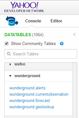
This will bring up a query in the console that is looking for the current weather from San Francisco International airport.

For our example we want to be a bit more specific, so we replace the ‘SFO’ ‘location’ with ‘Wellington, New Zealand’.
If you then click on the ‘Test’ button the query will run and results will be presented in the box below it;
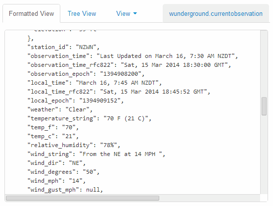
If that looks like the results you were expecting, fantastic!
The next gem from YQL is the REST query that is automatically generated at the bottom of the page;

If you select this query and past it in your URL bar, you will have the JSON data returned into your browser.
At this point it might seem a bit confusing, and if you’re unfamiliar with how JSON based data sets are structured it will DEFINITELY be confusing (You will need to do some research to get up to speed there). My advice is to first understand a bit about JSON and then examine the output from the REST query in the developer console on your browser (this is a fairly long topic in itself, so I will not cover it here sorry). Additionally check out the ‘Examples’ chapter for real world usage.
If you are comfortable with understanding how the data can be encoded, it is then just a matter of including the REST query in your call when selecting data using d3.json and you will be away.
Please check out the examples I will include in the ‘Examples’ chapter for a deeper look at the use of the data with d3.js (This will also help with understanding the JSON structure).
Export an image from a d3.js page as a SVG or bitmap
At some point you will want to take your lovingly crafted D3 graphical masterpiece and put it in a (close your eyes if you’re squeamish) Power Point presentation or Word document or export it for sharing in some other way.
There could be many reasons for wanting to do this and some may be more complicated than I will be willing to explore, but for the occasional conversion of images I have found what I regard as a fairly easy process.
Before we begin our exporting odyssey, let’s cover a little bit of housekeeping and describe the difference between a vector graphic (in this case specifically Scalable Vector Graphics) and a bitmap. Please skip ahead if you’re comfortable with the terms.
Bitmaps
A bitmap (or raster) image is one that is composed of lots of discrete individual dots (let’s call them pixels) which, when joined together (and zoomed out a bit) give the impression of an image. If we use the force layout example we developed, and look at a screen shot (and it’s important to remember that this is a screen shot) of the image we see a picture that looks fairly benign.
However, as we enlarge the image by doubling its size (x 2) we begin to see some rough edges appear.
And if we enlarge it by doubling again (x 4) , it starts to look decidedly rough.
Doubling again (x 8), starts to show the pixels pretty clearly.

Doubling again for the last time (x 16) and the pixels are plainly evident.
Bitmaps can be saved in a wide range of formats depending on the users requirements including compression, colour depth, transparency and a host of other attributes. Typically they can be identified by the file suffix .jpg, .png or .bmp (and there are an equally large number of other suffixes).
This will be the type of format that most people will be familiar with for images and their ubiquity with the advent of digital cameras almost makes it redundant to describe them.
However, there is another type of image and it is even more important to d3.js users.
Vector Graphics (Specifically SVG)
Scalable Vector Graphics (SVG) use a technique of drawing an image that relies more on a description of an image than the final representation that a user sees. Instead of arranging individual pixels, an image is created by describing the way the image is created.
For instance, drawing a line would be accomplished by defining two sets of coordinates and specifying a line of a particular width and colour be drawn between the points.
This might sound a little long winded, and it does create a sense of abstraction, but it is a far more powerful mechanism for drawing as there is no loss of detail with increasing scale. Changes to the image can be simply carried out by adjusting the coordinates, colour description, line width or curve diameter. If this all sounds a little familiar, you have definitely been paying attention, because this is the heart of the way that d3.js draws images in a browser. It uses a combination of coordinates, shapes and attributes to create vector images in a web page.
As a demonstration of the difference, here is the same original picture which I have saved as a SVG image.
Enlarged by doubling its size (x 2) everything looks smooth.
If we enlarge it by doubling again (x 4) , it still looks good.

Doubling again (x 8) and we can see that the text ‘James’ is actually composed of a fill colour and a border.

Doubling again for the last time (x 16) everything still retains its clear sharp edges.

Let’s get exporting!
We’ll use a three stage process for exporting our image (assuming the desired end result is a bitmap) and usefully, the first stage will result in us having a vector image as well!
The sequence will go as follows:
- Copy the image from the web page and save it as a SVG file
- Open the SVG image in a program designed to use vector images and edit it if required.
- Export that image as a bitmap
Copying the image off the web page
Getting the image out of a web page is made easy by using ‘SVG Crowbar’. This is a “A Chrome-specific bookmarklet that extracts SVG nodes and accompanying styles from an HTML document and downloads them as an SVG file”. What that means is that once you drag the bookmarklet from the web page to your bookmarks (You need to be using Google Chrome, and I’m told that about 60% of the people who visit d3noob.org do) you’re ready to go.

Now when you have a web page open that’s displaying a D3 creation, all you need to do is click on the SVG Crowbar bookmark and you will be prompted for a location to save a svg image.
Really. It’s that simple.
Open the SVG Image and Edit
Obviously now that you have a SVG image, you need to be able to do something with it. My preferred software for this is Inkscape.
Inkscape is “An Open Source vector graphics editor, with capabilities similar to Illustrator, CorelDraw, or Xara X, using the W3C standard Scalable Vector Graphics (SVG) file format”.
It really is an extremely capable drawing program and it is capable of a lot more than the job we’re going to use it for, so you may find it has other uses that may be valuable.
Once installed, you can open the saved file directly into Inkscape.
While here you can edit the drawing to your hearts delight. I particularly recommend ungrouping the diagram and removing or adjusting individual elements if required.
Once you have finished editing, you are ready for the final step.
Saving as a bitmap
While still in Inkscape, go to the ‘File’, ‘Export Bitmap…’ menu.
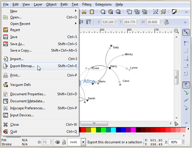
This will open a dialog box where you can select an appropriate resolution and location for your bitmap and then press the export button.
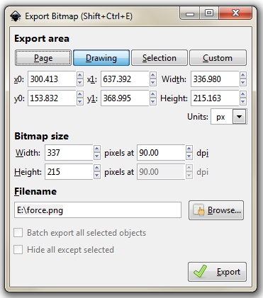
There you go.
It is worth knowing that the default settings here will export the diagram with a transparent background (using *.png) which will fit in nicely with a wide range of graphical end uses.
Understanding JavaScript Object Notation (JSON)
One of the most useful things you might want to learn when understanding how to present your data with D3 is how to structure your data so that it is easy to use.
As explained earlier in the book, there are several different types of data that can be requested by D3 including text, Extensible Markup Language (XML), HyperText Markup Language (HTML), Comma Separated Values (CSV), Tab Separated Values (TSV) and JavaScript Object Notation (JSON).
Comma separated values and tab separated values are fairly well understood forms of data. They are expressed as rows and columns of information that are separated using a known character. While these forms of data are simple to understand, it is not easy to incorporate a hierarchy structure to the data, and when you try, it isn’t natural and makes managing the data difficult.
JavaScript Object Notation (JSON) presents a different mechanism for storing data. A light weight description could read “JSON is a text-based open standard designed to present human-readable data. It is derived from the JavaScript scripting language, but it is language and platform independent.”
Unfortunately, when I first started using JSON, I struggled with the concept of how it was structured, in spite of some fine descriptions on the web (start with http://www.json.org/ in my humble opinion). So the following is how I came to think of and understand JSON.
In the following steps we’ll go through a process that (hopefully) demonstrates that we can transform identifiers that would represent the closing price for a stock of 58.3 on 2013-03-14 into more traditional x,y coordinates.
I think of data as having an identifier and a value.
If a point on a graph is located at the x,y coordinates 150,25 then the identifier ‘x’ has a value 150.
If the x axis was a time-line, the true value for ‘x’ could be “2013-03-14”.
This example might look similar to those seen by users of d3.js, since if we’re using date / time format we can let D3 sort out the messy parts like what coordinates to provide for the screen.
And there’s no reason why we couldn’t give the ‘x’ identifier a more human readable label such as “date”. So our data would look like;
This is only one part of our original x,y = 150,25 data set. The same way that the x value represented a position on the x axis that was really a date, the y value represents a position on the y axis that is really another number. It only gets converted to 25 when we need to plot a position on a graph at 150,25. If the ‘y’ component represents the closing price of a stock we could take the same principles used to transform…
… into …
… to change ….
… into …
This might sound slightly confusing, so try to think of it this way. We want to plot a point on a graph at 150,25, but the data that this position is derived from is really “2013-03-14”, 58.3. D3 can look after all the scaling and determination of the range so that the point gets plotted at 150,25 and our originating data can now be represented as;
This represents two separate pieces of data. Each of which has an identifier (“date” or “close”) and a value (“2013-03-14” and 58.3)
If we wanted to have a series of these data points that represented several days of closing prices, we would store them as an array of identifiers and values similar to this;
Each of the individual elements of the array is enclosed in curly brackets and separated by commas.
Now that we have an array, we can apply the same rules to it as we did the the item that had a single value. We can give it an identifier all of its own. In this case we will call it “data”. Now we can use our identifier: value analogy to use “data” as the identifier and the array as the value.
The array has been enclosed in square brackets to designate it as an array and the entire identifier: value sequence has been encapsulated with curly braces (much the same way that the subset “date”, “close” values were enclosed with curly braces.
If we try to convey the same principle in a more graphical format, we could show our initial identifier and value for the x component like so;

The we can add our additional component for the y value;

We can then add several of these combinations together in an array;
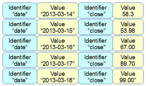
Then the array becomes a value for another identifier “data”;
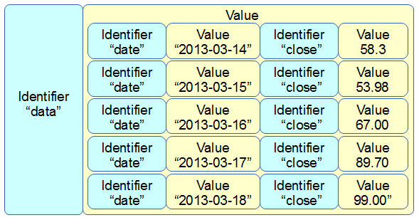
More complex JSON files will have multiple levels of identifiers and values arranged in complex hierarchies which can be difficult to interpret. However, laying out the data in a logical way in a text file is an excellent way to start to make sense of the data.
D3.js Examples Explained
I’ve decided to include an examples chapter because I have occasionally come across things that I wanted to do with data or a technique that didn’t necessarily fall into a specific category or where I had something that I wanted to do that went beyond an exercise that I would want to turn into a simple description.
In other words I think that this will be a place where I can put random graphics that I have made up that don’t necessarily fall into a logical category but which I think would be worth recording.
In many cases these examples will combine a range of techniques that have been explained in the book and in some cases they may include new material that perhaps I would have struggled to explain without putting the technique into better context.
Whatever the case, I will try to explain the examples as best I can and to include a full code listing for each and a link to an electronic version wherever possible.
Multi-line graph with automatic legend and toggling show / hide lines.
Purpose
Creating a multi-line graph is a pretty handy thing to be able to do and we worked through an example earlier in the book as an extension of our simple graph. In that example we used a csv file that had the data arranged with each lines values in a separate column.
This is a common way to have data stored, but if you are retrieving information from a database, you may not have the luxury of having it laid out in columns. It may be presented in a more linear fashion where each lines values are stores on a unique row with the identifier for the line on the same row. For instance, the data above could just as easily be presented as follows;
In this case, we would need to ‘pivot’ the data to produce the same multi-column representation as the original format. This is not always easy, but it can be achieved using the d3 nest function which we will examine.
As well as this we will want to automatically encode the lines to make them different colours and to add a legend with the line name and the colour of the appropriate line.
Finally, because we will build a graph script that can cope with any number of lines (within reason), we will need to be able to show / hide the individual lines to try and clarify the graph if it gets too cluttered.
All of these features have been covered individually in the book, so what we’re going to do is combine them in a way that presents us with an elegant multi-line graph that looks a bit like this;
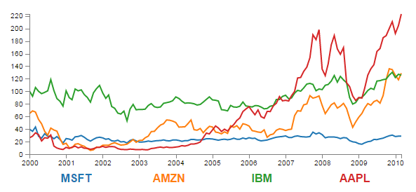
The Code
The following is the code for the initial example which is a slight derivative of the original simple graph. A live version is available online at bl.ocks.org or GitHub. It is also available as the files ‘super-multi-lines.html’ and ‘stocks.csv’ as a download with the book D3 Tips and Tricks (in a zip file) when you download the book from Leanpub.
<!DOCTYPE html>
<meta charset="utf-8">
<style> /* set the CSS */
body { font: 12px Arial;}
path {
stroke: steelblue;
stroke-width: 2;
fill: none;
}
.axis path,
.axis line {
fill: none;
stroke: grey;
stroke-width: 1;
shape-rendering: crispEdges;
}
</style>
<body>
<!-- load the d3.js library -->
<script src="https://d3js.org/d3.v4.min.js"></script>
<script>
// Set the dimensions of the canvas / graph
var margin = {top: 30, right: 20, bottom: 30, left: 50},
width = 600 - margin.left - margin.right,
height = 270 - margin.top - margin.bottom;
// Parse the date / time
var parseDate = d3.timeParse("%b %Y");
// Set the ranges
var x = d3.scaleTime().range([0, width]);
var y = d3.scaleLinear().range([height, 0]);
// Define the line
var priceline = d3.line()
.x(function(d) { return x(d.date); })
.y(function(d) { return y(d.price); });
// Adds the svg canvas
var svg = d3.select("body")
.append("svg")
.attr("width", width + margin.left + margin.right)
.attr("height", height + margin.top + margin.bottom)
.append("g")
.attr("transform",
"translate(" + margin.left + "," + margin.top + ")");
// Get the data
d3.csv("stocks.csv", function(error, data) {
data.forEach(function(d) {
d.date = parseDate(d.date);
d.price = +d.price;
});
// Scale the range of the data
x.domain(d3.extent(data, function(d) { return d.date; }));
y.domain([0, d3.max(data, function(d) { return d.price; })]);
// Nest the entries by symbol
var dataNest = d3.nest()
.key(function(d) {return d.symbol;})
.entries(data);
// Loop through each symbol / key
dataNest.forEach(function(d) {
svg.append("path")
.attr("class", "line")
.attr("d", priceline(d.values));
});
// Add the X Axis
svg.append("g")
.attr("class", "axis")
.attr("transform", "translate(0," + height + ")")
.call(d3.axisBottom(x));
// Add the Y Axis
svg.append("g")
.attr("class", "axis")
.call(d3.axisLeft(y));
});
</script>
</body>
Description
Nesting the data
The example code above differs from the simple graph in two main ways.
Firstly, the script loads the file stocks.csv which was used by Mike Bostock in his small multiples example. This means that the variable names used are different (price for the value of the stocks, symbol for the name of the stock and good old date for the date) and we have to adjust the parseDate function to parse a modified date value.
Secondly we add the code blocks to take the stocks.csv information that we load as data and we apply the d3.nest function to it and draw each line.
The following code nest’s the data
var dataNest = d3.nest()
.key(function(d) {return d.symbol;})
.entries(data);
We declare our new array’s name as dataNest and we initiate the nest function;
var dataNest = d3.nest()
We assign the key for our new array as symbol. A ‘key’ is like a way of saying “This is the thing we will be grouping on”. In other words our resultant array will have a single entry for each unique symbol or stock which will itself be an array of dates and values.
.key(function(d) {return d.symbol;})
Then we tell the nest function which data array we will be using for our source of data.
}).entries(data);
Then we use the nested data to loop through our stocks and draw the lines
dataNest.forEach(function(d) {
svg.append("path")
.attr("class", "line")
.attr("d", priceline(d.values));
});
The forEach function being applied to dataNest means that it will take each of the keys that we have just declared with the d3.nest (each stock) and use the values for each stock to append a line using its values.
The end result looks like the following;
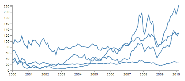
You would be justified in thinking that this is more than a little confusing. Clearly while we have been successful in making each stock draw a corresponding line, unless we can tell them apart, the graph is pretty useless.
Applying the colours
Making sure that the colours that are applied to our lines (and ultimately our legend text) is unique from line to line is actually pretty easy.
The code that we will implement for this change is available online at bl.ocks.org or GitHub. It is also available as the files ‘super-multi-colours.html’ and ‘stocks.csv’ as a download with the book D3 Tips and Tricks v4 (in a zip file) when you download the book from Leanpub.
The changes that we will make to our code are captured in the following code snippet.
// set the colour scale
var color = d3.scaleOrdinal(d3.schemeCategory10);
// Loop through each symbol / key
dataNest.forEach(function(d) {
svg.append("path")
.attr("class", "line")
.style("stroke", function() { // Add the colours dynamically
return d.color = color(d.key); })
.attr("d", priceline(d.values));
});
Firstly we need to declare an ordinal scale for our colours with var color = d3.scaleOrdinal(d3.schemeCategory10);. This is a set of categorical colours (10 of them in this case) that can be invoked which are a nice mix of difference from each other and pleasant on the eye.
We then use the colour scale to assign a unique stroke (line colour) for each unique key (symbol) in our dataset.
.style("stroke", function() {
return d.color = color(d.key); })
It seems easy when it’s implemented, but in all reality, it is the product of some very clever thinking behind the scenes when designing d3.js and even picking the colours that are used. The end result is a far more usable graph of the stock prices.
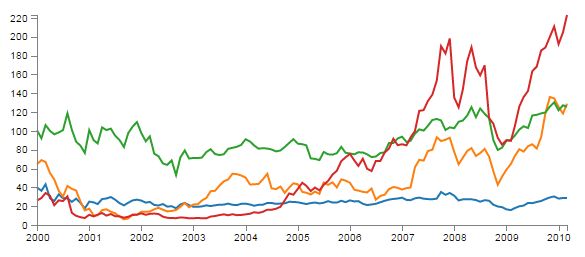
Of course now we’re faced with the problem of not knowing which line represents which stock price. Time for a legend.
Adding the legend
If we think about the process of adding a legend to our graph, what we’re trying to achieve is to take every unique data series we have (stock) and add a relevant label showing which colour relates to which stock. At the same time, we need to arrange the labels in such a way that they are presented in a manner that is not offensive to the eye. In the example I will go through I have chosen to arrange them neatly spaced along the bottom of the graph. so that the final result looks like the following;

Bear in mind that the end result will align the legend completely automatically. If there are three stocks it will be equally spaced, if it is six stocks they will be equally spaced. The following is a reasonable mechanism to facilitate this, but if the labels for the data values are of radically different lengths, the final result will looks ‘odd’ likewise, if there are a LOT of data values, the legend will start to get crowded.
The code that we will implement for this change is available online at bl.ocks.org or GitHub. It is also available as the files ‘super-multi-legend.html’ and ‘stocks.csv’ as a download with the book D3 Tips and Tricks v4 (in a zip file) when you download the book from Leanpub.
There are three broad categories of changes that we will want to make to our current code;
- Declare a style for the legend font
- Change the area and margins for the graph to accommodate the additional text
- Add the text
Declaring the style for the legend text is as easy as making an appropriate entry in the <style> section of the code. For this example we can choose the following;
.legend {
font-size: 16px;
font-weight: bold;
text-anchor: middle;
}
To change the area and margins of the graph we can make the following small changes to the code.
var margin = {top: 30, right: 20, bottom: 70, left: 50},
width = 600 - margin.left - margin.right,
height = 300 - margin.top - margin.bottom;
The bottom margin is now 70 pixels high and the overall space for the area that the graph (including the margins) covers is increased to 300 pixels.
To add the legend text is slightly more work, but only slightly more. The following code incorporates the changes and there are commented out asterisks to the end of the lines that have been added
legendSpace = width/dataNest.length; // spacing for legend // ******
// Loop through each symbol / key
dataNest.forEach(function(d,i) { // ******
svg.append("path")
.attr("class", "line")
.style("stroke", function() { // Add the colours dynamically
return d.color = color(d.key); })
.attr("d", priceline(d.values));
// Add the Legend
svg.append("text") // *******
.attr("x", (legendSpace/2)+i*legendSpace) // spacing // ****
.attr("y", height + (margin.bottom/2)+ 5) // *******
.attr("class", "legend") // style the legend // *******
.style("fill", function() { // dynamic colours // *******
return d.color = color(d.key); }) // *******
.text(d.key); // *******
});
The first added line finds the spacing between each legend label by dividing the width of the graph area by the number of symbols (key’s or stocks).
legendSpace = width/dataNest.length;
Then there is a small and subtle change that might other wise go unnoticed, but is nonetheless significant. We add an i to the forEach function;
dataNest.forEach(function(d,i) {
This might not seem like much of a big deal, but declaring i allows us to access the index of the returned data. This means that each unique key (stock or symbol) has a unique number. In our example those numbers would be from 0 to 3 (MSFT = 0, AMZN = 1, IBM = 2 and AAPL = 3 (this is the order in which the stocks appear in our csv file)).
Now we get to adding our text. Again, this is a fairly simple exercise which is following the route that we have taken several times already in the book but using some of our prepared values.
svg.append("text")
.attr("x", (legendSpace/2)+i*legendSpace)
.attr("y", height + (margin.bottom/2)+ 5)
.attr("class", "legend")
.style("fill", function() {
return d.color = color(d.key); })
.text(d.key);
The horizontal spacing for the labels is achieved by setting each label to the position set by the index associated with the label and the space available on the graph. To make it work out nicely we add half a legendSpace at the start (legendSpace/2) and then add the product of the index (i) and legendSpace (i*legendSpace).
We position the legend vertically so that it is in the middle of the bottom margin (height + (margin.bottom/2)+ 5).
And we apply the same colour function to the text as we did to the lines earlier;
.style("fill", function() {
return d.color = color(d.key); })
The final result is a neat and tidy legend at the bottom of the graph;

If you’re looking for an exercise to test your skills you could adapt the code to show the legend to the right of the graph. And if you wanted to go one better, you could arrange the order of the legend to reflect the final numeric value on the right of the graph (I.e in this case AAPL would be on the top and MSFT on the bottom).
Making it interactive
The last step we’ll take in this example is to provide ourselves with a bit of control over how the graph looks. Even with the multiple colours, the graph could still be said to be ‘busy’. To clean it up or at least to provide the ability to more clearly display the data that a user wants to see we will add code that will allow us to click on a legend label and this will toggle the corresponding graph line on or off.
This is a progression from the example of how to show / hide an element by clicking on another element that was introduced in he ‘Assorted tips and tricks’ chapter.
The only changes to our code that need to be implemented are in the forEach section below. I have left some comments with asterisks in the code below to illustrate lines that are added.
dataNest.forEach(function(d,i) {
svg.append("path")
.attr("class", "line")
.style("stroke", function() {
return d.color = color(d.key); })
.attr("id", 'tag'+d.key.replace(/\s+/g, '')) // assign ID **
.attr("d", priceline(d.values));
// Add the Legend
svg.append("text")
.attr("x", (legendSpace/2)+i*legendSpace)
.attr("y", height + (margin.bottom/2)+ 5)
.attr("class", "legend")
.style("fill", function() {
return d.color = color(d.key); })
.on("click", function(){ // ************
// Determine if current line is visible
var active = d.active ? false : true, // ************
newOpacity = active ? 0 : 1; // ************
// Hide or show the elements based on the ID
d3.select("#tag"+d.key.replace(/\s+/g, '')) // *********
.transition().duration(100) // ************
.style("opacity", newOpacity); // ************
// Update whether or not the elements are active
d.active = active; // ************
}) // ************
.text(d.key);
});
The full code for the complete working example is available online at bl.ocks.org or GitHub. It is also available as the files ‘super-multi.html’ and ‘stocks.csv’ as a download with the book D3 Tips and Tricks v4 (in a zip file) when you download the book from Leanpub.
The first piece of code that we need to add assign an id to each legend text label.
.attr("id", 'tag'+d.key.replace(/\s+/g, ''))
Being able to use our key value as the id means that each label will have a unique identifier. “What’s with adding the 'tag' piece of text to the id?” I hear you ask. Good question. If our key starts with a number we could strike trouble (in fact I’m sure there are plenty of other ways we could strike trouble too, but this was one I came across). As well as that we include a little regular expression goodness to strip any spaces out of the key with .replace(/\s+/g, '').
Then we use the .on("click", function(){ call carry out some actions on the label if it is clicked on. We toggle the .active descriptor for our element with var active = d.active ? false : true,. Then we set the value of newOpacity to either 0 or 1 depending on whether active is false or true.
From here we can select our label using its unique id and adjust it’s opacity to either 0 (transparent) or 1 (opaque);
d3.select("#tag"+d.key.replace(/\s+/g, ''))
.transition().duration(100)
.style("opacity", newOpacity);
Just because we can, we also add in a transition statement so that the change in transparency doesn’t occur in a flash (100 milli seconds in fact (.duration(100))).
Lastly we update our d.active variable to whatever the active state is so that it can toggle correctly the next time it is clicked on.
Since it’s kind of difficult to represent interactivity in a book, head on over to the live example on bl.ocks.org to see the toggling awesomeness that could be yours!
